Posts filed under Graphics (394)

August 18, 2013

Killing people

TV3 has tried to stir up the issue of the death penalty in New Zealand.  They have a poll showing majority opposition by the country as a whole, and by supporters of every party except NZ First.  Even the Sensible Sentencing Trust isn’t in favor.

The lead-in to the story is that the murder rate has never ‘recovered’ from the abolition of the death penalty.  They have a graph showing homicides per capita rising and then falling again, but not to the earlier levels.

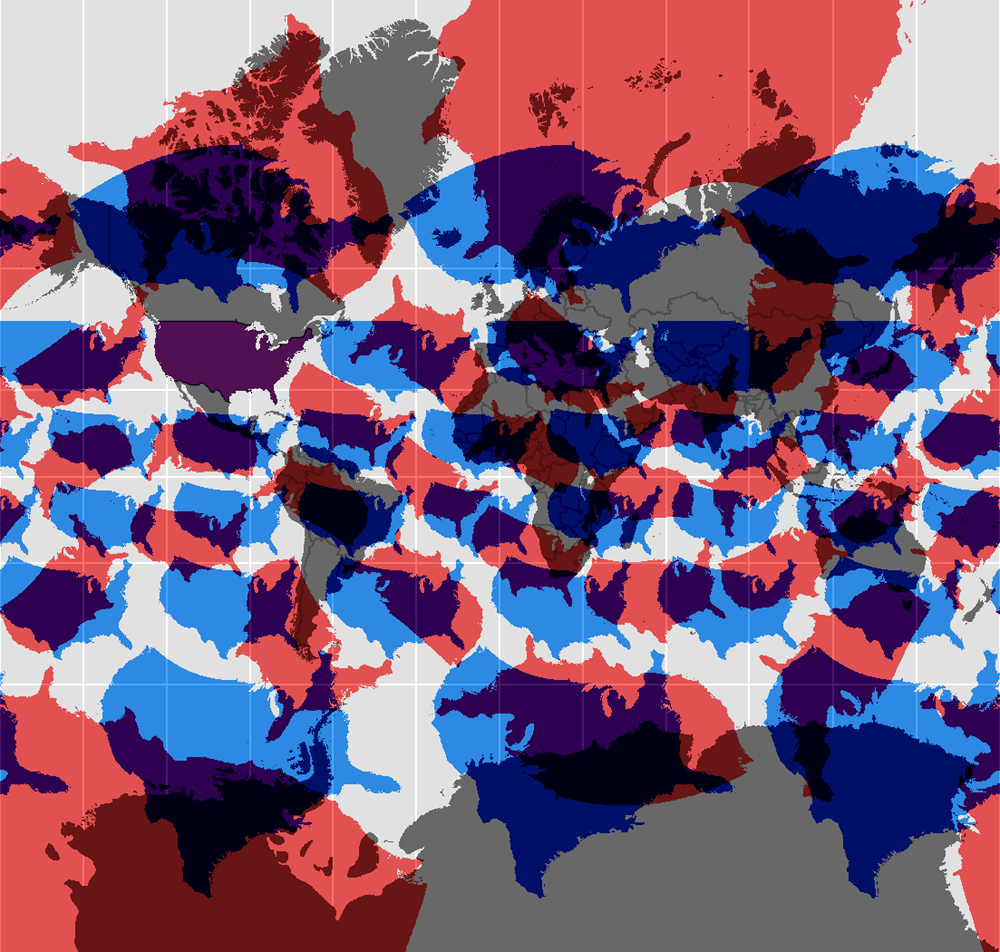
Using the term ‘recovered’ comes very close to asserting a causal connection; but is there even a reliable correlation? International comparisons are useful here.  I don’t have long time series for homicide, but Kieran Healy has produced a graph of international trends in deaths due to assault. This isn’t the same as homicide, but is close enough to be relevant.

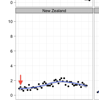
Here’s the New Zealand panel, with the arrow indicating the abolition of the death penalty. The details are slightly different from those for homicide, but the basic trend is the same that TV3 reports.

nz


and here’s the international comparison, with NZ second from the bottom, on the left. As usual, click to embiggen

assault-deaths-oecd-ts-facet


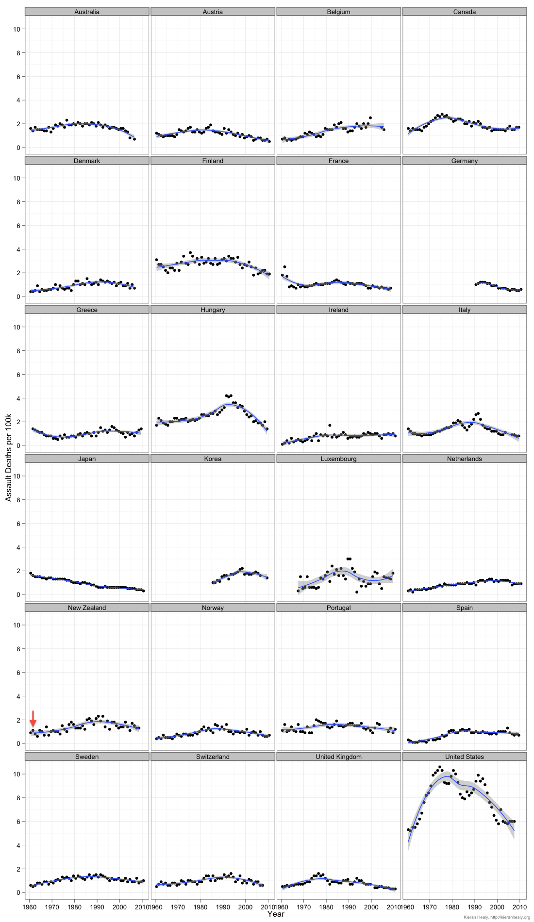
The NZ pattern is very similar to other countries, including Australia (where abolition didn’t happen until about 10 years later), Finland (where it was abolished in 1949 for crimes committed in peacetime), and Switzerland (1942).

If you look at the countries that still have the death penalty, murder rates are low and falling in Japan, South Korea had the same sort of rise and fall that NZ has had (over a shorter time scale), and of course there’s the USA.

It doesn’t look as though the death penalty is a major driving force in these patterns.

August 17, 2013

How to lie with barcharts

From the Guardian, a story about a barchart in the Sun portraying the cost of ‘green energy’

SUN_GREEN_BARCHART_3007

August 14, 2013

Different colours, one people?

A beautiful map from the Cooper Center for Demographics at the University of Virginia, showing 300 million dots, one for each person in the United States, coloured by the census-reported race/ethnicity categories.

usmap


As we’ve pointed out before, the most obvious feature in the map is the change in population density across the north-south ‘dry line’, but it’s the other features that are of most interest. The larger black population across the south-east, and the greater diversity of the cities are obvious.

There’s also a zoomable version of the map for you to explore.  Here’s part of Seattle, where I used to live, which is the purple splotch at the top left of the whole-US map

seattle-map


At this smaller scale there’s a lot more clumping by race, with black and Hispanic people living at the top and bottom of the map. Oh, and that odd-shaped spot in the middle? That’s the University of Washington, so those are university students.

(via Luis Apiolaza on Twitter)

August 13, 2013

Some more graphics links

  • Subtleties of Color (parts 1, 2, 3) on choosing colour palettes for different types of graphic
  • Dear NASA, No more rainbow color scales, please.
  • The Colour Oracle runs a colour filter on your whole screen to show the impact of the three sorts of dichromatic colour vision. Now it’s easy to avoid graphs that are invisible to some of your audience.
  • “Standards of statistical presentation”, originally published in 1966 by the US Army, and containing a lot of what StatsChat covers.  This isn’t cutting edge stuff, people.
August 9, 2013

Graphical innovation in delivering workforce analytics

Via Nathan Yau (from a source that evades Google’s reverse image search), another innovation in data visualisation

If you’re the first person to use a data visualisation idea, it’s just possible that it’s because it isn’t a very good idea.

August 2, 2013

Facts are scared

The Guardian blog section has the motto “Comment is free, but facts are sacred”.  Their Datablog is showing 16 examples of infographics that don’t exactly cast light on the facts, including

nurses

August 1, 2013

The machine that goes ‘ping’

Listen to Wikipedia is an entrancingly pointless real-time display of edits to Wikipedia, with visual and audio, indicating additions and deletions, by registered or unregistered people or bots

ltw


(via @hildabast)

July 30, 2013

3d bar graphs: just say no.

Or perhaps “OMG NO!!!”

article-3178

This example (click to embiggen) comes from The Critic, the magazine of Otago University Students Association and has been nominated for Stat of the Week.  It accompanies a reasonable story about satisfaction with services provided by OUSA.   There are some good points: for example, the colour coding means that you can easily tell which bars in the three graphs refer to the same OUSA service.  What you can’t easily do is compare services for levels of satisfaction. For example, in the right-hand set of bars, is the magenta bar taller than, shorter than, or the same as the  dark blue bar? Are you sure? How about the light blue and green bars? Also, if the questions were on a 1 to 5 scale, the bars should start at one, not at zero.

Here’s a version that’s less pretty but actually lets you compare the numeric values. I kept the same colour-coding, although more sedate colours would have been easier to read

ousa-survey


Transit maps: moving further from geography

The famous London Transport map showed that a train map didn’t have to represent where the trains went, just how they related to each other.  A new example from New York uses concentric circles. The designer says

 “These circles maps score poorly for simplicity: the line trajectories have lots of twists and turns, but score well for coherence: the city is forced into an unprecedented level of organization

1682692-inline-1200svpq


(via @juhasaarinen)

July 26, 2013

Interesting maps

Two selections from radicalcartography (via Noah Illinsky on Twitter)

The Mercator projection (and other projections) with copies of the US superimposed for reference

wandering_merc


(the Mercator projection has the unique property, vital for pre-modern navigation, that compass bearings are straight lines.  It shouldn’t be used where this property isn’t needed).


And social survey data on how people greet friends in France

frenchkisses


(as the cartographer notes, the data come from a bogus poll and may be somewhat unreliable)