Posts filed under Graphics (394)

July 25, 2013

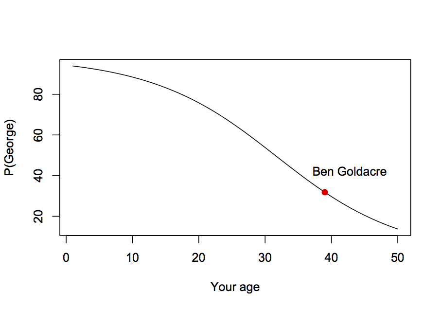
Royal baby coronation lifetables

Ben Goldacre asked on Twitter
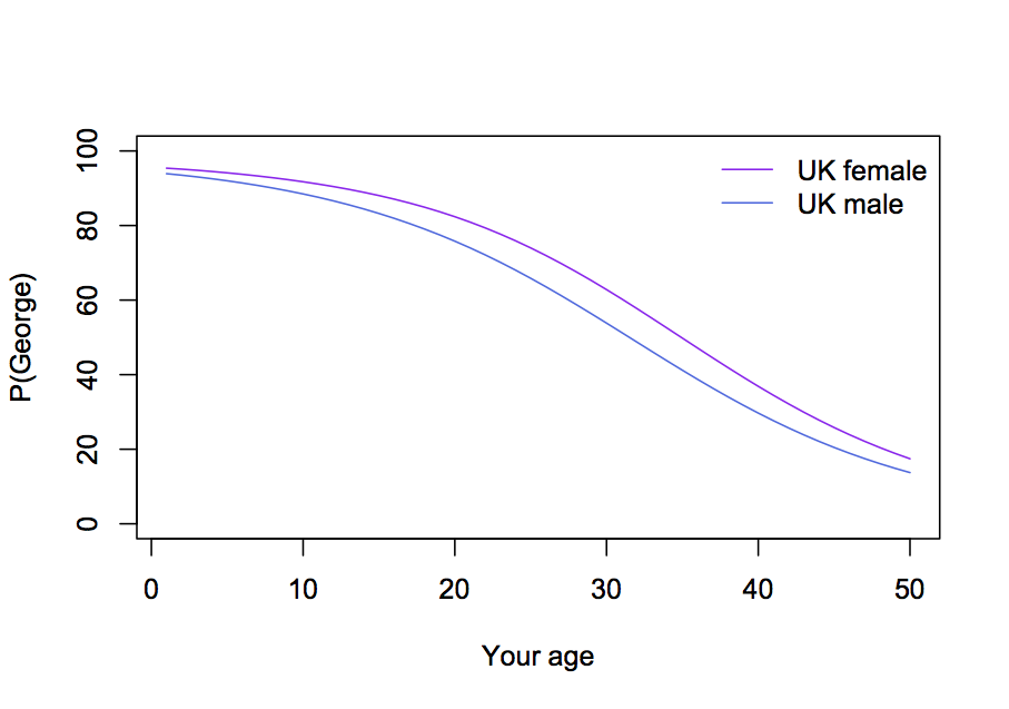
As he suggests, we’re going to have to make some oversimplifications.  Both Prince William (who comes from a wealthy, long-lived family) and Ben Goldacre (who is a skinny, hyperactive medical doctor) are likely to live longer than the typical UK male, and we will ignore this.  We will also ignore the possibilities that Baby George dies before his father, or that William dies before his father or grandmother, and the possibility that there won’t be a throne for King George.

Now we need to get life tables for UK males, which give the current risk of death at each age.  For each year into the future, we multiply the chance of Prince William dying in that year by the chance that Dr Goldacre is still alive, and add these up, to get a little over 30%

ukmale


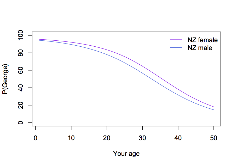
We can do the same thing for UK females and (with NZ life tables) for NZ males and females

ukboth


nzboth

July 24, 2013

Briefly

  • Some 1920-30s cartograms (distorted maps) of the USA, at Making Maps. Here’s the one based on electricity use
    brinton_gp_cartograms_1921
  • Another map: the USA has low income mobility (ie, children of the poor stay poor), but there is quite a lot of variation over the country. This is the version of the map from the original researchers, click for the shiny interactive New York Times version
    e_rank_b_hybrid_continental
  • A good story about a new randomized trial of a melanoma vaccine, based on NZ research.  The story even says that the trial is measuring specific components of immune response, not (yet) actual disease.  As should always be the case, the trial is registered and there’s more detail at the registry.
  • A post about wild extrapolation in estimating the value of marine reserves to (UK) anglers:
    Or you could look at the Celtic Deep rMPA, a site located some 70km offshore, where they estimate between 145,000 and 263,000 angling visits per year. That’s 400-720 visits a day, which translates to approx 40-70 typical sea angling boats, each full to the gunwales every single day of the year.
July 17, 2013

Olympic and Paralympic success (per capita)

From Stats New Zealand

Paralympic medals per capita

yrbk12-paralympic


and (you’ve seen this before) Olympic medals per capita

yrbk12-olympic


Congratulations to the athletes.

This being StatsChat, I will note that it’s not obvious where the bars begin and end in these plots (is the white pedestal included? Is the grey top included? How about the flag-wrapped athlete?), and however I try to do it, the Grenada bar seems to measure less than twice the length of the Jamaica bar, which shouldn’t be the case.


Some data visualisation links

These are from a long list of recommended links at Health Intelligence (I wouldn’t recommend all of the long list).

July 16, 2013

Numbers have a magnitude as well as an order

Nathan Yau, at Flowing Data, shows this barchart-like object

Speaking-the-world-625x622


The most obvious problem is that the bar for Chinese is about 3 times the area of the bar for English, and should be either about a third bigger, or, if you really believe there are 1 trillion Chinese speakers, 1300 times bigger. The bars for English and Spanish are obviously out of proportion as well.

I tried to find the original source of this graph, which Nathan doesn’t give, perhaps because he couldn’t find it either.  However, Google image search did show a related graph that explains some of the problems.  I found it at a range of sites, but the one at 10-most.com is where it looks most original.

The-most-common-languages


This version is still ugly, but the bars match the labels.

Comparing the numbers to Wikipedia, it looks as though someone edited the labels from ‘top ten by number of native speakers’ to ‘top ten by total number of speakers’ either as a deliberate change or because they didn’t understand the original graph (and they also inflated the Chinese count by a factor of 1000). Sadly, the editor didn’t appreciate that the bars are more than just decoration; they are supposed to convey numeric information.

PS: Yes, we could also get picky about ‘Chinese’ as a single language, but they clearly mean Mandarin Chinese, the group of dialects that includes the official language of both the PRC and the ROC.

July 13, 2013

Visualising the Bechdel test

The Bechdel Test classifies movies according to whether they have two female characters, who at some point talk to each other, about something other than a man.

It’s not that all movies should pass the test — for example, a movie with a tight first-person viewpoint is unlikely to pass the test if the viewpoint character is male, and no-one’s saying such movies should not exist.  The point of the test is that surprisingly few movies pass it.

At Ten Chocolate Sundaes there’s an interesting statistical analysis of movies over time and by genre, looking at the proportion that pass the test.  The proportion seems to have gone down over time, though it’s been pretty stable in recent years.

July 12, 2013

Did he ever return?

Irene Ros has a visualisation of ridership on the Boston subway (famous from the Kingston Trio song back before I was born)

You can see how the rush-hour varies across the subway lines, with the Silver Line (to the airport) having only an evening rush hour, the Green line having a moderate morning peak,  the Red and Orange lines having about the same peak in the morning and evening, and the Blue line having more of a peak in the morning.


July 6, 2013

Average housecat shown for scale

Via Edward Tufte on Twitter, from an Indiana newspaper

P4uh78P (more…)

July 5, 2013

Email metadata

Some folks at the MIT Media Lab have put together a simple web app that takes your Gmail headers and builds a social network.

Once you log in, Immersion will use only the From, To, Cc and Timestamp fields of the emails in the account you are signing in with. It will not access the subject or the body content of any of your emails.

Here’s mine, from my University of Washington email (with the names blurred, not that communicating with me is all that incriminating)

immersion


Obviously my email headers reveal who I email, and, unsurprisingly, the little outlying clusters are small groups or individuals involved in specific projects.  More interesting is how the main clump breaks down:  the blue and pink circles are statisticians, the red are epidemiology and genomics people that I have worked with in person in Seattle, and the green are epidemiology and genomics people that I work with only via email.

July 3, 2013

Data sonification

An interestesting video from the Geography department at the University of Minnesota. The cellist, Minnesota student Daniel Crawford, plays the historical earth mean temperature record converted to music

One difficulty with sonic display of data is scaling: the video uses a semitone for 0.03 Celsius, but that seems like quite a big pitch change for a barely-measurable temperature difference.  The scaling gives a range of three octaves (rather more than a typical singers voice) for just over 1 degree, which is a meaningful but not catastrophic change in temperature.  I think it’s fair to say the pitch scaling is a bit exaggerated.

It’s hard to say what would be appropriate, since we don’t have the research and practical experience that informs axis choices for graphs.  One approach might be to take advantage of vibrato in cello performance, and scale so that the minimum measurement uncertainty is the same as the vibrato variation.  The Google suggests that cello vibrato is about 1/5 to 1/4 semitone, and mapping this to a minimum confidence interval width (from the Berkeley data) of 0.04C gives a scaling of 0.16 to 0.2 degrees per semitone, or a total range for the whole piece of about half an octave.