Posts filed under Graphics (394)

July 2, 2013

Ranking America

Via BetterPosters, a site devoted to graphics showing the US rank in international comparisons on a range of things.  Some of the graphs are misleading because they look at totals rather than some per-capita quantity and so the US ranks high because it’s a big country.

Others …well, see for yourselves.

preview-of-e2809capproval-of-russian-leadership-xlsxe2809d (1)

June 28, 2013

Regions lead post-GFC growth?

From Stuff

Auckland may have the population, but Taranaki, Southland and the West Coast were the fastest-growing regions in the aftermath of the global financial crisis, new figures show.

That’s true, but if you look at the pretty interactive graphics, the differences in growth are basically restricted  to growth from 2007 to 2008.  Changes since then have been small in all regions, and if anything, worse in Taranaki. For example

taranaki


auckland


June 25, 2013

Personal data as a motivator

Almost five months ago, I gave birth to my third child. After each birth, I have tracked my weight loss. I have a few self-chosen rules* for this:

  1. I don’t weigh myself at all during pregnancy. I don’t want to become obsessive about weight gain and didn’t gain what I consider to be unhealthy/ridiculous amounts. I did seem to put on a lot more weight with my third pregnancy, right at the end.
  2. I weigh myself first thing each morning, and only record the weight if it’s gone down. It’s more motivating this way for me.
  3. I eat when I’m hungry, and don’t worry too much about how much I eat in the first three months after giving birth. I always try to eat healthily.
  4. I don’t follow a diet. I do watch what I eat in the evenings as I find this is when I’m most tempted to eat unhealthily. Living reasonably far from food shops helps curb the temptation to go grab snacks.

*I’m not in any way a weight loss expert. Disclaimers etc!

While there’s plenty of cool technology and apps to track your own weight and fitness data such as Fitbit (there’s even Wifi scales!), I’ve been using a more humble approach by just manually typing my weight into Excel.

I’ve found this to be such a great motivator for me to see my progress, and to compare it against previous births. There’s something quite nice about manually collecting data and seeing the graph update.

So, I’m going to do a great reveal and show my graphs so far. I don’t lose weight after giving birth incredibly fast, so I hope this is also a nice example for others to see.

For reference, I’m 174cm tall, and normally about 66-68kg. When I was younger, I was about 62kg. I have exclusively breastfed each of my babies.

weight

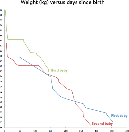
For each birth, there’s been an initial dramatic weight loss in the couple of weeks after giving birth (water retention, body changes etc), then there’s been a flat period. Note that I didn’t start tracking my weight until a little later with my first child. Then there’s been periods of quick weight loss (often connected to increased breastfeeding!) and periods of much slower weight loss.

In case you’re wondering, I’m currently feeding my baby a lot more as she’s started waking in the night again as she has a bit of a cold and may be teething or just being a baby and waking more!

After the first two births, I went down to my target normal weight and then stopped weighing myself.

June 7, 2013

You don’t sound like you’re from round here

Joshua Katz, a statistics PhD student at North Carolina State University, has produced a beautiful set of maps of US dialect.  He used data from the Dialect Survey conducted by Bruce Vaux, of Harvard University.

As an example, people in various parts of the US were asked about their generic name for sweetened carbonated soft drinks: soda, pop, or coke.

spcMap


The original maps by Prof Vaux were closer to the data, since they showed dots for individual respondents, but they have visual artifacts due to population density — the clear vertical edge running north from Texas is a rainfall threshold, not a dialect boundary.

sodamap

June 4, 2013

Nonlinear time

Allan Hansen sends in this infographic from Greatist, showing the benefits of quitting smoking

Smokers-Timeline-1

He points out the non-linear time scale — equally spaced intervals range from 20 minutes to five years.  It’s also a bit strange that time progresses in the opposite direction to the burning of the cigarette — perhaps it should have been flipped left to right.

Other versions of this information are common, and they nearly all have the same nonlinear time scale

Smoking-timeline-2smoking_times-3smoking-timeline-4Smoke Timeline-5


One notable exception is from Blisstree, where the evenly-spaced text is linked to accurately-scaled times by lines.  This graphic also avoids the direction-of-burning problem, using comments from former smokers as the background.

smoking_timeline_2070x1530

May 29, 2013

More on design of graphics

Since it’s clearly Night of the Living Data here, another link on data visualisation (via @zentree), a long essay from Bret Victor  “Magic Ink: information software and the graphical interface”

A person experiences modern software almost exclusively through two channels:

  • She reads and interprets pictures on a screen.
  • She points and pushes at things represented on the screen, using a mouse as a proxy finger.

Thus, software design involves the design of two types of artifact:

  • Pictures.
  • Things to push.

These are not brave new realms of human endeavor. We share the blood of cavemen who pushed spears into mammoths and drew pictures of them in the living room. By now, these two activities have evolved into well-established design disciplines: graphic design and industrial design.

The software designer can thus approach her art as a fusion of graphic design and industrial design. Now, let’s consider how a user approaches software, and more importantly, why.

(and even if you aren’t a dataviz enthusiast, someone whose hypothetical example books are called ‘Waiting for Good Dough”, “The Bun Also Rises”, and “Yeast of Eden”, is definitely worth reading)

Good information display

Recommended by Noah Iliinsky (@noahi), via @keith_ng, a display from the US travel-booking site Hipmunk (click to embiggen)

hip


The bars display options for, in this case, a flight from Seattle (where I used to live) to Raleigh, NC, where the Environmental Protection Agency lives.  The coloured segments are flights; the pale segments are layovers (labelled with the airport).  The colour indicates the airline, and there are also symbols indicating availability of WiFi on the plane.

From the graph you can see at a glance that there’s no good way to get from Seattle to Raleigh, but also what all the options are.

Noah Iliinsky also has relatively sparse blog (Complex Diagrams) and gives a lot of talks.  A good short one is “Data Visualizations Done Wrong”, where he does a lot of the easy pointing and laughing, but also talks about the relationship between the structure of information and its display.

Best place to live

The Herald has a big spread on the OECD Better Life Index today — the graphics don’t show up in the online version, so I didn’t notice initially.

As long-time readers will remember from two years ago, the best thing about the OECD data is that their website lets you see what rankings result from giving different importance to different parts of their survey.  For example, New Zealand does well overall, but does relatively poorly on income, so its ranking is quite sensitive to how important you think income is.

This year’s interactive website is here (the Herald, sadly, doesn’t link). Go play.

daisies

Two graphs, three trends

First, the serious one.  Nature News has a story about new immune-based cancer treatments (like Herceptin for breast cancer), some of which are very effective, but which are increasingly expensive.  In contrast to previous `small molecule’ drugs, these won’t necessarily get cheap when the patent runs out, since generic  (technically, `biosimilar’) versions are harder to make and test.

ASCO-cancer-graph


Now for something completely different

iemurder


By @altonncf — via various people on Twitter who don’t cite original sources. Pro tip: Google Image Search is quite good at finding originals.

May 28, 2013

Analytics is beating statistics

icrunchdata, which is a data-related jobs site, has introduced what it is calling the Big Data Jobs Index

crunchy


If you believe the numbers, it looks as though analytics is way ahead in the synonym game, followed by data science, but at least statistics is still ahead of business intelligence. And at least this is a bar chart, though not an index in any usual sense of the term.

The company describes Big Data as having ‘fueled one of the most hyper-growth niches of employment in a century’, but since their projection is for the sector to grow to nearly 1% of the US job market by 2015, we clearly need to be careful of the definition of fast growth