November 23, 2011
Visualising money
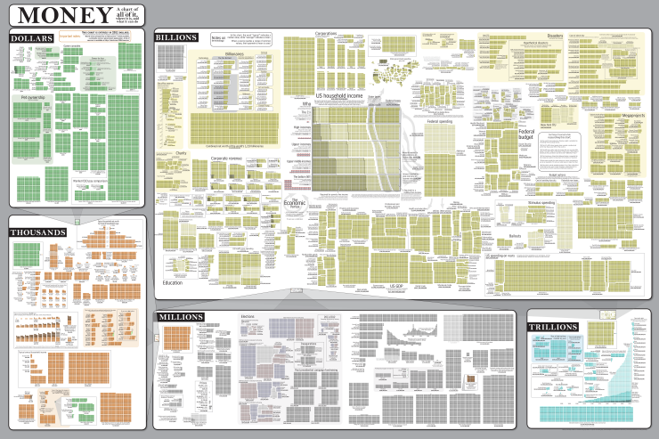
Randall Monroe, at XKCD, has produced another of his amazing charts (click for the full-size version).
Money: a chart of (almost) all of it, where it is, and what it can do.
Randall Monroe, at XKCD, has produced another of his amazing charts (click for the full-size version).
Money: a chart of (almost) all of it, where it is, and what it can do.
Housing prices are in the news again, and I was curious to see how much of the change in prices is just ordinary inflation, and how much is real improvement. Over the past 45 years, housing prices have increased more than fifty-fold. Barfoot & Thompson like to point this out, and they have a graph of Auckland prices that is designed to show the increase very dramatically. But other things from apples to yachts are also more expensive than they were in the past. (more…)
Articles about the MV Rena appeared in the New Zealand Herald over the past week and I’m surprised they didn’t show up in the Stat of the Week competition.

Let’s take a look at one in particular, from October 31. See that graphic there? Cam Slater didn’t like the manipulated Likert-scale, but I was more concerned by the thermometer:

It raises more questions than it answers, and even after several minutes staring at it and trying to decipher it, I was even more bewildered. The areas are overlapping, there’s a giant bulb on the bottom hiding where 0 belongs, and the different colours and sizes drag the eye around in a mad series of saccades.
I took it upon myself to redo this into something a bit tidier and less confusing. Is it better? I’ll let you be the judge of that:

The big problem with our stat-of-the-week was the graphics. While David Farrar’s redesign to add the early years of Helen Clark’s government provides some context, a cumulative graph is not a good way to see changes over time. For anyone who actually wants to see the immigration/emigration rates over time, rather than just making a political point, here is a non-cumulative graph using data I downloaded from Stats New Zealand. The dots are totals for the 12 months ending August each year (the most up-to-date values available).

Disaggregating immigration and emigration is helpful here: immigration from Australia has been roughly constant, but emigration to Australia fluctuates a lot, on top of a weak upwards trend.
Data visualisation is difficult to do correctly, but this one just sort of fell out while I was sorting the family’s laundry:

This sort of graphical representation is easy to do improperly, the most common offence being to scale on more than one axis, causing the area to confusingly increase at a much greater rate than the underlying data:

Here I demonstrate just one of many ways in which the graph can be manipulated to mislead the eye and thus the viewer.
Edward Tufte would still dislike my original graphic: there’s too much “chart junk” in the background. Move that pillow!
The Federal Reserve Bank of St Louis (part of the US Federal Reserve), who run the excellent FRED economic data website, have now released a free iPhone/iPad app that lets you download depressing economic statistics and graphics wherever you are.
There probably aren’t many people in New Zealand who would want this, but I bet they are over-represented among our readers.
Per Square Mile is a fascinating blog about population density with plenty of research, statistics, graphics and food for thought.
See how much space the people of the world would fit in if they lived in one big city which was as densely populated as cities such as London, Paris or New York:

Explore, share and soon create infographics and data visualisations at the brand new website, Visual.ly
Charlie Park has a great post on Edward Tufte’s “slopegraphs” where he explains what they are, how they’re made, why they haven’t been used too much to date and why they may become more popular very soon.
Brain Pickings has compiled a fantastic list of 7 books on data visualisation from the speakers at the eyeo festival.
Once you’ve explored those, jump over to eyeo‘s website to be linked to some incredible people in the data visualisation field, including:
Moritz Stefaner who worked on the OECD Better life project and Google’s Think Quarterly – both previously blogged about here on Stats Chat; Ben Fry of Fathom, Adam Bly of Visualizing, Amanda Cox who creates beautiful graphics for the New York Times, and Nicholas Felton. All their sites are well worth a visit.
eyeo was partly sponsored by Visual.ly which launches this week and promises to showcase more than 2,000 visualisations and enable people to create their own web-based infographics and visualisations.
And, for more fascinating visualisations, visit Data Insight – a recently held data visualisation competition.