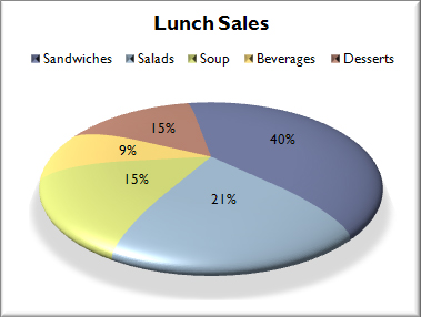
Posts filed under Just look it up (285)

June 28, 2013

Apples and orangs

In a Stat-of-the-Week nomination, Nick Iversen points out a Herald story about the convention centre deal, under the headline “Support disappears for convention deal

Public opinion has turned against the Government’s SkyCity international convention centre deal just days before it is due to be signed off, allowing for 230 extra poker machines at the downtown Auckland casino.

The latest Herald-DigiPoll survey shows 61.5 per cent of those polled disapprove of the deal while 33.8 per cent approve.

That’s a sharp turnaround from a year ago when a similar poll found 40.3 per cent disapproved and 57.3 supported it.

As Nick and the SkyCity spokesperson point out, the poll last year had a ‘conditionally approve’ option, so they aren’t really comparable. In fact it’s worse than that. the Herald’s headline last year was “Public opposed to SkyCity deal — or want conditions“, so it’s not just a matter of interpreting last year’s data; the story isn’t even consistent with last year’s headline.

Last year, the poll found 40.3% disapproved, 37.7% approved if the total number of gaming machines across Auckland decreased, and 19.6% approved.   This year 61.5% disapprove and 33.8% approve. It’s hard to decide how the 37.7% of conditional approvals should be apportioned, since the number of machines is going down, but it’s going down for reasons basically unrelated to the SkyCity deal.

Some possibilities

  • All the conditional approvals should be treated as approvals. That’s the Herald’s current interpretation and gives 57.3% approval last year, and a roughly 25% decrease in approval
  • All the conditional approvals should be treated as disapprovals. That was the Herald’s interpretation last year, and gives 19.6% approval last year and and a roughly 13% increase in approval
  • The conditional approvals should be ignored, and we should look at the proportion of approval among those approving or disapproving.  That gives 32.7% approval last year, almost identical to this year.

It’s clear that you really can’t say anything very useful about the change using the two different sets of questions.  On the other hand, it’s also clear that the majority in Auckland is currently opposed to the deal, and if public opinion was relevant to the decision-making process, that, rather than the change since last year, would be the important fact.


June 27, 2013

How much does NZ pay?

The Herald has a story about NZ average wage figures published by the job-search website Seek.

Seek’s latest salary report, released today, showed the average salary for jobs advertised on their website, grew to $72,731 per annum – a 1.3 per cent increase on wages since January.

The problem is that this is an average for a set of ads. It’s  not an average for NZ workers as a whole, but it’s not even an average for people who apply for Seek jobs, or even people who get Seek jobs.

The Herald sensibly reports the average hourly wage that StatsNZ computes.

Figures from Statistics NZ show as of March this year, the average hourly wage was $27.48 or $57,158.40 per year.  

Another useful figure is the median weekly income from wage or salary for those receiving some wage or salary, allowing for part-time and overtime work, which the NZ Income Survey estimates (for June 2012) as $806, giving a yearly figure of $42000.

June 7, 2013

Proper use of denominators

Mathew Dearnaley, in the Herald, has a story today about dangerous roads where he observes that the largest number of deaths is in the Auckland region, but immediately points out that what matters is the individual risk, estimated by fatalities per million km travelled.  We’ve been over this point quite a lot on StatsChat, so it’s great to see proper use of denominators in public.

When you divide by total distance travelled, to get a fair comparison, it  turns out that Gisborne has the most dangerous roads, followed by Taranaki, and that Auckland, like Wellington, is relatively safe.

Although Waikato roads claimed 66 lives – more than a fifth of a national toll of 308 deaths – the odds of being among the 10 people who died in crashes between the Wharerata Hills south of Gisborne and East Cape were almost twice as high as in the busier northern region.

One problem with the story is the issue of random variation.  According to NZTA, Hawkes Bay and Gisborne together had a total of 16 deaths last year, up from 8 the previous year.  There’s a lot of noise in these numbers, and even though the story sensibly looked at serious injuries as well, it’s hard to tell how much of the difference between regions is real and how much is chance.

It would be helpful to add up data over multiple years, though even then there is a problem, since we know that road deaths decreased noticeably in mid-2010, and this decrease may not have been uniform across regions.

June 1, 2013

Statistical criticism with teeth

Andrew Dillnot has the dream job for a statistics blogger — he is responsible for telling British MPs and government departments that their misrepresentations of official statistics are naughty.  From a Guardian story

But the big number was – there is no other word for it – a lie. Dilnot, now responsible for protecting the integrity of official statistics, exposed it as a lie this week, albeit using mild Whitehall language in letters to Shapps and Iain Duncan Smith, the work and pensions secretary. The 878,300 alleged malingerers had never received incapacity benefit. They were new claimants, aggregated over three-and-a-half years. Many (probably most) withdrew their claim because they recovered from their condition or found a new job. In 2011-12, out of 603,600 established benefit claimants referred for the new medical tests, just 19,700 (3.3%) withdrew before taking them. That figure – which most of us would think small – represented the true scale of people pretending to be sick.


May 27, 2013

A spiffy, professional look

Helpful data visualisation advice from Microsoft:

Using Microsoft Office Excel 2007, you can quickly turn your data into a pie chart, and then give that pie chart a spiffy, professional look.

 micropie


After you create a pie chart, you can rotate the slices for different perspectives. You can also focus on specific slices by pulling them out of the pie chart, or by changing the chart type to a pie of pie or bar of pie chart to draw attention to very small slices.

This strategy is especially useful when the data are meaningless but you need something to put on a slide to distract attention from what you are saying.

May 24, 2013

Fact checking is allowed

Stats New Zealand crime statistics:  criminal convictions in Asian, Middle Eastern, Latin American, African ethnicity are 4.4% of all convictions in the country as a whole, 13.7% in Auckland

Population: for NZ as a whole, 10% Asian in 2006 (projected to rise to 13% in 2016).  For Auckland, 24% in 2006.

So, people of Asian ethnicity are substantially less likely to be convicted of crimes (and, presumably, to commit crimes) than the population as a whole.  Would this be so hard to check when reporting? It can’t be much harder than getting responses from political leaders, which the Fairfax papers managed.

May 14, 2013

Open data: new continents

Two new(ish) Open Data sites are being developed, for Africa and Latin America

These are both in development. The majority of data on the Africa site at the moment is from Kenya; the Latin America site currently has data from Argentina, Chile, Bolivia, and a few others, though nothing from Brazil.

The Latin America site is explicitly focused on the potential for open data to improve government accountability; the Africa site seems to emphasize archiving and access to data. Both are sponsored by the World Bank and have involvement from local journalism.

May 8, 2013

Does emergency hospital choice matter?

The Herald has a completely over-the-top presentation of what might be an important issue. The headline is “Hospital choice key to kids’ survival”, and the story starts off

Where ambulances take badly injured children first seems to affect their chances, paediatric surgeons say.

Starship children’s hospital surgeons have found that sending badly injured children to the wrong hospital may be contributing to a child death rate from injuries that is twice the rate of Australia’s.

The data:

Six (7 per cent) of the 88 children who went first to Middlemore died, but so did one (8 per cent) of the 12 who went directly to Starship.

That is, to the extent the data tell us anything, the evidence is against the headline.  Of course, the uncertainties are huge: a 95% confidence interval for the relative odds of dying after being sent to Middlemore goes from a 40-fold decrease to a 12-fold increase.  There’s basically no information in the survival data.

So, how much of the two-fold higher rate of death in NZ compared to Australia could reasonably be explained by suboptimal hospital choice? One of the surgeons involved in the study says

… overseas research showed that a good trauma protocol system could cut the death rate for injured adults by 20 to 30 per cent, but there was no good data for children.

That is, hardly any of the difference between NZ and Australia — especially as this specific hospital-choice issue only applies to one sector of one city in New Zealand, with less than 10% of the national population.

On the other hand, we see

The head of Starship’s emergency department, Dr Mike Shepherd, said the major factors contributing to New Zealand’s high fatal injury rate for children lay outside the hospital system in policies such as driver blood-alcohol limits, graduated driver licensing, and laws requiring children’s booster seats and swimming pool fences.

That sounds plausible, but if it’s the whole story you would expect high levels of non-fatal as well as fatal injuries. The overall rate of hospitalisations for injuries in children 0-14 years is almost identical in NZ (1395 per 100 000 per year, p29) and Australia (‘about’ 1500 per 100 000 per year, page v).


May 7, 2013

Modestly significant

From a comment piece in Stuff, by Bruce Robertson (of Hospitality NZ)

In the past five years, the level of hazardous drinking has significantly decreased for men (from 30 per cent to 26 per cent) and marginally decreased for women (13 per cent to 12 per cent).

There was a modest but important drop in the rates of hazardous drinking among Maori adults, with the rate falling from 33 per cent to 29 per cent in the latest survey.

As @tui_talk pointed out on Twitter, that’s a four percentage point decrease described as “significant” for men and “modest” for Maori.

At first I thought this might be a confusion of “statistically significant” with “significant”, with the decrease in men being statistically significant but the difference in Maori not, but in fact the MoH report being referenced says (p4)

As a percentage of all Māori adults, hazardous drinking patterns significantly decreased from 2006/07 (33%) to 2011/12 (29%). 


May 6, 2013

A good graph

StatsChat spends a lot of time criticizing bad graphs.  Here’s a simple but good graph, from the Calculated Risk blog

EmployRecAlignedApr2013


The graph shows employment during US recessions, aligned at the point of maximum job loss.  It clearly demonstrates that the current Great Recession is very different from all the other post-WWII recessions, both in depth and in duration.

It would be easy to quibble with some design choices in the graph, but it fulfills the basic requirements admirably: the real difference is visually dramatic, and it wouldn’t be visually dramatic if it weren’t real.