Holiday travel trends
The Herald has a story and video graphic, and a nice interactive graphic on international travel by Kiwis since 1979. The story is basically good (and even quotes a price corrected for inflation).
Here’s one frame of the video graphic
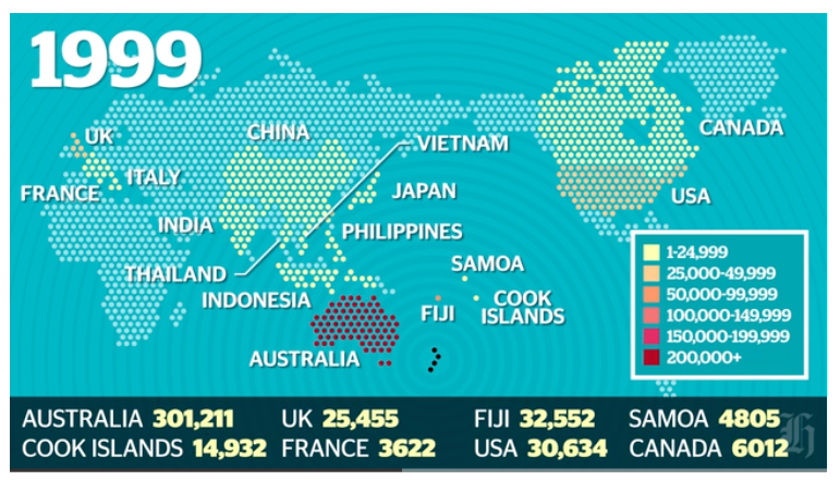
First, a lot of the world isn’t coloured. There are New Zealanders who have visited say, Germany or Turkey or Egypt, even though these countries never make it into the 1-24,999 colour category. It looks as if the video picks a set of 16 countries and follows just those forward in time: we’re not told how these were picked.
Second, there’s the usual map problem of big things looking big (exacerbated by the Mercator projection). In 1999, more people went to Fiji than the US; more to Samoa than France. A map isn’t good at making these differences visually obvious, though the animation helps. And, tangentially, if you’re going to use almost a third of the map real estate on the region north of 60°, you should notice that Alaska is part of the USA.
The other, more important, issue that’s common to the whole presentation (and which I understand is being updated at the moment) is what the country data actually mean. It seems that it really is holiday data, excluding both business and visiting friends/relatives (comparing the video to this from Figure.NZ), but it’s by “country of main destination”. If you go to more than one country, only one is counted. That’s why the interactive shows zero Kiwis travelling to the Vatican City, and it may help explain numbers like 300 for Belgium.
Official statistics usually measure something fairly precise, but it’s not always the thing that you want them to measure.