Posts filed under Polls (132)

July 2, 2014

What’s the actual margin of error?

The official maximum margin of error for an election poll with a simple random sample of 1000 people is 3.099%. Real life is more complicated.

In reality, not everyone is willing to talk to the nice researchers, so they either have to keep going until they get a representative-looking number of people in each group they are interested in, or take what they can get and reweight the data — if young people are under-represented, give each one more weight. Also, they can only get a simple random sample of telephones, so there are more complications in handling varying household sizes. And even once they have 1000 people, some of them will say “Dunno” or “The Conservatives? That’s the one with that nice Mr Key, isn’t it?”

After all this has shaken out it’s amazing the polls do as well as they do, and it would be unrealistic to hope that the pure mathematical elegance of the maximum margin of error held up exactly.  Survey statisticians use the term “design effect” to describe how inefficient a sampling method is compared to ideal simple random sampling. If you have a design effect of 2, your sample of 1000 people is as good as an ideal simple random sample of 500 people.

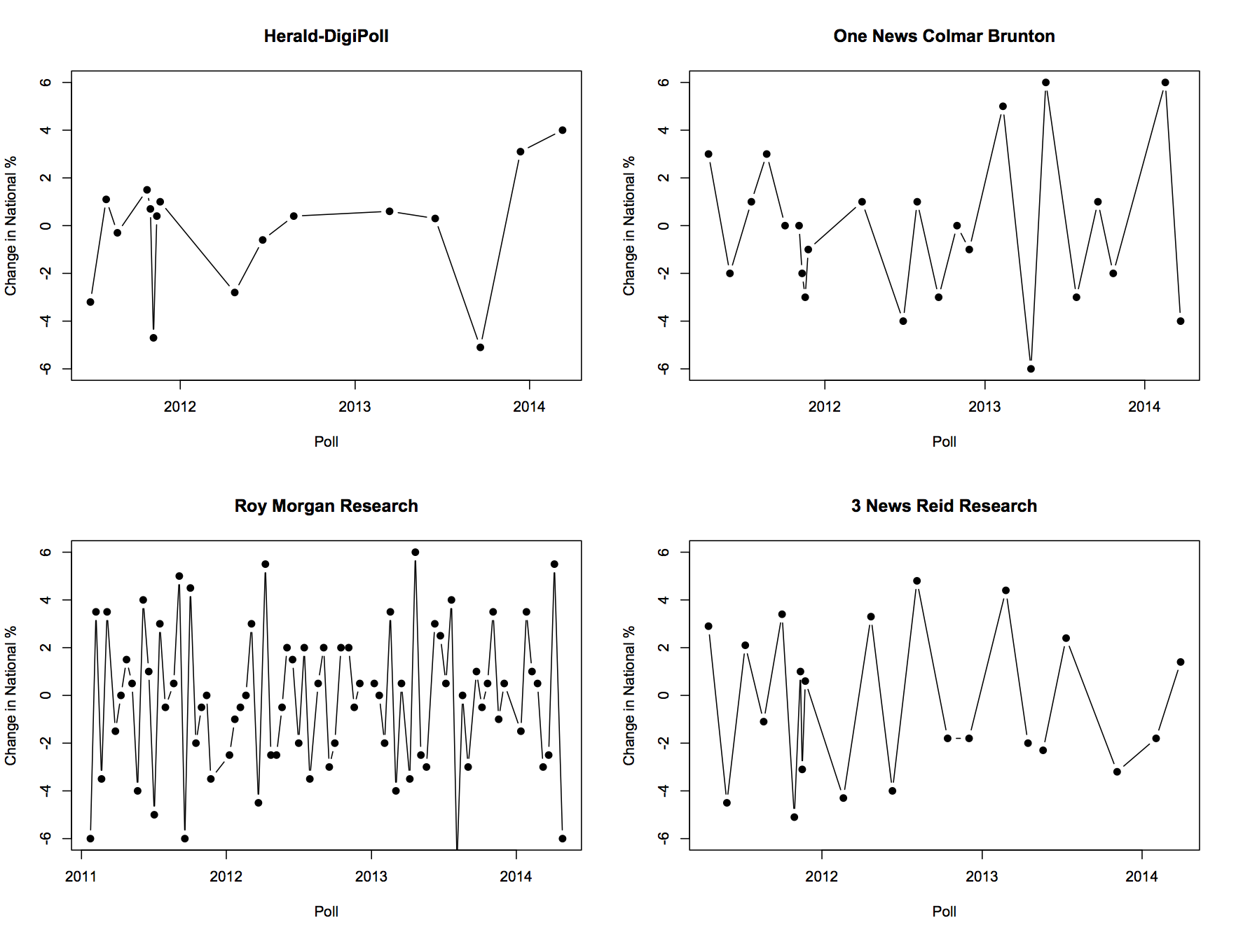
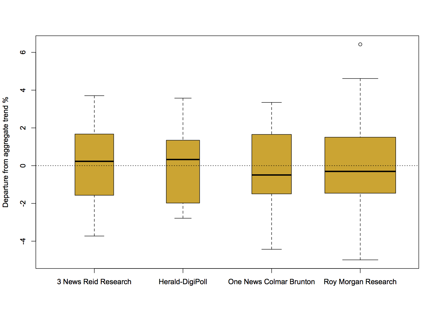
We’d like to know the design effect for individual election polls, but it’s hard. There isn’t any mathematical formula for design effects under quota sampling, and while there is a mathematical estimate for design effects after reweighting it isn’t actually all that accurate.  What we can do, thanks to Peter Green’s averaging code, is estimate the average design effect across multiple polls, by seeing how much the poll results really vary around the smooth trend. [Update: this is Wikipedia’s graph, but I used Peter’s code]

NZ_opinion_polls_2011-2014-majorparties

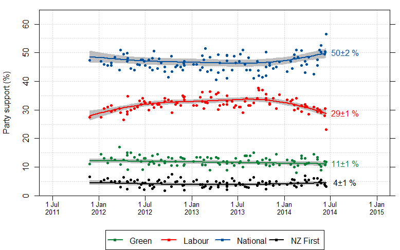
I did this for National because it’s easiest, and because their margin of error should be close to the maximum margin of error (since their vote is fairly close to 50%). The standard deviation of the residuals from the smooth trend curve is 2.1%, compared to 1.6% for a simple random sample of 1000 people. That would be a design effect of (2.1/1.6)2, or 1.8.  Based on the Fairfax/Ipsos numbers, about half of that could be due to dropping the undecided voters.

In principle, I could have overestimated the design effect this way because sharp changes in party preference would look like unusually large random errors. That’s not a big issue here: if you re-estimate using a standard deviation estimator that’s resistant to big errors (the median absolute deviation) you get a slightly larger design effect estimate.  There may be sharp changes, but there aren’t all that many of them, so they don’t have a big impact.

If the perfect mathematical maximum-margin-of-error is about 3.1%, the added real-world variability turns that into about 4.2%, which isn’t that bad. This doesn’t take bias into account — if something strange is happening with undecided voters, the impact could be a lot bigger than sampling error.


June 23, 2014

Undecided?

My attention was drawn on Twitter to this post at The Political Scientist arguing that the election poll reporting is misleading because they don’t report the results for the relatively popular “Undecided” party.  The post is making a good point, but there are two things I want to comment on. Actually, three things. The zeroth thing is that the post contains the numbers, but only as screenshots, not as anything useful.

The first point is that the post uses correlation coefficients to do everything, and these really aren’t fit for purpose. The value of correlation coefficients is that they summarise the (linear part of the) relationship between two variables in a way that doesn’t involve the units of measurement or the direction of effect (if any). Those are bugs, not features, in this analysis. The question is how the other party preferences have changed with changes in the ‘Undecided’ preference — how many extra respondents picked Labour, say, for each extra respondent who gave a preference. That sort of question is answered  (to a straight-line approximation) by regression coefficients, not correlation coefficients.

When I do a set of linear regressions, I estimate that changes in the Undecided vote over the past couple of years have split approximately  70:20:3.5:6.5 between Labour:National:Greens:NZFirst.  That confirms the general conclusion in the post: most of the change in Undecided seems to have come from  Labour. You can do the regressions the other way around and ask where (net) voters leaving Labour have gone, and find that they overwhelmingly seem to have gone to Undecided.

What can we conclude from this? The conclusion is pretty limited because of the small number of polls (9) and the fact that we don’t actually have data on switching for any individuals. You could fit the data just as well by saying that Labour voters have switched to National and National voters have switched to Undecided by the same amount — this produces the same counts, but has different political implications. Since the trends have basically been a straight line over this period it’s fairly easy to get alternative explanations — if there had been more polls and more up-and-down variation the alternative explanations would be more strained.

The other limitation in conclusions is illustrated by the conclusion of the post

There’s a very clear story in these two correlations: Put simply, as the decided vote goes up so does the reported percentage vote for the Labour Party.

Conversely, as the decided vote goes up, the reported percentage vote for the National party tends to go down.

The closer the election draws the more likely it is that people will make a decision.

But then there’s one more step – getting people to put that decision into action and actually vote.

We simply don’t have data on what happens when the decided vote goes up — it has been going down over this period — so that can’t be the story. Even if we did have data on the decided vote going up, and even if we stipulated that people are more likely to come to a decision near the election, we still wouldn’t have a clear story. If it’s true that people tend to come to a decision near the election, this means the reason for changes in the undecided vote will be different near an election than far from an election. If the reasons for the changes are different, we can’t have much faith that the relationships between the changes will stay the same.

The data provide weak evidence that Labour has lost support to ‘Undecided’ rather than to National over the past couple of years, which should be encouraging to them. In the current form, the data don’t really provide any evidence for extrapolation to the election.


[here’s the re-typed count of preferences data, rounded to the nearest integer]

June 17, 2014

Margins of error

From the Herald

The results for the Mana Party, Internet Party and Internet-Mana Party totalled 1.4 per cent in the survey – a modest start for the newly launched party which was the centre of attention in the lead-up to the polling period.

That’s probably 9 respondents. A 95% interval around the support for Internet–Mana goes from 0.6% to 2.4%, so we can’t really tell much about the expected number of seats.

Also notable

Although the deal was criticised by many commentators and rival political parties, 39 per cent of those polled said the Internet-Mana arrangement was a legitimate use of MMP while 43 per cent said it was an unprincipled rort.

I wonder what other options respondents were given besides “unprincipled rort” and “legitimate use of MMP”.

May 29, 2014

Margins of error and our new party

Attention conservation notice:  if you’re not from NZ or Germany you probably don’t understand the electoral system, and if you’re not from NZ you don’t care.

Assessing the chances of the new Internet Mana party from polls will be even harder than usual. The Internet half of the chimera will get a List seat if the party gets exactly one electorate and enough votes for two seats (about 1.7 1.2%), or if they get two electorates (eg Hone Harawira and Annette Sykes)  and enough votes for three seats (about 2.5 2%), or if they get no electorates and at least 5% of the vote. [Update: a correspondent points out that it’s more complicated. The orange man provides a nice calculator. Numbers in the rest of the post are updated]

With a poll of 1000 people, 1.2% is 12 people and 2% is 20 people.  Even if there were no other complications, the sampling uncertainty is pretty large: if the true support proportion is 0.02, a 95% prediction interval for the poll result goes from 0.9% to 2.9%, and if the true support proportion is 0.012, the interval goes from 0.6% to 1.8%.

Any single poll is almost entirely useless — for example, if the party polls 1.5% it could have enough votes for one, two, or three total seats, and national polling data won’t tell us anything useful about the relevant electorates. Aggregating polls will help reduce the sampling uncertainty, but there’s not much to aggregate for the Internet Party and it’s not clear how the amalgamation will affect Mana’s vote, so we are limited to polls starting now.

Worse, we don’t have any data on how the polls are biased (compared to the election) for this party. The Internet half will presumably have larger support among people without landline phones,  even after age, ethnicity, and location are taken into account. Historically, the cell-phone problem doesn’t seem to have caused a lot of bias in NZ opinion polls (in contrast to the US), but this may well be an extreme case. The party may also have more support from younger and less well off people, who are less likely to vote on average, making it harder to translate poll responses into election predictions.

May 26, 2014

What’s wrong with this question?

ruitaniwha

I usually don’t bother with bogus polls on news stories, but this one (via @danyl) is especially egregious. It’s not just the way the question is framed, or the glaring lack of a “How the fsck would I know?” option. There are some questions that are just not a matter of opinion. After a bit of informed public debate, and collected in a meaningful way, the national opinion on “This is the impact on farming: is it worth it?” would be relevant. But not this.

While we’re on this story, the map illustrating it is also notable. The map shows ‘Predicted median DIN’. Nowhere in the story is there any mention of DIN, let alone a definition. I suppose they figured it was a well-known abbreviation, and it’s true that if you ask Google, it immediately tells you. DIN is short for Deutsches Institut für Normung.

din


PS: yes, I know, Dissolved Inorganic Nitrogen

May 23, 2014

Who did they survey again?

To seasoned readers of Stats Chat, the contradiction in the first two sentences of this article will be glaringly obvious:

“A survey released yesterday has found at least four in five Kiwis refuse to leave home without their smartphone in hand.

The survey, carried out by 2degrees on Facebook, asked 357 smartphone users about their habits.”

Meanwhile, there’s a better article about cellphones over here:

“As many as three in five New Zealanders own a smartphone, an online survey by British-based market researcher TNS shows.

Based on the 500 responses it received to its survey, TNS estimated smartphone ownership had jumped from 33 per cent to 60 per cent over the past year.

The fact that the survey was conducted online could mean it overstated the prevalence of devices such as smartphones.

Other surveys have put smartphone ownership at close to, or in some cases slightly above, 50 per cent.”

Is Roy Morgan weird?

There seems to be a view that the Roy Morgan political opinion poll is more variable than the others, even to the extent that newspapers are willing to say so, eg, Stuff on May 7

The National Party has taken a big hit in the latest Roy Morgan poll, shedding 6 points to 42.5 per cent in the volatile survey.

I was asked about this on Twitter this morning, so I went to get Peter Green’s data and aggregation model to see what it showed. In fact, there’s not much difference between the major polling companies in the variability of their estimates. Here, for example, are poll-to-poll changes in the support for National in successive polls for four companies

fourpollers


And here are their departures from the aggregated smooth trend

boxpollers


There really is not much to see here. So why do people feel that Roy Morgan comes out with strange results more often? Probably because Roy Morgan comes out with results more often.

For example, the proportion of poll-to-poll changes over 3 percentage points is 0.22 for One News/Colmar Brunton, 0.18 for Roy Morgan, and 0.23 for 3 News/Reid Research, all about the same, but the number of changes over 3 percentage points in this time frame is 5 for One News/Colmar Brunton, 14 for Roy Morgan, and 5 for 3 News/Reid Research.

There are more strange results from Roy Morgan than for the others, but it’s mostly for the same reason that there are more burglaries in Auckland than in the other New Zealand cities.

May 11, 2014

Change you can’t believe in

From One News and  a Colmar Brunton poll about Judith Collins and the Oravida affair

Which of these statements best describes how the issues will influence your vote in the upcoming election?

23% These issues will be a factor in your decision about who to vote for 
75% These issues will not have much influence on your vote 
1% Don’t know/won’t vote

Graeme Edgeler pointed out on Twitter that it matters what starting position people are being influenced from.  That information wasn’t in the Colmar Brunton summary, because reporting it would also involve reporting the split of party affiliations in the sample, and the poll wasn’t designed for that split to be a reliable estimate.

I’m not going to report the split, either, but you can get it from the detailed poll report.  I do think it’s reasonable to note that among people who identified as Labour/Green voters, about 1/3 said it would influence their vote, and among those who identified as National voters, less than 10% said it would influence their vote. The difference is more than twice the margin of error estimated from those proportions and numbers. Looked at the other way, three-quarters of respondents said the issue would not make much difference to their vote, and three-quarters of the rest were Labour or Green voters.

It’s not impossible for Labour or Green supporters to have their votes influenced by the Oravida affair. You could imagine someone with a long-term philosophical or emotional attachment to Labour, who had been thinking of voting National at this election, but who decided against it because of the scandal. But if there are enough people like that to show up in a poll, the left-wing parties are in real trouble. It’s more likely that most respondents said whatever they thought would make their side look good.

April 9, 2014

I couldn’t possibly comment

Two excerpts from Gavin White’s  SAYit blog:

The flag

The specific question was “do you think the New Zealand flag should be changed?”.  The answers were:

  • Yes 19%
  • No 77%
  • Unsure 4%

And on conspiracy theories

…the moon landing:

  • 20% of us think that it’s likely that the United States of America government staged or faked the Apollo moon landing (5% very likely, 15% somewhat likely)
  • 74% think it’s unlikely
  • 6% are unsure or haven’t heard of this conspiracy before..
April 8, 2014

Another phony poll?

The flipside of failing to question numbers is assuming that anyone who does question them is correct (from US journalism/editing blog headsup)

Hence, even though in this case it’s an out-and-out lie, “another phony poll” doesn’t just resonate around the echo chamber; it puts a bug in the grownup world’s ear too. It looks like what journalism is supposed to be doing. Polls are suspect anyway (being based on data, which is inferior to gut feelings and news sense), and catching a fake one is a triumph of  the common man over the spinmeisters