Posts filed under Polls (132)

December 20, 2014

Not enough pie

From James Lee Gilbert on Twitter, a pie chart from WXII News (Winston-Salem, North Carolina)

pie

This is from a (respectable, if pointless) poll conducted in North Carolina. As you can clearly see, half of the state favours the local team. Or, as you can clearly see from the numbers, one-third of the state does.

If you’re going to use a pie chart (which you usually shouldn’t), remember that the ‘slices of pie’ metaphor is the whole point of the design. If the slices only add up to 70%, you need to either add the “Other”/”Don’t Know”/”Refused” category, or choose a different graph.

If your graph makes it easy to confuse 1/3 and 1/2, it’s not doing its job.

December 8, 2014

Political opinion: winning the right battles

From Lord Ashcroft (UK, Conservative) via Alex Harroway (UK, decidedly not Conservative), an examination of trends in UK opinion on a bunch of issues, graphed by whether they favour Labour or the Conservatives, and how important they are to respondents. It’s an important combination of information, and a good way to display it (or it would be if it weren’t a low-quality JPEG)

Ashcroft-Chart


Ashcroft says

The higher up the issue, the more important it is; the further to the right, the bigger the Conservative lead on that issue. The Tories, then, need as many of these things as possible to be in the top right quadrant.

Two things are immediately apparent. One is that the golden quadrant is pretty sparsely populated. There is currently only one measure – being a party who will do what they say (in yellow, near the centre) – on which the Conservatives are ahead of Labour and which is of above average importance in people’s choice of party.

and Alex expands

When you campaign, you’re trying to do two things: convince, and mobilise. You need to win the argument, but you also need to make people think it was worth having the argument. The Tories are paying for the success of pouring abuse on Miliband with the people turned away by the undignified bully yelling. This goes, quite clearly, for the personalisation strategy in general.

November 5, 2014

US election graphics

Facebook has a live map of who has mentioned on Facebook that they had voted (via Jason Sundram)

facebook-voted

USA Today showed a video including a Twitter live map

twitter-elections

These both have the usual problem with maps of how many people do something: there are more people in some places than others. As usual, XKCD puts it well:

xkcd-elections

Useful statistics is about comparisons, and this comparison basically shows that more people live in New York than in New Underwood.

As usual, the New York Times has informative graphics, including a live set of projections for the interesting seats.


September 19, 2014

Not how polling works

The Herald interactive for election results looks really impressive. The headline infographic for the latest poll, not so much. The graph is designed to display changes between two polls, for which the margin of error is 1.4 times higher than in a single poll: the margin of error for National goes beyond the edge of the graph.

election-diff


The lead for the story is worse

The Kim Dotcom-inspired event in Auckland’s Town Hall that was supposed to end John Key’s career gave the National Party an immediate bounce in support this week, according to polling for the last Herald DigiPoll survey.

Since both the Dotcom and Greenwald/Snowden Moments of Truth happened in the middle of polling, they’ve split the results into before/after Tuesday.  That is, rather than showing an average of polls, or even a single poll, or even a change from a single poll, they are headlining the change between the first and second halves of a single poll!

The observed “bounce” was 1.3%. The quoted margin of error at the bottom of the story is 3.5%, from a poll of 775 people. The actual margin of error for a change between the first and second halves of the poll is about 7%.

Only in the Internet Party’s wildest dreams could this split-half comparison have told us anything reliable. It would need the statistical equivalent of the CSI magic video-zoom enhance button to work.


September 18, 2014

Interactive election results map

The Herald has an interactive election-results map, which will show results for each polling place as they come in, together with demographic information about each electorate.  At the moment it’s showing the 2011 election data, and the displays are still being refined — but the Herald has started promoting it, so I figure it’s safe for me to link as well.

Mashblock is also developing an election site. At the moment they have enrolment data by age. Half the people under 35 in Auckland Central seem to be unenrolled,which is a bit scary. Presumably some of them are students enrolled at home, and some haven’t been in NZ long enough to enrol, but still.

Some non-citizens probably don’t know that they are eligible — I almost missed out last time. So, if you know someone who is a permanent resident and has lived in New Zealand for a year, you might just ask if they know about the eligibility rules. Tomorrow is the last day.

September 8, 2014

Poll meta-analyses in NZ

As we point out from time to time, single polls aren’t very accurate and you need sensible averaging.

There are at least three sets of averages for NZ:

1. Peter Green’s analyses, which get published at DimPost (larger parties, smaller parties). The full code is here.

2. Pundit’s poll of polls. They have a reasonably detailed description of their approach and it follows what Nate Silver did for the US elections.

3. Curiablog’s time and size weighted average. Methodology described here

The implementors of these cover a reasonable spectrum of NZ political affiliation. The results agree fairly closely except for one issue: Peter Green adds a correction to make the predictions go through the 2011 election results, which no-one else does.

According to Gavin White, there is a historical tendency for National to do a bit worse and NZ First to do a bit better in the election than in the polls, so you’d want to correct for this, but you could also argue that the effect was stronger than usual at the last election so this might overcorrect.

In addition to any actual changes in preferences over the next couple of weeks, there are three polling issues we don’t have a good handle on:

  • Internet Mana is new, and you could make a plausible case that their supporters might be harder for the  pollers to get a good grip on (note: age and ethnicity aren’t enough here, the pollers do take account of those).
  • There seems to have been a big increase in ‘undecided‘ responders to the polls, apparently from former Labour voters. To the extent that this is new, no-one really knows what they will do on the day.
  • Polling for electorates is harder, especially when strategic voting is important, as in Epsom.


[Update: thanks to Bevan Weir in comments, there’s also a Radio NZ average. It’s a simple unweighted average with no smoothing, which isn’t ideal for estimation but has the virtue of simplicity]

August 28, 2014

Bogus polls

This is a good illustration of why they’re meaningless…

Bogus polls

August 22, 2014

Margin of error for minor parties

The 3% ‘margin of error’ usually quoted for poll is actually the ‘maximum margin of error’, and is an overestimate for minor parties. On the other hand, it also assumes simple random sampling and so tends to be an underestimate for major parties.

In case anyone is interested, I have done the calculations for a range of percentages (code here), both under simple random sampling and under one assumption about real sampling.


Lower and upper ‘margin of error’ limits for a sample of size 1000 and the observed percentage, under the usual assumptions of independent sampling

Percentage lower upper
1 0.5 1.8
2 1.2 3.1
3 2.0 4.3
4 2.9 5.4
5 3.7 6.5
6 4.6 7.7
7 5.5 8.8
8 6.4 9.9
9 7.3 10.9
10 8.2 12.0
15 12.8 17.4
20 17.6 22.6
30 27.2 32.9
50 46.9 53.1


Lower and upper ‘margin of error’ limits for a sample of size 1000 and the observed percentage, assuming that complications in sampling inflate the variance by a factor of 2, which empirically is about right for National.

Percentage lower upper
1 0.3 2.3
2 1.0 3.6
3 1.7 4.9
4 2.5 6.1
5 3.3 7.3
6 4.1 8.5
7 4.9 9.6
8 5.8 10.7
9 6.6 11.9
10 7.5 13.0
15 12.0 18.4
20 16.6 23.8
30 26.0 34.2
50 45.5 54.5
August 7, 2014

Non-bogus non-random polling

As you know, one of the public services StatsChat provides is whingeing about bogus polls in the media, at least when they are used to anchor stories rather than just being decorative widgets on the webpage. This attitude doesn’t (or doesn’t necessarily) apply to polls that make no effort to collect a non-random sample but do make serious efforts to reduce bias by modelling the data. Personally, I think it would be better to apply these modelling techniques on top of standard sampling approaches, but that might not be feasible. You can’t do everything.

I’ve been prompted to write this by seeing Andrew Gelman and David Rothschild’s reasonable and measured response (and also Andrew’s later reasonable and less measured response) to a statement from the American Association for Public Opinion Research.  The AAPOR said

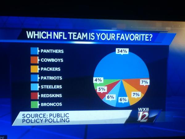
This week, the New York Times and CBS News published a story using, in part, information from a non-probability, opt-in survey sparking concern among many in the polling community. In general, these methods have little grounding in theory and the results can vary widely based on the particular method used. While little information about the methodology accompanied the story, a high level overview of the methodology was posted subsequently on the polling vendor’s website. Unfortunately, due perhaps in part to the novelty of the approach used, many of the details required to honestly assess the methodology remain undisclosed.

As the responses make clear, the accusation about transparency of methods is unfounded. The accusation about theoretical grounding is the pot calling the kettle black.  Standard survey sampling theory is one of my areas of research. I’m currently writing the second edition of a textbook on it. I know about its grounding in theory.

The classical theory applies to most of my applied sampling work, which tends to involve sampling specimen tubes from freezers. The theoretical grounding does not apply when there is massive non-response, as in all political polling. It is an empirical observation based on election results that carefully-done quota samples and reweighted probability samples of telephones give pretty good estimates of public opinion. There is no mathematical guarantee.

Since classical approaches to opinion polling work despite massive non-response, it’s reasonable to expect that modelling-based approaches to non-probability data will also work, and reasonable to hope that they might even work better (given sufficient data and careful modelling). Whether they do work better is an empirical question, but these model-based approaches aren’t a flashy new fad. Rod Little, who pioneered the methods AAPOR is objecting to, did so nearly twenty years before his stint as Chief Scientist at the US Census Bureau, an institution not known for its obsession with the latest fashions.

In some settings modelling may not be feasible because of a lack of population data. In a few settings non-response is not a problem. Neither of those applies in US political polling. It’s disturbing when the president of one of the largest opinion-polling organisations argues that model-based approaches should not be referenced in the media, and that’s even before considering some of the disparaging language being used.

“Don’t try this at home” might have been a reasonable warning to pollers without access to someone like Andrew Gelman. “Don’t try this in the New York Times” wasn’t.

July 22, 2014

Lack of correlation does not imply causation

From the Herald

Labour’s support among men has fallen to just 23.9 per cent in the latest Herald-DigiPoll survey and leader David Cunliffe concedes it may have something to do with his “sorry for being a man” speech to a domestic violence symposium.

Presumably Mr Cunliffe did indeed concede it might have something to do with his statement; and there’s no way to actually rule that out as a contributing factor. However

Broken down into gender support, women’s support for Labour fell from 33.4 per cent last month to 29.1 per cent; and men’s support fell from 27.6 per cent last month to 23.9 per cent.

That is, women’s support for Labour fell by 4.2 percentage points (give or take about 4.2) and men’s by 3.7 percentage points (give or take about 4.2). This can’t really be considered evidence for a gender-specific Labour backlash. Correlations need not be causal, but here there isn’t even a correlation.