Posts filed under Research (207)

December 15, 2017

Di Cook: “I had advantages early on, and I feel like I need to pay that back”

Australian Di Cook @visnut was one of several leading women in data science who attended this week’s joint conference of the New Zealand Statistical Association, the International Association oDi Cook
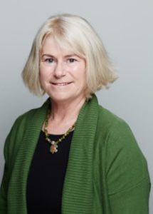
f Statistical Computing (Asian Regional Section) and the Operations Research Society of New Zealand at the University of Auckland, so we couldn’t miss the opportunity to talk with her. A brief bio: Di is a world leader in data visu­al­isa­tion and well-known for her work on inter­ac­tive graph­ics. She is Professor of Business Analytics in the Department of Econometrics and Business Statistics at Monash University. She’s a Fellow of the American Statistical Association, elected member of the R Foundation and the Editor of the Journal of Computational and Graphical Statistics. Her research lies in data science, data visualisation, exploratory data analysis, data mining, high-dimensional methods and statistical computing.

Statschat: When did you first encounter statistics? Di: It was in my undergraduate degree. I studied mathematics with a plan to do math teaching. Statistics was one of the areas of mathematics that I could major in other than pure, or applied, mathematics. There was an extremely good female professor at the University of New England, Eve Bofinger, and I was drawn to some of the methods she was teaching, and that led me into statistics.

What was your career path after that?  I taught math at high school for about three months, then I had an offer from the Australian National University to go there as a research assistant, and that seemed a better fit. As a research assistant, I got to learn a lot more things, particularly computing. Computing, I think, is a critical aspect of data science today.

I spent a few years doing that and then realised I’d really like to make art, because some of the research-assistant work I was doing was computer graphics for data online. It fed into my art instincts from teenage years, so I spent some time as an artist before finding a graduate programme in statistics in the US that focused on data visualisation.

What sort of art do you do? I was painting – I haven’t done any for a long, long time, since I finished my PhD; it’s been too busy.

So your creative pursuits have fed into your career. Yeah – seeing that I could do data visualisation as a part of the statistics allowed me to realise that I could do a higher degree in stats; that merged my interests very well.

Where did you do your PhD? At Rutgers University in New Jersey.

You spent 22 years at Iowa State University in the US, and moved to Monash in Australia in 2015. What are your major projects there? I have a lot of projects. One of them is with Tennis Australia; we’ve been looking at tennis serves. So we have Hawk-Eye trajectory data and we visualise the tennis serves and look at how the players are different or similar.

That’s very cool – how’s that for applied statistics. Yeah, it’s fantastic, isn’t it. We’re also looking at face recognition in tennis video, to be able to detect the face through broadcast video, so that we can monitor emotions throughout a match and see how that affects performance.

We’re also looking at pedestrian sensor data, that comes from a city of Melbourne (almost live) feed. One of my PhD students, Earo, has a new type of plot called a calendar plot; you make your data plots into a calendar format so that you can study things relative to holidays, and put it really on a human pattern basis.

Describe a typical day at work at Monash. We have a lot of meetings with students, so I would meet up with two or three students – PhD students or postdocs or research assistants – on projects that we’re working with, and meet up with other faculty. On some days I’m teaching data science classes to around 200 students. We often just go for a coffee with colleagues. We also play ping-pong on the conference table! I’ve got a good group of colleagues who play tennis, so we play tennis together.

It sounds very collegial. You’re a prominent woman in data science, and the field seems to appeal to women as a career path. Do have any thoughts on that? I haven’t really looked at those numbers … but honestly, I think there’s too big of an emphasis on gender differences, and they’re not real when you look at the metrics. It’s just a perception. But one of the things I notice with the women that I work with is that they are interested in solving problems, and having an outcome of their work that makes life better for others. And that’s one thing that data science offers that pure statistics research is a bit removed from.

Do you have a family? I have one son. I moved to Monash after he graduated high school. He went off to college in the US, while I moved halfway across the globe, which he was quite happy about. He visits during the holidays, and last American summer found an internship at Monash University.

When he was small, how did you navigate work and life? It’s really difficult. I can’t imagine how single women do that – you need to have some sort of support mechanism. Day-care is amazing – and however much you spend on day-care, it’s worth it. And also partly because I think young kids early on really get a huge amount of benefit from being in the social mix of other kids the same age. He was in day-care from three months, part-time, and even at five months, if we were away for a week, when he’d get back, the other babies were over the moon – they recognised each other. I hadn’t realised how early on that socialisation happens.

So you weren’t concerned about day-care at all. Some women get tied up in knots about putting their kids in day-care. I know – there’s this thing about guilt. It is actually the best environment – they [pre-school educators] can do a much better job than me. If my time pressure is relieved by not having to have every moment dealing with all the stuff you have to deal with young kids … he’s come out as being a very sociable child and that he learnt from early on. Guaranteed when you’ve got the most important meeting, and your husband has a most important meeting at exactly the same time, that’ll be the time your kid gets sick. So you have to have a backup.

So what advice do you give other academic mums? Don’t stress – there are ways around. And the meeting you think is most important doesn’t have to be the most important. You just juggle everything you have as well as you can, and there are ways around any hurdle or hiccup. Just keep out there. It’s really important for other younger women to see women in senior roles.

Are universities doing the necessary to help women make the most of their talents in data science? I think it’s still a struggle. I think there’s been bureaucratic pushes for gender equality, which is really how I actually got an academic position in the first place in the US.

How so? Equal opportunity. Many statistics departments had no women, and it was a cultural shift in the early 1990s that many university administrations were forcing departments to hire women … or otherwise they couldn’t hire … if they [universities] were doing it well, they were not putting women in that situation of thinking, “Oh I was only hired because I was a woman”. They were doing it in the sense of making sure that women realised that they were talented, and wanted for their  talents, not just because of the administration push. But that wasn’t universal.

I thought things have been solved, but it’s not. Time and time again women are evaluated differently at promotion, and in classroom evaluations, they are not on average [rated to be] as good as the men, and that’s been shown again and again and again. So the thing is, don’t get put off by that; you will sometimes need to fight for your promotions and have people willing to fight for you.

Systemically, things are still not weighted fairly between men and women. It’s not. I’ve just finished studying some of the research-grant rates in Australia and the number given to women faculty are pitiful, from both the Australian Research Council and the National Health and Medical Research Council, which is the health sciences. That impacts whether women can get through to those higher ranks. That’s my next fight.

Would you see yourself as a crusader? How do you define yourself in exposing these inequalities? We’ve seen a lot of things [around sex, privilege and power discussed] in public in these last few months, with the sex scandals in Hollywood.  I’ve seen that all through my career in academia. I think we, hopefully, are on a cusp where the playing field for recognising talent among women becomes more level … I had advantages early on, and I feel like I need to pay that back.

I wouldn’t say I’m a crusader; I’m saying I see where we’ve come from, in terms of generations of women in my family, and where we are now, and we’ve come a long, long way. I’ve had so many more opportunities than my mum and my grandmother … I feel like I’ve got a responsibility to those generations to keep it moving in the right direction.

What advice would you give young women looking at a career in data science? What skills and attributes do they need to develop? Get onto the publicly available software – free software like R and Python – and get to know them. These are hugely powerful, and they give you power. There’s a number of courses you can do for free to help learn how to work with data.

Any particular courses that you would recommend? There’s Data Camp and Corsera and Software Carpentry, among others. Work with data. Play. Extract somebody’s tweets and analyse the text – there are really good resources for that. Pull data from the government web pages – they have lots of information. The New Zealand Herald has lots of data available. Just get comfortable finding data, making plots of it, and seeing whether it matches up what the media is reporting about a problem. This is the sort of power you can get over your life if you can make decisions yourself, rather than being fed decisions.

Read more about Di Cook:

Her academic page

Wikipedia

Another Q & A

November 23, 2017

More complicated than that

Science Daily

Computerized brain-training is now the first intervention of any kind to reduce the risk of dementia among older adults.

Daily Telegraph

Pensioners can reduce their risk of dementia by nearly a third by playing a computer brain training game similar to a driving hazard perception test, a new study suggests.

Ars Technica

Speed of processing training turned out to be the big winner. After ten years, participants in this group—and only this group—had reduced rates of dementia compared to the controls

The research paper is here, and the abstract does indeed say “Speed training resulted in reduced risk of dementia compared to control, but memory and reasoning training did not”

They’re overselling it a bit. First, these are intervals showing the ratios of number of cases with and without the three types of treatment, including the uncertainty

dementia

Summarising this as “speed training works but the other two don’t” is misleading.  There’s pretty marginal evidence that speed training is beneficial and even less evidence that it’s better than the other two.

On top of that, the results are for less than half the originally-enrolled participants, the ‘dementia’ they’re measuring isn’t a standard clinical definition, and this is a study whose 10-year follow-up ended in 2010 and that had a lot of ‘primary outcomes’ it was looking for — which didn’t include the one in this paper.

The study originally expected to see positive results after two years. It didn’t. Again, after five years, the study reported “Cognitive training did not affect rates of incident dementia after 5 years of follow-up.”  Ten-year results reported in 2014, showed relatively modest differences in people’s ability to take care of themselves, as Hilda Bastian commented.

So. This specific type of brain training might actually help. Or one of the other sorts of brain training they tried might help. Or, quite possibly, none of them might help.  On the other hand, these are relatively unlikely to be harmful, and maybe someone will produce an inexpensive app or something.

October 23, 2017

Questions to ask

There’s a story in a lot of the British media (via Robin Evans on Twitter) about a plan to raise speed limits near highway roadworks. The speed limit is currently 50mph and the proposal is to raise it to 55mph or 60mph.

Obviously this is an significant issue, with potential safety and travel time consequences.  And Highways England did some research. This is the key part of the description in the stories (presumably from a press release that isn’t yet on the Highways England website)

More than 36 participants took part in each trial and were provided with dashcams and watches incorporating heart-rate monitors and GPS trackers to measure their reactions.

The tests took place at 60mph on the M5 between junction 4a (Bromsgrove) to 6 (Worcester) and at 55mph on the M3 in Surrey between junction 3 and 4a.

According to Highways England 60% of participants recorded a decrease in average heart rate in the 60mph trial zone and 56% presented a decrease on the 55mph trial.

That’s a bit light on detail — how many more than 36; does 60% decrease mean 40% increase; are they saying that the 4 percentage point difference between 55 and 60mph is enough to matter or not enough to matter?

More importantly, though, why is a heart rate decrease in drivers even the question?  I’m not saying it can’t be. Maybe there’s some good reason why it’s reliable information about safety, but if there is the journalists didn’t think to ask about it.

A few stories, such as the one in the Mirror, had a little bit more

“Increasing the speed limit to 60mph where appropriate also enables motorists who feel threatened by the close proximity of HGVs in roadworks to free themselves.”

Even so, is this a finding of the research (why motorists felt safer, or even that they felt safer)? Is it a conclusion from the heart rate monitors? Is it from asking the drivers? Is it just a hypothetical explanation pulled out of the air?

If you’re going to make a scientific-sounding measurement the foundation of this story, you need to explain why it answers some real question. And linking to more information would, as usual, be nice.

April 26, 2017

Simplifying to make a picture

1. Ancestry.com has maps of the ancestry structure of North America, based on people who sent DNA samples in for their genotype service (click to embiggen)ncomms14238-f3

To make these maps, they looked for pairs of people whose DNA showed they were distant relatives, then simplified the resulting network into relatively stable clusters. They then drew the clusters on a map and coloured them according to what part of the world those people’s distant ancestors probably came from.  In theory, this should give something like a map of immigration into the US (and to a lesser extent, of remaining Native populations).  The map is a massive oversimplification, but that’s more or less the point: it simplifies the data to highlight particular patterns (and, necessarily, to hide others).  There’s a research paper, too.


2. In a satire on predictive policing, The New Inquiry has an app showing high-risk neighbourhoods for financial crime. There’s also a story at Buzzfeed.

sub-buzz-24605-1493145131-7

The app uses data from the US Financial Regulatory Authority (FINRA), and models the risk of financial crime using the usual sort of neighbourhood characteristics (eg number of liquor licenses, number of investment advisers).


3. The Sydney Morning Herald had a social/political quiz “What Kind of Aussie Are You?”.

1486745652102

They also have a discussion of how they designed the 7 groups.  Again, the groups aren’t entirely real, but are a set of stories told about complicated, multi-dimensional data.


The challenge in any display of this type is to remove enough information that the stories are visible, but not so much that they aren’t true– and not everyone will agree on whether you’ve succeeded.

November 26, 2016

Where good news and bad news show up

In the middle of last year, the Herald had a story in the Health & Wellbeing section about solanezumab, a drug candidate for Alzheimer’s disease. The lead was

The first drug that slows down Alzheimer’s disease could be available within three years after trials showed it prevented mental decline by a third.

Even at the time, that was an unrealistically hopeful summary. The actual news was that solanezumab had just failed in a clinical trial, and its manufacturers, Eli Lilly, were going to try again, in milder disease cases, rather than giving up.

That didn’t work, either.  The story is in the Herald, but now in the Business section. The (UK) Telegraph, where the Herald’s good-news story came from, hasn’t yet mentioned the bad news.

If you read the health sections of the media you’d get the impression that cures for lots of diseases are just around the corner. You shouldn’t have to read the business news to find out that’s not true.

November 4, 2016

Unpublished clinical trials

We’ve known since at least the 1980s that there’s a problem with clinical trial results not being published. Tracking the non-publication rate is time-consuming, though.  There’s a new website out that tries to automate the process, and a paper that claims it’s fairly accurate, at least for the subset of trials registered at ClinicalTrials.gov.  It picks up most medical journals and also picks up results published directly at ClinicalTrials.gov — an alternative pathway for boring results such as dose equivalence studies for generics.

Here’s the overall summary for all trial organisers with more than 30 registered trials:

all

The overall results are pretty much what people have been claiming. The details might surprise you if you haven’t looked into the issue carefully. There’s a fairly pronounced difference between drug companies and academic institutions — the drug companies are better at publishing their trials.

For example, compare Merck to the Mayo Clinic
merck mayo

It’s not uniform, but the trend is pretty clear.


October 31, 2016

Give a dog a bone?

From the Herald (via Mark Hanna)

Warnings about feeding bones to pets are overblown – and outweighed by the beneficial effect on pets’ teeth, according to pet food experts Jimbo’s.

and

To back up their belief in the benefits of bones, Jimbo’s organised a three-month trial in 2015, studying the gums and teeth of eight dogs of various sizes.

Now, I’m not a vet. I don’t know what the existing evidence is on the benefits or harms of bones and raw food in pets’ diets. The story indicates that it’s controversial. So does Wikipedia, but I can’t tell whether this is ‘controversial’ as in the Phantom Time Hypothesis or ‘controversial’ as in risks of WiFi or ‘controversial’ as in the optimal balance of fats in the human diet. Since I don’t have a pet, this doesn’t worry me. On the other hand, I do care what the newspapers regard as reliable evidence, and Jimbo’s ‘Bone A Day’ Dental Trial is a good case to look at.

There are two questions at issue in the story: is feeding bones to dogs safe, and does it prevent gum disease and tooth damage? The small size of the trial limits what it can say about both questions, but especially about safety.  Imagine that a diet including bones resulted in serious injuries for one dog in twenty, once a year on average. That’s vastly more dangerous than anyone is actually claiming, but 90% of studies this small would still miss the risk entirely.  A study of eight dogs for three months will provide almost no information about safety.

For the second question, the small study size was aggravated by gum disease not being common enough.  Of the eight dogs they recruited, two scored ‘Grade 2’ on the dental grading, meaning “some gum inflammation, no gum recession“, and none scored worse than that.   Of the two dogs with ‘some gum inflammation’, one improved.  For the other six dogs, the study was effectively reduced to looking at tartar — and while that’s presumably related to gum and tooth disease, and can lead to it, it’s not the same thing.  You might well be willing to take some risk to prevent serious gum disease; you’d be less willing to take any risk to prevent tartar.  Of the four dogs with ‘Grade 1: mild tartar’, two improved.  A total of three dogs improving out of eight isn’t much to go on (unless you know that improvement is naturally very unusual, which they didn’t claim).

One important study-quality issue isn’t clear: the study description says the dental grading was based on photographs, which is good. What they don’t say is when the photograph evaluation was done.  If all the ‘before’ photos were graded before the study and all the ‘after’ photos were graded afterwards, there’s a lot of room for bias to creep in to the evaluation. For that reason, medical studies are often careful to mix up ‘before’ and ‘after’ or ‘treated’ and ‘control’ images and measure them all at once.  It’s possible that Jimbo’s did this, and that person doing the grading didn’t know which was ‘before’ and which was ‘after’ for a given dog. If before-after wasn’t masked this way, we can’t be very confident even that three dogs improved and none got worse.

And finally, we have to worry about publication bias. Maybe I’m just cynical, but it’s hard to believe this study would have made the Herald if the results had been unfavourable.

All in all, after reading this story you should still believe whatever you believed previously about dogfood. And you should be a bit disappointed in the Herald.

June 23, 2016

Or the other way around

It’s a useful habit, when you see a causal claim based on observational data, to turn the direction around: the story says A causes B, but could B cause A instead? People get annoyed when you do this, because they think it’s silly. Sometimes, though, that is what is happening.

As a pedestrian and public transport user, I’m in favour of walkable neighbourhoods, so I like seeing research that says they are good for health. Today, Stuff has a story that casts a bit of doubt on those analyses.

The researchers used Utah driver’s-licence data, which again included height and weight, to divide all the neighbourhoods in Salt Lake County into four groups by average body mass index. They used Utah birth certificates, which report mother’s height and weight, and looked at 40,000 women who had at least two children while living in Salt Lake County during the 20-year study period.  Then they looked at women who moved from one neighbourhood to another between the two births. Women with higher BMI were more likely to  move to a higher-BMI neighbourhood.

If this is true in other cities and for people other than mothers with new babies, it’s going to exaggerate the health benefits of walkable neighbourhoods: there will be a feedback loop where these neighbourhoods provide more exercise opportunity, leading to lower BMI, leading to other people with lower BMI moving there.   It’s like with schools: suppose a school starts getting consistently good results because of good teaching. Wealthy families who value education will send their kids there, and the school will get even better results, but only partly because of good teaching.

June 22, 2016

Making hospital data accessible

From the Guardian

The NHS is increasingly publishing statistics about the surgery it undertakes, following on from a movement kickstarted by the Bristol Inquiry in the late 1990s into deaths of children after heart surgery. Ever more health data is being collected, and more transparent and open sharing of hospital summary data and outcomes has the power to transform the quality of NHS services further, even beyond the great improvements that have already been made.

The problem is that most people don’t have the expertise to analyse the hospital outcome data, and that there are some easy mistakes to make (just as with school outcome data).

A group of statisticians and psychologists developed a website that tries to help, for the data on childhood heart surgery.  Comparisons between hospitals in survival rate are very tempting (and newsworthy) here, but misleading: there are many reasons children might need heart surgery, and the risk is not the same for all of them.

There are two, equally important, components to the new site. Underneath, invisible to the user, is a statistical model that predicts the surgery result for an average hospital, and the uncertainty around the prediction. On top is the display and explanation, helping the user to understand what the data are saying: is the survival rate at this hospital higher (or lower) than would be expected based on how difficult their operations are?

May 20, 2016

Depends who you ask

There’s a Herald story about sleep

A University of Michigan study using data from Entrain, a smartphone app aimed at reducing jetlag, found Kiwis on average go to sleep at 10.48pm and wake at 6.54am – an average of 8 hours and 6 minutes sleep.

It quotes me as saying the results might not be all that representative, but it just occurred to me that there are some comparison data sets for the US at least.

  • The Entrain study finds people in the US go to sleep on average just before 11pm and wake up on average between 6:45 and 7am.
  • SleepCycle, another app, reports a bedtime of 11:40 for women and midnight for men, with both men and women waking at about 7:20.
  • The American Time Use Survey is nationally representative, but not that easy to get stuff out of. However, Nathan Yau at Flowing Data has an animation saying that 50% of the population are asleep at 10:30pm and awake at 6:30am
  • And Jawbone, who don’t have to take anyone’s word for whether they’re asleep, have a fascinating map of mean bedtime by county of the US. It looks like the national average is after 11pm, but there’s huge variation, both urban-rural and position within your time zone.

These differences partly come from who is deliberately included and excluded (kids, shift workers, the very old), partly from measurement details, and partly from oversampling of the sort of people who use shiny gadgets.