Posts filed under Surveys (188)

March 29, 2017

Technological progress in NZ polling

From a long story at stoppress.co.nz

For the first time ever, Newshub and Reid Research will conduct 25 percent of its polling via the internet. The remaining 75 percent of polling will continue to be collected via landline phone calls, with its sampling size of 1000 respondents and its margin of error of 3.1 percent remaining unchanged. The addition of internet polling—aided by Trace Research and its director Andrew Zhu—will aim to enhance access to 18-35-year-olds, as well as better reflect the declining use of landlines in New Zealand.

This is probably a good thing, not just because it’s getting harder to sample people. Relying on landlines leads people who don’t understand polling to assume that, say, the Greens will do much better in the election than in the polls because their voters are younger. And they don’t.

The downside of polling over the internet is it’s much harder to tell from outside if someone is doing a reasonable job of it. From the position of a Newshub viewer, it may be hard even to distinguish bogus online clicky polls from serious internet-based opinion research. So it’s important that Trace Research gets this right, and that Newshub is careful about describing different sorts of internet surveys.

As Patrick Gower says in the story

“The interpretation of data by the media is crucial. You can have this methodology that we’re using and have it be bang on and perfect, but I could be too loose with the way I analyse and present that data, and all that hard work can be undone by that. So in the end, it comes down to me and the other people who present it.”

It does. And it’s encouraging to see that stated explicitly.
January 11, 2017

Bogus poll stories, again

We have a headline today in the HeraldNew Zealand’s most monogamous town revealed“.

At first sight you might be worried this is something new that can be worked out from your phone’s sensor data, but no. It’s the result of a survey, and not even a survey of whether people are monogamous, but of whether they say they agree with the statement “I believe that monogamy is essential in a relationship” as part of the user data for a dating site that emphasises lasting relationships.

To make matters worse, this particular dating site’s marketing focuses on how different its members are from the general population.  It’s not going to be a good basis for generalising to “Kiwis are strongly in favour of monogamy

You can find the press release here (including the embedded map) and the dating site’s “in-depth article” here.

It’s not even that nothing else is happening in the world this week.

November 13, 2016

What polls aren’t good for

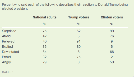
From Gallup, how Americans feel about the election

gallup

We can believe the broad messages that many people were surprised; that Trump supporters have positive feelings; that Clinton supporters have negative feelings; that there’s more anger and fear expressed that when Obama first was elected (though not than when he was re-elected). The surprising details are less reliable.

I’ve seen people making a lot of the 3% apparent “buyer’s remorse” among Trump voters, with one tweet I saw saying those votes would have been enough to swing the election. First of all, Clinton already has more votes that Trump, just distributed suboptimally, so even if these were Trump voters who had changed their minds it might not have made any difference to the result.  More importantly, though, Gallup has no way of knowing who the respondents voted for, or even if they voted at all.  The table is just based on what they said over the phone.

It could be that 3% of Trump voters regret it. It could also be that some Clinton voters or some non-voters claimed to have voted for Trump.  As we’ve seen in past examples even of high-quality social surveys, it’s very hard to estimate the size of a very small subpopulation from straightforward survey data.

August 6, 2016

Momentum and bounce

Momentum is an actual property of physical objects, and explanations of flight, spin, and bounce in terms of momentum (and other factors) genuinely explain something.  Electoral poll proportions, on the other hand, can only have ‘momentum’ or ‘bounce’ as a metaphor — an explanation based on these doesn’t explain anything.

So, when US pollsters talk about convention bounce in polling results, what do they actually mean? The consensus facts are that polling results improve after a party’s convention and that this improvement tends to be temporary and to produce polling results with a larger error around the final outcome.

Andrew Gelman and David Rothschild have a long piece about this at Slate:

Recent research, however, suggests that swings in the polls can often be attributed not to changes in voter intention but in changing patterns of survey nonresponse: What seems like a big change in public opinion turns out to be little more than changes in the inclinations of Democrats and Republicans to respond to polls. 

As usual, my recommendation is the relatively boring 538 polls-plus forecast, which discounts the ‘convention bounce’ very strongly.

July 31, 2016

Lucifer, Harambe, and Agrabah

Public Policy Polling has a history of asking … unusual… questions in their political polls.  For example, asking if you are in favour of bombing Agrabah (the fictional country of Disney’s Aladdin), whether you think Hillary Clinton has ties to Lucifer, and whether you would vote for Harambe (the dead, 17-yr old gorilla) if running as an independent against Trump and Clinton.

From these three questions, the Lucifer one stands out: it comes from a familiar news issue and isn’t based on tricking the respondents. People may not answer honestly, but at least they know roughly what they are being asked and how it’s likely to be understood.  Since they know what they are being asked, it’s possible to interpret the responses in a reasonably straightforward way.

Now, it’s fairly common when asking people (especially teenagers) about drug use to include some non-existent drugs for an estimate of the false-positive response rate.  It’s still pretty clear how to interpret the results: if the name is chosen well, no respondents will have a good-faith belief that they have taken a drug with that name, but they also won’t be confident that it’s a ringer.  You’re not aiming to trick honest respondents; you’re aiming to detect those that aren’t answering honestly.

The Agrabah question is different. There had been extensive media discussion of the question of bombing various ISIS strongholds (eg Raqqa), and this was the only live political question about bombing in the Middle East. Given the context of a serious opinion poll, it would be easy to have a good-faith belief that ‘Agrabah’ was the name of one of these ISIS strongholds and thus to think you were being asked whether bombing ISIS there was a good idea. Because of this potential confusion, we can’t tell what the respondents actually meant — we can be sure they didn’t support bombing a fictional city, but we can’t tell to what extent they were recklessly supporting arbitrary Middle-Eastern bombing versus just being successfully trolled. Because we don’t know what respondents really meant, the results aren’t very useful.

The Harambe question is different again. Harambe is under the age limit for President, from the wrong species, and dead, so what could it even mean for him to be a candidate?  The charitable view might be that Harambe’s 5% should be subtracted from the 8-9% who say they will vote for real, living, human candidates other than Trump and Clinton. On the other hand, that interpretation relies on people not recognising Harambe’s name — on almost everyone not recognising the name, given that we’re talking about 5% of responses.  I can see the attraction of using a control question rather than a half-arsed correction based on historical trends. I just don’t believe the assumptions you’d need for it to work.

Overall, you don’t have to be very cynical to suspect the publicity angle might have some effect on their question choice.

July 27, 2016

In praise of NZ papers

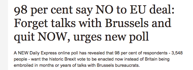
I whinge about NZ papers a lot on StatsChat, and even more about some of the UK stories they reprint. It’s good sometimes to look at some of the UK stories they don’t reprint.  From the Daily Express

express

The Brexit enthusiast and cabinet Minister John Redwood says “The poll is great news, well done to the Daily Express.” As he seems to be suggesting, you don’t get results like this just by chance — having an online bogus poll on the website of an anti-Europe newspaper is a good start.

(via Antony Unwin)

May 24, 2016

Microplummeting

Headline: “Newshub poll: Key’s popularity plummets to lowest level”

Just 36.7 percent of those polled listed the current Prime Minister as their preferred option — down 1.6 percent — from a Newshub poll in November.

National though is steady on 47 percent on the poll — a drop of just 0.3 percent — and similar to the Election night result.

So, apparently, 0.3% is “steady” and 1.6% is a “plummet”.

The reason we quote ‘maximum margin of error’, even though it’s a crude summary, not a good way to describe evidence, underestimates variability, and is a terribly misleading phrase, is that it at least gives some indication of what is worth headlining.  The maximum margin of error for this poll is 3%, but the margin of error for a change is 1.4 times higher, about 4.3%.

That’s the maximum margin of error, for a 50% true value, but it doesn’t make that much difference– I did a quick simulation to check. If nothing happened, the Prime Minister’s measured popularity would plummet or soar by more than 1.6% between two polls about half the time purely from sampling variation.


May 20, 2016

Depends who you ask

There’s a Herald story about sleep

A University of Michigan study using data from Entrain, a smartphone app aimed at reducing jetlag, found Kiwis on average go to sleep at 10.48pm and wake at 6.54am – an average of 8 hours and 6 minutes sleep.

It quotes me as saying the results might not be all that representative, but it just occurred to me that there are some comparison data sets for the US at least.

  • The Entrain study finds people in the US go to sleep on average just before 11pm and wake up on average between 6:45 and 7am.
  • SleepCycle, another app, reports a bedtime of 11:40 for women and midnight for men, with both men and women waking at about 7:20.
  • The American Time Use Survey is nationally representative, but not that easy to get stuff out of. However, Nathan Yau at Flowing Data has an animation saying that 50% of the population are asleep at 10:30pm and awake at 6:30am
  • And Jawbone, who don’t have to take anyone’s word for whether they’re asleep, have a fascinating map of mean bedtime by county of the US. It looks like the national average is after 11pm, but there’s huge variation, both urban-rural and position within your time zone.

These differences partly come from who is deliberately included and excluded (kids, shift workers, the very old), partly from measurement details, and partly from oversampling of the sort of people who use shiny gadgets.

March 11, 2016

Getting to see opinion poll uncertainty

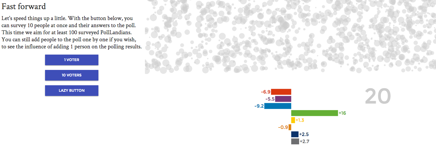
Rock’n Poll has a lovely guide to sampling uncertainty in election polls, guiding you step by step to see how approximate the results would be in the best of all possible worlds. Highly recommended.

Of course, we’re not in the best of all possible worlds, and in addition to pure sampling uncertainty we have ‘house effects’ due to different methodology between polling firms and ‘design effects’ due to the way the surveys compensate for non-response.  And on top of that there are problems with the hypothetical question ‘if an election were held tomorrow’, and probably issues with people not wanting to be honest.

Even so, the basic sampling uncertainty gives a good guide to the error in opinion polls, and anything that makes it easier to understand is worth having.

poll-land

(via Harkanwal Singh)

February 28, 2016

How I met your mother

Via Jolisa Gracewood on Twitter, a graph from Stanford sociologist Michael Rosenfeld on how people met their partners (click to embiggen)

met

Obviously the proportion who met online has increased — in the old days there weren’t many people on line. It’s still dramatic how fast the change happened, considering that ‘the year September never ended’, when AOL subscribers gained access to Usenet, was only 1993.  It’s also notable how everything else except ‘in a bar or restaurant’ has gone down.

Since this is StatsChat you should be asking how they got the data: it was a reasonably good survey. There’s a research paper, too (PDF).

You should also be worrying about the bump in ‘online’ in the mid-1980s. It’s ok. The paper says “This bump corresponds to two respondents. These two respondents first met their partners in the 1980s without the assistance of the Internet, and then used the Internet to reconnect later”