June 7, 2015

What does 80% accurate mean?

From Stuff (from the Telegraph)

And the scientists claim they do not even need to carry out a physical examination to predict the risk accurately. Instead, people are questioned about their walking speed, financial situation, previous illnesses, marital status and whether they have had previous illnesses.

Participants can calculate their five-year mortality risk as well as their “Ubble age” – the age at which the average mortality risk in the population is most similar to the estimated risk. Ubble stands for “UK Longevity Explorer” and researchers say the test is 80 per cent accurate.

There are two obvious questions based on this quote: what does it mean for the test to be 80 per cent accurate, and how does “Ubble” stand for “UK Longevity Explorer”? The second question is easier: the data underlying the predictions are from the UK Biobank, so presumably “Ubble” comes from “UK Biobank Longevity Explorer.”

An obvious first guess at the accuracy question would be that the test is 80% right in predicting whether or not you will survive 5 years. That doesn’t fly. First, the test gives a percentage, not a yes/no answer. Second, you can do a lot better than 80% in predicting whether someone will survive 5 years or not just by guessing “yes” for everyone.

The 80% figure doesn’t refer to accuracy in predicting death, it refers to discrimination: the ability to get higher predicted risks for people at higher actual risk. Specifically, it claims that if you pick pairs of  UK residents aged 40-70, one of whom dies in the next five years and the other doesn’t, the one who dies will have a higher predicted risk in 80% of pairs.

So, how does it manage this level of accuracy, and why do simple questions like self-rated health, self-reported walking speed, and car ownership show up instead of weight or cholesterol or blood pressure? Part of the answer is that Ubble is looking only at five-year risk, and only in people under 70. If you’re under 70 and going to die within five years, you’re probably sick already. Asking you about your health or your walking speed turns out to be a good way of finding if you’re sick.

This table from the research paper behind the Ubble shows how well different sorts of information predict.

si2

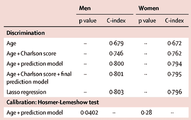
Age on its own gets you 67% accuracy, and age plus asking about diagnosed serious health conditions (the Charlson score) gets you to 75%.  The prediction model does a bit better, presumably it’s better at picking up a chance of undiagnosed disease.  The usual things doctors nag you about, apart from smoking, aren’t in there because they usually take longer than five years to kill you.

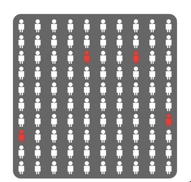
As an illustration of the importance of age and basic health in the prediction, if you put in data for a 60-year old man living with a partner/wife/husband, who smokes but is healthy apart from high blood pressure, the predicted percentage for dying is 4.1%.

The result comes with this well-designed graphic using counts out of 100 rather than fractions, and illustrating the randomness inherent in the prediction by scattering the four little red people across the panel.

ubble

Back to newspaper issues: the Herald also ran a Telegraph story (a rather worse one), but followed it up with a good repost from The Conversation by two of the researchers. None of these stories mentioned that the predictions will be less accurate for New Zealand users. That’s partly because the predictive model is calibrated to life expectancy, general health positivity/negativity, walking speeds, car ownership, and diagnostic patterns in Brits. It’s also because there are three questions on UK government disability support, which in our case we have not got.


Briefly

  • Bad things happen to innocent numbers in the news for several reasons. One is the craft norm that it’s OK — even expected — to be bad with numbers. Another is that news stories are. well, stories: they put information into narrative contexts that make sense.” From editing blog headsup
  • From the Atlantic (via @beck_eleven) : Should Journalists Know How Many People Read Their Stories?  From Scientific American, The Secret to Online Success: What Makes Content Go Viral. The answer given is ’emotion’, but if you look at their research paper, the ‘controls’ such as position on the page, length, and type of content have a much bigger influence.
  • From Felix Salmon at Fusion “The way Uber fares are calculated is a mess”
  • Mapping Los Angeles’ sprawl: story from Wired about the Built:LA interactive map of age of buildings in LA County. Light blue shows the early 20th century city, with dark purple post-WWII shading to pink and orange for recent consturction
    la
  • From Medium, a piece on how internet data gathering and advertising can control your world. If this really worked, you’d think online advertising would be much more lucrative than it seems to be.
June 5, 2015

Peacocks’ tails and random-digit dialing

People who do surveys using random-digit phone number dialing tend to think that random-digit dialling or similar attempts to sample in a representative way are very important, and sometimes attack the idea of public-opinion inference from convenience samples as wrong in principle.  People who use careful adjustment and matching to calibrate a sample to the target population are annoyed by this, and point out that not only is statistical modelling a perfectly reasonable alternative, but that response rates are typically so low that attempts to do random sampling also rely heavily on explicit or implicit modelling of non-response to get useful results.

Andrew Gelman has a new post on this issue, and it’s an idea that I think should be taken more further (in a slightly different direction) than he seems to.

It goes like this. If it becomes widely accepted that properly adjusted opt-in samples can give reasonable results, then there’s a motivation for survey organizations to not even try to get representative samples, to simply go with the sloppiest, easiest, most convenient thing out there. Just put up a website and have people click. Or use Mechanical Turk. Or send a couple of interviewers with clipboards out to the nearest mall to interview passersby. Whatever. Once word gets out that it’s OK to adjust, there goes all restraint.

I think it’s more than that, and related to the idea of signalling in economics or evolutionary biology, the idea that peacock’s tails are adaptive not because they are useful but because they are expensive and useless.

Doing good survey research is hard for lots of reasons, only some involving statistics. If you are commissioning or consuming a survey you need to know whether it was done by someone who cared about the accuracy of the results, or someone who either didn’t care or had no clue. It’s hard to find that out, even if you, personally, understand the issues.

Back in the day, one way you could distinguish real surveys from bogus polls was that real surveys used random-digit dialling, and bogus polls didn’t. In part, that was because random-digit dialling worked, and other approaches didn’t so much. Almost everyone had exactly one home phone number, so random dialling meant random sampling of households, and most people answered the phone and responded to surveys.  On top of that, though, the infrastructure for random-digit dialling was expensive. Installing it showed you were serious about conducting accurate surveys, and demanding it showed you were serious about paying for accurate results.

Today, response rates are much lower, cell-phones are common, links between phone number and geographic location are weaker, and the correspondence between random selection of phones and random selection of potential respondents is more complicated. Random-digit dialling, while still helpful, is much less important to survey accuracy than it used to be. It still has a lot of value as a signalling mechanism, distinguishing Gallup and Pew Research from Honest Joe’s Sample Emporium and website clicky polls.

Signalling is valuable to the signaller and to consumer, but it’s harmful to people trying to innovate.  If you’re involved with a serious endeavour in public opinion research that recruits a qualitatively representative panel and then spends its money on modelling rather than on sampling, you’re going to be upset with the spreading of fear, uncertainty, and doubt about opt-in sampling.

If you’re a panel-based survey organisation, the challenge isn’t to maintain your principles and avoid doing bogus polling, it’s to find some new way for consumers to distinguish your serious estimates from other people’s bogus ones. They’re not going to do it by evaluating the quality of your statistical modelling.


June 4, 2015

Round up on the chocolate hoax

Science journalism (or science) has a problem:

Meh. Unimpressed.

Study was unethical


June 3, 2015

NRL Predictions for Round 13

Team Ratings for Round 13

The basic method is described on my Department home page.

Here are the team ratings prior to this week’s games, along with the ratings at the start of the season.

Current Rating Rating at Season Start Difference
Roosters 10.22 9.09 1.10
Cowboys 6.53 9.52 -3.00
Broncos 5.13 4.03 1.10
Rabbitohs 4.84 13.06 -8.20
Storm 4.08 4.36 -0.30
Dragons 3.76 -1.74 5.50
Warriors 0.60 3.07 -2.50
Panthers -0.10 3.69 -3.80
Bulldogs -1.41 0.21 -1.60
Sea Eagles -1.51 2.68 -4.20
Knights -2.17 -0.28 -1.90
Raiders -3.12 -7.09 4.00
Eels -4.80 -7.19 2.40
Wests Tigers -6.65 -13.13 6.50
Titans -6.74 -8.20 1.50
Sharks -7.34 -10.76 3.40


Performance So Far

So far there have been 91 matches played, 53 of which were correctly predicted, a success rate of 58.2%.

Here are the predictions for last week’s games.

Game Date Score Prediction Correct
1 Panthers vs. Eels May 29 20 – 26 9.90 FALSE
2 Cowboys vs. Sea Eagles May 30 18 – 14 12.20 TRUE
3 Raiders vs. Broncos May 30 12 – 24 -4.10 TRUE
4 Titans vs. Rabbitohs May 30 16 – 22 -9.00 TRUE
5 Dragons vs. Sharks May 31 42 – 6 10.70 TRUE
6 Warriors vs. Knights May 31 24 – 20 7.30 TRUE
7 Roosters vs. Storm Jun 01 24 – 2 7.00 TRUE


Predictions for Round 13

Here are the predictions for Round 13. The prediction is my estimated expected points difference with a positive margin being a win to the home team, and a negative margin a win to the away team.

Game Date Winner Prediction
1 Broncos vs. Sea Eagles Jun 05 Broncos 9.60
2 Wests Tigers vs. Titans Jun 05 Wests Tigers 3.10
3 Knights vs. Raiders Jun 06 Knights 3.90
4 Panthers vs. Storm Jun 06 Storm -1.20
5 Rabbitohs vs. Warriors Jun 06 Rabbitohs 8.20
6 Sharks vs. Roosters Jun 07 Roosters -14.60
7 Bulldogs vs. Dragons Jun 08 Dragons -2.20
8 Eels vs. Cowboys Jun 08 Cowboys -8.30


Super 15 Predictions for Round 17

Team Ratings for Round 17

The basic method is described on my Department home page.

Here are the team ratings prior to this week’s games, along with the ratings at the start of the season.

Current Rating Rating at Season Start Difference
Crusaders 9.06 10.42 -1.40
Waratahs 6.16 10.00 -3.80
Hurricanes 6.07 2.89 3.20
Highlanders 5.12 -2.54 7.70
Brumbies 4.12 2.20 1.90
Chiefs 3.60 2.23 1.40
Stormers 3.59 1.68 1.90
Bulls 2.26 2.88 -0.60
Lions -1.12 -3.39 2.30
Blues -1.68 1.44 -3.10
Sharks -1.94 3.91 -5.90
Rebels -4.58 -9.53 4.90
Reds -7.37 -4.98 -2.40
Force -7.38 -4.67 -2.70
Cheetahs -8.92 -5.55 -3.40


Performance So Far

So far there have been 106 matches played, 71 of which were correctly predicted, a success rate of 67%.

Here are the predictions for last week’s games.

Game Date Score Prediction Correct
1 Crusaders vs. Hurricanes May 29 35 – 18 5.60 TRUE
2 Brumbies vs. Bulls May 29 22 – 16 6.40 TRUE
3 Sharks vs. Rebels May 29 25 – 21 7.80 TRUE
4 Highlanders vs. Chiefs May 30 36 – 9 2.80 TRUE
5 Force vs. Reds May 30 10 – 32 7.20 FALSE
6 Stormers vs. Cheetahs May 30 42 – 12 14.70 TRUE
7 Lions vs. Waratahs May 30 27 – 22 -3.90 FALSE


Predictions for Round 17

Here are the predictions for Round 17. The prediction is my estimated expected points difference with a positive margin being a win to the home team, and a negative margin a win to the away team.

Game Date Winner Prediction
1 Hurricanes vs. Highlanders Jun 05 Hurricanes 4.90
2 Force vs. Brumbies Jun 05 Brumbies -7.50
3 Rebels vs. Bulls Jun 06 Bulls -2.30
4 Blues vs. Crusaders Jun 06 Crusaders -6.70
5 Reds vs. Chiefs Jun 06 Chiefs -6.50
6 Cheetahs vs. Waratahs Jun 06 Waratahs -10.60
7 Stormers vs. Lions Jun 06 Stormers 8.70


Cancer correlation and causation

It’s a change to have a nice simple correlation vs causation problem. The Herald (from the Telegraph) says

Statins could cut the risk of dying from cancer by up to half, large-scale research suggests. A series of studies of almost 150,000 people found that those taking the cheap cholesterol-lowering drugs were far more likely to survive the disease.

Looking at the conference abstracts,  a big study found a hazard ratio of 0.78 based on about 3000 cancer deaths in women and a smaller study found a hazard ratio of 0.57 based on about half that many prostate cancer deaths (in men, obviously). That does sound impressive, but it is just a correlation. The men in the prostate cancer studies who happened to be taking statins were less likely to die of cancer; the women in the Women’s Health Initiative studies who happened to be taking statins were less likely to die of cancer.

There’s a definite irony that the results come from the Women’s Health Initiative. The WHI, one of the most expensive trials ever conducted, was set up to find out if hormone supplementation in post-menopausal women reduced the risk of serious chronic disease. Observational studies, comparing women who happened to be taking hormones with those who happened not to be, had found strong associations. In one landmark paper, women taking estrogen had almost half the rate of heart attack as those not taking estrogen, and a 22% lower rate of death from cardiovascular causes. As you probably remember, the WHI randomised trials showed no protective effect — in fact, a small increase in risk.

It’s encouraging that the WHI data show the same lack of association with getting cancer that summaries of randomised trials have shown, and that there’s enough data the association is unlikely to be a chance finding. As with estrogen and heart attack there are biochemical reasons why statins could increase survival in cancer. It could be true, but this isn’t convincing evidence.

Maybe someone should do a randomised trial.

Expensive new cancer drugs

From Stuff:

Revolutionary new drugs that could cure terminal cancer should be on the market here within a few years but patients will have to be “super rich” to afford them.

One four-dose treatment of the drug now under clinical trials costs about $140,000 while other ongoing courses can cost hundreds of thousands of dollars

That’s one real possibility, but there are others.

Firstly, the new drugs might not be all that good. After all, we had some of the same enthusiasm about angiogenesis inhibitors in the late 1990s and about selective tyrosine kinase inhibitors a few years later. The new immunotherapies look wonderful, but so far only  for a minority of patients. And we’re seeing their best side now, from trials stopped early for efficacy.

Alternatively, they might be too effective.  The adaptive immune system is kept under the same sort of strict controls as nuclear weapons, and for much the same reason — its ability to turn the battlefield into a lifeless wasteland. The most successful new treatments remove one of the safety checkpoints, and it’s possible that researchers won’t be able to dramatically expand the range of patients treated without producing dangerous collateral damage.

Finally, there’s the happy possibility. If we get evidence that inhibiting PD-1 and other T-cell checkpoints is safe and broadly effective, everyone will want to make inhibitors, and we’ll get competition. Bristol-Myers-Squib has a monopoly on nivolumab, but it doesn’t have a monopoly on immune checkpoint inhibition. This is already happening, as Bruce Booth reports from the ASCO conference

Most major oncology players have abstracts involving PD-1, including Merck, BMS, AZ, Novartis, Roche, and pretty much everyone else.  Other T-cell related targets like CTLA-4, TIM-3, OX-40, and LAG-3 round out the list of frequent mentions

The drugs still won’t be cheap, because each company will need its own clinical trials, but the development risk will be much lower and the margin for rapacious price-gouging narrower, so they won’t be $140000 per patient for very long.

June 2, 2015

Improving pie-charts

We’ve seen animations of this sort from Darkhorse Analytics before, but this one is special. It shows how to remove unnecessary components from a pie chart to produce something genuinely useful, though, sadly, the procedure doesn’t work for all pie charts.

Click on the picture to start the animation

devourThePie3

(via @JennyBryan)

June 1, 2015

Graph of the week

Yes, it’s only Monday, but this one will be hard to beat (from CNN on Twitter, via @albertocairo)

CGX6SisW8AA_QOQ

The off-square dividing make this look as if it’s trying to be a pie chart, but it isn’t. Not only are these not percentages of the same thing and so make no sense as a pie, the colour sections aren’t even scaled in proportion to the numbers (whether you look at angle or area).