January 24, 2015

Measuring what you care about

Via Felix Salmon, here’s a chart from Credit Suisse that’s been making the headlines recently, in the Oxfam report on global wealth.  The chart shows where in the world people live for each of the ‘wealth’ deciles, and I’ve circled the most interesting piece.

wealth

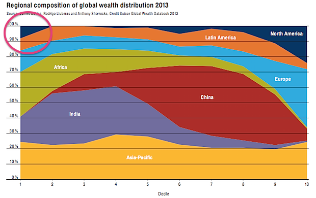
About 10% of the least wealthy people in the world live in North America. This isn’t (just) Mexico, Guatemala, Nicaragua, etc, it’s also the US, because some people in the US have really big debts.

If you are genuinely poor, you can’t have hundreds of thousands of dollars of negative wealth because no-one would give you that sort of money. Compared to a US law-school graduate with student loans, you’re wealthy.  This is obviously a dumb way to define wealth. Also, as I’ve argued on the ‘net tax’ issue, cumulative percentages just don’t work usefully as summaries when some of the numbers are negative.

This doesn’t mean wealth inequality doesn’t exist (boy, does it) or doesn’t matter, but it does mean summaries like the Credit Suisse one don’t capture it. If you wanted to capture the sort of wealth inequality worth worrying about, you’d need to think about what it really meant and why it was a problem separately from income inequality (which is much easier to define).

There seem to be two concerns with wealth inequality that people on a reasonably broad political spectrum might care about, if we stipulate that redistributive international taxation is not on the agenda:

  • transfer of wealth from parents to children leads to social stratification
  • high concentrations of wealth give some people too much power (and more so in societies more corrupt than NZ).

Both of these are non-linear ($200 isn’t twice as much as $100 in any meaningful sense) and they both depend on where you are ($20,000 will get you much further in Nigeria than in Rhode Island). There probably isn’t going to be a good way to look at global wealth inequality. Within countries, it’s probably feasible but it will still take some care and I expect it will be necessary to discount debts quite a lot.  If you owe the bank $10, you’re not wealthy, but if you owe the bank $10 million, you probably are.

January 23, 2015

Where did I come from?

One of the popular uses of recreational genotyping is ancestry determination.  Everyone inherits mitochondria only from our mothers, who got it from their mothers, and so on. Your mitochondrial DNA is a good match for your greatnth-grandmother, and people will sell you stories about where she came from.  In men, the Y chromosome does the same job for male-line ancestry.

When you go back even 50 generations (eg, very roughly to the settlement of New Zealand, or the Norman Conquest), you have approximately a million billion ancestors, obviously with rather a lot of overlap. You might wonder if the single pure female line ancestor was representative, and how informative she was about your overall ancestry.

In a new paper in the American Journal of Human Genetics, researchers looked at what you’d conclude about ancestry from the mitochondrial DNA compared to what you’d conclude from the whole genome.  They weren’t trying to get this very precise, just down to what continent most of your ancestors came from. This is what they found:

Continental-ancestry proportions often varied widely among individuals sharing the same mtDNA haplogroup. For only half of mtDNA haplogroups did the highest average continental-ancestry proportion match the highest continental-ancestry proportion of a majority of individuals with that haplogroup. Prediction of an individual’s mtDNA haplogroup from his or her continental-ancestry proportions was often incorrect. Collectively, these results indicate that for most individuals in the worldwide populations sampled, mtDNA-haplogroup membership provides limited information about either continental ancestry or continental region of origin.

The agreement was better than chance — there is some information about ancestry from just your greatnth-grandmother — but not very good. It wasn’t even a particularly severe test, since the samples were a set that had been previously selected to expand the diversity of genome sequencing and were deliberately spread out around the world.  In a random group of young adults from London or New York or Rio you’d expect to do worse.

Meet Statistics summer scholar Bo Liu

Photo Bo LiuEvery year, the Department of Statistics offers summer scholarships to a number of students so they can work with staff on real-world projects. Bo, right, is working on a project called Construction of life-course variables for the New Zealand Longitudinal Census (NZLC) with Roy Lay-Yee, Senior Research Fellow at the COMPASS Research Centre, University of Auckland, and Professor Alan Lee of Statistics. Bo explains:

“The New Zealand Longitudinal Census has linked individuals across the 1981-2006 New Zealand censuses. This enables the assessment of life-course resources with various outcomes.

“I need to create life-course variables such as socio-economic status, health, education, work, family ties and cultural identity from the censuses. Sometimes such information is not given directly in the census questions, but several pieces of information need to be combined together.

“An example is the overcrowding index that measures the personal living space. We need to combine the age, partnership status of the residents and number of bedrooms in each dwelling to derive the index.

“Also, the format of the questionnaire as well as the answers used in each census were rather different, so data-cleaning is required. I need to harmonise information collected in each census so that they are consistent and can be compared over different censuses. For example, in one census the gender might be given code ‘0’ and ‘1’ representing female and male, but in another census the gender was given code ‘1’ and ‘2’. Thus the code ‘1’ can mean quite different things in different censuses. My job is to find these differences and gaps in each census.

“The results of this project will enable future studies based on New Zealand longitudinal censuses, say, for example, the influence of life-courses variables on the risk of mortality. This project will also be a very good experience for my future career, since data-cleaning is a very important process that we were barely taught in our courses but will actually cost almost one-third of the time in most real-life projects. When we were studying statistics courses, most data sets we encountered were “toy” data sets that had fewer variables and observations and were clean. However, in real life, as in this case, we often meet with data that have millions of observations, hundreds of variables, and inconsistent variable specification and coding.

“I hold a Bachelor of Commerce in Accounting, Finance and Information Systems. I have just completed Postgraduate Diploma in Science, majoring in Statistics, and in 2015, I will be doing Master of Science in Statistics.

“When I was studying information systems, my lecturer introduced several statistical techniques to us and I was fascinated by what statistics is capable of in the decision-making process. For example, retailers can find out if a customer is pregnant purely based on her purchasing behaviour, so the retailers can send out coupons to increase their sales. It is amazing how we can use statistical techniques to find that little tiny bit of useful information in oceans of data. Statistics appeals to me as it is highly useful and applicable in almost every industry.

“This summer, I will spend some time doing road trips – hopefully I can make it to the South Island this time. I enjoy doing road trips alone every summer as I feel this is the best way to get myself refreshed and motivated for the next year.”


January 22, 2015

Do they know it’s Christmas time?

It’s (fortunately) out of season now, but there’s an interesting post on 538 about how Christmas music is detected, selected and played.

For example, the impact on algorithms that discover new hits or new performers:

The discovery algorithm searches for situations when the popularity of a song rises substantially faster than the popularity of the song’s artist. This becomes a problem in November, because Spotify starts seeing “Home for the Holidays” crooner Perry Como — who has been dead for 13 years — suddenly start behaving like an indie band out of Portland, Oregon, that’s about to make it big.

Meet Statistics summer scholar Yiying Zhang

yiyingEvery year, the Department of Statistics offers summer scholarships to a number of students so they can work with staff on real-world projects. Yiying, right, is working on a project called Modelling Competition and Dispersal in a Statistical Phylogeographic Framework with Dr Stéphane GuindonYiying explains.

 “The processes that govern the spatial distribution of species are complex. Traditional approaches in ecology generally rely on the hypothesis that adaptation to the environment is the main force driving this distribution.

“The supervisors of this project propose an alternative explanation that assumes that species are found in certain places simply because they were the first to colonise these locations during the course of evolution. They have recently designed a stochastic model that explains the observed spatial distribution of species using a combination of dispersal events (i.e., species migrating to new territories) and competition between species.

“In this project, I will run in silico [computer] experiments and analyse real data in order to validate the software Phyloland that implements our dispersal-competition model.

“To validate the model, we will randomly generate ‘true value’. Then we will use the model to make estimations of the true value. If the estimated values match the true value relatively closely, then the model is reliable.

“I am doing a BCom/BSc conjoint degree. My majors are Finance, Accounting and Statistics – 2015 is my fourth year. I am planning to do an Honours degree in statistics, so this summer research project is a very valuable experience for me.

“I enjoy statistics because it brings me closer to the real world. Sometimes, things are not simply what we see. Without data, we would never have convincing evidence about what is really happening. The amount of information out there is massive and statistics can help people tell how reliable a statement is. Studying statistics has helped me make better use of information and think more critically.

“My plans for summer include relaxing and reading more books. And having plenty of sleep.”


January 21, 2015

How to feel good about New Zealand

StatsChat criticises the NZ media a lot, but if you really want a target-rich zone, the place is the UK. Today, the Daily Express had this front page:

B703j6kIcAEiyUl

The biggest vote on this country’s ties to ­Brussels for 40 years saw 80 per cent say they no longer want to be in Europe, the ­Daily Express can reveal.

It marks a huge leap forward in this news­paper’s crusade to get Britain out of the EU.


This comes from a survey in three Conservative electorates in the southern UK (out of 650 electorates), where 100,000 questionnaires were distributed. About 12% said Britain should leave the EUK, about 3% were opposed, and the other 85% didn’t respond.

Other, better-conducted polling doesn’t find such a dramatic lead. Even a late-December poll by “Get Britain Out” found only 51% support for leaving the EU and consoled themselves by describing this as showing their campaign was gaining momentum.

(via @federicacocco)

Tired foreign drivers

This one makes sense as a possibility

However, road safety campaigner Clive Matthew-Wilson today slammed the new website a “dangerous waste of time”.

He has repeatedly called for tourist drivers to be banned from driving vehicles within 24 hours of arriving in the country.

“Driving tired is as dangerous as driving drunk,” said Mr Matthew-Wilson.

Obviously it matters how tired vs how drunk, but fatigue certainly is unhealthy in drivers.

There’s also the issue that almost 50% of foreign tourists have only come from Australia, not a terribly arduous trip, and that there are almost as many Kiwis returning from Foreign Parts as there are Foreigners visiting. Still, banning car rentals within 24 hours of a sufficiently long flight is something that wouldn’t need to be restricted to foreigners and so wouldn’t require withdrawing from the UN Conventions on Road Traffic.

It would be surprising if tired foreign drivers weren’t at somewhat higher risk of a crash. We’d still want data to see how many crashes we’re talking about. Is this rule going to prevent 10 fatal crashes per year, or 1 per decade?

We can get an initial idea from the National Crash Map built by Richard Law and Andrew Parnell and feature in the Herald Data Blog on Christmas Day.

Here are all the crashes from December 2013 to July 2014 where both fatigue and being a foreign driver were judged to be contributing causes. It’s an overestimate, since it includes fatigue from all causes rather than just from recent arrival, and in a multi-car collision even includes fatigue in someone other than the foreign driver. Also, it’s based on police judgment and maybe they overestimate or underestimate fatigue as a cause.

It’s a start.

tired-foreign


Over this eight-month period there were no fatal crashes, one serious-injury crash, and two minor-injury crashes satisfying these criteria.

This is just two-thirds of one year, and a proper analysis would look at the data back to 2007 (or the more-limited data even further back). It’s still more data than the story provided.


Meet Statistics summer scholar Alexander van der Voorn

Alex van der VoornEvery year, the Department of Statistics offers summer scholarships to a number of students so they can work with staff on real-world projects. Alexander, right, is undertaking a statistics education research project with Dr Marie Fitch and Dr Stephanie Budgett. Alexander explains:

“Essentially, what this project involves is looking at how bootstrapping and re-randomisation being added into the university’s introductory statistics course have affected students’ understanding of statistical inference, such as interpreting P-values and confidence intervals, and knowing what can and can’t be justifiably claimed based on those statistical results.

“This mainly consists of classifying test and exam questions into several key categories from before and after bootstrapping and re-randomisation were added to the course, and looking at the change (if any) in the number of students who correctly answer these questions over time, and even if any common misconceptions become more or less prominent in students’ answers as well.

“This sort of project is useful as traditionally, introductory statistics education has had a large focus on the normal distribution and using it to develop ideas and understanding of statistical inference from it. This results in a theoretical and mathematical approach, which means students will often be restricted by the complexity of it and will therefore struggle to be able to use it to make clear inference about the data.

“Bootstrapping and re-randomisation are two techniques that can be used in statistical analysis and were added into the introductory statistics course at the university in 2012. They have been around for some time, but have only become prominent and practically useful recently as they require many repetitions of simulations, which obviously is better-suited to a computer rather than a person. Research on this emphasises how using these techniques allow key statistical ideas to be taught and understood without a lot of fuss, such as complicated assumptions and dealing with probability distributions.

“In 2015, I’ll be completing my third year of a BSc in Statistics and Operations Research, and I’ll be looking at doing postgraduate study after that. I’m not sure why statistics appeals to me, I just found it very interesting and enjoyable at university and wanted to do more of it. I always liked maths at school, so it probably stemmed from that.

“I don’t have any plans to go away anywhere so this summer I’ll just relax, enjoy some time off in the sun and spend time around home. I might also focus on some drumming practice, as well as playing with my two dogs.”

January 20, 2015

Is it misleading to say a majority of US public school kids live in poverty?

Yes.

Well, no.

Ok, yes, maybe.

This was the Washington Post headline: “Majority of U.S. public school students are in poverty“. It hasn’t made the NZ media, but some of you probably read about the rest of the world occasionally and might have seen it.

The original source, a report from the Southern Education Foundation, is careful not to use the word “poverty”.  They say 51% of public school students are low-income, defined as receiving free or subsidised school meals.  There’s a standard US government definition of poverty, used in defining eligibility for social programs, and by that definition 51% of public school students come from households with income less than 1.85 times the threshold for poverty.  The report also says what proportion get free school meals, for which the threshold is 1.35 times the poverty line, and it’s 44%.

They don’t give the proportion under the official poverty line. If the exact figure mattered for this post I could probably work it out from the American Community Survey, but since only about 10% of US kids are in private schools after kindergarten and before college, it’s going to be in the same ballpark as the proportion for all children — 22%.   It’s hard to see it being more than 30%.

On the other hand, the US has an unusual official definition of poverty.  In most Western countries, the poverty line is a set fraction (often 60%) of the median household income (adjusted somehow for household size). The US uses the price of a fixed set of foodstuffs and an estimate of what fraction of income goes on food, defined in 1963-4 and then updated using the CPI (actually, that’s what the Census Bureau uses, the rest of the government uses a simplified version of the same thing).  If you defined poverty by 60% of median household income, you’d come pretty close to the subsidized-meals threshold.  That is, defining poverty the way most other Western countries do, the headline is close to being correct.

On the other other hand, the Washington Post is a  US newspaper.  If you’re writing for the Post and you think it’s unreasonable to define ‘poverty’ to exclude a US family of three with an income (including cash benefits) of $20,000, I have some sympathy for your position. I still think you need to say your definition is different from the official one and wasn’t used by your source.

Ask a silly question, get a silly answer

The monthly US FoodDemand survey added some questions about government policies this time around. Mostly these were reasonable (eg, do you support a tax on sugared sodas, which got 39% ‘Yes”, the same as here; do you support a ban on sale of marijuana, 46% yes)

However, one question was

“Do you support mandatory labeling for foods containing DNA?”

There’s no way this is a sensible question about government policies: it isn’t a reasonable policy or one that has been under public debate.  Most foods will contain DNA, the exceptions being distilled spirits, some candy, and (if you don’t measure too carefully) white rice and white flour. Nevertheless, 80% of people were in favour.

There was also a question “Do you support mandatory labeling for foods produced with genetic engineering”. This got 82% support.

It seems most likely that many respondents interpreted these questions as basically the same: they wanted labelling for food containing DNA that was added or modified by genetic engineering.  This isn’t what the researchers meant, since they write

A large majority (82%) support mandatory labels on GMOs, but curiously about the same amount (80%) also support mandatory labels on foods containing DNA.

If you ask a question that is nuts when interpreted precisely, but is basically similar to a sensible question, people are going to answer the question they think you meant to ask. People are helpful that way, even when it isn’t helpful.