July 29, 2014
H.G. Wells and statistical thinking
Your periodic reminder that we do know the masthead quotation is a paraphrase, but that I think it is an accurate one.
Your periodic reminder that we do know the masthead quotation is a paraphrase, but that I think it is an accurate one.
A couple of months ago, I wrote about a One News story on ‘drinkable sunscreen’.
In New Zealand, it’s very easy to make complaints about ads that violate advertising standards, for example by making unsubstantiated therapeutic claims. Mark Hanna submitted a complaint about the NZ website of the company selling the stuff.
The decision has been released: the complaint was upheld. Mark gives more description on his blog.
In many countries there is no feasible way for individuals to have this sort of impact. In the USA, for example, it’s almost impossible to do anything about misleading or unsubstantiated health claims, to the extent that summoning a celebrity to be humiliated publicly by a Senate panel may be the best option.
It can at least produce great television: John Oliver’s summary of the Dr Oz event is viciously hilarious
Journalism
Data
The Automatic Statistician project (somewhat flaky website) is working to automate various types of statistical modelling. They have interesting research papers. They also have a demo that’s fairly limited but produces linear regression models, model checks, and descriptions that are reasonable from a predictive point of view.
Automating some bits of data analysis is an important problem, because there aren’t enough statisticians to go around. However (as Cathy O’Neill points out about competition sites like Kaggle), they aren’t tackling the hard bits of data analysis: getting the data ready, and more importantly, getting the question into a precisely-specified form that can be answered by fitting a model.
Statistics New Zealand is running the numbers during the Glasgow 2014 Commonwealth Games to show how many medals countries are winning relative to their population. At the time of posting, we were third on a per-million-of-population basis. Check it out here.
This map, from Reddit, shows the most common name in each county of England and Wales in 1881, based on the 1881 census.
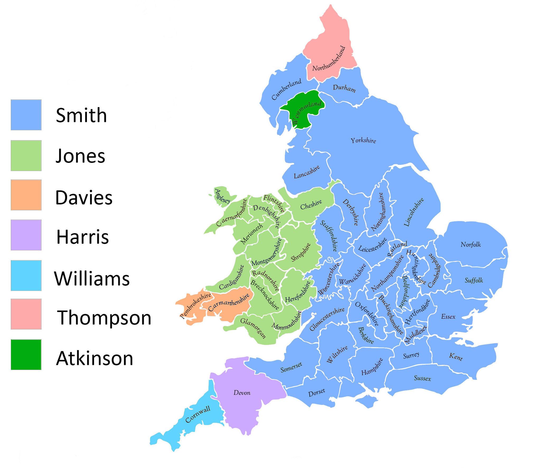
Matthew Yglesias at Vox.com says “what’s remarkable is how nearly perfectly the Smith/Jones divide lines up with the political boundary between England and Wales”. I think it’s remarkable that he think’s it’s remarkable — I think of ‘Jones’ as the stereotypical Welsh name — but obviously associations are different in the US. It is worth pointing out that the line-up isn’t as good as you might think if you weren’t careful: three of the light-green counties are actually in England, not in Wales.
Yglesias also says that the names “seem to show pretty distinctively what part of the British Isles your male line hails from.” That’s an example of how maps are systematically misleading — the conclusion may be true, but the map doesn’t support it as strongly as it seems to. The map shows the most common name in each county, and most of the counties where Jones is the most common name are Welsh. However, that doesn’t mean most people called Jones were in Wales. In fact, based on search counts from UKCensusOnline.com, Lancashire had more Joneses than any Welsh county, and London had more than all but two Welsh counties. Overall, only 51% of Joneses were in Wales, going up to 60% if you include the three English counties coloured light green on the map.
In this particular case, many non-Welsh Joneses probably did have Welsh ancestors who had left Wales well before 1881, but not all of them — according to Wikipedia, the name came from Norman French and the first recorded use was in England.
The New Zealand Data Futures Forum, which was established by the Ministers of Finance and Statistics to explore the future of data-sharing between the public and private sector, has released a discussion paper here.
This is the press release that was issued this morning:
Paddock to plate, and smart roads possible – NZ Data Futures Forum
New Zealand’s international brand and exports could grow significantly with the creation of a data sharing ‘eco-system’ according to a paper released by the NZ Data Futures Forum today.
Food traceability or ‘paddock to plate’ tracking is one of a number of kick start projects recommended in the paper that would see New Zealand become a world leader in the trusted use of data.
“New Zealand has got a real opportunity here. If we can create an ‘eco-system’ for data, we can unlock huge value, but to do this we need to treat data as a national asset,” says Forum Chair John Whitehead.
The paper suggests a range of initiatives including the establishment of an independent data council and an open data champion to drive innovation through data sharing. The data council would act as an independent ‘guardian’ to ensure trust, privacy and security are maintained.
“Getting the rules of the game right is a vital part of encouraging collaboration, creativity and innovation. New Zealand is uniquely placed to do this extremely well.”
The development of ‘smart roads’ that pull data from a range of sources, such as cats eye data capturing traffic flow, is another example the Forum uses to highlight the value that can be created through collaborative data sharing.
“Transport is a critical issue for Auckland. Smart roads can keep traffic moving more freely and prevent a future of bottlenecks and delays literally putting a brake on productivity
“If our recommendations are followed we will see New Zealand lead the world in this space. The potential gains are limitless, including the ability to tackle immediate and real social problems.”
Each week, we would like to invite readers of Stats Chat to submit nominations for our Stat of the Week competition and be in with the chance to win an iTunes voucher.
Here’s how it works:
Next Monday at midday we’ll announce the winner of this week’s Stat of the Week competition, and start a new one.
From Offsetting Behaviour (specifically, Seamus Hogan): How unfair is the Super 15 schedule?
The was prompted by one of the posts on the (apparently new) blog Sport Loves Data, by Kirdan Lees.
David Spiegelhalter, Professor of the Public Understanding of Risk at Cambridge University, has looked at the chance of getting three fatal plane crashes in the same 8-day period, based on the average rate of fatal crashes over the past ten years. He finds that if you look at all 8-day periods in ten years, three crashes is actually the most likely way for the worst week to turn out.
He does this with maths. It’s easier to do it by computer simulation: arrange the 91 crashes randomly among the 3650 days and count up the worst week. When I do this 10,000 times (which takes seconds). I get
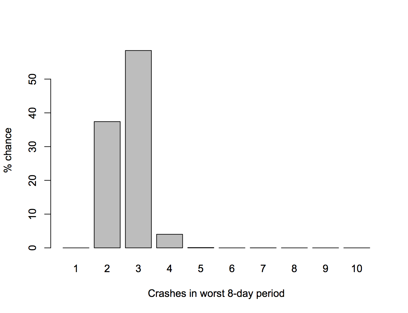
The recent crashes were separate tragedies with independent causes — two different types of accident and one deliberate shooting — they aren’t related like, say, the fires in the first Boeing Dreamliners were. There’s no reason for the recent events should make you more worried about flying.
A talk from this year’s Tapestry conference, taking the idea of storytelling with data seriously by looking at genre
Genres create a shared language, but they can also become formulaic.
Here’s one example to get you going: what do love stories have to do with taxi maps?
(via Alberto Cairo)
Recent comments