July 3, 2014

Super 15 Predictions for Round 18

Team Ratings for Round 18

The basic method is described on my Department home page. I have made some changes to the methodology this year, including shrinking the ratings between seasons.

Here are the team ratings prior to this week’s games, along with the ratings at the start of the season.

Current Rating Rating at Season Start Difference
Crusaders 8.02 8.80 -0.80
Waratahs 7.48 1.67 5.80
Sharks 5.65 4.57 1.10
Hurricanes 3.40 -1.44 4.80
Bulls 2.62 4.87 -2.30
Brumbies 2.13 4.12 -2.00
Stormers 1.98 4.38 -2.40
Blues 1.76 -1.92 3.70
Chiefs 1.13 4.38 -3.20
Highlanders -1.37 -4.48 3.10
Reds -3.16 0.58 -3.70
Force -4.40 -5.37 1.00
Cheetahs -4.52 0.12 -4.60
Lions -6.02 -6.93 0.90
Rebels -7.70 -6.36 -1.30


Performance So Far

So far there have been 106 matches played, 67 of which were correctly predicted, a success rate of 63.2%.

Here are the predictions for last week’s games.

Game Date Score Prediction Correct
1 Highlanders vs. Chiefs Jun 27 29 – 25 -0.60 FALSE
2 Rebels vs. Reds Jun 27 20 – 36 -0.10 TRUE
3 Hurricanes vs. Crusaders Jun 28 16 – 9 -3.40 FALSE
4 Waratahs vs. Brumbies Jun 28 39 – 8 4.80 TRUE
5 Force vs. Blues Jun 28 14 – 40 0.90 FALSE


Predictions for Round 18

Here are the predictions for Round 18. The prediction is my estimated expected points difference with a positive margin being a win to the home team, and a negative margin a win to the away team.

Game Date Winner Prediction
1 Chiefs vs. Hurricanes Jul 04 Chiefs 0.20
2 Lions vs. Rebels Jul 04 Lions 5.70
3 Crusaders vs. Blues Jul 05 Crusaders 8.80
4 Force vs. Reds Jul 05 Force 1.30
5 Stormers vs. Bulls Jul 05 Stormers 1.90
6 Cheetahs vs. Sharks Jul 05 Sharks -7.70
7 Waratahs vs. Highlanders Jul 06 Waratahs 12.90


July 2, 2014

What’s the actual margin of error?

The official maximum margin of error for an election poll with a simple random sample of 1000 people is 3.099%. Real life is more complicated.

In reality, not everyone is willing to talk to the nice researchers, so they either have to keep going until they get a representative-looking number of people in each group they are interested in, or take what they can get and reweight the data — if young people are under-represented, give each one more weight. Also, they can only get a simple random sample of telephones, so there are more complications in handling varying household sizes. And even once they have 1000 people, some of them will say “Dunno” or “The Conservatives? That’s the one with that nice Mr Key, isn’t it?”

After all this has shaken out it’s amazing the polls do as well as they do, and it would be unrealistic to hope that the pure mathematical elegance of the maximum margin of error held up exactly.  Survey statisticians use the term “design effect” to describe how inefficient a sampling method is compared to ideal simple random sampling. If you have a design effect of 2, your sample of 1000 people is as good as an ideal simple random sample of 500 people.

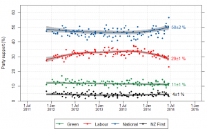
We’d like to know the design effect for individual election polls, but it’s hard. There isn’t any mathematical formula for design effects under quota sampling, and while there is a mathematical estimate for design effects after reweighting it isn’t actually all that accurate.  What we can do, thanks to Peter Green’s averaging code, is estimate the average design effect across multiple polls, by seeing how much the poll results really vary around the smooth trend. [Update: this is Wikipedia’s graph, but I used Peter’s code]

NZ_opinion_polls_2011-2014-majorparties

I did this for National because it’s easiest, and because their margin of error should be close to the maximum margin of error (since their vote is fairly close to 50%). The standard deviation of the residuals from the smooth trend curve is 2.1%, compared to 1.6% for a simple random sample of 1000 people. That would be a design effect of (2.1/1.6)2, or 1.8.  Based on the Fairfax/Ipsos numbers, about half of that could be due to dropping the undecided voters.

In principle, I could have overestimated the design effect this way because sharp changes in party preference would look like unusually large random errors. That’s not a big issue here: if you re-estimate using a standard deviation estimator that’s resistant to big errors (the median absolute deviation) you get a slightly larger design effect estimate.  There may be sharp changes, but there aren’t all that many of them, so they don’t have a big impact.

If the perfect mathematical maximum-margin-of-error is about 3.1%, the added real-world variability turns that into about 4.2%, which isn’t that bad. This doesn’t take bias into account — if something strange is happening with undecided voters, the impact could be a lot bigger than sampling error.


July 1, 2014

Does it make sense?

From the Herald (via @BKDrinkwater on Twitter)

Wages have only gone up $34.53 annually against house prices, which are up by $38,000.

These are the findings of the Home Affordability Report quarterly survey released by Massey University this morning.

At face value, that first sentence doesn’t make any sense, and also looks untrue. Wages have gone up quite a lot more than $34.53 annually. It is, however, almost a quote from the report, which the Herald embeds in their online story

 There was no real surprise in this result because the average annual wage increase of $34.53 was not enough to offset a $38,000 increase in the national median house price and an increase in the average mortgage interest rate from 5.57% to 5.64%. 

If you look for income information online, the first thing you find is the NZ Income Survey, which reported a $38 increase in median weekly salary and wage income for those receiving any. That’s a year old and not the right measure, but it suggests the $34.53 is probably an increase in some measure of average weekly income. Directly comparing that to the increase in the cost of house would be silly.

Fortunately, the Massey report doesn’t do that. If you look at the report, on the last page it says

Housing affordability for housing in New Zealand can be assessed by comparing the average weekly earnings with the median dwelling price and the mortgage interest rate

That is, they do some calculation with weekly earnings and expected mortgage payments. It’s remarkably hard to find exactly what calculation, but if you go to their website, and go back to 2006 when the report was sponsored by AMP, there is a more specific description.

If I’ve understood it correctly, the index is annual interest payment for an 80% mortgage  on the median house price at the average interest rate, divided by the average weekly wage.  That is, it’s the number of person-weeks of average wage income it would take to pay the mortgage interest for a year.  An index of 30 in Auckland means that the mortgage interest for the first year on 80% mortgage on the median house would take 30 weeks of average wage income to pay. A household with two people earning the average Auckland wage would spend 15/52 or nearly 30% of their income on mortgage interest to buy the median Auckland house.

Two final notes: first the “There was no real surprise” claim in the report is pretty meaningless. Once you know the inputs there should never be any real surprise in a simple ratio. Second, the Herald’s second paragraph

These are the findings of the Home Affordability Report quarterly survey released by Massey University this morning.

is just not true. Those are the inputs to the report, from, respectively, Stats New Zealand and REINZ. The findings are the changes in the affordability indices.

Graph of the week

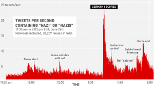
From Deadspin. No further comment needed.

785528210252283206

Facebook recap

The discussion over the Facebook experiment seems to involve a lot of people being honestly surprised that other people feel differently.

One interesting correlation based on my Twitter feed is that scientists involved in human subjects research were disturbed by the research and those not involved in human subjects research were not. This suggests our indoctrination in research ethics has some impact, but doesn’t answer the question of who is right.

Some links that cover most of the issues

June 30, 2014

Stat of the Week Competition: June 28 – July 4 2014

Each week, we would like to invite readers of Stats Chat to submit nominations for our Stat of the Week competition and be in with the chance to win an iTunes voucher.

Here’s how it works:

  • Anyone may add a comment on this post to nominate their Stat of the Week candidate before midday Friday July 4 2014.
  • Statistics can be bad, exemplary or fascinating.
  • The statistic must be in the NZ media during the period of June 28 – July 4 2014 inclusive.
  • Quote the statistic, when and where it was published and tell us why it should be our Stat of the Week.

Next Monday at midday we’ll announce the winner of this week’s Stat of the Week competition, and start a new one.

(more…)

Briefly

June 29, 2014

Not yet news

When you read “The university did not reveal how the study was carried out” in a news story about a research article, you’d expect the story to be covering some sort of scandal. Not this time.

The Herald story  is about broccoli and asthma

They say eating up to two cups of lightly steamed broccoli a day can help clear the airways, prevent deterioration in the condition and even reduce or reverse lung damage.

Other vegetables with the same effect include kale, cabbage, brussels sprouts, cauliflower and bok choy.

Using broccoli to treat asthma may also help for people who don’t respond to traditional treatment.

‘How the study was carried out’ isn’t just a matter of detail: if they just gave people broccoli, they wouldn’t know what other vegetables had the same effect, so maybe it wasn’t broccoli but some sort of extract? Was it even experimental or just observational? And did they actually test people who don’t respond to traditional treatment? And what exactly does that mean — failing to respond is pretty rare, though failing to get good control of asthma attacks isn’t.

The Daily Mail story was actually more informative (and that’s not a sentence I like to find myself writing). They reported a claim that wasn’t in the press release

The finding due to sulforaphane naturally occurring in broccoli and other cruciferous vegetables, which may help protect against respiratory inflammation that can cause asthma.

Even then, it isn’t clear whether the research really found that sulforaphane was responsible, or whether that’s just their theory about why broccoli is effective. 

My guess is that the point of the press release is the last sentence

Ms Mazarakis will be presenting the research findings at the 2014 Undergraduate Research Conference about Food Safety in Shanghai, China.

That’s a reasonable basis for a press release, and potentially for a story if you’re in Melbourne. The rest isn’t. It’s not science until they tell you what they did.

Ask first

Via The Atlantic, there’s a new paper in PNAS (open access) that I’m sure is going to be a widely cited example by people teaching research ethics, and not in a good way:

 In an experiment with people who use Facebook, we test whether emotional contagion occurs outside of in-person interaction between individuals by reducing the amount of emotional content in the News Feed. When positive expressions were reduced, people produced fewer positive posts and more negative posts; when negative expressions were reduced, the opposite pattern occurred. These results indicate that emotions expressed by others on Facebook influence our own emotions, constituting experimental evidence for massive-scale contagion via social networks.

More than 650,000 people had their Facebook feeds meddled with in this way, and as that paragraph from the abstract makes clear, it made a difference.

The problem is consent.  There is a clear ethical principle that experiments on humans require consent, except in a few specific situations, and that the consent has to be specific and informed. It’s not that uncommon in psychological experiments for some details of the experiment to be kept hidden to avoid bias, but participants still should be given a clear idea of possible risks and benefits and a general idea of what’s going on. Even in medical research, where clinical trials are comparing two real treatments for which the best choice isn’t known, there are very few exceptions to consent (I’ve written about some of them elsewhere).

The need for consent is especially clear in cases where the research is expected to cause harm. In this example, the Facebook researchers expected in advance that their intervention would have real effects on people’s emotions; that it would do actual harm, even if the harm was (hopefully) minor and transient.

Facebook had its research reviewed by an Institutional Review Board (the US equivalent of our Ethics Committees), and the terms of service say they can use your data for research purposes, so they are probably within the law.  The psychologist who edited the study for PNAS said

“I was concerned,” Fiske told The Atlantic, “until I queried the authors and they said their local institutional review board had approved it—and apparently on the grounds that Facebook apparently manipulates people’s News Feeds all the time.”

Fiske added that she didn’t want the “the originality of the research” to be lost, but called the experiment “an open ethical question.”

To me, the only open ethical question is whether people believed their agreement to the Facebook Terms of Service allowed this sort of thing. This could be settled empirically, by a suitably-designed survey. I’m betting the answer is “No.” Or, quite likely, “Hell, no!”.

[Update: Story in the Herald]

June 26, 2014

Want to learn data analysis? No stats experience required

4 Chris Wild, UoAInterested in learning to do data analysis but don’t know where to start? Try out the Department of Statistics’ new MOOC (massive online open course) called From Data to Insight: An Introduction to Data Analysis. It’s free – yep, it won’t cost you a bean – starts on October 6, takes just three hours a week, and will be led by our resident world-renowned statistics educator Prof Chris Wild (right).

The blurb says, in part:

“The course focuses on data exploration and discovery, showing you what to look for in statistical data, however large it may be. We’ll also teach you some of the limitations of data and what you can do to avoid being misled. We use data visualisations designed to teach you these skills quickly, and introduce you to the basic concepts you need to start understanding our world through data.

“This course assumes very little experience with statistical ideas and concepts. You will need to be comfortable thinking in terms of percentages, have basic Microsoft Excel skills, and a Windows or Macintosh computer to download and install our iNZight software.”

And that’s all you need. Spread the word.