May 8, 2014
Think I’ll go eat worms
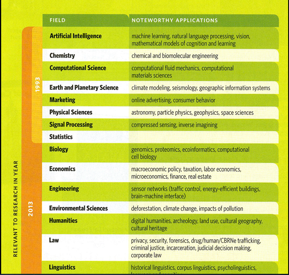
This table is from a University of California alumni magazine
Jeff Leek argues at Simply Statistics that the big problem with Big Data is they, too, forgot statistics.
This table is from a University of California alumni magazine
Jeff Leek argues at Simply Statistics that the big problem with Big Data is they, too, forgot statistics.
Two tweets in my time line this morning linked to this report about this research paper, saying “americans have stopped searching on forbidden words“
That’s a wild exaggeration, but what the research found was interesting. They looked at Google Trends search data for words and phrases that might be privacy-related in various ways: for example, searches that might be of interest to the US government security apparat or searchers that might be embarrassing if a friend knew about them.
In the US (but not in other countries) there was a small but definite change in searches at around the time of Edward Snowden’s NSA revelations. Search volume in general kept increasing, but searches on words that might be of interest to the government decreased slightly
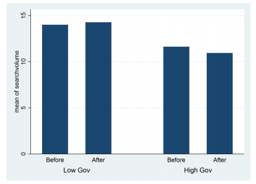
The data suggest that some people in the US became concerned that the NSA might care about them, and given that there presumably aren’t enough terrorists in the US to explain the difference, that knowing about the NSA surveillance is having an effect on political behaviour of (a subset of) ordinary Americans.
There is a complication, though. A similar fall was seen in the other categories of privacy-sensitive data, so either the real answer is something different, or people are worried about the NSA seeing their searches for porn.
The basic method is described on my Department home page. I have made some changes to the methodology this year, including shrinking the ratings between seasons.
Here are the team ratings prior to this week’s games, along with the ratings at the start of the season.
| Current Rating | Rating at Season Start | Difference | |
|---|---|---|---|
| Crusaders | 8.08 | 8.80 | -0.70 |
| Sharks | 5.49 | 4.57 | 0.90 |
| Chiefs | 4.24 | 4.38 | -0.10 |
| Brumbies | 4.08 | 4.12 | -0.00 |
| Waratahs | 3.05 | 1.67 | 1.40 |
| Bulls | 1.99 | 4.87 | -2.90 |
| Hurricanes | 1.63 | -1.44 | 3.10 |
| Blues | -0.10 | -1.92 | 1.80 |
| Stormers | -0.21 | 4.38 | -4.60 |
| Highlanders | -1.71 | -4.48 | 2.80 |
| Force | -2.36 | -5.37 | 3.00 |
| Reds | -2.86 | 0.58 | -3.40 |
| Cheetahs | -2.90 | 0.12 | -3.00 |
| Rebels | -4.74 | -6.36 | 1.60 |
| Lions | -6.69 | -6.93 | 0.20 |
So far there have been 74 matches played, 48 of which were correctly predicted, a success rate of 64.9%.
Here are the predictions for last week’s games.
| Game | Date | Score | Prediction | Correct | |
|---|---|---|---|---|---|
| 1 | Blues vs. Reds | May 02 | 44 – 14 | 3.70 | TRUE |
| 2 | Rebels vs. Sharks | May 02 | 16 – 22 | -6.30 | TRUE |
| 3 | Crusaders vs. Brumbies | May 03 | 40 – 20 | 6.30 | TRUE |
| 4 | Chiefs vs. Lions | May 03 | 38 – 8 | 12.90 | TRUE |
| 5 | Waratahs vs. Hurricanes | May 03 | 39 – 30 | 4.80 | TRUE |
| 6 | Stormers vs. Highlanders | May 03 | 29 – 28 | 6.20 | TRUE |
| 7 | Bulls vs. Cheetahs | May 03 | 26 – 21 | 7.80 | TRUE |
Here are the predictions for Round 13. The prediction is my estimated expected points difference with a positive margin being a win to the home team, and a negative margin a win to the away team.
| Game | Date | Winner | Prediction | |
|---|---|---|---|---|
| 1 | Chiefs vs. Blues | May 09 | Chiefs | 6.80 |
| 2 | Rebels vs. Hurricanes | May 09 | Hurricanes | -2.40 |
| 3 | Highlanders vs. Lions | May 10 | Highlanders | 9.00 |
| 4 | Brumbies vs. Sharks | May 10 | Brumbies | 2.60 |
| 5 | Cheetahs vs. Force | May 10 | Cheetahs | 3.50 |
| 6 | Bulls vs. Stormers | May 10 | Bulls | 4.70 |
| 7 | Reds vs. Crusaders | May 11 | Crusaders | -6.90 |
Wiki New Zealand, which has information on all sorts of things, has a graph showing animal use for research/testing/teaching in NZ over time. The data are from the annual report (PDF) of the National Animal Ethics Advisory Committee.
Here’s a slightly more detailed graph showing types of animals and who used them, over time.
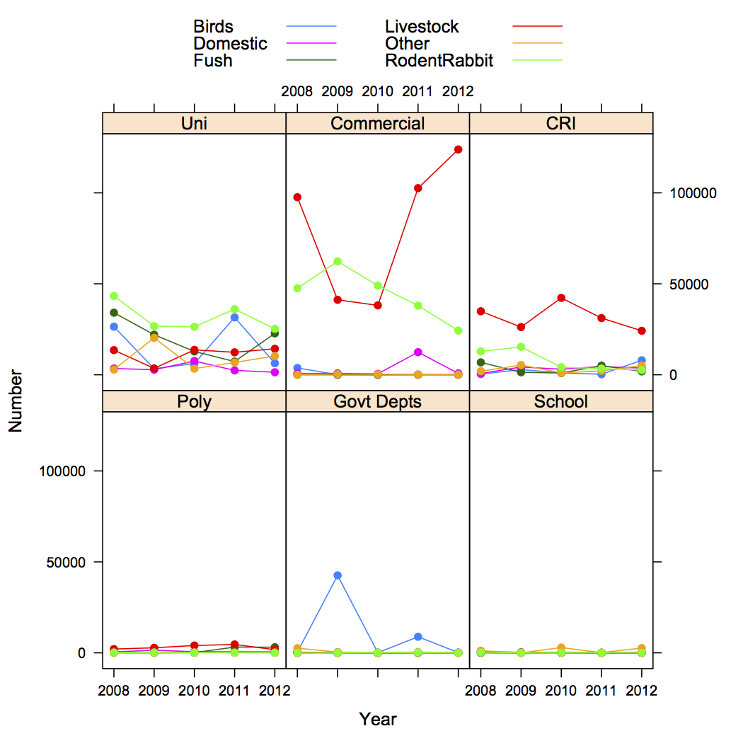
It’s also important to remember that nearly all the livestock and domestic animals weren’t harmed significantly — research on things like different feed or stocking densities still counts. Most of the rodents and rabbits ended up dead, as did about a third of the fish.
The two big increases recently are commercial livestock (most of which are no worse off than they would be anyway as livestock) and fish at universities. The increase in fish is probably due at least in part to substitution of zebrafish for mice in some biological research.
No, I don’t know what the government departments did with 40000 birds in 2009. [Update: thanks to James Green in comments, I now do. I]
[Update: here’s the data in accessible form]
The New Zealand Data Futures Forum was established by the Ministers of Finance and Statistics to have a balanced conversation with New Zealand about the opportunities, risks and benefits of sharing data.
It is particularly keen that people have a say about the potential sharing of big data (information captured through instruments, sensors, internet transactions, email, video, click streams, and other digital activity) held by public and private-sector organisations. How do individuals control their own information and identity while at the same time creating an environment where data can be harnessed for public and economic good?
The Forum will be active until the end of June this year. To post a comment go to https://www.nzdatafutures.org.nz/have-your-say
This piece from the Vancouver Sun exaggerates the current level of usefulness of genetic tests, but is spot on about the problems of scale
“As a diagnostic tool, personal genomics is invaluable for selecting therapies, but this whole screening issue opens up another can of worms,” said Lynd. “With the new economies of scale … it is just as easy to look for everything as it is to look for the one thing you need to know.”
Every cancer patient sent for a full genome analysis to determine which variant of breast cancer she has, could potentially become a patient for any or all of the other diseases indicated on their genome and the subject of a whole series of expensive tests to disprove the presence of an illness.
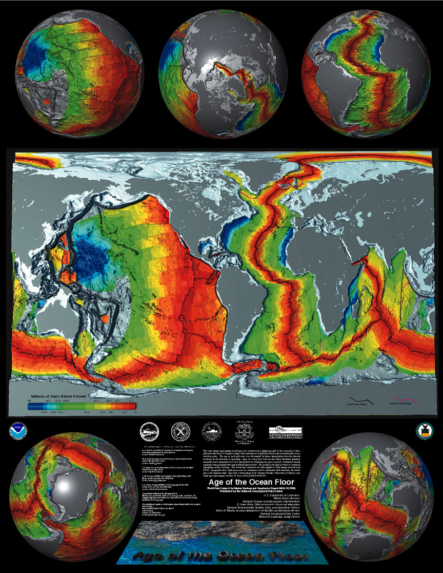
One of the standard science facts that comes in in polls about general scientific ignorance is that the continents move. More than 80% of people in the US know this, but within living memory it went from loony to controversial to accepted to boring enough for school curriculum.
People noticed the similarity of the African and American coastlines as soon as there were maps of both continents, but the idea of millions of square kilometers of land cruising around the earth seemed rather less plausible than a massive coincidence. This, from NOAA is a modern version of one of the most compelling pieces of evidence. The ocean floor is younger along the mid-Atlantic ridge (and similar lines), and gets older, symmetrically, as you move away from the ridge
, 
[the sea turtle migration/continental drift story, though? That’s a myth]
From Harvard Business Review, 10 kinds of stories to tell with data
For almost a decade I have heard that good quantitative analysts can “tell a story with data.” Narrative is—along with visual analytics—an important way to communicate analytical results to non-analytical people. Very few people would question the value of such stories, but just knowing that they work is not much help to anyone trying to master the art of analytical storytelling. What’s needed is a framework for understanding the different kinds of stories that data and analytics can tell. If you don’t know what kind of story you want to tell, you probably won’t tell a good one.
From Matthew Hankins, via a Cochrane Collaboration blog post, the first few items on an alphabetical list of ways to describe failure to meet a statistical significance threshold
a barely detectable statistically significant difference (p=0.073)
a borderline significant trend (p=0.09)
a certain trend toward significance (p=0.08)
a clear tendency to significance (p=0.052)
a clear trend (p<0.09)
a clear, strong trend (p=0.09)
a considerable trend toward significance (p=0.069)
a decreasing trend (p=0.09)
a definite trend (p=0.08)
a distinct trend toward significance (p=0.07)
a favorable trend (p=0.09)
a favourable statistical trend (p=0.09)
a little significant (p<0.1)
a margin at the edge of significance (p=0.0608)
a marginal trend (p=0.09)
a marginal trend toward significance (p=0.052)
a marked trend (p=0.07)
a mild trend (p<0.09)
…
Often there’s no need to have a threshold and people would be better off giving an interval estimate including the statistical uncertainty.
The defining characteristic of the (relatively rare) situations where a threshold is needed is that you either pass the threshold or you don’t. A marked trend towards a suggestion of positive evidence is not meeting the threshold.
From Malaysian newspaper The Star, via Twitter, an infographic that gets the wrong details right
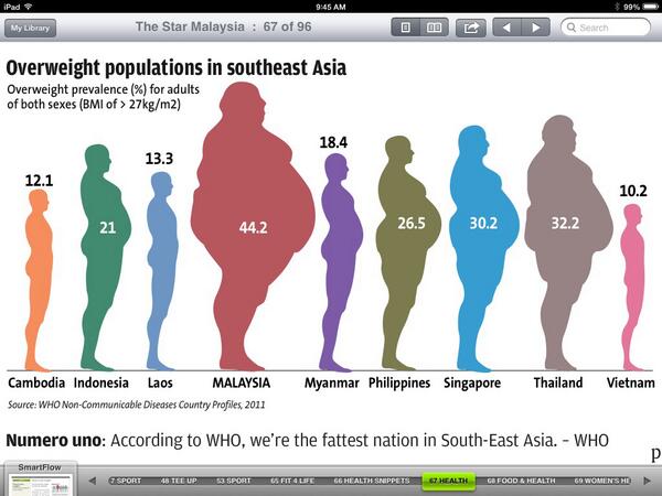
The designer went to substantial effort to make the area of each figure proportional to the number displayed (it says something about modern statistical computing that the my quickest way to check this was read the image file in R, use cluster analysis to find the figures, then tabulate).
However, it’s not remotely true that typical Malaysians weigh nearly four times as much as typical Cambodians. The number is the proportion above a certain BMI threshold, and that changes quite fast as mean weight increases. Using 1971 US figures for the variability of BMI, you’d get this sort of range of proportion overweight with a 23% range in mean weight between the highest and lowest countries.
Recent comments