Posts filed under Random variation (139)

April 3, 2017

The recently ex-kids are ok

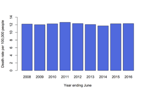
The New York Times had a story last week with the headline “Do Millennial Men Want Stay-at-Home Wives?”, and this depressing graphnyt

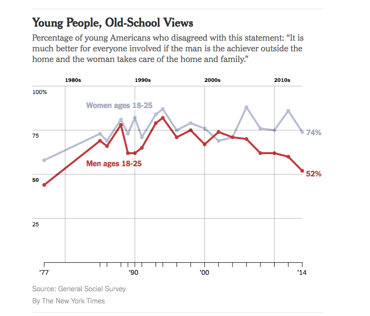
But, the graph doesn’t have any uncertainty indications, and while the General Social Survey is well-designed, that’s a pretty small age group (and also, an idiosyncratic definition of ‘millennial’)

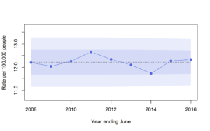
So, I looked up the data and drew a graph with confidence intervals (full code here)

foo

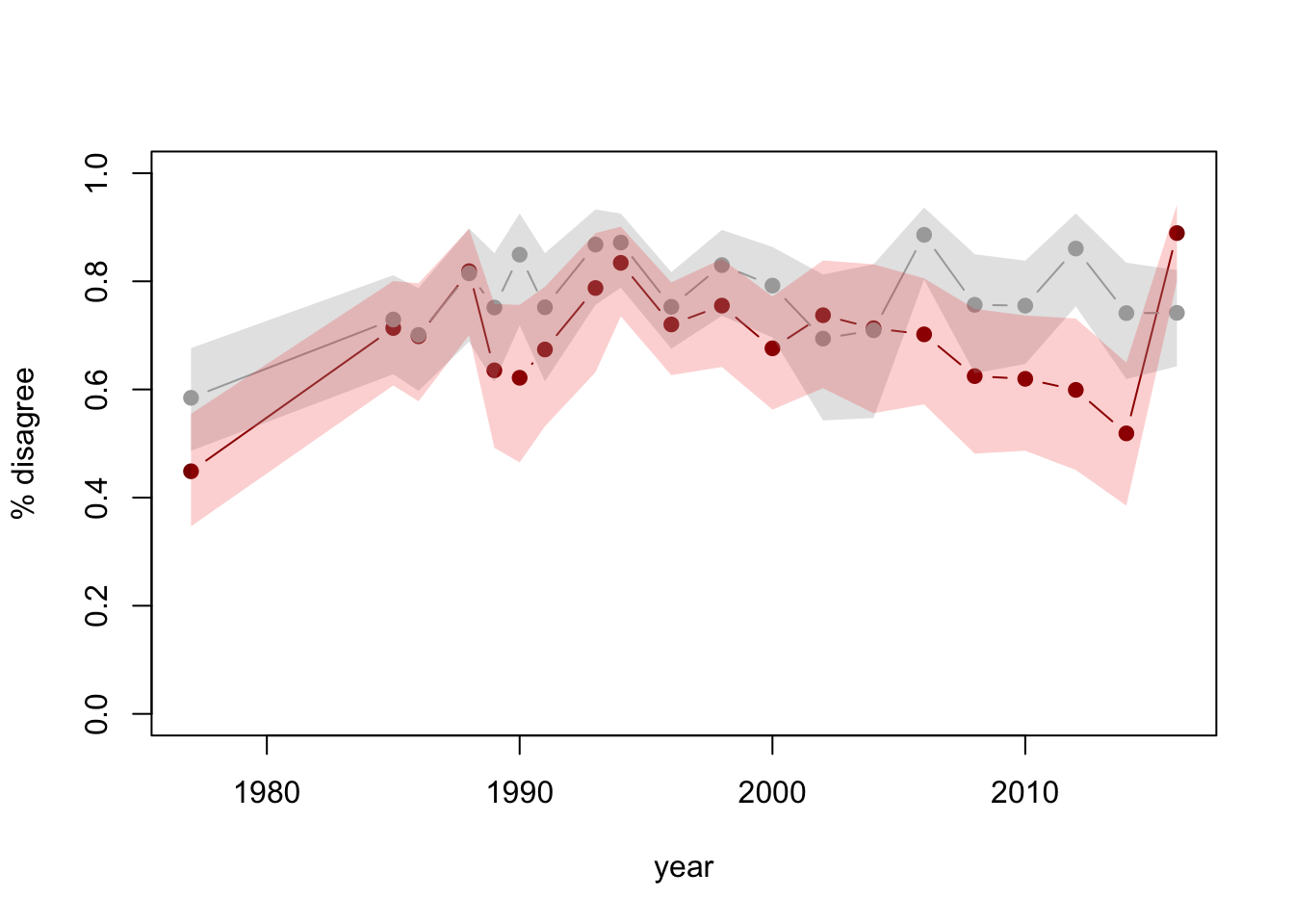
See the last point? The 2016 data have recently been released. Adding a year of data and uncertainty indications makes it clear there’s less support for the conclusion that it looked.

Other people did similar things: Emily Beam has a long post  including some context

The Pepin and Cotter piece, in fact, presents two additional figures in direct contrast with the garbage millennial theory – in Monitoring the Future, millennial men’s support for women in the public sphere has plateaued, not fallen; and attitudes about women working have continued to improve, not worsen. Their conclusion is, therefore, that they find some evidence of a move away from gender equality – a nuance that’s since been lost in the discussion of their work.

and Kieran Healy tweeted


As a rule if you see survey data (especially on a small subset of the population) without any uncertainty displayed, be suspicious.

Also, it’s impressive how easy these sorts of analysis are with modern technology. They used to require serious computing, expensive software, and potentially some work to access the data.  I did mine in an airport: commodity laptop, free WiFi, free software, user-friendly open-data archive.   One reason that basic statistics training has become much more useful in the past few decades is that so many of the other barriers to DIY analysis have been removed.

November 2, 2016

Lotto demographics

The headlines at both the Herald and Stuff say they’re about Lotto winners, but the vastly more numerous losers have to have basically the same demographics. That means any statistics drawn from a group of 12 winners are going to be very unreliable.

There some more reliable sources.  There’s (limited) information released by NZ Lotteries under the Official Information Act.  There’s also more detailed survey data from the 2012 Health and Lifestyles Survey (PDF)

Of the 12 people in today’s stories, 11 were men, even though men and women play Lotto at about the same rate. There’s a lot less variation by household income than I would have guessed. There is some variation by ethnicity, with Asians being less likely to play Lotto. People under 25 are a bit less likely to play. It’s all pretty boring.

I’ve complained a few times that clicky bogus polls have an error rate as bad as a random sample of about ten people, and are useless.  Here we have a random sample of about ten people, and it’s pretty useless.

Except as advertising.


October 18, 2016

The lack of change is the real story

The Chief Coroner has released provisional suicide statistics for the year to June 2016.  As I wrote last year, the rate of suicide in New Zealand is basically not changing.  The Herald’s story, by Martin Johnston, quotes the Chief Coroner on this point

“Judge Marshall interpreted the suicide death rate as having remained consistent and said it showed New Zealand still had a long way to go in turning around the unacceptably high toll of suicide.”

The headline and graphs don’t make this clear

Here’s the graph from the Herald

suicide-herald

If you want a bar graph, it should go down to zero, and it would then show how little is changing

suicide-2

I’d prefer a line graph showing expected variation if there wasn’t any underlying change: the shading is one and two standard deviations around the average of the nine years’ rates

suicide-3

As Judge Marshall says, the suicide death rate has remained consistent. That’s our problem.  Focusing on the year to year variation misses the key point.

June 22, 2016

Making hospital data accessible

From the Guardian

The NHS is increasingly publishing statistics about the surgery it undertakes, following on from a movement kickstarted by the Bristol Inquiry in the late 1990s into deaths of children after heart surgery. Ever more health data is being collected, and more transparent and open sharing of hospital summary data and outcomes has the power to transform the quality of NHS services further, even beyond the great improvements that have already been made.

The problem is that most people don’t have the expertise to analyse the hospital outcome data, and that there are some easy mistakes to make (just as with school outcome data).

A group of statisticians and psychologists developed a website that tries to help, for the data on childhood heart surgery.  Comparisons between hospitals in survival rate are very tempting (and newsworthy) here, but misleading: there are many reasons children might need heart surgery, and the risk is not the same for all of them.

There are two, equally important, components to the new site. Underneath, invisible to the user, is a statistical model that predicts the surgery result for an average hospital, and the uncertainty around the prediction. On top is the display and explanation, helping the user to understand what the data are saying: is the survival rate at this hospital higher (or lower) than would be expected based on how difficult their operations are?

May 29, 2016

I’ma let you finish

Adam Feldman runs the blog Empirical SCOTUS, with analyses of data on the Supreme Court of the United States. He has a recent post (via Mother Jones) showing how often each judge was interrupted by other judges last year:

Interrupted

For those of you who don’t follow this in detail, Elena Kagan and Sonia Sotomayor are women.

Looking at the other end of the graph, though, shows something that hasn’t been taken into account. Clarence Thomas wasn’t interrupted at all. That’s not primarily because he’s a man; it’s primarily because he almost never says anything.

Interpreting the interruptions really needs some denominator. Fortunately, we have denominators. Adam Feldman wrote another post about them.

Here’s the number interruptions per 1000 words, with the judges sorted in order of  how much they speak

perword

And here’s the same thing with interruption per 100 ‘utterances’

perutterance

It’s still pretty clear that the female judges are interrupted more often (yes, this is statistically significant (though not very)). Taking the amount of speech into account makes the differences smaller, but, interestingly, also shows that Ruth Bader Ginsburg is interrupted relatively often.

Denominators do matter.

April 27, 2016

Not just an illusion

There’s a headline in the IndependentIf you think more celebrities are dying young this year, you’re wrong – it’s just a trick of the mind“. And, in a sense, Ben Chu is right. In a much more important sense, he’s wrong.

He argues that there are more celebrities at risk now, which there are. He says a lot of these celebrities are older than we realise, which they are. He says that the number of celebrity deaths this year is within the scope of random variation looking at recent times, which may well be the case. But I don’t think that’s the question.

Usually, I’m taking the other side of this point. When there’s an especially good or especially bad weekend for road crashes, I say that it’s likely just random variation, and not evidence for speeding tolerances or unsafe tourists or breath alcohol levels. That’s because usually the question is whether the underlying process is changing: are the roads getting safer or more dangerous.

This time there isn’t really a serious question of whether karma, global warming, or spiders from Mars are killing off celebrities.  We know it must be a combination of understandable trends and bad luck that’s responsible.  But there really have been more celebrities dying this year.   Prince is really dead. Bowie is really dead. Victoria Wood, Patty Duke, Ronnie Corbett, Alan Rickman, Harper Lee — 2016 has actually happened this way,  it hasn’t been (to steal a line from Daniel Davies) just a particularly inaccurate observation of the underlying population and mortality patterns.

April 17, 2016

Evil within?

The headlineSex and violence ‘normal’ for boys who kill women in video games: study. That’s a pretty strong statement, and the claim quotes imply we’re going to find out who made it. We don’t.

The (much-weaker) take-home message:

The researchers’ conclusion: Sexist games may shrink boys’ empathy for female victims.

The detail:

The researchers then showed each student a photo of a bruised girl who, they said, had been beaten by a boy. They asked: On a scale of one to seven, how much sympathy do you have for her?

The male students who had just played Grand Theft Auto – and also related to the protagonist – felt least bad for her. with an empathy mean score of 3. Those who had played the other games, however, exhibited more compassion. And female students who played the same rounds of Grand Theft Auto had a mean empathy score of 5.3.

The important part is between the dashes: male students who related more to the protagonist in Grand Theft Auto had less empathy for a female victim.  There’s no evidence given that this was a result of playing Grand Theft Auto, since the researchers (obviously) didn’t ask about how people who didn’t play that game related to its protagonist.

What I wanted to know was how the empathy scores compared by which game the students played, separately by gender. The research paper didn’t report the analysis I wanted, but thanks to the wonders of Open Science, their data are available.

If you just compare which game the students were assigned to (and their gender), here are the means; the intervals are set up so there’s a statistically significant difference between two groups when their intervals don’t overlap.

gtamean

The difference between different games is too small to pick out reliably at this sample size, but is less than half a point on the scale — and while the ‘violent/sexist’ games might reduce empathy, there’s just as much evidence (ie, not very much) that the ‘violent’ ones increase it.

Here’s the complete data, because means can be misleading

gtaswarm

The data are consistent with a small overall impact of the game, or no real impact. They’re consistent with a moderately large impact on a subset of susceptible men, but equally consistent with some men just being horrible people.

If this is an issue you’ve considered in the past, this study shouldn’t be enough to alter your views much, and if it isn’t an issue you’ve considered in the past, it wouldn’t be the place to start.

March 11, 2016

Getting to see opinion poll uncertainty

Rock’n Poll has a lovely guide to sampling uncertainty in election polls, guiding you step by step to see how approximate the results would be in the best of all possible worlds. Highly recommended.

Of course, we’re not in the best of all possible worlds, and in addition to pure sampling uncertainty we have ‘house effects’ due to different methodology between polling firms and ‘design effects’ due to the way the surveys compensate for non-response.  And on top of that there are problems with the hypothetical question ‘if an election were held tomorrow’, and probably issues with people not wanting to be honest.

Even so, the basic sampling uncertainty gives a good guide to the error in opinion polls, and anything that makes it easier to understand is worth having.

poll-land

(via Harkanwal Singh)

March 7, 2016

Crime reports in NZ

The Herald Insights section has a multi-day exploration of police burglary reports, starting with a map at the Census meshblock level.

burglary

When you have counts of things on a map there’s always an issue of denominators and areas.  There’s the “one cow, one vote” phenomenon where rural areas dominate the map, and also the question of whether to show the raw count, the fraction of the population, or something else.  Burglaries are especially tricky in this context, because the crime location need not be a household, and the perpetrator need not live nearby, so the meshblock population really isn’t the right denominator.  The Herald hasn’t standardised, which I think is a reasonable default.

It’s also an opportunity to link again to Graeme Edgeler’s discussions of  why ‘burglary’ is a wider category than most people realise.

September 29, 2015

When variation is the story

A familiar trope of alternative cancer therapy is the patients who were given just months to live and are still alive years later.  The implication is that their survival is surprising and the cancer therapy was responsible.  Falling foul of the post hoc ergo propter hoc fallacy isn’t the big problem here. The big problem is that it’s not surprising that some people live a lot longer than the median.

Our intuition for variation is developed on measurements that aren’t like cancer survival. Most adults are pretty close to the average height — very few are more than a foot taller or shorter. Most people in Western countries die at close to the average age: for example, by the NZ life tables, the median life expectancy for NZ men born now is 81 years, and the tables predict half will die between 73 and 88 years.

For many types of cancer, survival isn’t like that. Here’s a graph from a big Canadian study of breast cancer

F1.large

The median survival for women with stage IV cancer in this group is about a year; half of them are still alive after a year. About half of those are still alive after two years; about half of those are still alive after three years, and some live much longer.

Variation in cancer survival — the long tail — should be welcome, but not surprising. Some people will be alive three, four, five or more years after ‘being given a year to live’.  We should be just as cautious about crediting them with finding a cure as we should be about blaming those who died sooner.