Posts filed under Denominator? (87)

June 8, 2014

Foreign drivers

From the ChCh Press

Foreign drivers cause more fatal and injury crashes in the South Island than the national average – and the West Coast is the worst spot.

They don’t actually mean “more,” they mean “a higher proportion of”.

New Zealand Transport Agency (NZTA) safety directions chief adviser Lisa Rossiter said its crash statistics for the past 10 years showed foreign drivers were involved in about 6 per cent of all fatal or injury crashes in New Zealand, and were at fault in about 2 per cent.

On average, short-term visitors make up roughly 2.5% of people in New Zealand (2.78 million visitors in the year to April 2014, median visit of 9 days, so I’m guessing mean visit about two weeks). About another 2% of people in New Zealand are international students, who are at least sometimes counted as foreign drivers.

So, the risk seems to be a bit higher for foreign drivers, but probably not twice as high. Some of the excess can probably be explained by age: international students, backpackers, and drunk Australians in Queenstown are younger than the population average.

It’s different in parts of the South Island

The tourist hot spots of Otago and the West Coast fared worst.

A foreign driver was identified as a factor in 13 per cent of fatal crashes on the coast, and 5 per cent of fatal crashes in Otago from 2004 to 2013.

A lot of this must be because tourists are over-represented in tourist hot spots: that’s what ‘tourist hot-spot’ means. The proportion of short-term visitors is about 2.5% nationwide, but it’s probably rather lower that than in Gisborne and rather higher on the West Coast.

It’s also worth noting that “identified as a factor” is fairly weak. If you go to the Ministry of Transport reports and add up the percentage of times different factors were involved in a crash, you get a lot more than 100% (for the 2010 report I get 225% for fatal crashes and 185% for injury crashes)

For crashes involving a tourist driver and more than one car, the foreign driver was fully or partly responsible two out of three times.

This at least gets rid of the denominator problem, but the “partly” responsible is still a problem. We aren’t told what proportion of the time the local driver was fully or partly responsible — based on the information given, that could also be two out of three times.

It’s quite likely that foreign drivers are at higher risk, especially those from countries that drive on the right, but the problem is not a big fraction of the NZ road toll. It’s worth considering things that can sensibly be done to reduce it — which doesn’t include withdrawing from the U.N. Convention on Road Traffic — but if you’re trying to stop road deaths it may be more effective to concentrate on interventions that don’t just affect foreign drivers.  Clearer signage, guard rails and median barriers, separated bike lanes, improved public transport… there are many things that might knock a percentage point off road deaths more easily than targetting foreign drivers.
May 23, 2014

Is Roy Morgan weird?

There seems to be a view that the Roy Morgan political opinion poll is more variable than the others, even to the extent that newspapers are willing to say so, eg, Stuff on May 7

The National Party has taken a big hit in the latest Roy Morgan poll, shedding 6 points to 42.5 per cent in the volatile survey.

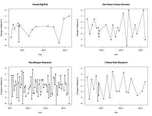
I was asked about this on Twitter this morning, so I went to get Peter Green’s data and aggregation model to see what it showed. In fact, there’s not much difference between the major polling companies in the variability of their estimates. Here, for example, are poll-to-poll changes in the support for National in successive polls for four companies

fourpollers


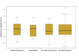
And here are their departures from the aggregated smooth trend

boxpollers


There really is not much to see here. So why do people feel that Roy Morgan comes out with strange results more often? Probably because Roy Morgan comes out with results more often.

For example, the proportion of poll-to-poll changes over 3 percentage points is 0.22 for One News/Colmar Brunton, 0.18 for Roy Morgan, and 0.23 for 3 News/Reid Research, all about the same, but the number of changes over 3 percentage points in this time frame is 5 for One News/Colmar Brunton, 14 for Roy Morgan, and 5 for 3 News/Reid Research.

There are more strange results from Roy Morgan than for the others, but it’s mostly for the same reason that there are more burglaries in Auckland than in the other New Zealand cities.

March 30, 2014

Inflation adjustment before breakfast

I saw this story in the Herald and didn’t read it in detail, just thought it was an interesting calculation to do

The Financial Times reported last week that the average global price of eight breakfast staples had risen almost 25 per cent this year.

The increases mainly affected coffee, orange juice, wheat, sugar, milk, butter, cocoa and pork.

We decided to create a Kiwi version of the Financial Times story and Statistics NZ food price figures reveal New Zealand families are not exempt from the trend.

David Farrar did read the story, and so was rather less impressed, as he also mentioned on Twitter.  The problem is that the calculation was done wrong.

If you served tomatoes, mushrooms, bacon, toast, eggs, tinned spaghetti and cereal, with coffee, tea and orange juice this weekend, it would have cost you 6.9 per cent more than the same meal in 2008, and almost 3 per cent more than in 2012. Breakfast food prices have risen more quickly than other prices.

Over the past five years, the compound average annual rate of inflation was 2.1 per cent.

If the average annual rate was 2.1%, which sounds about right, the total increase over five years would be 2.1% five times, which turns out to be 11%. Since 6.9% is less than 11%, breakfast food prices have risen less quickly than other prices. Quite a bit less. The story has it completely backward.

If you’re reading especially carefully, you might also notice that it’s more than five years from “this weekend” back to 2008 — for example, a comparison of end of March 2008 to this weekend would be a six year period.

This is the sort of thing that a subeditor should spot. It’s also the sort of thing the RBNZ inflation calculator is useful for — you put in a number and two years and it does the calculations.  If you use the calculator, you find that “this weekend” is apparently December 2013, and the 2008 comparison is December 2008, rather than March 2008 to March 2013. You’d also see that the sub-index for food had increased less than the total CPI, which would presumably make you more suspicious about the story.

There’s also some discussion of individual item prices. This doesn’t have the awful 5:1 error ratio of the main argument, but it still demonstrates where a bit of thinking could have helped

Mild Arabica coffee was trading on the commodity markets for US$1.76 ($2.03) a pound (453g) in February, up from US$1.35 in January. Mild Arabica coffee was trading on the commodity markets for US$1.76 ($2.03) a pound (453g) in February, up from US$1.35 in January.

If you go to the Countdown website you find that their Signature range coffee beans cost NZ$6 for 200g, or roughly US$12 per pound. Obviously most of the cost is not the wholesale commodity price. That’s presumably even more true for instant coffee (the authentic version of the beverage in a ‘traditional cooked breakfast’)

The components of the CPI that have increased fastest aren’t all that surprising if you read the Herald regularly. For example, the cost of home ownership was up 27% over that five-year period, insurance was up 26%, education, and cigarettes and tobacco were up 67%.

If some things go up faster than average, others must go up slower or even decrease. Household appliances and furniture are down a bit. Telecommunications equipment, computing equipment,  and telecommunications services have gotten much cheaper. You can hardly give away a 2008 phone or computer (though if you’re trying to, Te Whare Marama refuge will put it, and more recent kit, to good use)

March 27, 2014

Individual risk and population risk

The Herald and Stuff both have a story about the most dangerous intersections in the country, based on the Ministry of Transport press release. The Herald continues its encouraging new policy of providing the actual data, so we can look in more detail.

The first thing to note is that no intersection in the country appears to have had more than two fatal crashes in ten years, which is better than I would have expected. That’s why crashes involving even minor injuries need to be included in the ranking.

The second issue is the word ‘dangerous’. These 100 intersections are the ones that most need something done to them; they are where the most crashes happen. That’s not the same as the usual use of ‘most dangerous’ — these aren’t the intersections that pose the greatest risk to someone driving through them. The list is from a population or public health viewpoint: these intersections are more dangerous in the same way that dogs are more dangerous than sharks, or flu is more dangerous than meningitis.


January 9, 2014

Infographic of the week

Via @keith_ng, this masterpiece showing that more searches for help lead to more language. Or something.

badlang

It’s not, sadly, unusual to see numbers being used just for ordering, but in this case the numbers don’t even agree with the vertical ordering.  And several of them aren’t, actually, languages. And the headline is just bogus.

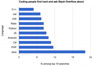
This version, by Kevin Marks (@kevinmarks), at least is accurate and readable.

oklang

but it’s hard to tell how much of Java’s dominance is due to it being popular versus being confusing.

Adam Bard has data on the most popular languages on the huge open-source software repository GitHub. This isn’t quite the right denominator, since Stack Overflow users aren’t quite the same population as GitHub users, but it’s something.  Assigning iOS, Android, and Rails, to Objective-C, Java, and Ruby respectively, and scaling by GitHub popularity, we find that C# has the most StackOverflow queries per GitHub commit; Objective-C and Java have about two-thirds as many.  In the end, though, this data isn’t going to tell you much about either high-demand programming skills or the relative friendliness of different programming languages.


November 16, 2013

Fun with percentages

This week there was a quarterly report estimating smartphone market share for different operating systems, which turned out to be  packed with trapdoors for the unwary reporter.  The NZ media largely avoided  the problems (mostly by sensibly ignoring the report) but many international tech sites leaped in with both feet.

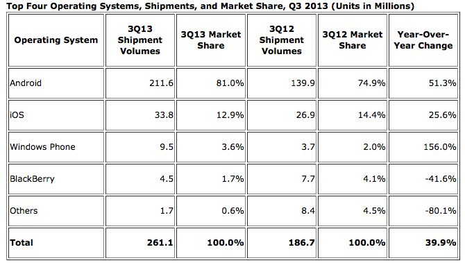
The basic information is in this table:

iphone


There are some important nerdy details in interpreting the numbers, such as the difference between “shipments” and “sales,” but we can ignore those for now. The main problem came in picking which numbers to report. The popular ones were the 81.0% market share for Android, the 1.5% fall in market share for Apple’s iOS, and the 156% increase in shipments for the Windows Phone.

The big rise in Windows phones is due (as the report points out) to the fact that there were basically no Windows phones being sold last year, and that’s now increased to some Windows phones being sold — not only is Windows still well behind iOS and Android, but its increase in actual phones shipped was smaller than the increase for either iOS or Android.  That’s all clear just from the numbers in the report.

Android has obviously been really successful, but 80% market share doesn’t mean quite as much as it sounds: this is just one quarter of phone shipments, and nowhere near 80% of the smartphones already out there are Android — the installed base is still much larger for iOS. If you’re writing the next Candy Crush or Angry Birds, what you care about most is the number of potential customers on each operating system. On the other hand, if you’re interested in current cash flow, so that one quarter’s shipments are relevant, you care about revenue or profit, which are lower per phone for Android (which is why I now have an Android phone).

And, finally, if you’re a tech writer, as Kit Eaton points out, you should know enough about the industry to realise that Apple made a much-anticipated announcement of two new iPhone models at the end of September.  Given a choice, many people (and not just psychotic Apple fanboys) would want to wait until the new phones appeared, either to buy one or to get discounted obsolete model. You’d expect iOS sales to be lower  in the preceding quarter. This isn’t just hypothetical: the chart from the April IDC press release (we’re not digging very deep here) shows the contraction and expansion in Apple market share around the release of the previous model, the iPhone 5, last September.

phones


On the  other hand, at least the fact that last year also had a new iPhone release means that ignoring the context sort of cancels itself out.

(via @juhasaarinen)

November 5, 2013

Can we bring out the real numbers now?

So, the decision has been made and the blood alcohol limit will be lowered.  Perhaps now we can start using realistic numbers for the impact.  The story in the Herald today shows the problem, although it’s actually much better than anything I’ve seen in the mainstream media previously:

The changes come after a two-year review of the impact of lowering the legal blood alcohol limit by 30mg suggested 3.4 lives would be saved a year and 64 injury-causing crashes avoided.

It would also save $200 million in social costs over 10 years.

“Alcohol impairment is a major cause of road accidents in New Zealand, with an average of 61 fatalities, 244 serious injuries, and 761 minor injuries every year caused by at-fault drivers who have been drinking,” said Transport Minister Gerry Brownlee.

“The social cost of these injuries and fatalities is $446 million – a huge sum in a country of our size.”

In the first paragraph the estimated benefit based on actual research is quoted. That’s a big step forward. The second paragraph is just wrong: the social costs aren’t in addition to the lives saved and injuries prevented; that’s where the social cost numbers come from. And it’s multiplied by ten years.

In the third and fourth paragraphs Mr Brownlee is quoted as justifying the change by quoting total costs of drink driving. The social cost number in the fourth paragraph is 22 times larger than the actual estimated benefit. You’d think that sort of discrepancy would draw some journalistic comment.

And later in the story we are told about a victim of a drunk driver. A driver whose blood alcohol concentration was 190mg/100ml, more than twice the existing legal limit, and who was duly convicted and sent to prison under the old laws. Not the sort of person whose behaviour is likely to be affected by this change.

October 31, 2013

Scary lack of context

A number that should be in all stories about accidents on special days of the year: 4500.  That’s roughly how many new claims ACC gets per day: divide the 1.7 million per year by 365.

The Herald passes on the ACC’s figures of 31 Halloween-related injuries and 840 attributed to Guy Fawkes. First you have to divide by five, since these are aggregate totals over five years. Then divide by the average number of claims per day to find that Guy Fawkes Day is responsible for about 4% of a typical day’s injuries, and Halloween racks up about 0.1% of a day.

It wouldn’t be surprising if Halloween actually prevented more injuries than it causes — participating children will be doing something safe under adult supervision, rather than teasing innocent pets, fighting with siblings, getting underfoot in the kitchen, or participating in team sports.

October 18, 2013

Cost-effectivness and meningococcal vaccine

There’s a story in the Herald arguing for mass vaccination in NZ against group C meningococcal disease.  There’s a good case for the vaccination — it’s a really nasty disease and there aren’t any other good treatment or prevention approaches — but I don’t see how the cost-effectiveness claims in the story can be right.

Dr Gravatt is quoted as saying there would be zero net medical cost for the vaccination program

Dr Gravatt estimated the net cost of vaccinating children at 12 months and again at 18 years would be zero for each “quality-adjusted” year of life saved at a vaccine price of $25 to $40 per dose. The listed prices were around $43 to $87, but discounts would be likely in a bulk contract.

He refers to a British vaccine study — which one isn’t specified.  However, there are cost-effectiveness analyses of the whole British group C meningococcal vaccination program (they vaccinate against group C but not group B, the opposite of NZ).  One, from 2002, estimates  a cost per life year saved of £6259. The second, from 2006, considers a wider range of possible vaccination programs: for the one that’s most similar to what Dr Gravatt proposed it estimates net medical costs of £9082 per quality-adjusted life year, and for the cheapest one, £3653 £2760 (update)per quality-adjusted life year. And that’s assuming the vaccine costs only £12 per dose, and in a country where group C meningococcal disease was slightly more common than it is here.

Another way to look at it: there are about 60000 births per year in NZ, so after the initial catch-up phase we’d be paying for 120000 doses per year. Even at $25 per dose, that comes to $3 million per year. According to the Herald’s story there are about 25 cases per year, so for the vaccination to be cost-neutral even at this lowest suggested price, the average disease case would have to cost the healthcare system $120000. That’s more than ten times what the UK cost-effectiveness study estimated (roughly £4000) including both the immediate cost of treating the disease and the cost of treating the long-term effects.

The vaccine looks to be a lot more cost-effective than, say, the prostate cancer drug that Campbell Live was pushing last week, and because herd immunity is important for this disease, there’s a relatively stronger case for vaccinating everyone, but that would be because the cost is worth it, not because the cost is zero.

Updates, including a lot more technical detail:  (more…)

October 13, 2013

Think of a number and multiply by 80000

Bernard Hickey in the Herald

Imagine the public outrage if it were discovered that more than 80,000 New Zealanders were receiving wages, salaries and investment incomes of more than $6 billion a year, but were also receiving a benefit from the Government.

and

Income figures this week from Statistics NZ show more than 80,000 New Zealanders over the age of 65 receive wages, salaries and investment returns of more than $6.5 billion a year while claiming NZ Super.

It certainly helps to summon the outrage if you uses totals rather than averages. I  think there could be a reasonable case for means-testing NZ Super, but these numbers are not a contribution to informed public debate.

I’m not even sure where he got the data: he says “income figures this week from Statistics NZ”, and the only plausible source on the Stats NZ release calendar seems to be the NZ Income Survey, released on October 4. But in the NZ Income Survey data, table 8 says there are only 53,900 people aged 65+ with income above $1150/wk, which works out to just under $60000/year (including their NZ Super, of course).  His figures could still be right — perhaps the very wealthy people at the top drag the total up —  but they can only be right in the same sense as Bill English‘s “people earning under $110000 collectively pay no net income tax”.

Imagine the public outrage if it were discovered that nearly 54000 retired New Zealanders were earning over $45000/yr  from investments and salaries and still collecting NZ Super as well. Go on, imagine it.