Summary offences
The NZ Police have put out a report “based on the most frequent data requests made by members of the public under the Official Information Act and is organised according to the largest areas of demand that Police responds to.” (via Nat Dudley on Twitter)
That’s great. There are numbers and tables and graphical summaries. Very useful.
On the other hand, this is typical of the graphs
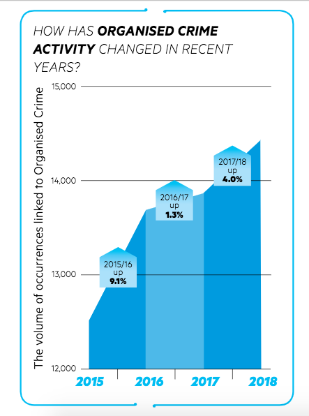
The report has a lot of charts like this, showing trends over time. They look as if they are using areas to depict the data, but they all have truncated y-axes that make the year-to-year variation look more dramatic. The bottom 75% of this chart has gone missing.
If you want to use a truncated y-axis you can, with a line chart and axis designs that don’t make the bottom of the graph look as if it’s zero. For example, patterns in the Keeling Curve of atmospheric CO2 are more apparent if the whole range down to zero ppm isn’t shown. In this case, though, there’s no obvious benefit. It’s just misleading.