Posts filed under General (3156)

December 7, 2014

Briefly

December 5, 2014

Bogus polls don’t work even for the good guys

There’s a story in the Times Higher Education Supplement about a Nuffield Council report “The Culture of Scientific Research in the UK.”  The lead in the THES story is

More than a quarter of scientists have felt tempted or under pressure to compromise the integrity of their research, according to a report on the ethics culture at universities.

On the other hand, since the report also found that 56% of scientists were women, the UK must be doing something right.

Seriously, there is a lot to be concerned about — especially in the light of the recent case of Professor Stefan Grimm at Imperial College — but that makes it more important to be careful about facts, not less important.

The survey that formed the quantitative part of the report had just under 1000 responses over three months, which is a substantially lower fraction of the target population than the NZ Association of Scientists managed for similar surveys in much less time. Researchers in biosciences are over-represented (57% of respondents vs 34% of university scientists, according to the report), and I think postdocs probably are too (30% of respondents).

The report itself is careful to describe the percentages as “of survey respondents” — it’s THES that dropped this distinction. As usual, it’s the qualitative information in the report that is most useful, and it’s a pity it has been pushed aside by unreliable numbers.

December 4, 2014

The poker economy?

StatsChat spends a lot of time criticising the Herald and Stuff. That’s because they are readily available, not because they are particularly bad.

For a change, this graph is from the Waikato Business News (you can see the e-book version of the paper here)

hamilton-is-coming

So, there’s some measure of a city’s economy where Hamilton is 4/7 of Auckland, Christchurch is 6/7 of Auckland, and where ChCh and Auckland will be stable but Hamilton will increase and Wellington decrease by about the same amount over the next 10 years.

It’s a bit surprising that you can find a measure (other than construction expenditures, perhaps) where Christchurch’s economy is almost as big as Auckland’s. The graph doesn’t say what the measure is, or how big the poker chips are. Neither does the text of the story. The statistics and graphs are attributed to a report “Growing the Hamilton Economy” by Berl Economics, which I can’t find online — but the reader shouldn’t have to do this much work to decode a front-page headline graphic.

December 3, 2014

Briefly

  • The Economist has a piece on interactive graphics “It is becoming clear that the native form for data is alive, not dead. Online, interactive charts will become the norm, nudging aside paper-based, static ones.”
  • Ampp3d is the data blog of (UK left-wing tabloid) The Mirror. I’m not sure how to phrase this without sounding more pretentious than I actually am, but it’s good to find data journalism in idioms other than California/Manhattan nerdy and New York Times/BBC/Guardian upper-middle-class liberal.
  • Datavisualization.ch claims to be “the premier news and knowledge resource for data visualization and infographics.” Despite that, it is really worth reading.
December 2, 2014

Bogus UK poll reporting

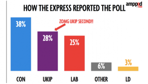
The Daily Express today: Ukip is now MORE popular than LABOUR: Nigel Farage gets polls boost as Ukip surges ahead. For NZ readers who aren’t familiar with Ukip, you can think of them as NZ First without all the tolerance and multiculturalism. It would be surprising, to put it mildly, for them to be doing that well.

I heard about this on Twitter, from Federica Cocco, who (among other things) writes about politics, data, and statistics for the Mirror Here are her graphs:

raw-poll 

and

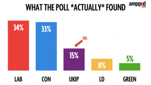
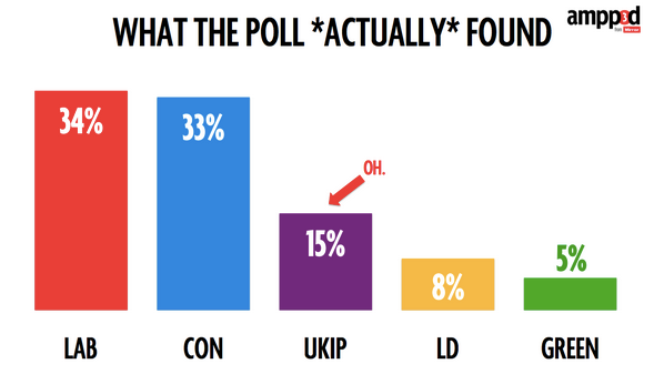
weighted-poll

That’s a lot more plausible.

As she says, the problem is sampling bias. I had a long post drafted on reweighting and YouGov and non-response bias, but then I read her post more carefully (on a real computer, not on my phone) and realised the mistake was nothing nearly as complicated or subtle.

YouGov report results broken down in a lot of subsets, because that’s how their methodology works. Rather than attempting to get a relatively random sample and fine-tuning it to be representative, they have given up on random samples and rely on statistical modelling to get representative results. Essentially, they give each respondent a different number of ‘votes’ depending on whether people like them are under-represented or over represented in the sample.

For example, they report the results for people 18-24 (who were under-represented by about 1/3 in the sample and so will be given extra votes in the result), for Scots (who were over-represented by about 1/2 and so will be given fractional votes in the result), and for Sun readers (who were represented about right in the sample).

Overall, accounting for the over- and under-representation, the UKIP got 15% support; among the 18-24 year olds, the UKIP got 10% support; among the Scots, they got 2%. And among Sun readers they got 28% support. That’s pretty much the sort of variation you’d expect, and shows YouGov have probably picked sensible categories for doing their statistical adjustments.

The question still remains as to how the Express managed to report the poll results only for Sun readers, a small, unrepresentative sample of people who support their competition. I don’t know, but my guess is that it’s because the ‘Sun readers’ column is on the right-hand edge of the table of results. If you aren’t paying attention, you might expect the overall totals to be there.


[for non-UK readers: a guide to British papers]

December 1, 2014

Ghosts and zombies

A month late for the season, but still interesting:

  • The Iraq military reportedly has about 50,000 ‘ghost’ soldiers, existing only for payroll fraud.
  • Jordan Weissman at Slate tries to track down a zombie figure of $400 billion/year for illegal sports betting in the US. It has been cited in an academic paper and a Supreme Court brief, without any primary source being given.
November 28, 2014

School funding: more complicated than deciles

Most of the coverage of the school decile changes has worked on the basis that decile tells you everything important about government funding levels.  I had thought this was true (not being a parent or school teacher, I hadn’t studied the matter carefully). Harkanwal Singh’s new interactive in the Herald shows that this is a major oversimplification. There are ‘steps’ within the deciles, and the range across decile 1 is larger than the difference between the top of decile 1 and the bottom of decile 2.

The piece combines maps and tables: the table are much better if you want to look for particular schools, but the maps are interesting for looking at geographical trends. For example, I wasn’t expecting funding increases for schools in the Onehunga/Royal Oak/Mt Roskill area.


November 20, 2014

Not a good look

Clinical trials involve experimenting on humans, and so you want them to involve the minimum number of people and use the information as efficiently as possible. Part of that is committing in advance to what you expect the benefits of a treatment to be (the ‘primary endpoint’). If you got to look at the data first, and search for a favorable difference between the treated and untreated people you’d need a lot more evidence to convince people. That’s why clinical trial registration is important.

Derek Lowe, at In the Pipeline, has an unfortunate example of from biotech company studying stem cells in heart disease. Last year, the registration information at ClinicalTrials.gov said

To determine safety and the effect of intracoronary infusion of AMR-001 on myocardial perfusion (RTSS), measured by gated SPECT MPI at baseline and six months in subjects post-STEMI

and

primary endpoint includes safety of bone marrow procurement (measured by adverse events) and AMR-001 cell infusion (including incidence of re-stenosis and stent thrombosis in addition to other adverse events) as well as efficacy measured by quantitative by gated SPECT MPI specifically looking at resting total severity score)

On November 17 this year it changed

To determine safety and efficacy of intracoronary infusion of NBS10.

and

The primary endpoint includes the occurrence of AE’s, SAE’s and Major Adverse Cardiac Events (MACE) and the assessment of myocardial perfusion measured by quantitative gated SPECT MPI specifically looking at resting total severity score.

From the company’s press release

  • A statistically significant mortality benefit (p<0.05) in patients treated with NBS10 (also known as AMR-001) as compared to the placebo group; there were no deaths in the treatment group.
     
  • A statistically significant dose-dependent reduction in SAEs (p<0.05).
  • Observation of a dose-dependent numerical decrease in MACE. MACE occurred in 14% of control subjects, in 17% of subjects of who received less than 14 million CD34 cells, in 10% of subjects who received greater than 14 million CD34 cells, and in 7% of subjects who received greater than 20 million CD34 cells.
  • No meaningful difference in perfusion, as evidenced by SPECT imaging, between the treatment and the control group from baseline to 6 months in resting total severity score (RTSS) suggesting this may not be a future suitable tool to assess NBS10, which is consistent with U.S. Food and Drug Administration (FDA) guidance that mortality and MACE are the appropriate approvable endpoints to determine efficacy of a cellular therapy for cardiac disease as opposed to imaging endpoints. 

That is, the trial failed to show a change where there were looking for one,  but found evidence for a reduction in other things — apparently after they knew the results.

November 18, 2014

What do statisticians do all day?

As usual about this time of year, our Honours and M.Sc. students are giving talks on their research projects

  • Modelling the natural inflows to New Zealand lakes
  • Refactoring the xtable package
  • Invertible reproducible documents
  • Bootstrap goodness of fit tests
  • Convex regression
  • Using the Robust Covariance Matrix Estimator to improve the precision of principal component eigenvectors in the orthogonal multivariate test
  • Orthogonalised multivariate survey-weighted linear models for medical data
  • Factors affecting catch composition in NZ scampi fisheries
  • Factors affecting tagging mortality in snapper
  • Assessment of rapid eradication assessment
  • Factors explaining the low income return for education among Asian New Zealanders
  • A comparison of methods used to reconcile forecasts in hierarchical time series
  • Numerical methods for drawing piecewise smooth curves
  • An evaluation of the Christian Broadcasting Association’s Appeal and Donorcom campaigns
  • Multi-choice and true/false assessments in introductory statistics: What can they tell us about student understanding?
  • Bayesian computation for exoplanet data
  • Modelling an Ophthalmology Clinic Booking List System: Assumptions and Implementation
  • Reinforcement Processes on Graphs
  • Influence analysis on phylogeny inference
  • Statistical analysis of chemical soil composition in the Wairau Valley
  • Describing the world’s nations
  • Parameter estimation of the coalescent in continuous space
November 13, 2014

School deciles

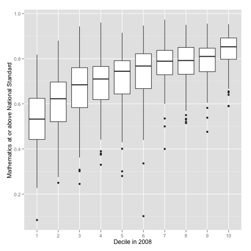
New Zealand has a national school funding system that allocates money to schools based on socio-economic data about students.  This isn’t self-reported individual-level data, but is at the level of Census meshblocks (details here.) Schools are divided into ten deciles, and more funding given to lower-decile schools.  Despite the higher funding, lower-decile schools, on average, have poorer results on standardised assessments.  You can see good visualisations of this from Luis Apiolaza,

mathOK

There are less-good ones at Stuff: dot plots aren’t ideal for this, and it really is better to look at cumulative categories (‘at standard or better’) rather than individual categories (‘at standard but not better’). Unfortunately, these graphs tell you almost nothing about the policy question of whether there are better ways to target the funding. There might be; there might not be.

One advantage of the current system is its automatic stabilisation. The Herald, earlier this week, had a good story about changing ethnic profiles of schools, with the sort of combination of data and individual stories it would be nice to see more often.  It turns out the low-decile schools are seeing fewer students of European ethnicity, and more Māori and Pasifika students. The phrase ‘white flight’ was used, but because of the funding system this isn’t the same sort of problem as the original ‘white flight’ from US inner cities.

In the US, a lot of public school funding comes from local government. When more-affluent families leave an area, the government funding for education goes down.  In New Zealand, when more-affluent families leave an area, the government funding for education goes up.  There’s still a concern about diversity, but not the same sort of vicious circle that was seen in the US.