
Posts filed under General (3156)

November 28, 2012

Hilarious love letter: “statisticians are the new sexy vampires, only even more pasty”

The New Yorker has a hilarious love letter to statistician of the moment, Nate Silver which includes the unforgettable line: “statisticians are the new sexy vampires, only even more pasty”.

It begins:

Dear Nate Silver:
My name is Emma Gertlowitz and I’m eleven years old and for a million years I liked Justin Bieber because he was so cute but now I like you. I watched you on MSNBC and HBO and on “Charlie Rose” and I can’t stop thinking about how you study polls and create probability models and predict elections and how you’re always right, which I think is so unbelievably cute, and I keep imagining you saying to me, “Emma, I think that there’s a 93.7% chance of me falling in love with you.”

Read more…

November 27, 2012

350 teachers talk statistics

The Auckland Mathematical Association and our Department of Statistics ran a special event at The University of Auckland’s Tamaki campus for 350 Year 13 statistics teachers last Thursday. The workshop introduced teachers to a range of online and interactive tools and resources to support the new statistics curriculum, which starts in the 2013 school year.

The workshop will be repeated in Wellington, Christchurch and Dunedin, with local maths associations running each event. You can find out more about the statistics road tour herephotos and teacher quotes here.

Jason Ellwood of Otumoetai College talks bootstrapping at The University of Auckland Statistics Roadshow, Tamaki campus, Thursday 22 November 2012. Photo: Stephen Barker/Barker Photography, www.barkerphotography.co.nz
©The University of Auckland.

November 23, 2012

Bus prediction

Today in the US is Thankgsiving, and it is traditional to be relentlessly positive, each large amounts of turkey, and collapse in front of the football game.

In partial observance of the tradition, I want to praise the new bus prediction system display.  The predictions are still too optimistic about remote buses, but at least the new display lets you tell which predictions are based on actual bus locations and which ones are just based on the timetable (eg).


November 22, 2012

Fly away home

With the summer holiday season approaching we’ve had requests for a post on the relative safety of driving and flying.

To a large extent this depends on where you are going: if you’re heading from Auckland to the Coromandel then I’d recommend driving, but if you want to spend some time on a beach in the Cook Islands your chances of getting there safely by car are distressingly low.

Clearly we need to rephrase the question.  Two possibilities are:

  • for a destination where either flying or driving makes sense, which one is safer?
  • if you compare a typical holiday road-trip to a typical holiday flight, which is safer?

We should also think about what risks to include: for a long plane flight the chance of a pulmonary embolism is higher than a crash, possibly much higher depending on your other risk factors.

The risk of a `fatal incident’ on a flight is largely independent of the length of the flight, and based on US data is about eight deaths per hundred million flights.  The risk is probably lower in NZ, since the figure includes the September 11 terrorist attacks.

The risk of death from car crash when driving in the US is about 4 per billion kilometers.  I don’t have good figures for NZ, but it’s a bit higher here. On the other hand, there’s a lot of variation depending on how you drive.

So, for a trip of 500km (eg, Auckland-Wellington), we’re looking at an average figure of about eight deaths in crashes per hundred million flights and about 200 deaths in crashes per hundred million car trips. Flying wins by a huge margin

University of Otago research estimates the risk of pulmonary embolism at about 0.5 per million short flights and about 1.3 per million long flights.  Estimates of the risk of death with pulmonary embolism in modern times seem to be around 10-20%, giving death rates of about 50-100 5-10 per hundred million short flights or 120-250 12-25 per hundred million long flights.  Flying still wins for the Auckland-Wellington route, even if driving doesn’t increase pulmonary embolism risk at all (it probably increases it but by less than driving)

If you compare a 500km drive with a long-haul intercontinental flight the numbers get less clear.  Flying to London could possibly be more dangerous than driving to Wellington, especially if you are a safe driver but at relatively high risk of blood clots.

After all these calculations it’s important to keep a sense of perspective. Driving is pretty safe. Flying is even safer.

November 19, 2012

Stat of the Week Winner: November 10 – 16 2012

Thanks for the nominations last week for our Stat of the Week competition! This week we’ve chosen the winner to be Scott Donaldson for his nomination:

“I’m sure I wasn’t the only one who noticed this. Stuff reported “Mitt Romney’s fall from social-media grace” with a grossly misrepresenting graph.

A glance at the graph seems to imply that Mitt suffered a dramatic drop in his number of ‘likes’. The accompanying commentary also made this interpretation. A detailed look reveals an entirely different picture.

Romney’s number of likes in fact dropped by a very modest 0.1% over the two hour period when it became apparent that he was not going to be president.

Perhaps the story should have reported the resoluteness of his supporters in the face of defeat.

The story originated at the social media website Mashable and at DisappearingRomney.com. LikeLoss.com tracks the percentage of likes lost since election result. It’s currently at a mere 1.23%.

November 14, 2012

2013: International Year of Statistics

A call for contributions from The Australian Mathematical Sciences Institute:

2013 is the International Year of Maths of Planet Earth and the International Year of Statistics. This is a once in a decade PR opportunity for the our discipline, AMSI is coordinating the national program for the year.

We are looking for guest bloggers to help us get the word out about the beauty and application of mathematics and statistics in the world around us. We want to show how mathematics and statistics appear in transport networks, bone remodelling, bush fire prediction, economic forecasting, predicting weather patterns, nature, movie animation, gene sequencing or any of the many other areas. Whatever your area of mathematics or statistics we want to hear from you.

This is an opportunity to showcase your research and teaching and help us show the limitless applications of mathematics and statistics to inspire the next generation.

Interested, or want more information? Email Simi.

November 13, 2012

Iris patterns

Nine years ago, the Herald knew that photographs of the iris of the eye were the basis for the most accurate biometric identification technology currently available (except in people with very dark eyes, where it doesn’t work so well). Because the iris is protected by the cornea and doesn’t change over time, it gives much more stable identification than most other biometrics. The main limitation is that people often don’t like putting their eyes close to a camera.

Today, however, the Herald says that iris patterns change rapidly in response to a wide variety of health changes.

Then he looks at the eye where each section of the iris relates to a body part. There may be stress rings, iron, or markings or colours which indicate changes in cholesterol and blood sugar levels, the state of your immune system, memory and circulation issues.

He also looks at the texture of the iris which shows the body’s constitution we are born with. “A strong constitution will look like silk, a weaker constitution will have a rougher texture like hessian.”

At least one of these stories is wrong, and I’m pretty sure I know which one.

November 11, 2012

XKCD misfire

The comic XKCD is usually spot-on in statistical commentary, but the most recent attempt doesn’t really work.  There’s a tendency for people who learnt frequentist statistics from bad textbooks and Bayesian statistics from good statisticians to think it’s the philosophy that makes the textbook bad, rather than the textbook that makes the philosophy bad.

I might be considered biased, so I’m outsourcing the details of this complaint to a well-known Bayesian statistician

November 9, 2012

Thomas Lumley interviewed on Firstline

Auckland University statistician and the most regular contributor to Stats Chat, Professor Thomas Lumley, spoke to Firstline this morning.

Watch the interview or read the interview below:

“Now bear with us, because we’re about to talk statistics, but not the dry mathematics you might expect: it’s all about the art of picking an election winner.

In the US election, many commentators said the race was too close to call but there were some who picked the Obama victory almost perfectly like Nate Silver of the New York Times and Princeton’s Sam Wang. How did they get it right when others got it so wrong. Well for more on this I’m joined by Auckland University statistician Professor Thomas Lumley.

So people like Nate Silver and Sam Wang, were you surprised that they predicted it so accurately?”

Thomas: “No, it’s the sort of thing that you really can predict things accurately. There’s a lot of polling information in the United States, people do a lot of National polls, State polls and so on, and there’s a lot of history about how accurate they are so it is possible to put that information together.”

“So who is Nate Silver?”

Thomas: “He’s currently from the New York Times. He used to a run a separate blog called FiveThirtyEight.com and then got bought by the New York Times essentially. Before that, he was a baseball statistician, he did baseball prediction.

He was extremely close, he was actually lucky as well as smart. He was closer than he could have been just by being right: but he got every single state correct in the electoral college vote and Florida which hasn’t been decided yet, he predicted at almost exactly 50%.”

“So he’s making these correct calls and yet we’re reporting all the time: ‘too close to call’. How can there be such a gulf between what he does and what everyone else is saying?”

Thomas: “Partially, it’s what people aren’t used to what you can do by putting the poll information together. In the old days, people looked at one poll at a time, and there because of the biases in different polls and because each poll is relatively small, maybe 1000 or 5000 people you can’t tell very accurately.

But if you put them all together you can tell quite accurately unless something really novel happens – there’s a big change in who goes out to vote or something. [This is what’s called] meta-polling: putting polls together. People have been picking polls with what they would like to believe and one of the things about Nate Silver is that he’s very good at distinguishing what he wants to be true from what there’s actually data about.”

“George Will of the Washington Post said Romney would win with 320 electoral votes, another one from the New York Post said 325. They’re way off.”

Thomas: “They’re way off and those people are off more than a reliance on a single poll could be. Part of the issue is that one of the things that political journalism is valuable about it is that people talk to inside sources and learn what people inside the parties are saying and cross check it. But it doesn’t actually help in this case because there isn’t any inside information, the parties don’t know any more than the pollers do.”

“Would something similar work for New Zealand elections?”

Thomas: “It would work and there’s a couple of websites which are trying to do it. It wouldn’t work quite as well probably because there are fewer polls in New Zealand. Because New Zealand’s smaller and the polls still have to be 1000 or so people, you can’t afford as many polls in a New Zealand as a US one. There isn’t as much information. It would still work better than a single poll though.

November 8, 2012

99% punctuality

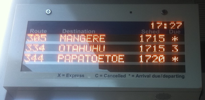
There are new bus prediction boards at some stops (this one is in Newmarket), which show the scheduled time and the estimated time to arrival.

The most obvious benefit of these is that you can verify how the prediction system is unreasonably optimistic for buses still a long way off and then gets more realistic as they approach.  They also make clear how detached from reality the official punctuality statistics are.

Our only source of punctuality data for the 99%+ figures that keep getting reported is the companies themselves, and the definition of punctuality (the bus is no more than 5 minutes late at the start of the route and doesn’t get abducted by aliens on the way) is so useless that (pace Brian Rudman  and others) the companies would hardly need to lie about it.

Given that Auckland Transport thinks it knows where the buses are, it wouldn’t be too hard to switch to a meaningful definition: something like “proportion of specified timetable points where the bus is no more than 5 minutes late or 1 minute early”.  The figures would be lower, but that’s ok.  It’s hard to run buses to a tight schedule through a congested central city, and some of them will be late.  But you’re not going to get on-time arrival at bus stops by monitoring on-time departure at the start of the route.

I’d also note that the new bus prediction boards have missed a big opportunity.  According to the sign, the asterisk indicates that a bus is about to arrive.  Since the sign displays the scheduled time, they could have used the asterisk or some other symbol to indicate that the system didn’t currently have reliably location information for that bus.  It’s obvious that sometimes the system is using actual locations and sometimes it’s just relying on the timetable, and telling us what is going on would make it measurably less annoying when the time counts down to zero and no bus appears.