Posts filed under General (3156)

October 25, 2012

Journalists have to get it from somewhere

A new paper in the (open-access) journal PLoS Medicine looks at ‘spin’ in reporting of scientific findings in the mass media, in press releases, and in the scientific papers underlying the press releases.

They found that the scope or importance of scientific findings were exaggerated in about half the media stories, almost always based on what was in the press release.  That’s not at all surprising.  The interesting part is that ‘spin’ in the press release often followed ‘spin’ in the scientific paper itself.  That is, it’s not just that the scientists cooperate with the university press office, they even exaggerate when writing for other scientists.

This doesn’t exonerate the journalists in cases of science puffery.  In sports, we expect the media to detect and ridicule any attempt to treat an ordinary All Blacks recruit as the second coming of Colin Meads.  They should also be able to tell the difference between a modestly interesting test-tube experiment and a ground-breaking clinical trial.
October 24, 2012

Colorado looks special again

But, unlike last time,  it’s supposed to be.

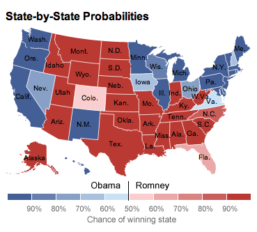
The graph, from Nate Silver’s fivethirtyeight.com, shows the probability of each State (and its Electoral College votes) going to Obama or Romney.  The colour scale makes states near 50% stand out, which is a feature, not a bug. States near 50% are the important ones.

Colorado is dramatically visible because it’s smallest estimated margin that the Republicans have.  It’s also dramatic because it’s surrounded by non-marginal states, which is appropriate.

The only way in which Colorado is inappropriately highly visible is that it’s sparsely populated and so occupies more of the map than its importance to the election result would justify.  That’s a really hard problem to solve with data-based maps: sparsely populated areas do get too much attention, and none of the ways of mitigating this really work.

October 23, 2012

Why is this week unlike every other week?

Researchers frequently want to find out how people behave in a typical day or week.  It turns out, though, that it’s often better to ask them what they did this week, even though this week may be far from typical.

It seems that a ‘typical’ day or week is actually a sort of Platonic ideal rather than a mean or median: in a ‘typical’ week, perhaps you exercise every day, but this particular week you missed a couple of days.  In a ‘typical’ week you eat vegetables every evening, but this particular week there was a social event at work and you didn’t.  In a typical week, you work five days, but this week there was a holiday on Monday.

The graph below shows the distribution of working hours reported for ‘usual’ weeks in two US government surveys and for “last week” in a third survey

People who work a lot tend to report more hours for a ‘usual’ week than last week. People who work less than half time tend to report fewer hours for a ‘usual’ week than last week.

The Washington Post article that provided the graph says that people who claim to work long hours are “lying”, but it’s more complicated than that.  Presumably these are people who ‘typically’ work long hours but reasonably often have to leave work ‘early’ to handle some part of the rest of their lives.  Conversely, the people at the low end of the distribution may have a regular part-time job that provides their ‘usual’ hours of work, but fairly often have over-time or additional jobs so that the average week has more work than a ‘usual’ week.   They aren’t lying, they just aren’t answering the question you thought you wanted to ask.

New earthquake risks

Earthquake forecasting (for everyone except Ken Ring) is difficult, and the accuracy of forecasts (for everyone, including Ken Ring) is low.  Even for relatively predictable faults such as NZ’s Alpine Fault, the margin of error is in decades.

The Italian government has just taken steps to make earthquake forecasting even less accurate.  Six scientists and a government official who failed to forecast that a set of small tremors near Aquila were forerunners of a big, deadly, quake have been sentenced to six years in prison for manslaughter. (Herald, Stuff).  They are still planning an appeal (and the Stuff headline is  wrong) but the courts do not appear to be friendly to the concept of uncertainty.


October 17, 2012

Consenting intellectual S&M activity

That’s how Ben Goldacre described the process of criticism and debate that’s fundamental to science, at a TED talk last year.  At this time of year we expose a lot of innocent young students to this process: yesterday it was the turn of statistical consulting course, next month it’s BSc(Hons) and MSc research projects, and then the PhD students.

Here’s Ben Goldacre’s whole talk


October 16, 2012

Dragon baby boom in NZ?

Back in January, Rachel Cunliffe looked at birth statistics for China as a whole and for Hong Kong, and saw a small ‘dragon baby’ boom for the Year of the Dragon in Hong Kong, but nothing for the whole PRC.

Today, the Herald is seeing a Year of the Dragon boom in Auckland

A support organisation for migrant parents in Auckland is experiencing a baby boom because of a surge in the number of dragon babies born to Chinese parents.

They go on to say

Membership at the Chinese Parents Support Service Trust for new Chinese migrant mothers has reached 200 – and one in four mothers had a dragon baby born this year.

It’s hardly surprising that new Chinese migrant mothers are likely to have a baby born this year — that’s what makes them new mothers.  So what we really have is growth in the number of mothers using the service, and the fact that one in four of these mothers has a child under 9 months, a ‘dragon baby’.

October 12, 2012

Even better than chocolate

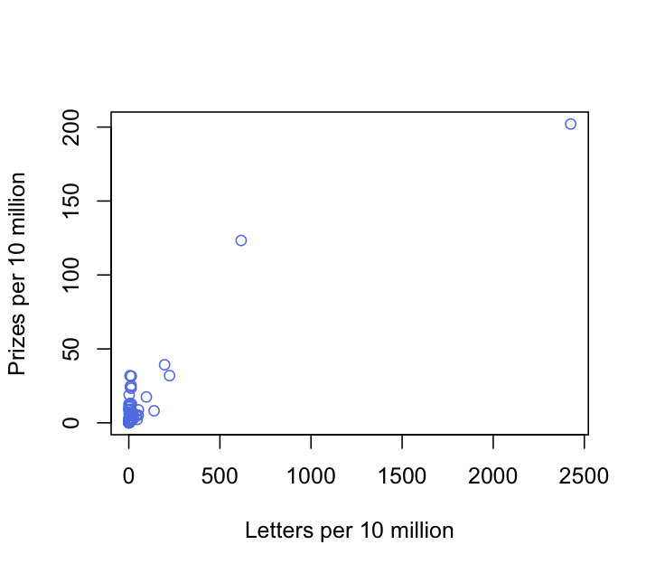
You can do even better than chocolate consumption in finding correlations with Nobel Prizes per capita.  With a few minutes on the Wikipedia entry used by Franz Messerli, I came up with a correlation of 0.921, much better than his 0.721. Here’s the graph (without lots of little flags, sorry)


The number of letters in the country’s name divided by total population is a much better predictor than the total chocolate consumption divided by total population.  Admittedly, changing the name of a country is usually more expensive than just eating more chocolate.

Turning a number into a rate or proportion helps for doing simple comparisons (this has a tag of its own on StatsChat) but simple ratio-based standardisation of two variables can create strong spurious correlations between them, something that medical researchers should be aware of.


October 8, 2012

Real-estate infographics

The Herald has some quite attractive interactive graphics of real-estate prices, but I’m not entirely convinced of their informativeness.  You can see any one of the numbers by pointing at it, but you can’t see two numbers simultaneously, just the binary up/down indicator.

Having a separate category for ‘basically the same’ would help, for example, Christchurch has one red and one green for both median house price and index level, but the increase in median house price is only 0.6% over a year, and the fall since last month is a relatively dramatic 5.7%.  Perhaps the intermediate colour could designate ‘increased less than inflation’, to offset the general resistance to using inflation-adjusted housing prices.

The red and green colours they chose have sufficiently different luminance than they are likely to be distinguishable even if you’re red:green color blind, which is to be commended, but I don’t really like the implication that cheaper housing is bad and more expensive housing is good.  I don’t think the Herald would use red for decreases and green for increases in the price of milk, or petrol, or health care.

October 6, 2012

Statistical interviews

As part of the “Statistical Reasoning” course in biostatistics at Johns Hopkins School of Public Health, John McGready has started a series of interviews with statistical researchers talking about their work.

The victims subjects include Roger Peng and Jeff Leek (who write the Simply Statistics blog), Karen Bandeen-Roche (the head of the department), and Tom Louis (generally famous statistician).


October 5, 2012

What happened when MPs took a maths exam

This just in from the BBC:

Could it be that Labour leader Ed Miliband’s demand that all school pupils must study maths until they are 18 has been prompted by new evidence that his own MPs struggle with numbers?

The man in charge of the party’s policy review, Jon Cruddas, admitted this weekend that he is “barely numerate”. And when the Royal Statistical Society (RSS) recently tested the ability of honourable members to answer a relatively simple mathematical question, only a quarter of Labour MPs got it right.

Read the rest of the yarn here.