Posts filed under Graphics (394)

February 8, 2014

Evils of axis

The UK Statistics Authority, among its other responsibilities, has the job of writing polite but firm letters to government bodies that misuse statistics. Yesterday’s installment is about the UK National Infrastructure Plan, which contains a chart showing how planned and ongoing infrastructure projects (ie, the infrastructure pipeline) are in all sorts of useful areas.

logbar


At least, that’s what it shows if you don’t look closely enough to see the y-axis is in powers of ten. The Statistics Authority thinks

 the chart could leave readers with a false impression of the relative size of investment between sectors. 

and suggests this revision

unlogbar


As a general principle, barcharts are only useful when zero is a relevant value, and since you can’t take the logarithm of zero, log-scale barcharts should never exist.

January 18, 2014

Vaccine-preventable disease outbreaks

The Council on Foreign Relations has built an interactive map showing outbreaks of the major vaccine-preventable diseases since mid-2008, based on news stories. Here’s the local map

vaccine-oznz


The red circles are measles; the green are pertussis; blue are rubella.

There are two big limitations to the use of news stories as the source. The first is obvious from the map. That outbreak of 3500 pertussis cases in Western Australia wasn’t actually among the Ngaanyatjarra people of the Western Desert, where the circle is. It was mostly in Perth, but the story didn’t say that, just “Western Australia”.

The second limitation is that not everything gets reported. Here’s a map of more of the world

vaccine-world


The small orange circles are  polio, and probably include every polio case diagnosed in the world. The larger, yellow circles include cholera and typhoid, and are just big outbreaks. The brown circles are mumps, which only seems to make the news in Europe and the Middle East. And there’s basically no pertussis reported in Africa or South Asia, because it’s underdiagnosed and not really news.

January 9, 2014

Infographic of the week

Via @keith_ng, this masterpiece showing that more searches for help lead to more language. Or something.

badlang

It’s not, sadly, unusual to see numbers being used just for ordering, but in this case the numbers don’t even agree with the vertical ordering.  And several of them aren’t, actually, languages. And the headline is just bogus.

This version, by Kevin Marks (@kevinmarks), at least is accurate and readable.

oklang

but it’s hard to tell how much of Java’s dominance is due to it being popular versus being confusing.

Adam Bard has data on the most popular languages on the huge open-source software repository GitHub. This isn’t quite the right denominator, since Stack Overflow users aren’t quite the same population as GitHub users, but it’s something.  Assigning iOS, Android, and Rails, to Objective-C, Java, and Ruby respectively, and scaling by GitHub popularity, we find that C# has the most StackOverflow queries per GitHub commit; Objective-C and Java have about two-thirds as many.  In the end, though, this data isn’t going to tell you much about either high-demand programming skills or the relative friendliness of different programming languages.


January 7, 2014

NZ electoral visualisations

The first post at the new Hindsight blog is on Chris McDowall’s hexagonal maps of NZ political geography.

hexmap


He also has some slides describing the construction of another visualisation, relating party vote to deprivation index.

How dangerous is the rest of the world?

Both Stuff and the Herald have stories today based on MFAT statistics on consular assistance provided for deaths and accidents overseas.  The basic message is that deaths overseas are increasing.

Both sites have interactive graphics: Stuff has a clicky map, and the Herald has barplots where you can select a country. A very nice feature of the Herald story is that they have more data, and a link to let you download it. They got the data under the Official Information Act, which is an impressive-sounding way of saying they asked MFAT for it (as Graeme Edgeler has pointed out, even ringing up some departmental office and asking what time they’re open is an Official Information Act request.)deaths

From the extended data it’s clear that consular assistance for deaths is up a lot over time. That’s a much bigger increase than the number of trips overseas, and the increase looks pretty similar if you exclude Australia, which is unrepresentative because so many Kiwis actually live there. I don’t have any real idea why this is happening, and apparently neither do the journalists.

It’s interesting to look at how dangerous foreign travel is based on these data.  For Thailand, the story in Stuff quotes 115000 trips and 18 deaths in the 9 months to September 2013. That gives a mortality rate of 0.16 per 1000 trips. The annual mortality rate for New Zealand as a whole is 6.8 per 1000 people per year, but travellers tend to be younger and healthier than average. For twentysomethings, the annual mortality rate is about 0.6 per 1000 per year, so the average trip uses up at most 3 months worth of mortality risk — travelling to Thailand is dangerous, but not very dangerous.   Even then, we can’t be sure that it’s Thailand that is dangerous: other contributing explanations could be that people do riskier things while they are there, or that the sort of people who travel to Thailand are prone to taking more risks.  The figure for all countries is about half that for Thailand, though it’s less reliable because of the difficulty in knowing how to handle Australia.

The figures for deaths while travelling should be fairly reliable — I’d expect most deaths of travellers to require some consular assistance — but the figures for accidents are obviously less complete. That didn’t stop Stuff saying

But according to the figures, deaths far outnumber accidents and injuries for New Zealanders across the globe.

The phrase “according to the figures” is doing a lot of work in that sentence, if you want to be able to say it with a straight face.


Update: Luis Apiolaza tracked down data(XLS) on deaths of visitors to NZ. Mortality is about 0.05-0.07 per 1000 trips. Visitors are safer here than we are abroad.

January 4, 2014

Blowing in the wind

From Cameron Beccario, an interactive visualisation of wind speeds around the world, with your choice of projection, and winds at levels from ground up to the stratosphere.

earth

January 1, 2014

Pretty things

1. Xiaoji Chen (陈晓霁) has graphs of air pollution in some cities in China, spiralling to show the seasons

Urumqi


2. The Cooper-Hewitt collection at the Smithsonian lets you search by colour, with up to five representative colours for each piece

colorsearch


I found this from Chris McDowall’s page that summarises a set of photos by their dominant colours.

tomatocolourtomato


There’s a lot of information loss in reducing a photo to four or five pixels, but finding good ways to reduce information is exactly what statistics is about

December 29, 2013

Some graph links


December 6, 2013

If New Zealand were a village of 100 people ….

… according to the 2013 Census figures,

  • 51 would be female, 49 male.
  • 70 would be European, 14 Maori and 11 Asian.
  • 24 would have been born overseas
  • 21 would have a tertiary qualification
  • 4 would be unemployed.
  • 4 would earn over $100,000

Statistics New Zealand has done a nice graphic of the above, too. Full 2013 Census info available here.


December 5, 2013

Anybody for a slice of PISA?

There has been significant coverage in the press of New Zealand’s slip in the OECD PISA (Programme for International Student Assessment) rankings for mathematics, reading, and science.
We probably should be concerned.

However, today I stumbled across the following chart: OECD PISA Rankings 2006 and 2012 
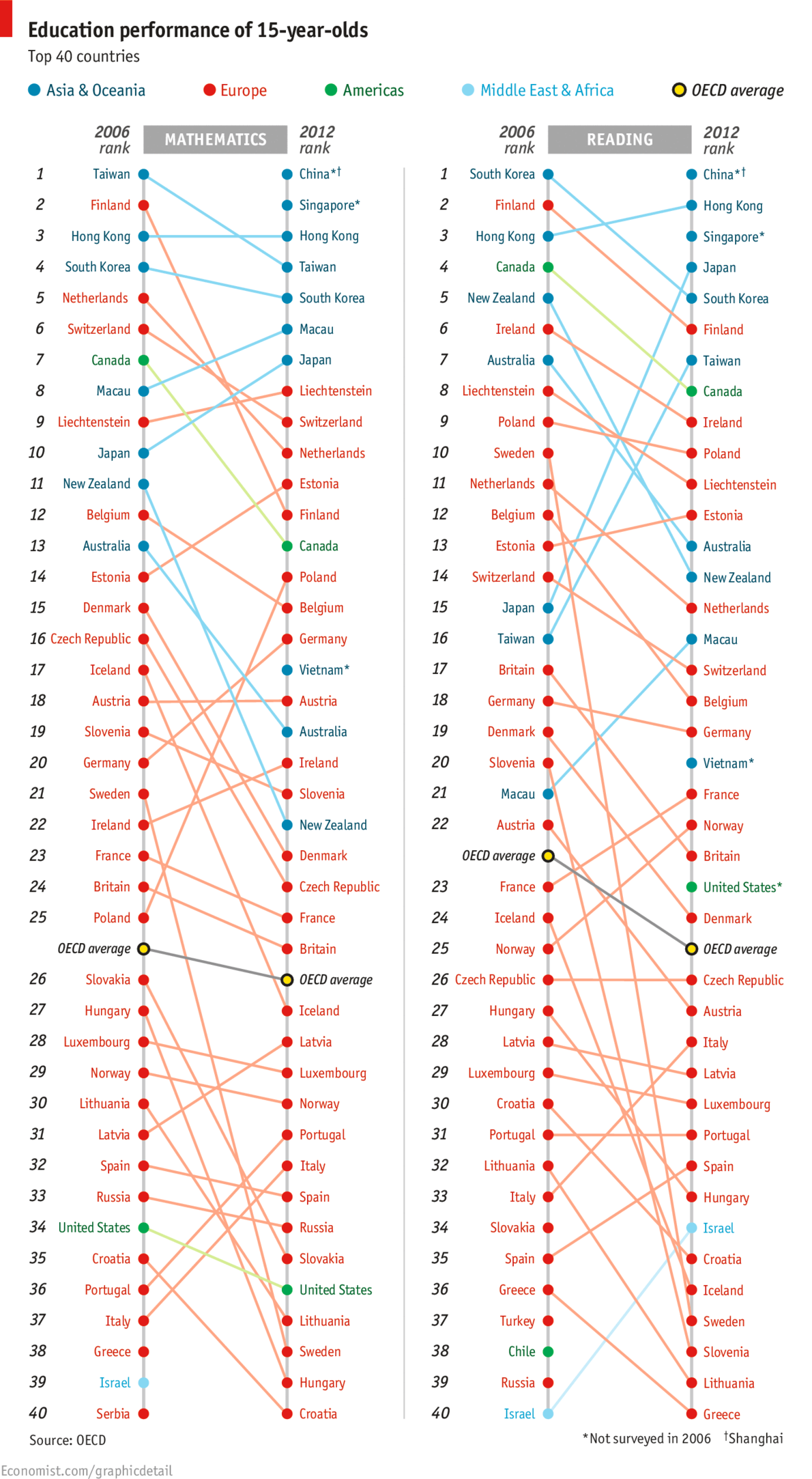
in The Economist. Two things about it struck me. Firstly, part of the change (in the mathematics ranking at least) was driven by the addition of three countries/cities which did not participate in the 2006 round: Shanghai, Singapore, and Vietnam. The insertion of these countries is not enough to explain away New Zealand’s apparent drop, but it does move us from a change of down 11 places to a change of down 8 places. Secondly, I found it really hard to see what was going on in this graph. The colour coding does not help, because it reflects geographic location and the data is not grouped on this variable. Most of the emphasis is probably initially on the current ranking which one can easily see by just reading the right-hand ranked list from The Economist’s graphic. However, relative change is less easily discerned. It seems sensible, to me at least, to have a nice graphic that shows the changes as well. So here it is, again just for the mathematics ranking:
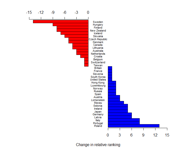
 Changes in PISA rankings for mathematics.

The raw data (entered by me from the graph) has been re-ranked omitting Greece, Israel, and Serbia who did not participate in 2012, and China, Singapore, and Vietnam, who did not participate in 2006. I am happy to supply the R script to anyone who wants to change the spacing – I have run out of interest.

It is also worth noting that these rankings are done on mean scores of samples of pupils. PISA’s own reports have groups of populations that cannot be declared statistically significantly different (if you like to believe in such tests). This may also change the rankings.

Updates:

Professor Neville Davies, Director of the Royal Statistical Society’s Centre for Statistical Education, and Elliot Lawes, kindly sent me the following links:

Firstly a blog article from the ever-thoughtful Professor David Spiegelhalter: The problems with PISA statistical methods

and secondly, a couple of articles from the Listener, which I believe Julie Middleton has also mentioned in the comments:
Education rankings “flawed” by Catherine Woulfe” and Q&A with Andreas Schieicher also by Catherine Woulfe.