Posts filed under Just look it up (283)

February 11, 2016

Anti-smacking law

Family First has published an analysis that they say shows the anti-smacking law has been ineffective and harmful.  I think the arguments that it has worsened child abuse are completely unconvincing, but as far as I can tell there isn’t any good evidence that is has helped.  Part of the problem is that the main data we have are reports of (suspected) abuse, and changes in the proportion of cases reported are likely to be larger than changes in the underlying problem.

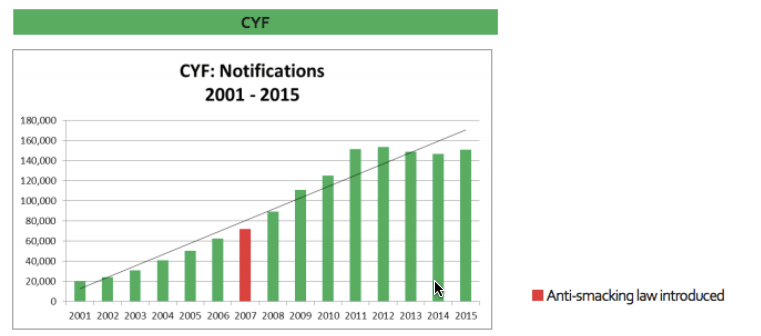
We can look at  two graphs from the full report. The first is notifications to Child, Youth and Family

ff-1

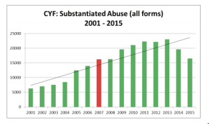
The second is ‘substantiated abuse’ based on these notifications

ff-2

For the first graph, the report says “There is no evidence that this can be attributed simply to increased reporting or public awareness.” For the second, it says “Is this welcome decrease because of an improving trend, or has CYF reached ‘saturation point’ i.e. they simply can’t cope with the increased level of notifications and the amount of work these notifications entail?”

Notifications have increased almost eight-fold since 2001. I find it hard to believe that this is completely real: that child abuse was rare before the turn of the century and became common in such a straight-line trend. Surely such a rapid breakdown in society would be affected to some extent by the unemployment  of the Global Financial Crisis? Surely it would leak across into better-measured types of violent crime? Is it no longer true that a lot of abusing parents were abused themselves?

Unfortunately, it works both ways. The report is quite right to say that we can’t trust the decrease in notifications;  without supporting evidence it’s not possible to disentangle real changes in child abuse from changes in reporting.

Child homicide rates are also mentioned in the report. These have remained constant, apart from the sort of year to year variation you’d expect from numbers so small. To some extent that argues against a huge societal increase in child abuse, but it also shows the law hasn’t had an impact on the most severe cases.

Family First should be commended on the inclusion of long-range trend data in the report. Graphs like the ones I’ve copied here are the right way to present these data honestly, to allow discussion. It’s a pity that the infographics on the report site don’t follow the same pattern, but infographics tend to be like that.

The law could easily have had quite a worthwhile effect on the number and severity of cases child abuse, or not. Conceivably, it could even have made things worse. We can’t tell from this sort of data.

Even if the law hasn’t “worked” in that sense, some of the supporters would see no reason to change their minds — in a form of argument that should be familiar to Family  First, they would say that some things are just wrong and the law should say so.  On the other hand, people who supported the law because they expected a big reduction in child abuse might want to think about how we could find out whether this reduction has occurred, and what to do if it hasn’t.

January 6, 2016

Pay shock vs data

From the Herald, using data from Seek.co.nz: Pay shock: Wellington, not Auckland, is the New Zealand city with the highest advertised salaries.

According to the New Zealand Income Survey, the Wellington region has had the highest median weekly earnings for people in paid employment every year since at least 2007., so the shock should have had time to sink in by now. Looking at NZ.Stat, that’s also true for average weekly earnings.

However, when looking at actual earnings rather than advertisements at one site, Wellington’s percentage lead was only about half as big. And, of course, the actual dollar amounts are lower.

January 4, 2016

Seek and ye shall be disappointed

There’s another Herald story about incomes based on job ads at Seek.co.nz.

Data released by job search company Seek shows outside of consultancy work roles linked to the building industry were paid the most last year and were some of the few sectors to see decent pay rises.

The average salary for the construction industry is now $94,580, a boost of 5 per cent on 2013 while engineers earned an average of $92,595

Stats NZ data isn’t quite as up to date, but the NZ Income Survey, in June, found average weekly earnings in the construction industry to be $1096 (go here, and select ‘Construction’ from ‘Industry’), up about 1% from 2013 (though 5% from 2014). If you assume a full-time job with holidays, that’s $57,000 per year.

I don’t know how much of this is due to different definitions and how much is due to the Seek jobs being non-representative, but it’s possible for anyone who really cares to find out exactly what the Stats NZ number means, and that’s not true for the Seek number.


November 10, 2015

Unwise baby name claims

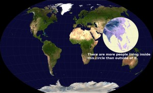
You’ve probably seen this map from Reddit: more people live inside the circle than outside it

CK6aONG

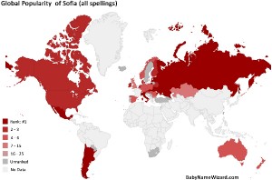
Another map, at Stuff, claims to show the countries where “Sofia” and its variants ranks high as a name for new babies

bnw

Based on these rankings, we get

“The numbers have been crunched and the results are in. Forget John, Mohammed, Charlotte or Olivia: the most popular baby name in the world right now is Sofia.”

You can see from the map that more than half the world’s population is in countries labelled “No Data”. In fact, more than half the world’s population, plus Brazil and all of Africa. “Sofia” is the most popular baby name the way L&P is world famous in New Zealand.

But that’s not the worst bit. The first line of the story said “Forget John, Mohammed, Charlotte or Olivia”. The statistics on the map and on the linked website are for Sofia as a popular name for girls. Boys’ names aren’t in the comparison — Stuff did just ‘forget’ John and Mohammed.

You’ve got to respect Laura Wattenberg of BabyNameWizard, who does a great job getting her website into the news. Sites that take this sort of story and exaggerate it into obviously unfounded headline news, maybe not so much respect.


October 8, 2015

He’s a lumberjack and he’s inconsistently counted

Official statistics agencies publish lots of useful information that gets used by researchers, by educators, by businesses, by journalists, and (with the help of groups like Figure.NZ) by everyone else.  A dilemma for these agencies is how to handle changes in the best ways to measure something. If you never change the definitions you get perfectly consistent reports of no-longer-useful information. If you do change the definitions, things don’t match up.

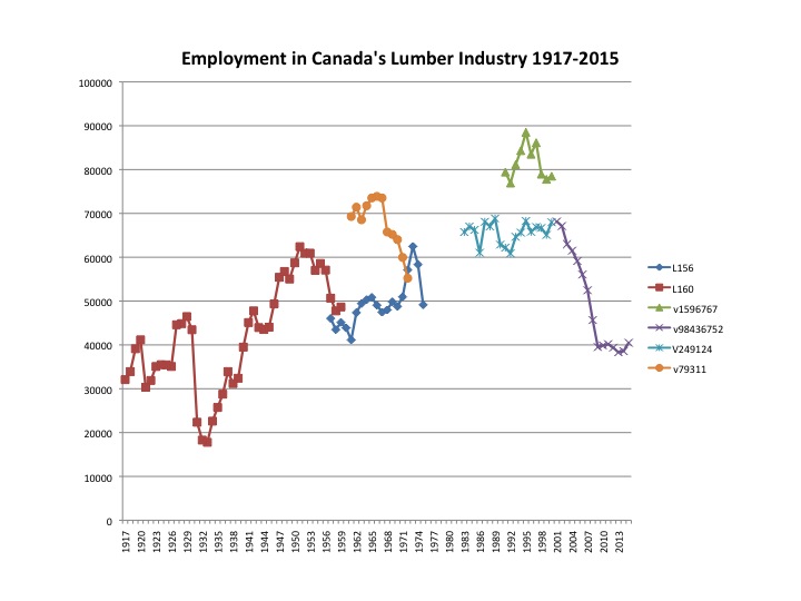
This graph is from a blog post by a Canadian economist, Liveo Di Matteo. It shows the number of Canadians employed in the lumber industry over time, patched together from several Statistics Canada time series.

6a00d83451688169e201b8d155a38a970c

Dr Di Matteo is a professional, and wasn’t trying to do anything subtle here — he just wanted a lecture slide — and a lot of this data was from the time when Stats Canada was among the best in the world, so it’s not a problem that’s easy to avoid. It’s just harder than it sounds to define who works in the lumber industry. For example, are the log drivers in the lumber industry, or are they something like “transport workers, not elsewhere classified”?


September 30, 2015

Three strikes: some evidence (updated)

Update: the data Graeme Edgeler was given didn’t mean what he (reasonably) thought they meant and this analysis is no longer operative. There isn’t good evidence that the law has any substantial beneficial effect.  See Nikki Macdonald’s story at Stuff and Graeme’s own post at Public Address.

The usual objection to a “three-strikes” law imposing life sentences without parole, in addition to the objections against severe mandatory minimums, is

  • It doesn’t work; or
  • It doesn’t work well enough given the injustice involved; or
  • There isn’t good enough evidence that it works well enough given the potential for injustice involved.

New Zealand’s version of the law is much less bad than the US versions, but there are still both real problems, and theoretical problems (robbery and aggravated burglary both include crimes of a wide range of severity).

Graeme Edgeler (who is not an enthusiast for the law) has a post at Public Address arguing that there is, at least, evidence of a reduction in subsequent offending by people who receive a first-strike warning, based a mixture of published data and OIA requests.

Here’s his data in tabular form, showing second convictions for offences that would qualify under the three-strikes law. The red cell is ‘first strike’ convictions, the other rows did not count as strikes because the law isn’t retrospective.

Offence Conviction Number Second conviction Number
7/05-6/10 7/05-6/10 6809 7/05-6/10 256
Before 7/10 7/10-6/15 2437 7/10-1/15 300
7/10-6/15 7/10-6/15 5422 7/10-6/15 81


The first and last rows are directly comparable five-year periods. Offences that now qualify as ‘strikes’ are down 20% in the last five-year period; second convictions are down a further 62%. Data in the middle row isn’t as comparable, but there is at least no apparent support for a general reduction in reoffending in the last five-year period.

The overall 20% decrease could easily be explained as part of the long-term trends in crime, but the extra decrease in second-strike offences can’t be.  It’s also much larger than could be expected from random variation. The law isn’t keeping violent criminals off the streets, but it does seem to be deterring second offences.

Reasonable people could still oppose the three-strikes law (and Graeme does) but unless we have testable alternative explanations for the large, selective decrease, we should probably be looking at arguments that the law is wrong in principle, not that it’s ineffective.


September 28, 2015

Seeing the margin of error

A detail from Andrew Chen’s visualisation of all the election polls in NZ:

polls

His full graph is somewhat interactive: you can zoom in on times, select parties, etc. What I like about this format is how clear it makes the poll-to-poll variability.  The poll result for, say, National isn’t a line, it’s a cloud of uncertainty.

The cloud of uncertainty gets narrower for minor parties (as detailed in my cheatsheet), but for the major parties you can see it span an entire 10-percentage-point grid cell or more.

September 26, 2015

US:China graph of the day

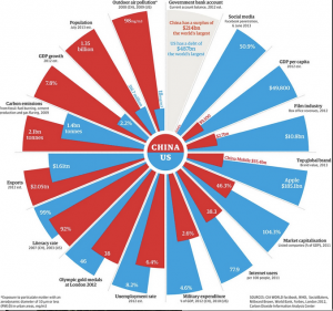
This (via @albertocairo) is from the Guardian, two years ago.

china

At first it looks like a pie chart, but it isn’t. It’s a set of bar charts warped into a circle, so that the ratio of blue and red areas in a wedge is the square of the ratio of the numbers. Also, the circle format means the longest wedge in each pair must be the same length: 8.6% unemployment rate is the same as 4.6% military expenditure, 104% market capitalisation, and 46 Olympic gold medals.

Many of these are proportions or per-capita figures, but not all. Carbon emissions are national totals, making China look worse. Film industry revenues and exports are totals; they are also gross revenues — because the whole visual metaphor falls apart completely for numbers that can be negative. That’s why the current-year budget surplus/deficit isn’t treated like the other numbers.

There are also some unusual definitions. “Social media”, the bar where China is furthest behind, is defined just by the proportion who use Facebook, which obviously underestimates the social-media activity of the US (and also, perhaps, of China).

The post has some discussion of the difficulties — for example, the measurement and even the definition of unemployment in the two counties — and is much better than the graph.

Here’s a different take on the same countries, in the same format, from the World Economic Forum

uschina-949x1024

They have similar problems with total vs proportion/mean variables. They solve the y-axis problem by working with international ranks, which at least gives a common scale. However, having 1 as the largest rank and some unspecified large number as the smallest rank does make the relationship between area and number fairly weird.  It also means that the actual numbers for each wedge aren’t fractions of a total in any sensible way.

If the main point is to be an eye-catching hook for the story, the Guardian graph is more successul

September 16, 2015

How many immigrants?

Before reading on, what proportion of New Zealand residents do you think were born overseas? (more…)

September 7, 2015

Some refugee numbers

First, the Gulf States. It has been widely reported that the Gulf States have taken zero refugees from Syria.  This is by definition: they are not signatories to the relevant UN Conventions, so people fleeing to the Gulf States do not count as refugees according to the UNHCR. Those people still exist. There are relevant questions about why these states aren’t signatories, and about how they have treated the (many) Syrians who fled there,  and about whether they should accept more people from Syria, and about their humanitarian record in general. The official figure of zero refugees isn’t a good starting point, though.


Second, New Zealand. The Government has announced an increase in the refugee quota, but the announcement is a mixture of annual figures and figures added up across two and a half years. It would be clearer if the numbers used the same time period.

The current quota is 750 per year. Over the next 2.5 years that would be 1875 people. We are increasing this by 600, to 2475.  The current budget is $58 million/year. Over the next 2.5 years that would be $145 million. We are increasing this by an estimated $48 million, to $193 million. Either by numbers or by dollars, this is about a 1/3 increase.