Posts filed under Just look it up (285)

May 23, 2014

Is Roy Morgan weird?

There seems to be a view that the Roy Morgan political opinion poll is more variable than the others, even to the extent that newspapers are willing to say so, eg, Stuff on May 7

The National Party has taken a big hit in the latest Roy Morgan poll, shedding 6 points to 42.5 per cent in the volatile survey.

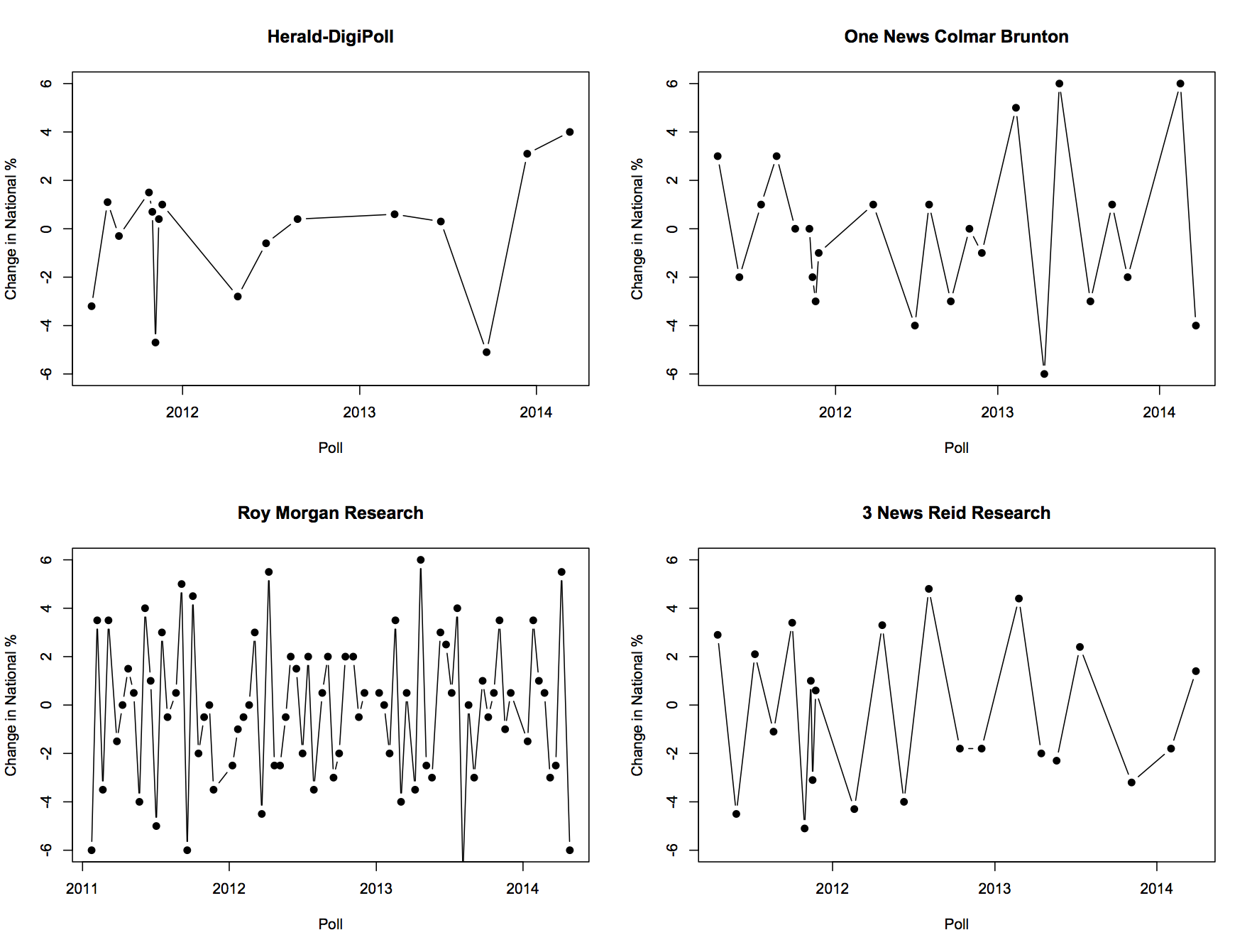
I was asked about this on Twitter this morning, so I went to get Peter Green’s data and aggregation model to see what it showed. In fact, there’s not much difference between the major polling companies in the variability of their estimates. Here, for example, are poll-to-poll changes in the support for National in successive polls for four companies

fourpollers


And here are their departures from the aggregated smooth trend

boxpollers


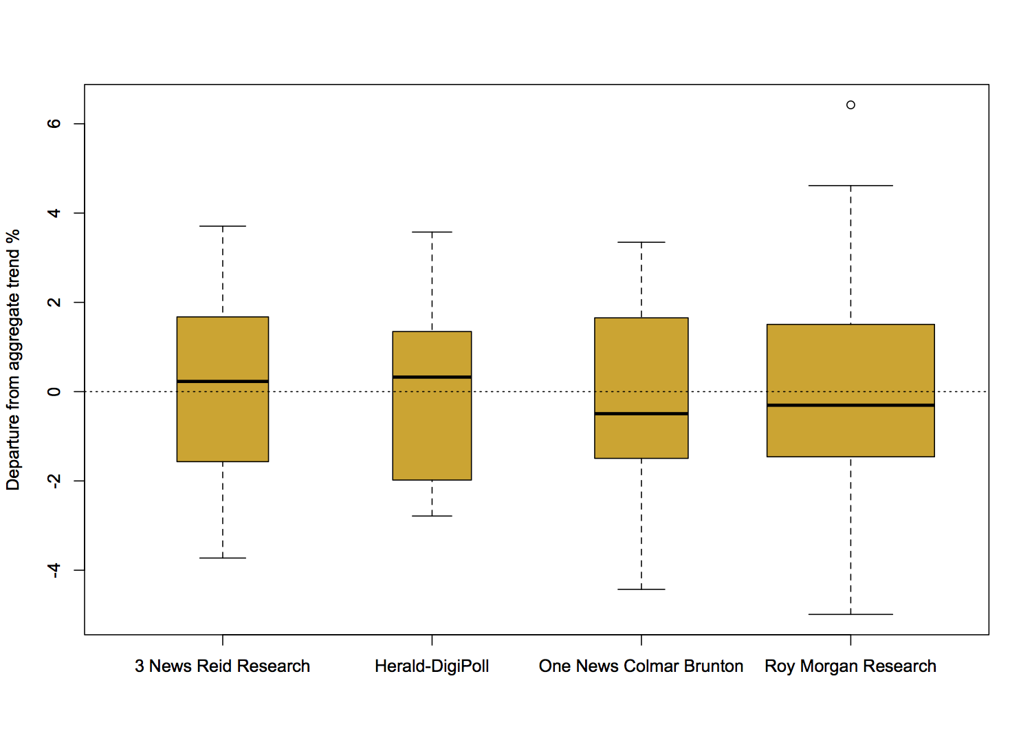
There really is not much to see here. So why do people feel that Roy Morgan comes out with strange results more often? Probably because Roy Morgan comes out with results more often.

For example, the proportion of poll-to-poll changes over 3 percentage points is 0.22 for One News/Colmar Brunton, 0.18 for Roy Morgan, and 0.23 for 3 News/Reid Research, all about the same, but the number of changes over 3 percentage points in this time frame is 5 for One News/Colmar Brunton, 14 for Roy Morgan, and 5 for 3 News/Reid Research.

There are more strange results from Roy Morgan than for the others, but it’s mostly for the same reason that there are more burglaries in Auckland than in the other New Zealand cities.

Distrust the center

Automated location information can be very useful, but if the ‘location’ is an area and the automated result is a single point, it’s easy to get misled.

May 21, 2014

Explaining income tax shares

Following up on the “net tax” tangle, Keith Ng has a step by step explanation of how income tax and income distribution has changed over recent years in NZ.

You can also play with the visualisation yourself. Or, if you want to see the arguments about it, they’ll be on his Public Address post.

May 15, 2014

Budget visualisation

Keith Ng has his annual interactive graphic of budget changes up at Public Address, and will soon have a graphic showing how overall forecasts have changed over time.

[update] And Harkanwal Singh has his version up at the Herald

May 12, 2014

Resources in education

Attention conservation notice: I have to write this post because I’ve spent too much time on it otherwise. You don’t have to read it.

There was an episode of “Yes, Prime Minister” where the term “Human Resource Rich Countries” was being posed as a replacement for “Less Developed Countries”, meaning “poor”. “Resources” is a word that can mean lots of different things, which is why I spent more time than was strictly sensible investigating the following graph

Bm2xm_8CcAAAcK1


The graph appeared in my Twitter feed last Monday. It’s originally from a campaign to give Australia a school funding model a bit more like NZ’s decile system, as recommended by a national review panel, so it is disturbing to see New Zealand almost at the bottom of the world.

(more…)

Big savings in super?

Via Stuff and the DimPost

Tens of thousands of well-off pensioners are claiming up to half a billion dollars in superannuation every year.

With government debt at more than $60 billion, critics say the wealthy are asking their children and grandchildren to fund their so-called retirement.

Ministry of Social Development figures revealed more than 26,000 people with total income of more than $70,000 a year claimed superannuation last year. At current rates, this could add up to $570m a year before tax..

From last year in the Herald via me

Imagine the public outrage if it were discovered that more than 80,000 New Zealanders were receiving wages, salaries and investment incomes of more than $6 billion a year, but were also receiving a benefit from the Government.

Income figures this week from Statistics NZ show more than 80,000 New Zealanders over the age of 65 receive wages, salaries and investment returns of more than $6.5 billion a year while claiming NZ Super.

The benefits to those 80,000-plus seniors are costing poorer taxpayers at least $1.3 billion a year. Many of these beneficiaries will be retired judges, politicians, chief executives, doctors, diplomats and lawyers who are well able to look after themselves.

It seems the problem is only half as bad now, without any policy changes.  Either that, or people really don’t know where they would like to draw the line.

May 8, 2014

Where to see NZ data

Today, Wiki New Zealand came to our department to talk about their work.  I mentioned them in late 2012 when they first went live, but they’ve developed a lot since then.

The aim of Wiki New Zealand is to have ALL THE DATAS about New Zealand in graphical form, so that people who aren’t necessarily happy with spreadsheets and SQL queries can browse the information. Their front page at the moment has data on cannabis use, greenhouse gas emissions,  wine grape and olive plantings, autism, and smoking.

 Check them out. 

Where would they get that impression?

From Stuff: “New Zealand’s worst air is not where you think“.  That’s not actually true. New Zealand’s worst air, according to the story, is pretty much where I thought it would be, in coastal Canterbury and Otago.  However, if you search the Stuff website for the term “air pollution”, you get:

airpollution-search


So if you expected Auckland to be the worst, you know who to blame.

May 6, 2014

Animal testing in New Zealand

Wiki New Zealand, which has information on all sorts of things, has a graph showing animal use for research/testing/teaching in NZ over time.  The data are from the annual report (PDF) of the National Animal Ethics Advisory Committee.

Here’s a slightly more detailed graph showing types of animals and who used them, over time.

animals


It’s also important to remember that nearly all the livestock and domestic animals weren’t harmed significantly — research on things like different feed or stocking densities still counts.  Most of the rodents and rabbits ended up dead, as did about a third of the fish.

The two big increases recently are commercial livestock (most of which are no worse off than they would be anyway as livestock) and fish at universities. The increase in fish is probably due at least in part to substitution of zebrafish for mice in some biological research.

No, I don’t know what the government departments did with 40000 birds in 2009. [Update: thanks to James Green in comments, I now do. I]


[Update: here’s the data in accessible form]

May 4, 2014

False, but not misleading

An infographic tweeted by Bill Gates recently on the world’s deadliest animals
00


He’s trying to make the point that malaria is a really big deal, killing more people than human violence, which is true, and which is the impression from the infographic, so it’s not misleading in that sense.

However, mosquitos don’t rend people limb from limb. The mosquito deaths are due to mosquitos infecting people with malaria parasites. The human deaths, however, are just directly due to violence. If  he’d included deaths due to human-human transmission of infection (influenza, tuberculosis, HIV, …), humans would easily be at the top of the list again.