Causation, correlation, and gaps
It’s often hard to establish whether a correlation between two variables is cause and effect, or whether it’s due to other factors. One technique that’s helpful for structuring one’s thinking about the problem is a causal graph: bubbles for variables, and arrows for effects.
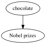
I’ve written about the correlation between chocolate consumption and number of Nobel prizes for countries. The ‘chocolate leads to Nobel Prizes’ hypothesis would be drawn like this:
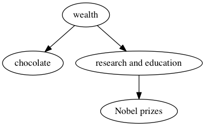
One of several more-reasonable alternatives is that variations in wealth explain the correlation, which looks like
As another example, there’s a negative correlation between the number of pirates operating in the world’s oceans and atmospheric CO2 concentration. It could be that pirates directly reduce atmospheric CO2 concentration:
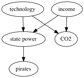
but it’s perhaps more likely that both technology and wealth have changed over time, leading to greater CO2 emissions and also to nations with the ability and motivation to suppress piracy:
The pictures are oversimplified, but they still show enough of the key relationships to help with reasoning. In particular, in these alternative explanations, there are arrows pointing into both the putative cause and the effect. There are arrows from the same origin into both ‘chocolate’ and ‘Nobel Prizes’; there are arrows from the same origins into both ‘pirates’ and ‘CO2‘. Confounding — the confusion of relationships that leads to causes not matching correlations — requires arrows into both variables (or selection based on arrows out of both variables).
So, when we see a causal hypothesis like this one:
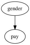
and ask if there’s “really” a gender pay gap, the answer “No” requires finding a variable with arrows into both gender and pay. Which in your case you have not got. The pay gap really is caused by gender.
There are still interesting and important questions to be asked about mechanisms. For example, consider this graph
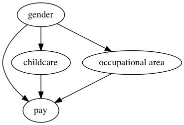
We’d like to know how much of the pay gap is direct underpayment, how much goes through the mechanism of women doing more childcare, and how much goes through the mechanism of occupations with more women being paid less. Information about mechanisms helps us think about how to reduce the gap, and what the other costs of reducing it might be. The studies I’ve seen suggest that all three of these mechanisms do contribute, so even if you think only the direct effects matter there’s still a problem.
You can also think of all sorts of things and stuff I’ve left out of that graph, and you could put some of them back in
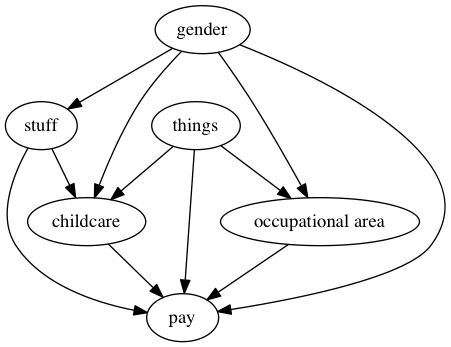
But you’re still going to end up with a graph where there are only arrows out of gender. Women earn less, on average, and this is causation, not mere correlation.