May 23, 2020

The MMP threshold

MMP is, in many ways, a beautiful voting system.  As implemented in New Zealand it’s got one feature that complicates voting slightly and complicates forecasting a lot: the threshold.

In TVNZ’s Colmar Brunton poll, the Greens got 4.7% of the vote. The threshold is 5%. Getting 4.7% of the vote in an election would mean you don’t get any seats.   The margin of error that TVNZ were stating was +/- 3%, so based just on that, the Greens were basically 50:50 on whether they make the threshold.

At that level it also potentially makes a big differences how you treat the undecided voters, who made up 16% of responses. The person who pointed this out to me thought that the 16% had been left as a separate group, which you might easily think from the TVNZ web post on the poll.  But if you do the arithmetic, the parties’ quoted percentages add up to 100 (give or take rounding error), so the percentages were of those who expressed a preference.  Only 4.1% of the respondents actually said “Green”.

Normally, you don’t have to worry about this because tiny changes in preferences will only produce small changes, if any, in the number of seats. But going from 4.99% to 5.00% takes you from no seats to several (I think six) seats. Predicting the make-up of Parliament gets hard when there are parties close to the threshold.

Given the sensitivity of the results to small changes, I think the website (if not the actual news segment) should be more explicit about how undecided voters are handled in the seat projection.  And making statements about whether a party is in or out of Parliament should have a bit more explicit uncertainty when it could be wrong by six seats with minute changes in voting.

On the TVNZ website, the report says ACT, assuming it wins an electoral seat, would pull in three MPs with its 2.2% support”, and if National’s gift of Epsom to David Seymour is enough of an uncertainty to require an explicit caveat, so is being a few voters per thousand away from the threshold. 
May 17, 2020

Premature publicity

One of the features of the COVID pandemic is the near-elimination of delays in making scientific data available.  Everyone is moving to releasing preprints, and they’re that more rapidly than they did in the past.  In many ways this is great, but it does mean things can get publicised faster than they can get evaluated.

Two examples: one from a preprint, one from a press release

The preprint: There’s a headline in the Herald: Landmark study: Virus didn’t come from animals in Wuhan market. That’s a pretty big claim. So where did the Herald get  it? The Daily Mail on Sunday.  The Mail got it from a preprint that was uploaded a couple of weeks ago.   Most readers of the Mail and the Herald (including me) won’t be in a position to evaluate the credibility of the work. Because it sounds like it feeds into the whole quagmire of conspiracy theories and hoaxes around COVID origin, you’d really want to see some independent expert comment on the story. Writing a story like this  with quotes from the authors but no independent comments seems a bit irresponsible.

The press release: The Herald headline is Covid 19 coronavirus ‘cure’? US biotech company claims it’s found antibody to block virus. The CEO of the company is quoted as saying

“We want to emphasise there is a cure,’ Sorrento’s CEO, Dr Henry Ji, told Fox News.

“There is a solution that works 100 per cent. If we have the neutralising antibody in your body, you don’t need the social distancing. You can open up a society without fear

This is not normal.  “Works 100 per cent” is not something biotech CEOs go around saying about a product when they’re still trying to get FDA approval — and they haven’t actually tested the product in any humans.  Presumably the idea now is that it’s worth the risk of annoying the FDA if you get enough public interest. And since human tests have a nasty habit of not working nearly as well as lab tests, being able to sell your product without them is attractive.

The basic idea is sensible: using well-chosen synthetic antibodies rather than getting your body to make its own. In particular, they start working right away, where vaccines only start the process of getting your immune system to make antibodies. Also, some antibodies can have harmful effects, and you can avoid using those.  They’ll need to be administered by injection, and repeated as your body gets rid of them — synthetic (‘monoclonal’) antibodies for other conditions seem to mostly be given every 2-4 weeks. But, again, publishing a claim of a cure when it has not yet been shown to have any benefit at all in real live people, without any independent commentary is not best practice.

May 15, 2020

Test accuracy

There’s a new COVID case from the Marist College cluster today.  The person previously tested negative, but had been in isolation (perhaps, though the Herald doesn’t say, because of the combination of symptoms and being a contact).  Now that we have plenty of testing capacity there has been follow-up testing of some clusters as well as testing of some apparently healthy people in high-risk jobs.

From what I’ve seen on social media, this has led some more people to find out about the false negative rates of the current tests.  It’s not a secret that the swab+PCR test we use in NZ misses maybe a third of infections (because there isn’t enough virus on the swab), though it hasn’t exactly been emphasised.  So, how is this acceptable? Well, “acceptable” depends on the alternative. It’s the best test we have. Researchers (and companies) are working on better ones, and things are likely to improve over time, as they did with HIV testing.  If you’ve been in contact with a case and have COVID-like symptoms and test negative, you’re still going to need to isolate until you recover.  That, plus the fact that the testing does pick up the majority of cases, means a test/trace/isolate strategy, done right, should be nearly enough to control an outbreak that’s caught early.

The current tests give basically no false positives. That’s really helpful for a test/trace/isolate strategy — we’ve done 200,000 tests, and if, say, 5% of them were false positives, that would be another 10,000 cases. Before counting all the contacts of those 10,000 people.  The low false positive rate also means the health system can say, “yes, you need to get tested”,  and then after a positive results, “yes, you absolutely must stay home”, “yes, you need to tell us about all the places you’ve been, even if some of them are embarrassing or illegal”.

There’s another testing-accuracy story in the New York Times, unhelpfully headlined Coronavirus Testing Used by the White House Could Miss Infections. It turns out that they don’t mean that it could miss infections the way all the other tests do; they mean it could miss infections that other tests detect.  The test in question is a portable testing machine from Abbott that takes only 5 minutes to process a sample, quite a bit faster than the standard testing systems.  Researchers from a testing lab at New York University’s Langone Medical Center (who liked the idea of a faster test, given the number of tests they perform) did comparisons to the machines they are currently using and published a PDF about it– some tests on the same swabs and some on different swabs taken at the same time from the patient.  They say the Abbott machine missed 1/3 (out of 15) or 1/2 (out of 30) samples where the current machine found the virus.

Abbott, on the other hand, said their evaluations showed 0.02% false negative rate.

You might wonder how two evaluations could be so different: one false negative in 50,000 samples vs 5 in 15 samples?  As usual, when two numbers don’t fit, it’s probably because they don’t mean the same. Abbott will have been referring to an estimated false negative rate in viral samples with a known virus concentration — an evaluation of the assay itself.  The NYU researchers are talking about live clinical use in samples where they know the virus is present in the swab.  And when we talk about false negatives in the NZ sampling system, we’re talking about samples where the virus probably isn’t present in the swab.

Abbott argue that the NYU researchers were using the machine incorrectly. That could be true, but it’s only reassuring to the extent that you think the White House will be better at it than a pretty highly regarded New York hospital and research centre.

May 7, 2020

Prediction is hard

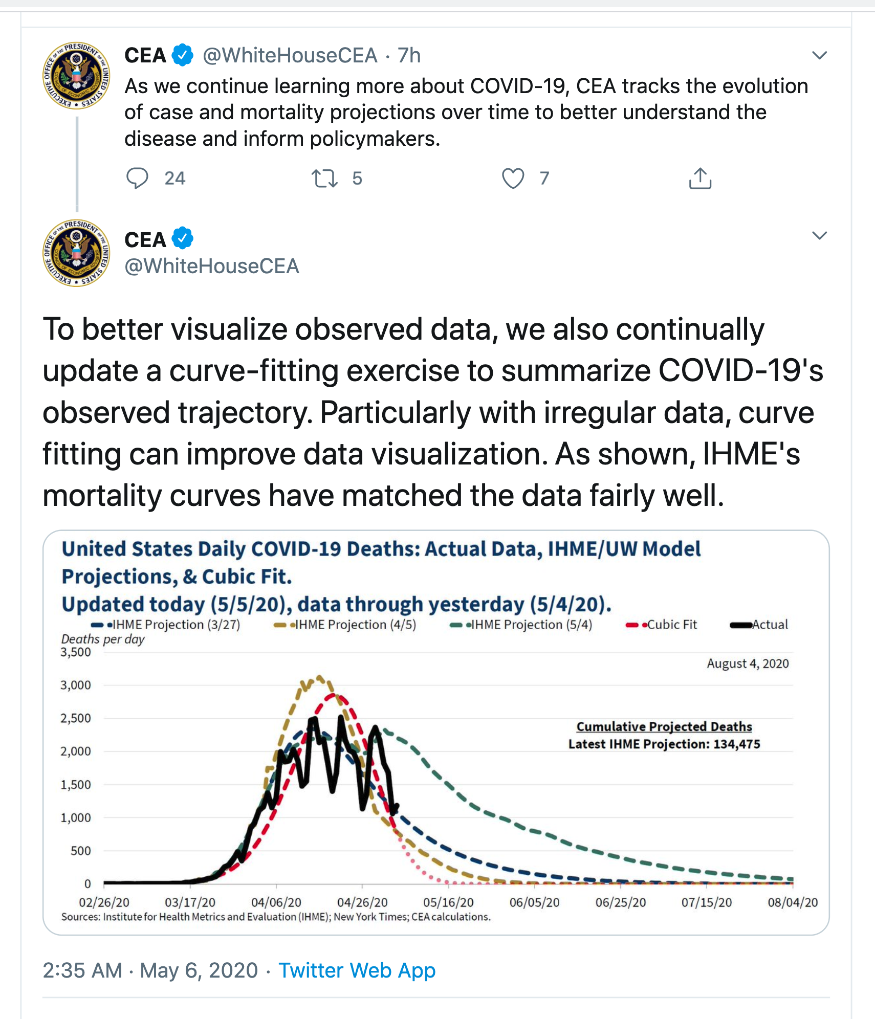
From the Twitter account of the White House Council of Economic Advisors

From the Washington Post

Even more optimistic than that, however, is the “cubic model” prepared by Trump adviser and economist Kevin Hassett. People with knowledge of that model say it shows deaths dropping precipitously in May — and essentially going to zero by May 15.

The red curve is, as the Post says, much more optimistic. None of them look that much like the data — they are all missing the weekly pattern of death reporting — but the IHME/UW model now predicts continuing deaths out until August.  Even that is on the optimistic side: Trevor Bedford, a virologist at the University of Washington who has been heavily involved with the outbreak says he would expect a plateau lasting months rather than an immediate decline.  Now, disagreement in predictions is nothing new and in itself isn’t that noteworthy.  The problem is what the ‘cubic model’ means.

Prediction, as the Danish proverb says, is hard, because we don’t have any data from the future.  We can divide predictive models into three broad classes

  • Models based on understanding the actual process that’s causing the trends.  The SIR models and their extensions, which we’ve seen a lot of in NZ, are based on a simplified but useful representation of how epidemics work.  Weather forecasting works this way. So do predictions of populations for each NZ region into the future.
  • Models based on simplifying and matching previous inputs.  When Google can distinguish cat pictures from dog pictures, it’s because it has seen a bazillion of each and has worked out a summary of what cat pictures and dog pictures look like. It will compare your picture to  those two summaries and see what matches best.  Risk models for heart disease are like this: does your data look like the data of people who had heart attacks. Fraud risk models for banks, insurance companies, and the IRD work this way. It still helps a lot to understand about the process you’re modelling, so you know what sort of data to put in or leave out, and what sort of summaries to try to match.
  • Models based on extrapolating previous inputs.  In business and economics you often need predictions of the near future.  These can be constructed by summarising existing recent trends and the variation around them, then assuming the trends and variation will stay roughly the same in the short term.  Expertise in both statistics and in the process you’re predicting is useful, so that you know what sorts of trends there are and what information is available to model them. A key part of these time-series models is getting the uncertainty right, but even when you do a good job the predictions won’t work when the underlying trends change.

The SIR epidemiology models that you might have seen in the Herald are based on knowledge of how epidemics work.  The IHME/UW models are at least based on knowledge of what epidemics look like. The cubic model isn’t.

The cubic fit is a model of the second type, based just on simplifying and matching the available data.  It could be useful for smoothing the data — as the tweet says, “with irregular data, curve fitting can improve data visualization”.  In particular, the weekly up-and-down pattern comes from limitations in the death reporting process, so filtering it out will give more insight into current trends.

The particular model that produces the red curve is extremely simple (Lucy D’Agostino McGowan duplicated it).  If you write t for day of the year, so t starts at 1 for January 1, the model is

log(number of deaths + 0.5) = -0.0000393× t3 +0.00804× t2 -0.329×t – 0.865

What you can’t do with a smoothing/matching model like this is to extrapolate outside the data you have.  If you have a model trained to distinguish cat and dog pictures and you give it a picture of a turkey, it is likely to be certain that the picture is a cat, or certain that the picture is a dog, but wrong either way.  If you have a simple matching model where the predicted number of deaths depends only on the date, and the model matches data from dates in March and April, you can’t use it to predict deaths in June. The model has never heard of June. If it gets good predictions in June, that’s entirely an accident.

When you extrapolate the model forward in time, the right-hand side becomes very large and negative, so the predicted number of deaths is zero with extreme certainty.  If you were to extrapolate backwards in time, the predicted number of deaths would explode to millions and billions during December. There’s obviously no rational basis for using the model to extrapolate backwards into December, but there isn’t much more for using it to extrapolate forward — nothing in the model fitting process cares about the direction of time.

The Chairman of the Council of Economic Advisers until the middle of last year was Dr Kevin Hassett (there’s no Chairman at the moment). He’s now a White House advisor, and the Washington Post attributes the cubic model to him.  Hassett is famous for having written a book in 1999 predicting that the Dow Jones index would reach 36,000 in the next few years.  It didn’t — though he was a bit unlucky in having his book appear just before the dot-com crash.  Various unkind people on the internet have suggested a connection between these two predictive efforts.  That’s actually completely unfair.  Dow 36,000 was based on a model for how the stock and bond markets worked, in two parts: a theory that stocks were undervalued because of their relative riskiness, and a theory that the markets would realise this underpricing in the very near future.  The predictions were wrong because the theory was wrong, but that’s at least the right way to try to make predictions. Extrapolating a polynomial isn’t.

May 6, 2020

At risk

We often hear groups of people described as ‘high risk’ in the context of COVID.  The problem is that this means three different things, and they often aren’t distinguished clearly

  • People who have a relatively high exposure to coronavirus, so they are more likely to catch it: nurses, doctors, supermarket staff, police (high probability)
  • People who are more likely to get seriously sick if they do become infected: elderly, immunocompromised, people with chronic lung disease (high consequence)
  • People who are more likely to spread the infection if they get it. Some overlap with the first group, but also migrant workers, prisoners, and at least in the US, meat processing workers. (high transfer)

The second group are very different from the others. Suppose you were doing intensive testing to try to see if there was undetected community transmission of COVID.  You’d definitely want to test the first group, because that’s where you’re most likely to find the virus, and you might want to test the last group, because missing it there would be serious (as it was in Singapore).  You might well not go after the second group, because the safest thing for them is isolation — having a bunch of health workers barge in and stick swabs up their noses is unpleasant and possibly risky.  You’d absolutely want to test the second group if there was any indication of symptoms or exposure, but not just in the ordinary course of business.  The three groups are different.

Even Cory Doctorow confused the first and second groups a bit, in his rant about the risks of contact-notification apps

The proximity sensing they do is going to miss out on people who don’t have smartphones and/or don’t have the technological savvy to install them. That overlaps broadly with the most at-risk groups: elderly people and poor people.

Epidemiology is a team sport and the most vulnerable people are the MVPs on the team. “Our app will tell you if you came in contact with an infected person (but not if that person is from the most likely group of infected people)” is a fundamentally broken premise.

Elderly people are a ‘high consequence’ group — infection is serious for them. They aren’t a ‘high probability’ group — there’s no special reason why elderly people in the community would be more likely to get infected (or in residential facilities, if good care is taken)

May 5, 2020

NZ net excess mortality

Nice story by Farah Hancock at Newsroom, on NZ mortality data.

In places with less successful control of COViD-19, there has been a spike in deaths confirmed as due to coronavirus, and also a spike in other deaths.  In New Zealand, there hasn’t been — there isn’t any clear excess over the average for the time of year.  There undoubtedly have been deaths due to coronavirus, but there have also been deaths prevented by the lockdown (on the roads, for example), and there may well have been deaths caused by the lockdown (eg, people not getting heart attacks treated promptly), but the overall trends are spectacularly unlike those in New York City, which has not quite twice the population of New Zealand and over 20,000 net excess deaths.

There’s still plenty of time for NZ to catch up to outbreaks in other parts of the world. Let’s not do that.

May 3, 2020

What will COVID vaccine trials look like?

There are over 100 potential vaccines being developed, and several are already in preliminary testing in humans.  There are three steps to testing a vaccine: showing that it doesn’t have any common, nasty side effects; showing that it raises antibodies; showing that vaccinated people don’t get COVID-19.

The last step is the big one, especially if you want it fast. I knew that in principle, but I was prompted to run the numbers by hearing (from Hilda Bastian) of a Danish trial in 6000 people looking at whether wearing masks reduces infection risk.  With 3000 people in each group, and with the no-mask people having a 2% infection rate over two months, and with masks halving the infection rate, the trial would still have more than a 1 in 10 chance of missing the effect.  Reality is less favorable:  2% infections is more than 10 times the population percentage of confirmed cases so far in Denmark (more than 50 times the NZ rate), and halving the infection rate seems unreasonably optimistic.

That’s what we’re looking at for a vaccine. We don’t expect perfection, and if a vaccine truly reduces the infection rate by 50% it would be a serious mistake to discard it as useless. But if the control-group infection rate over a couple of months is a high-but-maybe-plausible 0.2%  that means 600,000 people in the trial — one of the largest clinical trials in history.

How can that be reduced?  If the trial was done somewhere with out-of-control disease transmission, the rate of infection in controls might be 5% and a moderately large trial would be sufficient. But doing a randomised trial in setting like that is hard — and ethically dubious if it’s a developing-world population that won’t be getting a successful vaccine any time soon.  If the trial took a couple of years, rather than a couple of months, the infection rate could be 3-4 times lower — but we can’t afford to wait a couple of years.

The other possibility is deliberate infection. If you deliberately exposed trial participants to the coronavirus, you could run a trial with only hundreds of participants, and no more COVID deaths, in total, than a larger trial. But signing people up for deliberate exposure to a potentially deadly infection when half of them are getting placebo is something you don’t want to do without very careful consideration and widespread consultation.  I’m fairly far out on the ‘individual consent over paternalism’ end of the bioethics spectrum, and even I’d be a bit worried that consenting to coronavirus infection could be a sign that you weren’t giving free, informed, consent.


May 2, 2020

Hype

This turned up via Twitter, with the headline Pitt researchers developing a nasal spray that could prevent covid-19

“The nice thing about Q-griffithsin is that it has a number of activities against other viruses and pathogens,” said Lisa Rohan, an associate professor in Pitt’s School of Pharmacy and one of the lead researchers in the collaboration, in a statement. “It’s been shown to be effective against Ebola, herpes and hepatitis, as well as a broad spectrum of coronaviruses, including SARS and MERS.”

The active ingredient is the synthetic form of protein extracted from a seaweed found in Australia and NZ. Guess how many human studies there have been of this treatment?

Clinicaltrials.gov reports one completed safety study of a vaginal gel, and one ongoing safety study of rectal administration, both aimed at HIV prevention. There appear to have been no studies against coronaviruses in humans, nor Ebola, herpes, or hepatitis. There appear to have been no studies of a nasal-spray version in humans (and I couldn’t even find any in animals, just studies of tissue samples in a lab). It’s not clear that a nasal spray would work even if it worked — eg, is preventing infection via the nose enough, or do you need to worry about the mouth.

Researchers should absolutely be trying all these things, but making claims of demonstrated effectiveness is not on.  We don’t want busy journalists having to ask Dr Bloomfield if we should stick seaweed up our noses.

Population density

With NZ’s good-so-far control of the coronavirus, there has been discussion on the internets as to whether New Zealand has high or low population density, and also on whether March/April is summer here or not.  The second question is easy. It’s not summer here. The first is harder.

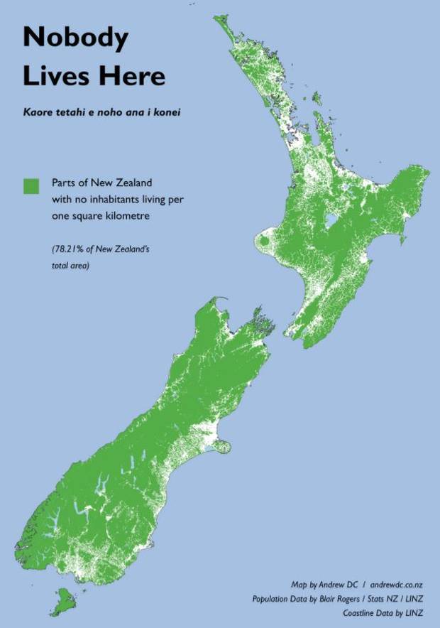
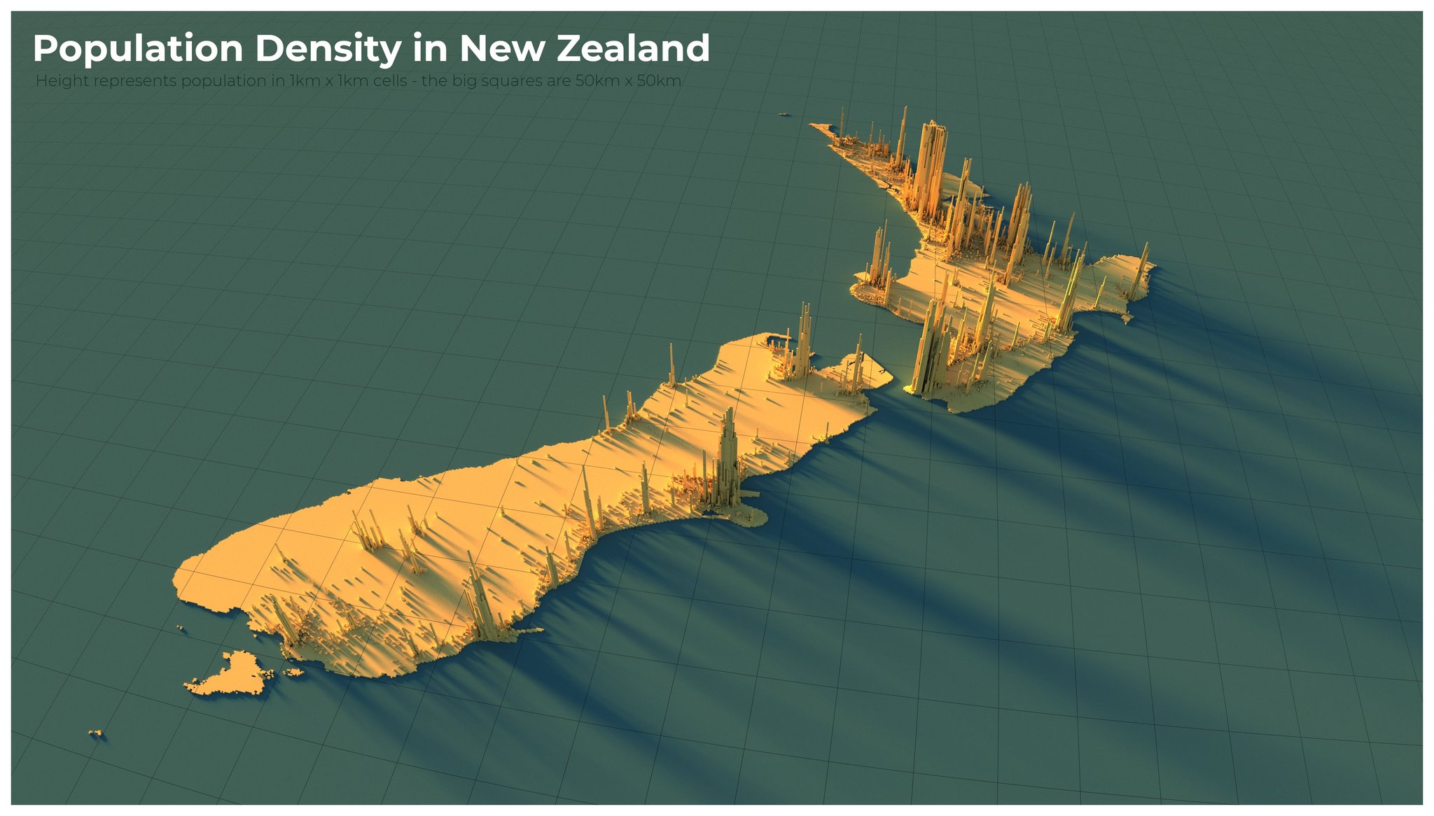
New Zealand’s average population density is very low.  It’s lower than the USA. It’s lower than the UK. It’s lower than Italy even if you count the sheep.  On the other hand, a lot of New Zealand has no people in it, so the density in places that have people is higher.  Here are a couple of maps: “Nobody Lives Here” by Andrew Douglas-Clifford, showing the 78% of the country’s land area with no inhabitants, and a 3-d map of population density by Alasdair Rae (@undertheraedar)

We really should be looking at the population density of inhabited areas. That’s harder than it sounds, because it makes a big difference where you draw the boundaries. Take Dunedin. The local government area goes on for ever in all directions. You can get on an old-fashioned train at the Dunedin station, and travel 75km through countryside and scenic gorges to the historic town of Middlemarch, and you’ll still be in Dunedin. The average population density is 40 people per square kilometre.  If you look just within the StatsNZ urban boundary, the average population density is 410/square kilometre — ten times higher.

A better solution is population-weighted density, where you work out the population density where each person lives and average them. Population-weighted density tells you how far away is the average person’s nearest neighbour; how far you can go within bumping into someone else’s bubble.The boundary problem doesn’t matter as much: hardly anyone lives in 90% of Dunedin, so it gets little weight — including or excluding the non-urban area doesn’t affect the average.  What does matter is the resolution.

If you work out population weighted densities using 1km squares you will get a larger number than if you use 2km squares, because the 1km square ignores density variation within 1km, and the 2km squares ignore density variation within 2km. If you use census meshblocks you will get a larger number than if you use electorates, and so on.  That can be an issue for international comparisons

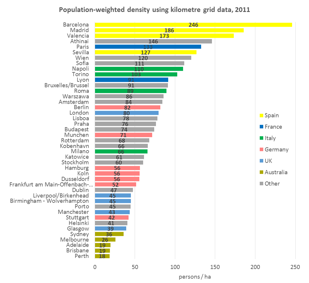
However, this is a graph of population-weighted density with 1km squares across a wide range of European and Australian cities using 1km square grids, in units of people per hectare:

If you compare the Australian and NZ cities using meshblocks, Auckland slots in just behind Melbourne, with Wellington following, and Christchurch is a little lower than Perth. The New York Metropolitan Area is at about 120.  Greater LA, the San Francisco Bay Area, and Honolulu, are in the mid-40s, based on Census Bureau data. New York City is at about 200.  I couldn’t find data for any Asian cities, but here’s a map of Singapore showing that a lot of people live in areas with population density well over 2000 people per square kilometre, or 200/hectare.

So, yes, New Zealand is more urban than foreigners might think, and Auckland is denser than many US metropolitan areas. But by world standards even Auckland and Wellington are pretty spacious.

May 1, 2020

The right word

Scientists often speak their own language. They sometimes use strange words, and they sometimes use normal words but mean something different by them.  Toby Morris & Siouxsie Wiles have an animation of some examples.

The goal of scientific language is usually to be precise, to make distinctions that aren’t important in everyday speech. Scientists aren’t trying to confuse you or keep you out, though those effects can happen  — and they aren’t always unwelcome.  I’ve written on my blog about two examples: bacteria vs virus (where the scientists are right) and organic (where they need to get over themselves).

This week’s example of conflict between trying to be approachable and trying to be precise is the phrase “false positive rate”.  When someone gets a COVID test, whether looking for the virus itself or looking for antibodies they’ve made in reaction to it, the test could be positive or negative.  We can also divide people up by whether they really have/had COVID infection or no infection. This gives four possibilities

  • True positives:  positive test, have/had COVID
  • True negatives: negative test, really no COVID
  • False positives: positive test, really no COVID
  • False negatives: negative test, have/had COVID

If you encounter something called the “false positive rate”, what is it? It obvious involves the false positives, divided by something, but it could be false positives as a proportion of all positive tests, or false positives as a proportion of people who don’t have COVID, or even false positives as a proportion of all tests.  It turns out that the first two of these definitions are both in common use.

Scientists (statisticians and epidemiologists) would define two pairs of accuracy summaries

  • Sensitivity:  true positives divided by people with COVID
  • Specificity: true negatives divided by people without COVID
  • Positive Predictive Value(PPV): true positives divided by all positives
  • Negative Predictive Value(NPV): true negatives divided by all negatives

The first ‘false positive rate’ definition is 1-PPV NPV; the second is 1-specificity.

If you write about the antibody studies carried out in the US, you can either use the precise terms, which will put off people who don’t know anything, or use the vague terms, and people who know a bit about the topic may misunderstand and think you’ve got them wrong.