August 8, 2017

Breast cancer alcohol twitter

Twitter is not an ideal format for science communication, because of the 140-character limitations: it’s easy to inadvertently leave something out.  Here’s one I was referred to this morning (link, so you can see if it is retracted)

latta

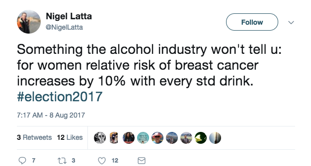
Usually I’d think it was a bit unfair to go after this sort of thing on StatsChat.  The reason I’m making an exception here is the hashtag: this is a political statement by a person of mana.

There’s one gross inaccuracy (which I missed on first reading) and one sub-optimal presentation of risk.  To start off, though, there’s nothing wrong with the underlying number: unlike many of its ilk it isn’t an extrapolation from high levels of drinking and it isn’t obviously confounded, because moderate drinkers are otherwise in better health than non-drinkers on average.  The underlying number is that for each standard drink per day, the rate of breast cancer increases by a factor of about 1.1.

The gross inaccuracy is the lack of a per day qualifier, making the statement inaccurate by a factor of several thousand.  An average of one standard drink per day is not a huge amount, but it’s probably more than the average for women in NZ (given the  2007/08 New Zealand Alcohol and Drug Use Survey finding that about half of women drank alcohol less than weekly).

Relative rates are what the research produces, but people tend to think in absolute risks, despite the explicit “relative risk” in the tweet.  The rate of breast cancer in middle age (what the data are about) is fairly low. The lifetime risk for a 45 year old woman (if you don’t die of anything else before age 90) is about 12%.  A 10% increase in that is 13.2%, not 22%. It would take about 7 drinks per day to roughly double your risk (1.17=1.94)  — and you’d have other problems as well as breast cancer risk.


August 7, 2017

Millennials and their pink wine

From Stuff, under  the headline Millennials love rose so much they’ve warped the traditional wine market

Millennials dominate Kiwi rose drinking, according to the report. Seventeen per cent of the still wine drunk by under-24s is rose . At 25-35 years it is about 11 per cent and at 35-44 years it drops to 6 per cent. 

Even if that’s true, younger people are less likely to be drinking wine than older people. Here are two graphs of the probability that the most recent alcoholic drink was wine, for women on the left and men on the right, by age groups (source).  The blue is under-24, then 25-44, 45-64, and 65+.

women-winemen-wine

A slightly larger proportion of the wine drunk by millennials is pink, but that’s not the same as saying they drink a large proportion of all the pink wine.


Stat of the Week Competition: August 5 – 11 2017

Each week, we would like to invite readers of Stats Chat to submit nominations for our Stat of the Week competition and be in with the chance to win an iTunes voucher.

Here’s how it works:

  • Anyone may add a comment on this post to nominate their Stat of the Week candidate before midday Friday August 11 2017.
  • Statistics can be bad, exemplary or fascinating.
  • The statistic must be in the NZ media during the period of August 5 – 11 2017 inclusive.
  • Quote the statistic, when and where it was published and tell us why it should be our Stat of the Week.

Next Monday at midday we’ll announce the winner of this week’s Stat of the Week competition, and start a new one.

(more…)

August 5, 2017

Just a temporary inconvenience

From Radio NZ

The book explores the widely held view that farm livestock are responsible for an enormous net production of new global warming gases.

“Once you take into account the entire cycle of the life of a cow, it’s actually impossible for the cow to omit even one extra atom of carbon to the atmosphere that wasn’t there already there, they are carbon neural in the end.” he says.

As you’d expect, there’s a sense in which this is completely true. It’s just not a sense that contradicts the standard views of methane and global warming.

What’s going on is easier to see if you consider carbon outputs from the other end of the cow.  Some of the carbon a cow takes in comes out as cowshit. This carbon doesn’t lie around for ever; it returns to the skies and the soil as part of the Great Circle of Life. Hakuna Matata. This doesn’t happen instantaneously, though. In the short term, you still need to wear sensible footwear or watch your step when you cross the field.

There’s an equilibrium between the production and decay of cowshit. When you increase the number of cows, the ambient cowshit level increases, and settles in at a new, higher equilibrium. When you decrease the number of cows, it decreases towards a new, lower equilibrium. The time this takes is governed by how long cowshit takes to decay, so it’s pretty fast.

In a similar, but more serious way, some of the carbon that goes into a cow comes out the front end as methane.  The methane doesn’t hang around in the air for ever; it turns back into carbon dioxide and water. As with cowshit, this doesn’t happen instantaneously.

There’s an equilibrium between the production and decay of methane. When you increase the number of cows, the ambient cow-derived methane level increases, and settles in at a new, higher equilibrium. When you decrease the number of cows, it decreases towards a new, lower equilibrium. The time this takes is governed by how long methane takes to decay: over each passing decade about half of it goes away.

Carbon emitted as methane, unlike carbon emitted in cowshit, is more than a local nuisance.  Per atom of carbon, methane has 24 times the greenhouse warming effect of CO2, and while it doesn’t last for ever, it lasts long enough to make an important contribution to climate change.  There’s more than twice as much methane in the atmosphere now as there was two centuries ago.

Cows are long-term carbon-neutral: that means reducing cow numbers (or finding ways to reduce their methane production) would, in mere decades, roll back the increases they’ve caused in an important greenhouse gas.

August 2, 2017

Briefly

  • Graphics: there’s a solar eclipse soon in the US. Washington Post‘s WonkBlog shows Google Trends search interest in iteclipse
  • Persuasive Cartography: 800 historical maps “intended primarily to influence opinions or beliefs – to send a message – rather than to communicate geographic information.”
  • Should there even be an app for this?”  and other tech questions from a workshop on design ethics. (Subquestion: should there be a prediction of this?)
  • “I never knew until very recently that the standard National Readership Survey socio-demographic classifications – ABC1, C2DE etc – deal with pensioners by classifying them all as working-class unless they are rich enough to be considered independently wealthy and therefore bucketed in with the As. ” Alex Harrowell on social class assessment and the politics of data
August 1, 2017

Super 18 Predictions for the Super Rugby Final

Team Ratings for the Super Rugby Final

The basic method is described on my Department home page.

Here are the team ratings prior to this week’s games, along with the ratings at the start of the season.

Current Rating Rating at Season Start Difference
Hurricanes 16.71 13.22 3.50
Crusaders 14.85 8.75 6.10
Lions 14.49 7.64 6.90
Highlanders 10.62 9.17 1.50
Chiefs 9.62 9.75 -0.10
Brumbies 1.81 3.83 -2.00
Stormers 1.38 1.51 -0.10
Sharks 0.72 0.42 0.30
Blues -0.22 -1.07 0.90
Waratahs -3.81 5.81 -9.60
Bulls -4.96 0.29 -5.20
Jaguares -5.03 -4.36 -0.70
Force -6.97 -9.45 2.50
Cheetahs -9.63 -7.36 -2.30
Reds -9.92 -10.28 0.40
Kings -12.08 -19.02 6.90
Rebels -15.29 -8.17 -7.10
Sunwolves -19.38 -17.76 -1.60


Performance So Far

So far there have been 141 matches played, 106 of which were correctly predicted, a success rate of 75.2%.
Here are the predictions for last week’s games.

Game Date Score Prediction Correct
1 Crusaders vs. Chiefs Jul 29 27 – 13 8.00 TRUE
2 Lions vs. Hurricanes Jul 29 44 – 29 -0.00 FALSE


Predictions for the Super Rugby Final

Here are the predictions for the Super Rugby Final. The prediction is my estimated expected points difference with a positive margin being a win to the home team, and a negative margin a win to the away team.

Game Date Winner Prediction
1 Lions vs. Crusaders Aug 05 Lions 3.60


NRL Predictions for Round 22

Team Ratings for Round 22

The basic method is described on my Department home page.

Here are the team ratings prior to this week’s games, along with the ratings at the start of the season.

Current Rating Rating at Season Start Difference
Storm 9.57 8.49 1.10
Cowboys 5.79 6.90 -1.10
Sharks 4.27 5.84 -1.60
Broncos 3.76 4.36 -0.60
Raiders 2.92 9.94 -7.00
Panthers 2.58 6.08 -3.50
Roosters 2.27 -1.17 3.40
Eels 0.68 -0.81 1.50
Sea Eagles -1.33 -2.98 1.60
Dragons -1.45 -7.74 6.30
Rabbitohs -2.85 -1.82 -1.00
Warriors -3.32 -6.02 2.70
Titans -3.91 -0.98 -2.90
Wests Tigers -4.30 -3.89 -0.40
Bulldogs -5.42 -1.34 -4.10
Knights -11.30 -16.94 5.60


Performance So Far

So far there have been 152 matches played, 92 of which were correctly predicted, a success rate of 60.5%.
Here are the predictions for last week’s games.

Game Date Score Prediction Correct
1 Panthers vs. Bulldogs Jul 27 16 – 8 12.30 TRUE
2 Warriors vs. Sharks Jul 28 12 – 26 -1.60 TRUE
3 Eels vs. Broncos Jul 28 28 – 14 -2.10 FALSE
4 Knights vs. Dragons Jul 29 21 – 14 -8.80 FALSE
5 Rabbitohs vs. Raiders Jul 29 18 – 32 -0.10 TRUE
6 Roosters vs. Cowboys Jul 29 22 – 16 -1.20 FALSE
7 Storm vs. Sea Eagles Jul 30 40 – 6 10.80 TRUE
8 Titans vs. Wests Tigers Jul 30 4 – 26 8.50 FALSE


Predictions for Round 22

Here are the predictions for Round 22. The prediction is my estimated expected points difference with a positive margin being a win to the home team, and a negative margin a win to the away team.

Game Date Winner Prediction
1 Bulldogs vs. Eels Aug 03 Eels -2.60
2 Dragons vs. Rabbitohs Aug 04 Dragons 4.90
3 Cowboys vs. Storm Aug 04 Storm -0.30
4 Knights vs. Warriors Aug 05 Warriors -4.00
5 Titans vs. Broncos Aug 05 Broncos -4.20
6 Sharks vs. Raiders Aug 05 Sharks 4.90
7 Sea Eagles vs. Roosters Aug 06 Roosters -0.10
8 Panthers vs. Wests Tigers Aug 06 Panthers 10.40


Currie Cup Predictions for Round 3

Team Ratings for Round 3

The basic method is described on my Department home page.

Here are the team ratings prior to this week’s games, along with the ratings at the start of the season.

Current Rating Rating at Season Start Difference
Lions 6.15 7.41 -1.30
Cheetahs 5.69 4.33 1.40
Western Province 2.77 3.30 -0.50
Blue Bulls 2.05 2.32 -0.30
Sharks 1.80 2.15 -0.30
Pumas -10.45 -10.63 0.20
Griquas -10.75 -11.62 0.90


Performance So Far

So far there have been 6 matches played, 5 of which were correctly predicted, a success rate of 83.3%.
Here are the predictions for last week’s games.

Game Date Score Prediction Correct
1 Lions vs. Griquas Jul 28 48 – 43 22.60 TRUE
2 Sharks vs. Pumas Jul 29 29 – 0 15.80 TRUE
3 Cheetahs vs. Western Province Jul 30 30 – 17 6.40 TRUE


Predictions for Round 3

Here are the predictions for Round 3. The prediction is my estimated expected points difference with a positive margin being a win to the home team, and a negative margin a win to the away team.

Game Date Winner Prediction
1 Sharks vs. Griquas Aug 04 Sharks 17.10
2 Blue Bulls vs. Lions Aug 05 Blue Bulls 0.40
3 Western Province vs. Pumas Aug 05 Western Province 17.70


Holiday travel trends

The Herald has a story and video graphic, and a nice interactive graphic on international travel by Kiwis since 1979.  The story is basically good (and even quotes a price corrected for inflation).

Here’s one frame of the video graphic
escape

First, a lot of the world isn’t coloured. There are New Zealanders who have visited say, Germany or Turkey or Egypt, even though these countries never make it into the 1-24,999 colour category. It looks as if the video picks a set of 16 countries and follows just those forward in time: we’re not told how these were picked.

Second, there’s the usual map problem of big things looking big (exacerbated by the Mercator projection). In 1999, more people went to Fiji than the US; more to Samoa than France. A map isn’t good at making these differences visually obvious, though the animation helps. And, tangentially, if you’re going to use almost a third of the map real estate on the region north of 60°, you should notice that Alaska is part of the USA.

The other, more important, issue that’s common to the whole presentation (and which I understand is being updated at the moment) is what the country data actually mean. It seems that it really is holiday data, excluding both business and visiting friends/relatives (comparing the video to this from Figure.NZ), but it’s by “country of main destination”.  If you go to more than one country, only one is counted.  That’s why the interactive shows zero Kiwis travelling to the Vatican City, and it may help explain numbers like 300 for Belgium.

Official statistics usually measure something fairly precise, but it’s not always the thing that you want them to measure.

July 31, 2017

Stat of the Week Competition: July 29 – August 4 2017

Each week, we would like to invite readers of Stats Chat to submit nominations for our Stat of the Week competition and be in with the chance to win an iTunes voucher.

Here’s how it works:

  • Anyone may add a comment on this post to nominate their Stat of the Week candidate before midday Friday August 4 2017.
  • Statistics can be bad, exemplary or fascinating.
  • The statistic must be in the NZ media during the period of July 29 – August 4 2017 inclusive.
  • Quote the statistic, when and where it was published and tell us why it should be our Stat of the Week.

Next Monday at midday we’ll announce the winner of this week’s Stat of the Week competition, and start a new one.

(more…)