December 15, 2016

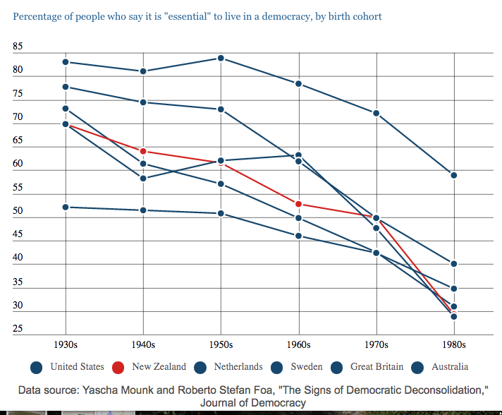
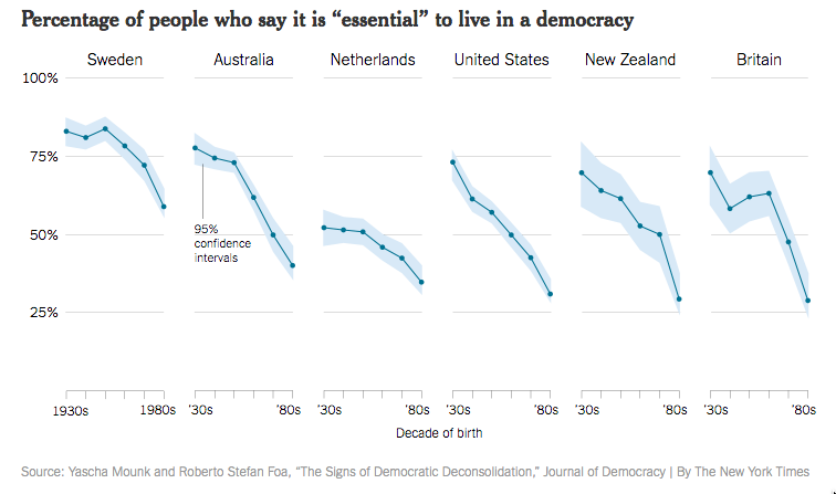
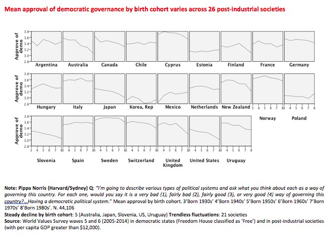
Beginning to look a lot like Christmas

In particular, the BMJ Christmas Edition is out, with genuine but not completely serious research papers.

Two to highlight this year:

First, a study of Pokémon GO and young adult physical activity: the news is bad.

Results 560 (47.4%) of the survey participants reported playing Pokémon GO and walked on average 4256 steps (SD 2697) each day in the four weeks before installation of the game. The difference in difference analysis showed that the daily average steps for Pokémon GO players during the first week of installation increased by 955 additional steps (95% confidence interval 697 to 1213), and then this increase gradually attenuated over the subsequent five weeks. By the sixth week after installation, the number of daily steps had gone back to pre-installation levels. No significant effect modification of Pokémon GO was found by sex, age, race group, bodyweight status, urbanity, or walkability of the area of residence.

Second, and especially relevant to a country where Christmas occurs in early summer, a modern genetic study

Conclusion A large proportion of people have asparagus anosmia. Genetic variation near multiple olfactory receptor genes is associated with the ability of an individual to smell the metabolites of asparagus in urine. Future replication studies are necessary before considering targeted therapies to help anosmic people discover what they are missing.

Future criminals revealed?

I was going to write about the Herald’s headlineFuture criminals revealed at 3, says study“, but Toby Manhire has a good interview with someone from the study, explaining that no, it doesn’t.

Richie Poulton: No. It’s a headline that doesn’t reflect what’s in the paper accurately. There were unfortunate headlines.

What then are the major findings of this study?

The idea, which is intuitively appealing, is that there is a small group that account for a lot of service use…

December 12, 2016

Why no chicken enquiry?

There’s an inquiry into the water contamination in Havelock North. However,  Otago’s Michael Baker points out there are about that many cases of disease caused by Campylobacter in chicken every two months. He asks “So why aren’t we having a national enquiry about that problem?”

Prof Baker was presumably intending this as a rhetorical question, but thinking of it as a serious question is a good illustration of risk perception.  It’s pretty clear that we do (as a society) care more about Havelock North’s water supply than about chicken contamination. Why?

  • Control.  Most people would think (largely correctly, not that it matters for the perception) that they could protect themselves from Campylobacter in chicken by taking reasonable care in preparing it. There aren’t any simple, everyday measures to protect yourself from your water supply.
  • Purity. We’re trained to think of raw chicken as dirty, but to think of NZ aquifer water as clean and uncontaminated — to the extent that people aren’t willing to even consider chlorination of some of these water supplies.  The Havelock North incident was a desecration.
  • Salience (reporting): The Havelock North cases happened all in one place, over about the ideal length of time for a news story — long enough for reporters to get there and interview people, and have news every day, but not long enough for it to get boring. It was all over the news. The media don’t report the sporadic cases. Stuff has a story today about Consumer NZ testing raw chicken, but the last reports I could find there of individual cases were smaller outbreaks due to raw milk contamination in 2014 and liver contamination in 2012. The most recent individually-described case report I could find from food that wasn’t a specific contamination incident was in 2009.
  • Salience (topic): Water pollution is becoming an increasingly important environmental issue in New Zealand, and even though nitrate and phosphate in streams is a different problem from Campylobacter in tap water, they feel connected through intensive agriculture (the inquiry should tell us something about this, not that it matters for the perception).

A more difficult question is whether the higher concern about Havelock North is evidence that we’re not thinking about this right, or evidence that comparing the case numbers isn’t the right way to think about it.

Stat of the Week Competition: December 10 – 16 2016

Each week, we would like to invite readers of Stats Chat to submit nominations for our Stat of the Week competition and be in with the chance to win an iTunes voucher.

Here’s how it works:

  • Anyone may add a comment on this post to nominate their Stat of the Week candidate before midday Friday December 16 2016.
  • Statistics can be bad, exemplary or fascinating.
  • The statistic must be in the NZ media during the period of December 10 – 16 2016 inclusive.
  • Quote the statistic, when and where it was published and tell us why it should be our Stat of the Week.

Next Monday at midday we’ll announce the winner of this week’s Stat of the Week competition, and start a new one.

(more…)

December 9, 2016

Briefly

  • Has serious crime in the UK increased sharply? Some UK papers think so; David Spiegelhalter is less convinced.
  • The Guardian explains the five most common dreams. In addition to the unconvincing explanations, there’s a problem with the most common dream type “Being attacked or pursued”, which they say has been experienced by 83% of people, but only 77% of men and 78% of women.
  • New Zealand has launched its component of the “Choosing Wisely” medical campaign, trying to get patients as well as health professionals asking whether tests or treatments are actually useful.
  • According to Pew Research, the majority of US people aren’t actually confused by all the poorly-substantiated and divergent diet news they see.  I think Pew are being too optimistic here: what their data say is that people don’t think they are confused by it, just as they don’t think they are influenced much by advertising.
  • A long story with good use of maps and visualisation, about Houston’s flooding problem. From Pro Publica.
  • Why the amazing new cancer immunotherapies might not fix everything: the immune system is terrifyingly powerful and we’re starting to get close to where it gets dangerous. (New York Times)
  • Visualisations of bird songs, by Google and the Cornell Ornithology Lab (via Susan Holmes)
  • The basic skill of mathematical modelling, in any applied field, is to decide what you don’t need to include in the model — “assume a spherical cow of uniform density”.  But sometimes, as in this simple chemistry example, you may need to include EVERYTHING.
  • Sometimes, on the other hand, it’s easy to see the important features:


December 8, 2016

Understanding risk

The Office of the PM’s Chief Science Advisor has two reports out on “Making decisions in the face of uncertainty: Understanding risk” (part 1, part 2). These aren’t completely new (part 1 came out in May), but I don’t think they’ve been on StatsChat before, and they’re good.

A quote from the second part, more generally relevant that just to statistics

 In forming their views and assimilating information, most people follow the lead of credible experts – but they define and choose ‘experts’ based on whom they perceive as sharing their values. Experts are not immune to bias, and, as explained in Part 1 of this series, the actuarial approach itself is not free from value judgments. Biases and values are inherent in the risk assessment process, beginning with what we recognise as a hazard. They can influence the priority given to the study of specific risks and thereby generate data necessary to promote action on those risks.

Scientists are human, with their own biases and values. But modern science has largely evolved as a set of internationally recognized processes designed to minimize such biases, at least in the collection and analysis of the data. A core value judgment that remains in the processes of science is in the evaluation of the sufficiency of evidence on which to draw a conclusion. Because this judgment can be subject to bias, it is important to have independent replication and aggregation of scientific evidence from different studies and sources in order to reach a scientific consensus.

 Public trust in science and scientists may be becoming increasingly tenuous as the issues become ever more complex and contested. Scientists must find better ways to interact with decision makers and the public in order to bolster confidence in the authority of their expertise and the legitimacy of the advice that they provide.

December 5, 2016

Do snake people hate our freedom?

We had a Stat of the Week nomination for this graph from Stuff showing attitudes to democracy changing for people born more recently:

stuff-essential

The complaint was that the non-NZ lines were indistinguishable. They do get pop-up descriptions on mouse-over, but the coloured circles in the legend are certainly not doing much work.

This is the original graph, from the New York Times:

nyt-essential

The Times verison is more elegant and clearer, and also provides uncertainty intervals around the lines. On the other hand, the higher-than-wide panels are going to make any decrease look more dramatic.

There are two more important problems with the graph. The first is that it uses only the highest category, “Essential”, on a ten-point scale.  A decrease in the proportion of people using the top rating could be due to the whole distribution moving down, but it could also just be a trend in people’s tendency to use the extreme values on a scale.

Here’s a related graph using other data, tweeted by (Prof) Pippa Norris

mean

The trend looks weaker when using means on a four-point scale. It’s also less universal than the New York Times graph suggests.

There’s another problem, though.  The source for the first graph: Yascha Mounk and Roberto Stefan Foa, “The Signs of Democratic Deconsolidation,” Journal of Democracy. The paper doesn’t exist yet at the journal’s website (or anywhere else that I’ve been able to find).  According to Dr Mounk’s CV, it’s coming out in the first edition next year.

Part of the point of peer-reviewed publications is that they include the details that don’t make it into a media story. This is, potentially, significant research on an important topic. If we’re going to have a full-on panic about millennials and the end of democracy, we could at least wait a couple of months for the research to be published.


Stat of the Week Competition: December 3 – 9 2016

Each week, we would like to invite readers of Stats Chat to submit nominations for our Stat of the Week competition and be in with the chance to win an iTunes voucher.

Here’s how it works:

  • Anyone may add a comment on this post to nominate their Stat of the Week candidate before midday Friday December 9 2016.
  • Statistics can be bad, exemplary or fascinating.
  • The statistic must be in the NZ media during the period of December 3 – 9 2016 inclusive.
  • Quote the statistic, when and where it was published and tell us why it should be our Stat of the Week.

Next Monday at midday we’ll announce the winner of this week’s Stat of the Week competition, and start a new one.

(more…)

December 2, 2016

Polling accuracy

It’s worth remembering sometimes that the Daily Mail is far from the worst UK paper statistically, and that US election polling and reporting could be a lot worse.

There was a by-election today in the electorate of Richmond Park. The Liberal Democrats won, with 49.7% of the vote to ex-Conservative Zac Goldsmith’s 45.2%.

Last month On Monday, the Evening Standard published a poll showing Goldsmith was leading 56% to 29%.

On Tuesday, the Standard reported as controversial a claim that the Liberal Democrats were “within three to four points” of Mr Goldsmith, with a Conservative source saying  “These are the usual claims from the LibDem national by-election machine – that’s not what we are finding on the doorstep.”

Crash statistics

From the Herald

crash
Obviously there isn’t research giving ‘the exact time you will crash your car’.  What you might hope for is the time at which you (more precisely, the average NZ driver) are at highest risk.  We don’t even get that.

The comparisons are for totals, and as the story admits, more crashes happen in peak times because more people are driving.  It’s worse than that, though. The story says

…22,000 collisions occur annually in the afternoon peak up to 6pm. This then drops to just 2000 crashes a year at 11pm and a mere 800 at 1am.

The 22,000 is over 3-hour periods and I think the 2000 and 800 are for single-hour periods — I can’t tell for sure, because there’s no link to the original source, and I can’t find it on the IAG website.

Perhaps more relevantly for the New Zealand Herald, you have to read down to paragraph 11, which begins “Across most states…” to get the first solid indication that this story is about another country.

It’s from news.com.au, which explains why the handling of numbers isn’t up to local standards.