Posts filed under Denominator? (88)

June 7, 2025

Auckland is larger than Wellington

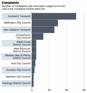
The Herald is reporting on the Government’s new road-cone hotline. Apparently there were 236 reports in the first four days, and the article usefully points out that this was about 100 for each of the first two days, so it dropped pretty fast after that.

A bit less usefully, there’s a graph (click to embiggen) of reports by miscellaneous administrative category . Auckland (region), as usual, is at the top.

It’s not completely clear what the right scaling is, but raw reports aren’t it. The traditional Kiwi favourite of per capita shows Wellington (city) way ahead of Auckland (region), with more than half as many reports from about an eighth as many people.  NZTA is there to represent state highways, and it doesn’t really have a population in the same sense as the other areas.

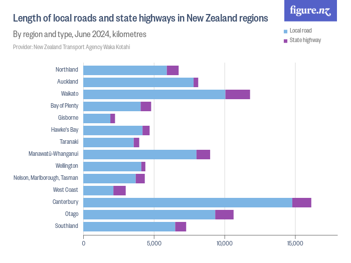
We might also scale by the amount of road to have cones on.  This map, from Figure NZ, isn’t quite what we want because it uses consistent geographical units — regions– but it does show how state highway and local roads compare. It looks like NZTA is coning above its weight per km of road

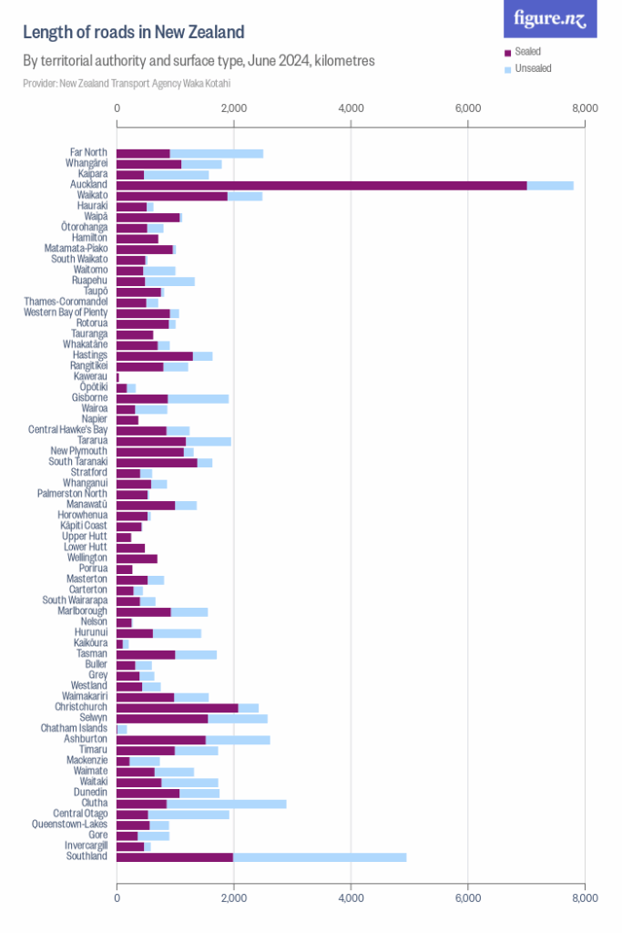
FigureNZ also has a graph by territorial authority,  a better match to the Herald’s graph, showing Auckland has well over twice the sealed road of any other authority (if you aren’t a Kiwi: this is ordered north to south).  Wellington has much less road, so it is attracting comparatively the most reports.

So, the data do show a “hotspot for cone concerns”, but it’s Wellington, not Auckland.  This could mean more cones, or streets with less spare room, or fewer alternate routes, or people who just whinge more. The data do not suffice to tell us.
February 13, 2018

Opinions about immigrants

Ipsos MORI do a nice set of surveys about public misperceptions: ask a sample of people for their estimate of a number and compare it to the actual value.

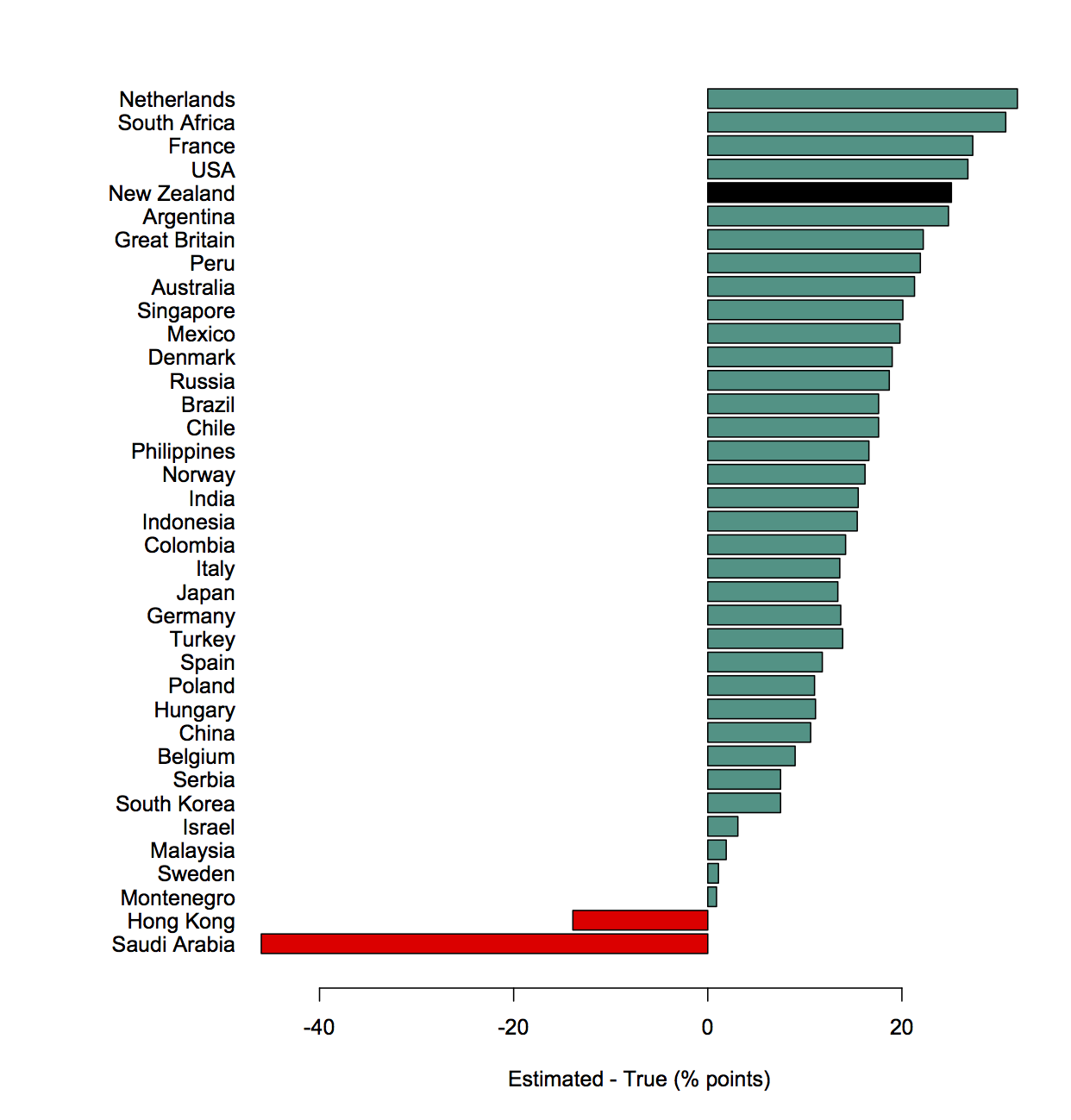
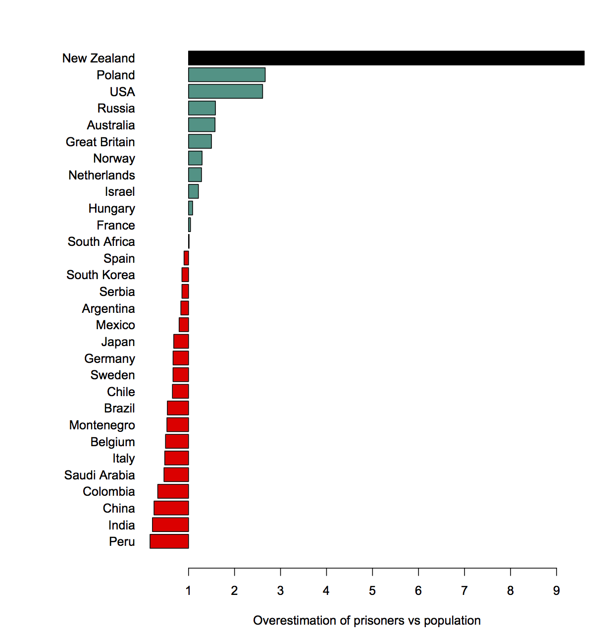
The newest set includes a question about the proportion of the prison population than are immigrants. Here’s (a redrawing of) their graph, with NZ in all black.

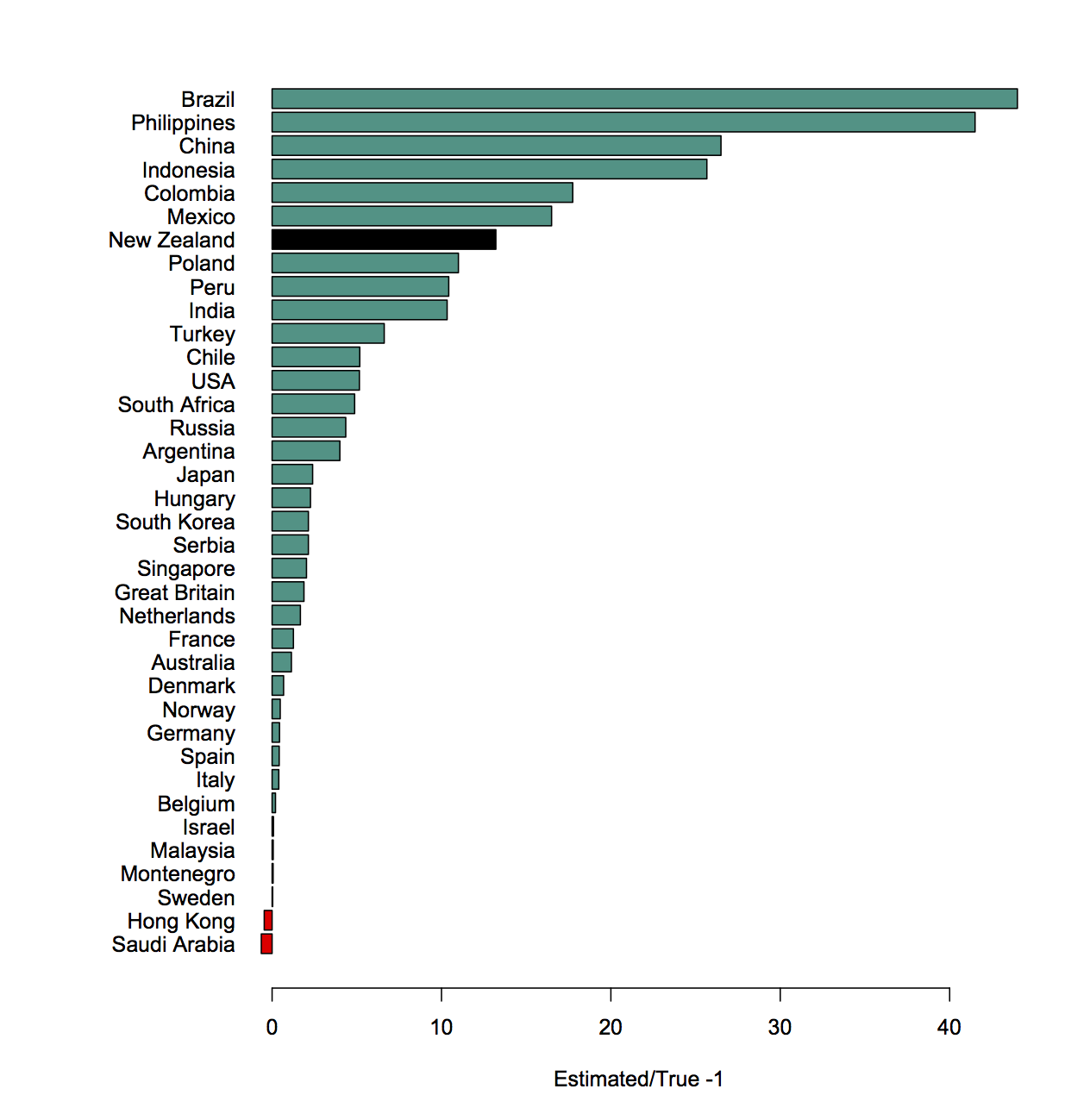
People think more than a quarter of NZ prisoners are immigrants; it’s actually less than 2%. I actually prefer this as a ratio

The ratio would be better on a logarithmic scale, but I don’t feel like doing that today since it doesn’t affect the main point of this pointpost.

A couple of years ago, though, the question was about what proportion of the overall population were immigrants. That time people also overestimated a lot.  We can ask how much of the overestimation for the prison question can be explained by people just thinking there are more immigrants than there really are.

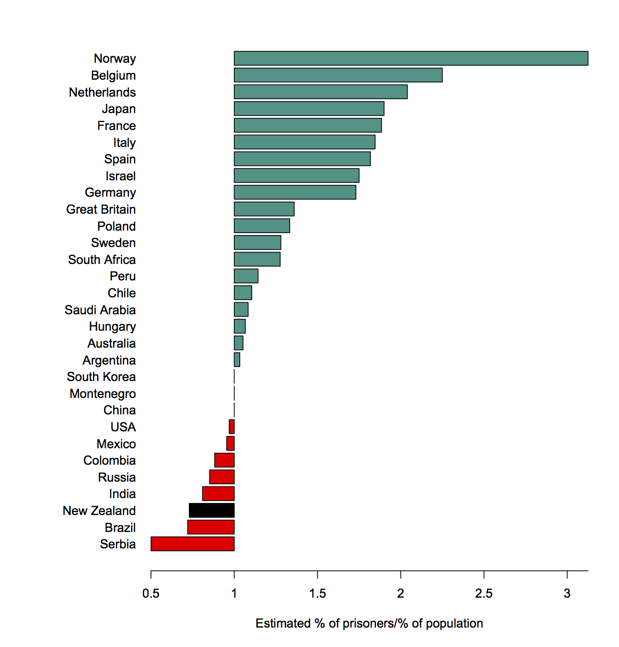
Here’s the ratio of the estimated proportion of immigrants among the prison population and the total population

The bar for New Zealand is to the left; New Zealand recognises that immigrants are less likely to be in prison than people born here. Well, the surveys taken two years apart are consistent with us recognising that, at least.

That’s just a ratio of two estimates. We can also compare to the reality. If we divide this ratio by the true ratio we find out how much more likely people think an individual immigrant is to end up in prison compared to how likely they really are.

It seems strange that NZ is suddenly at the top. What’s going on?

New Zealand has a lot of immigrants, and we only overestimate the actual number by about a half (we said 37%; it was 25% in 2017). But we overestimate the proportion among prisoners by a lot. That is, we get this year’s survey question badly wrong, but without even the excuse of being seriously deluded about how many immigrants there are.

January 8, 2018

Not dropping every year

Stuff has a story on road deaths, where Julie Ann Genter claims the Roads of National Significance are partly responsible for the increase in death rates. Unsurprisingly, Judith Collins disagrees.  The story goes on to say (it’s not clear if this is supposed to be indirect quotation from Judith Collins)

From a purely statistical viewpoint the road toll is lowering – for every 10,000 cars on the road, the number of deaths is dropping every year.

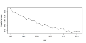
From a purely statistical viewpoint, this doesn’t seem to be true. The Ministry of Transport provides tables that show a rate of fatalities per 10,000 registered vehicles of 0.077 in 2013, 0.086 in 2014,  0.091 in 2015, and  0.090 in 2016. Here’s a graph, first raw

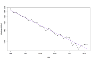
and now with a fitted trend (on a log scale, since the trend is straighter that way)

Now, it’s possible there’s some other way of defining the rate that doesn’t show it going up each year. And there’s a question of random variation as always. But if you scale for vehicles actually on the road, by using total distance travelled, we saw last year that there’s pretty convincing evidence of an increase in the underlying rate, over and above random variation.

The story goes on to say “But Genter is not buying into the statistics.” If she’s planning to make the roads safer, I hope that isn’t true.

December 28, 2017

Think of a number and multiply by 365


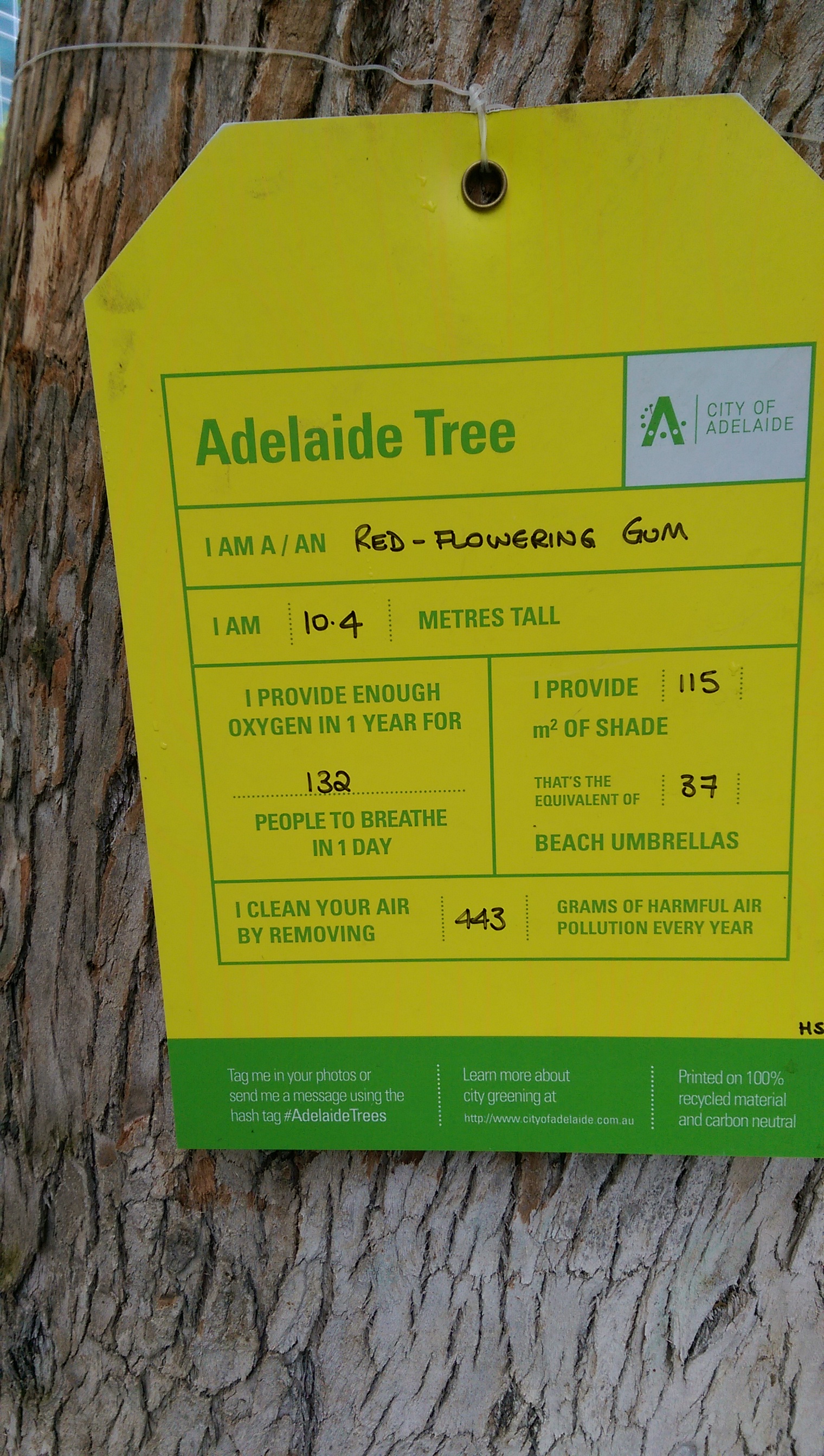
Providing enough oxygen in a year for 132 people to breathe for a day could be more simply expressed as providing about one-third of the oxygen needed by one person.

October 2, 2017

Denominators (when cellphones attack)

A question that is very unlikely to be interesting: were there more cellphone-related injuries in Dunedin or Auckland last year?

Auckland has a lot more people. Of course it has more cellphone-related injuries.

A question that is moderately unlikely to be interesting, but, ok, you might need to write a story: were people in Auckland more likely to have cellphone-related injuries than people in Dunedin?

So, where the Herald website (and presumably the ODT originally) has

In the three years to the end of 2016, ACC received 23 claims for cellphone injuries from Dunedin people and paid claimants a total of $10,436…

Statistics provided by ACC show Aucklanders made the highest number of claims at 190, costing a total of $76,159

the second paragraph might be better as

Although Auckland has more than ten times as many people, the home of the Vodafone Warriors had only 190 claims, costing a total of $76,159

(Someone who can actually write might do better than me here. )

September 19, 2017

Denominators and BIGNUMs

billennial

It’s pretty obvious that Bon Appétit has just confused averages and totals here.

So, what is the average? There were about 75 million millennials in the US in 2016 (we can probably assume  Bon Appétit doesn’t care about other countries), so we’re looking at $1280/year, or about $25/week. Which actually seems pretty low as an average.  The US as a whole spent $1.46 trillion on food and beverages in 2014, which is about $4500/person/year or about $87/week.

As with so much generation-mongering, asking about the facts is missing the intended purpose of the story, which is to recycle some stereotypes about lazy/wasteful youth.

The story links to another, about a new book “Generation Yum”

Turow characterized the quintessential Millennial experience this way: “You got into a top tier high school, you hustled through college—you’ve done everything society told you—and you’re not rewarded. 

When “get into a top-tier high school” is a quintessential generational experience it’s clear we’re not even trying to go beyond unrepresentative stereotypes.  In which case, hold the numbers.

August 19, 2017

Sampling bias

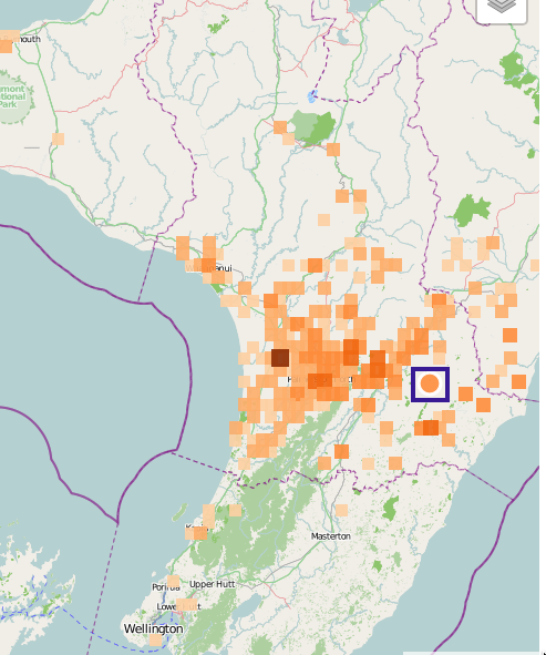
Via GeoNet, a magnitude 4.5 quake south of Dannevirke (blue box)

quake

The squares are reports of shaking. The big cluster is Palmerston North, with secondary clusters in Feilding and Ashhurst: there are more people who felt the quake there because there are more people there.  See also XKCD

August 11, 2017

Different sorts of graphs

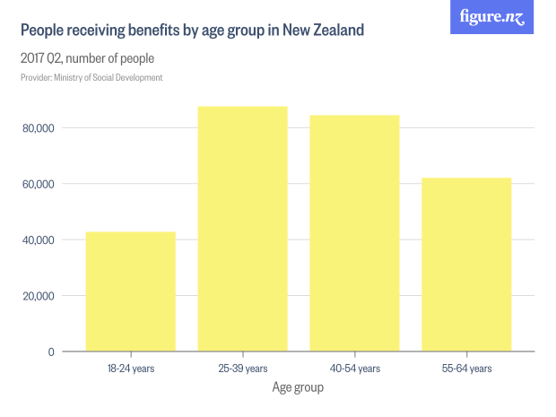
This bar chart from Figure.NZ was in Stuff today, with the lead

Working-age people receiving benefits are mostly in the prime of our working life – the ages of 25 to 54.

19205831

The numbers are correct, but the extent to which the graph fits the story is a bit misleading.  The main reason the two bars in the middle are higher is that they are 15-year age groups, when the first bar is a 7-year group and the last is a ten-year group.

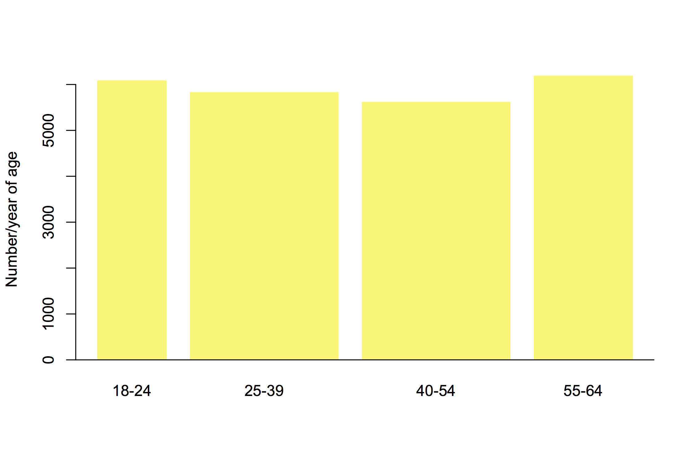
Another way to show the data is to scale the bar widths proportional to the number of years and then scale the height so that the bar area matches the count of people. The bar height is now counts of people per year of age

benefits

This is harder to read for people who aren’t used to it, but arguably more informative. It suggests the 25-54 year groups may be the largest just because the groups are wider.

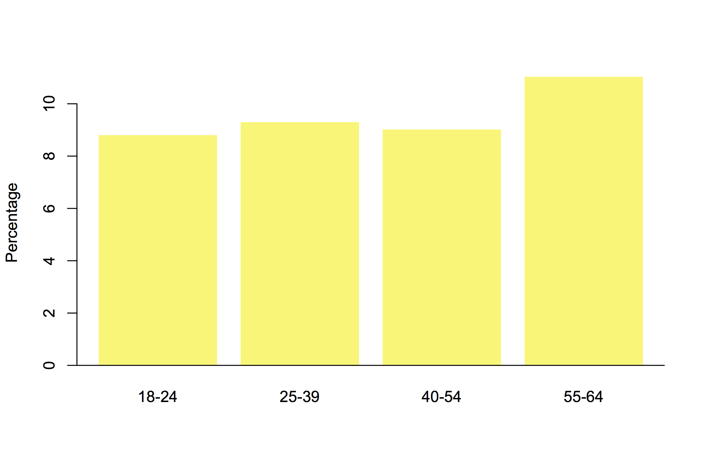
We really need population size data, since the number of people in NZ also varies by age group.  Showing the percentage receiving benefits in each age group gives a different picture again

benpop

It looks as though

  • “working age” people 25-39 and 40-54 make up a larger fraction of those receiving benefits than people 18-24 or 55-64
  • a person receiving benefits is more likely to be, say, 20 or 60 than 35 or 45.
  • the proportion of people receiving benefits increases with age

These can all be true; they’re subtly different questions. Part of the job of a statistician is to help you think about which one you wanted to ask.

August 8, 2017

Breast cancer alcohol twitter

Twitter is not an ideal format for science communication, because of the 140-character limitations: it’s easy to inadvertently leave something out.  Here’s one I was referred to this morning (link, so you can see if it is retracted)

latta

Usually I’d think it was a bit unfair to go after this sort of thing on StatsChat.  The reason I’m making an exception here is the hashtag: this is a political statement by a person of mana.

There’s one gross inaccuracy (which I missed on first reading) and one sub-optimal presentation of risk.  To start off, though, there’s nothing wrong with the underlying number: unlike many of its ilk it isn’t an extrapolation from high levels of drinking and it isn’t obviously confounded, because moderate drinkers are otherwise in better health than non-drinkers on average.  The underlying number is that for each standard drink per day, the rate of breast cancer increases by a factor of about 1.1.

The gross inaccuracy is the lack of a per day qualifier, making the statement inaccurate by a factor of several thousand.  An average of one standard drink per day is not a huge amount, but it’s probably more than the average for women in NZ (given the  2007/08 New Zealand Alcohol and Drug Use Survey finding that about half of women drank alcohol less than weekly).

Relative rates are what the research produces, but people tend to think in absolute risks, despite the explicit “relative risk” in the tweet.  The rate of breast cancer in middle age (what the data are about) is fairly low. The lifetime risk for a 45 year old woman (if you don’t die of anything else before age 90) is about 12%.  A 10% increase in that is 13.2%, not 22%. It would take about 7 drinks per day to roughly double your risk (1.17=1.94)  — and you’d have other problems as well as breast cancer risk.


July 29, 2017

Anything goes

According to a story in the Herald, based on what looks like it might be a bogus poll (press release), you need $5.3 million in Australia now to be considered rich.  If we assumed the number did actually measure something, how surprising would it be?

Before “Who wants to be a millionaire?” was a quiz show franchise, it was a Cole Porter song, from the  1956 movie “High Society”, so that seems a reasonable comparison period. The Australian CPI has gone up by a factor of 15.6 since 1956 (and while Australia didn’t have dollars until 1966, US and Australian dollars were roughly comparable then).

On top of pure currency conversion, though, Australia is richer now than in 1956.  Australia’s GDP in current purchasing-power adjusted dollars is nearly 8 times what it was in 1956. The population has gone from 9.4 million to 24.1 million, so real GDP per capita is up by a factor of about 3.5.

So, a 1956 million would be 15.6 current millions just from inflation, and over $50 million as a share of Australia’s economy: a millionaire in those days was not just rich, but Big Rich — as the song says: “flashy flunkies everywhere… a gigantic yacht… liveried chauffeur.”

We’re not given any real reason to believe the $5.3 million figure — there’s no reason you should rely on it more than your own guess. And ‘millionaire’ isn’t a useful comparison without a lot of additional qualification.