Posts filed under Graphics (394)

October 3, 2013

People who bought this theory also liked…

An improved version of study that Stuff and StatsChat reported on more than a year ago has now appeared in print. The study found that people who have non-standard beliefs about the moon landings or Princess Diana’s death are also likely to have non-standard beliefs about climate change or health effects of tobacco. It improves on the previous research by using a reasonably representative online survey rather than a sample of visitors to climate debate blogs.

Mother Jones magazine in the US summarised some of the results in this graph of correlations

conspiracies6_2


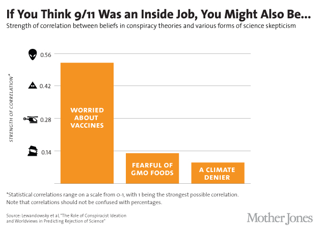
That’s a horrible graph partly because, contrary to what the footnote says, correlations are not in fact restricted to be between 0 and 1, but between -1 and 1: and in fact the three correlations shown were negative in the research and have been turned around for more convenient display.

The title is misleading: only one of the six `conspiracist ideation’ questions was about 9/11, and it wasn’t a yes/no question, and it wasn’t really about it being an inside job (ie, performed by the government), but about the government allowing it to happen. In the same way, the other three variables aren’t simple yes/no questions, but scores based multiple questions, each on a 5-point scale.

A more-technical point is that correlations, while appropriate in the paper as part of their statistical model, aren’t really a good way to describe the strength of association.  It’s easier to understand the square of the correlation, which gives the proportion of variability in one variable explained by the other.  That is, the conspiracy-theory score explains about 25% of the variation in the vaccine score,  just over 1% of the variation in the GM Foods score, and just under 1% of the variation in the climate change score.

(via @zentree)

September 27, 2013

Nuclear warming?

From the Guardian, some time ago

Jeremy Clarkson had a point – and that’s not something you hear me say every day (indeed, any day) – when in a recent Sun column he challenged the scientists […] who had described a slab of ice that had broken away from Antarctica as “the size of Luxembourg”.

“I’m sorry but Luxembourg is meaningless,” said Clarkson, pointing out that the standard units of measurement in the UK are double-decker London buses, football pitches and Wales. He could have added the Isle of Wight, Olympic-sized swimming pools and Wembley stadiums to the list.

These journalist units of measurements are useful only to the extent that they are more familiar and easily understood than the actual numbers.

From The Conversation, more recently, David Holmes begins

The planet is building up heat at the equivalent of four Hiroshima bombs worth of energy every second. And 90% of that heat is going into the oceans.

This image comes originally from John Cook, who writes

bomb

So I suggest a sticky way to communicate global warming is to express it in units of Hiroshima bombs worth of heat. This ticks all the sticky boxes:

  • It’s simple – nothing communicates a lot of heat like an A-bomb.
  • It’s unexpected – whenever I explain this to audiences, their eyes turn into saucers. Almost noone realises just how much heat our climate system is accumulating.
  • It’s concrete – nobody has trouble conceptualising an A-bomb. Well, much of the younger generation don’t know about Hiroshima – when I test-drived this metaphor on my teenage daughter, she asked “what’s Hiroshima?”. But it’s easily recommunicated as an atomic bomb.
  • It tells a story – the idea that second after second, day after day, the greenhouse effect continues to blaze away and our planet continues to build up heat.
  • The only downside of this metaphor is it is emotional – the Hiroshima bomb does come with a lot of baggage. However, this metaphor isn’t used because it’s scary – it’s simply about communicating the sheer amount of heat that our climate is accumulating. I’ve yet to encounter a stickier way of communicating the scale of the planet’s energy imbalance.

I think he’s wrong about the  downside.  The real downside is that the image of Hiroshima has nothing to do with heat production.  The Hiroshima bomb was important because it killed lots of people, many of them civilians, ended the war, and ushered in the age of nuclear weapons where a small number of military or political leaders had the ability to destroy industrial civilisation and kill the majority of our species (which nearly happened, 30 years ago today).

If we set off four Hiroshima-scale bombs per second, global warming would become a relatively unimportant side issue — and in fact, nuclear weapons are much more widely associated with nuclear winter.

You could also invoke public health concerns and describe the heat accumulation as equivalent to everyone in the world smoking seven cigarettes per second (1185 cal/cig: data). That would be wrong in the same ways.

Displaying uncertainty

Currently making the rounds of the Internet, a barchart that animates to show uncertainty, from Oliver Hawkins. The basic data are on immigration to the UK, and a traditional way to show the uncertainty (if you were going to both) would be with error bars. Click on the image to go to the animated version.

uncertainty-bar


Those of you who are NZ high-school teachers or students may recognise this idea from Chris Wild’s Visual Inference Tools

September 25, 2013

Just one poll

A recurring point on StatsChat is that single election polls don’t have a large enough sample size to track short-term changes in opinion. Some form of averaging is necessary.

The excuse for pointing this out again is the Herald-Digipoll result with an increase of 6.8% since the previous poll in June. Since the poll has a 3.6% margin of error for a single estimate, its margin of error for changes is about 5%, so 6.8% is quite impressive.

On the other hand, Danyl Mclauchlan just tweeted a nice interactive plot of aggregrated poll results. I can’t embed it because WordPress is scared of SVG graphics, but the key chunk is here and you can click for the interactive plot

polls


The highlighted points are past Herald-DigiPoll results, and there is indeed a big jump since June, but there’s almost no change since March. This poll seems to have given more variable results for Labour than the other polls do.

The conclusion: it’s too early to tell whether the change of management at Labour has affected opinion. But it’s probably more than a year until the election. We can wait a few weeks for the polls.


[Update: I’m apparently wrong about the excess variability in the Labour results, according to Peter Green on Twitter. Statisticians can overinterpret numbers just as much as the next guy]

[Further update: Twittering establishes that all the obvious suggestions for potentially-better ways to smooth the data have been tried.]

September 24, 2013

Student-friendly radar charts

The Critic, the student magazine of Otago, has an interesting feature on the council elections, rating the candidates on six issues determined by polling to be important to students. One of the ways they present the candidate ratings is with radar plots

radar-critic


These show the rating for each of the issues on six radial axes, connected to form the white polygon.  Candidates who are more ‘student-friendly’ on these issues will end up with larger polygons, and the different shapes show that there are significant tradeoffs between, say, a candidate who is in favour of drinking and (quality) loud music, and one who is sound on environment and transport.

This is a pretty good use of radar plots. Their main limitations are that the ordering of the axes can have a big effect on the visual impression, and that evaluating tradeoffs quantitatively is hard. Neither is a really serious limitation here, and both are problems common to many ways of displaying multivariate data.

Here’s another radar chart, originally from INFOGRAPHIKA magazine, rescued from its unfair banishment to wtfviz.net.

radio-success


This one shows how people rated the importance of eight factors in success, split up by their income.  It’s interesting to see how much higher  connections, initial capital, and cheating were rated as important by the poor, and how the rich thought hard work was the key factor, not being very impressed even by education.   It’s clear that each group likes the story that makes them look good; less clear who is more correct.  What’s a bit depressing is how small a role anyone thinks is played by luck.

September 23, 2013

Unclear on the pie chart concept

The pie-chart problems that Melbourne’s Herald-Sun had with their bogus polls appear to be spreading. This one is from wtfviz.net (via @TimHarford), and apparently comes from Britain’s TES magazine.

tespie

I suppose it’s encouraging that this sort of thing seems only to happen for bogus polls, not for actual data.


Real estate data visualisation

Det Mackey suggested we look at Grieg’s Hamilton and their graphs.

Some of these are quite good.

For example, this one shows how median sale price and CV change over time. The increase of sale price relative to government valuation in the boom is clear, as is the lack of increase since then.  Also, the variations in the median CV would give some idea of the extent to which differences in median price are due to changes in which houses are selling, versus changes in how much they are selling for.  The lack of a legend on the two series is a bit unfortunate, but it’s pretty obvious which is which. A graph like this would improve a lot of the newspaper stories about real estate prices.

CV-v-MS-July-2002-2013-3

This graph, on the other hand, I think is supposed to show a comparison of median sale price across suburbs.  Apart from aesthetic objections, it doesn’t really work because median sale prices by suburb are not components of a total in any meaningful way, so the ‘pie’ metaphor isn’t doing any useful work.

Suburban-Median-Prices-July-2013


The other graphs on the site fall somewhere in between: they convey information, but often in ways that could have been more effective.


September 22, 2013

Briefly

  • Careers: The number of people getting statistics degrees in the US has doubled in the past five years (and they’re still able to get jobs)
  • Increasing inequality in the US from 1977 to 2012 (it happens in other places too): top 1% share of income.  The colour choice is a bit unfortunate (red: more equal, green:less equal). There are animated pictures and more inequality measures in the original

aqzaxe9-1aqzaxe9

  • Map of sasquatch sightings in the US. The original has all the sightings as well as this map cross-referenced with population density. Remember, just because you can measure it doesn’t mean it exists

sasquatch

  • Software for drawing data-based maps: CartoDB. Has both free and paid versions.  Worth a look if you do maps.
September 21, 2013

Pie chart of the week

Originally from jobvine.co.za, via a Harvard Business Review piece on data visualisation, this graph is supposed to show salary ranges for different positions.

from jobvine.co.za


It really doesn’t.  Read the HBR story for a better version.

September 19, 2013

Briefly

  • An interactive graphic showing variation as well as trends in unemployment in the US. From eager eyes
  • Some people just can’t do simple mathematical computations, but  for those that can, they can easily be distracted by political bias. Grist describes a nice experiment by psychologist Dan Kahan and colleagues
  • Your refrigerator uses more power than many people in AfricaElectricity-consumption-Todd-Moss