Posts filed under Graphics (394)

August 11, 2017

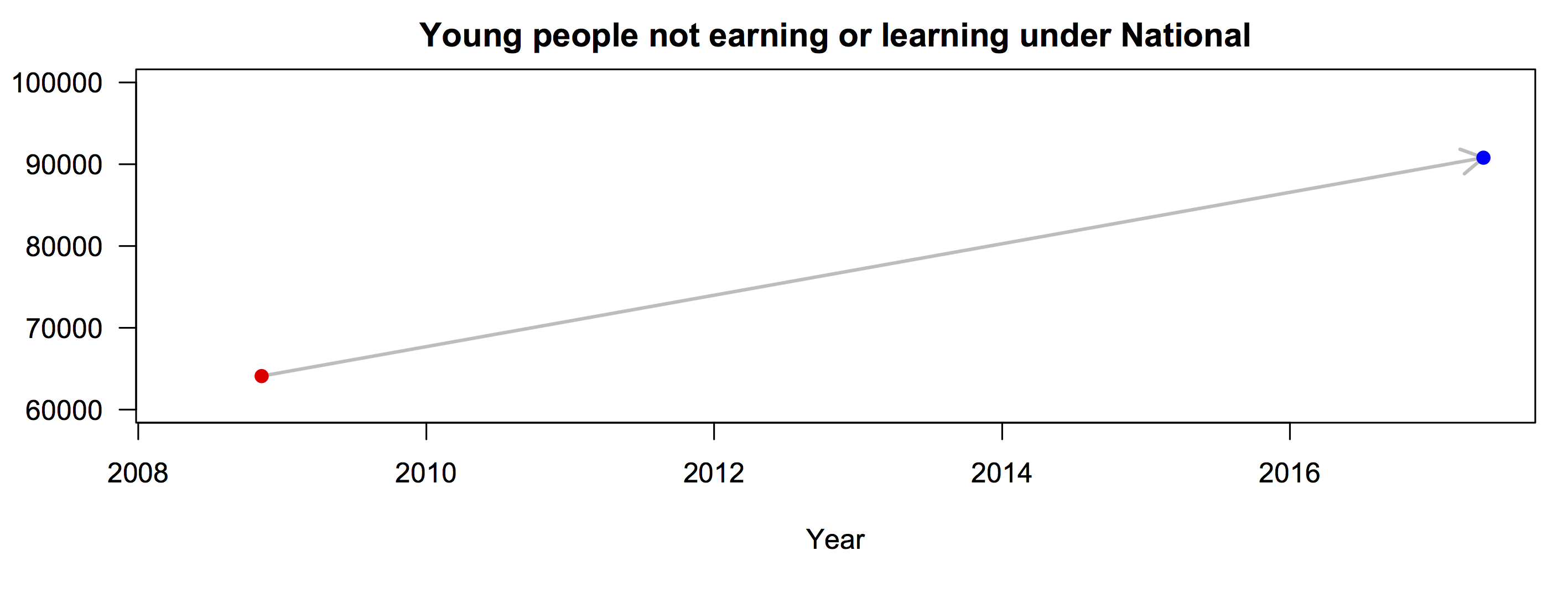
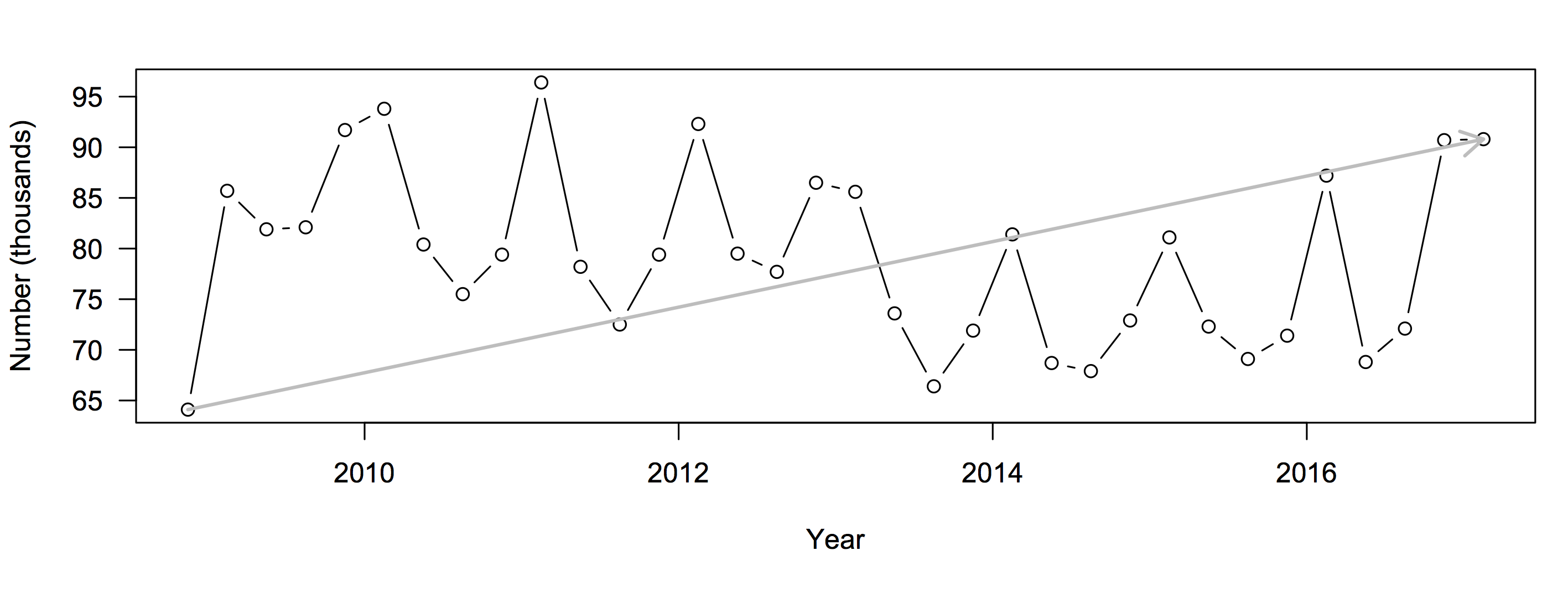
Different sorts of graphs

This bar chart from Figure.NZ was in Stuff today, with the lead

Working-age people receiving benefits are mostly in the prime of our working life – the ages of 25 to 54.

19205831

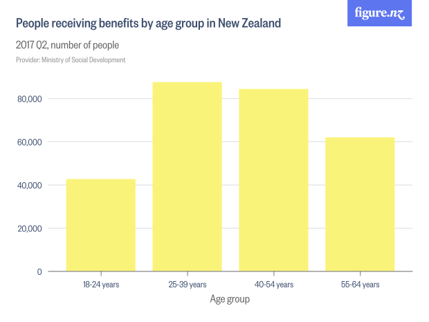
The numbers are correct, but the extent to which the graph fits the story is a bit misleading.  The main reason the two bars in the middle are higher is that they are 15-year age groups, when the first bar is a 7-year group and the last is a ten-year group.

Another way to show the data is to scale the bar widths proportional to the number of years and then scale the height so that the bar area matches the count of people. The bar height is now counts of people per year of age

benefits

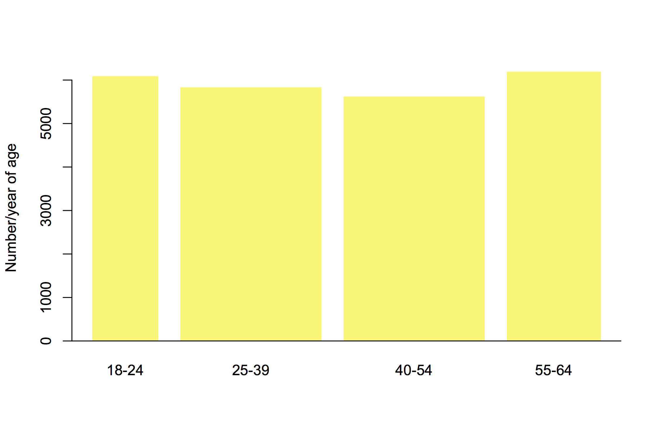
This is harder to read for people who aren’t used to it, but arguably more informative. It suggests the 25-54 year groups may be the largest just because the groups are wider.

We really need population size data, since the number of people in NZ also varies by age group.  Showing the percentage receiving benefits in each age group gives a different picture again
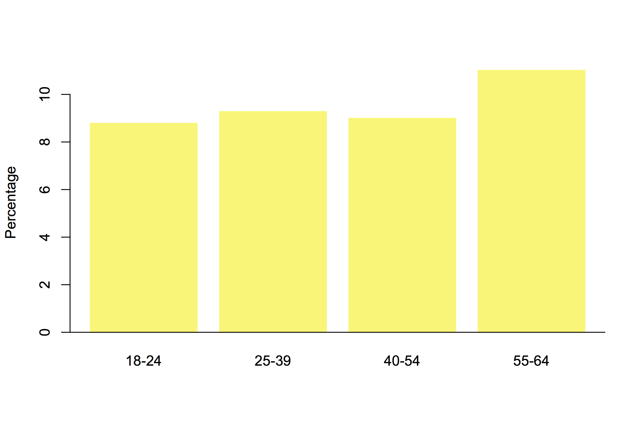
benpop

It looks as though

  • “working age” people 25-39 and 40-54 make up a larger fraction of those receiving benefits than people 18-24 or 55-64
  • a person receiving benefits is more likely to be, say, 20 or 60 than 35 or 45.
  • the proportion of people receiving benefits increases with age

These can all be true; they’re subtly different questions. Part of the job of a statistician is to help you think about which one you wanted to ask.

August 1, 2017

Holiday travel trends

The Herald has a story and video graphic, and a nice interactive graphic on international travel by Kiwis since 1979.  The story is basically good (and even quotes a price corrected for inflation).

Here’s one frame of the video graphic
escape

First, a lot of the world isn’t coloured. There are New Zealanders who have visited say, Germany or Turkey or Egypt, even though these countries never make it into the 1-24,999 colour category. It looks as if the video picks a set of 16 countries and follows just those forward in time: we’re not told how these were picked.

Second, there’s the usual map problem of big things looking big (exacerbated by the Mercator projection). In 1999, more people went to Fiji than the US; more to Samoa than France. A map isn’t good at making these differences visually obvious, though the animation helps. And, tangentially, if you’re going to use almost a third of the map real estate on the region north of 60°, you should notice that Alaska is part of the USA.

The other, more important, issue that’s common to the whole presentation (and which I understand is being updated at the moment) is what the country data actually mean. It seems that it really is holiday data, excluding both business and visiting friends/relatives (comparing the video to this from Figure.NZ), but it’s by “country of main destination”.  If you go to more than one country, only one is counted.  That’s why the interactive shows zero Kiwis travelling to the Vatican City, and it may help explain numbers like 300 for Belgium.

Official statistics usually measure something fairly precise, but it’s not always the thing that you want them to measure.

May 14, 2017

There’s nothing like a good joke

You’ve probably seen the 2016 US election results plotted by county, as in this via Brilliant Maps
county

It’s not ideal, because large, relatively empty counties take up a lot of space but represent relatively few people.  It’s still informative: you can see, for example, that urban voters tended to support Clinton even in Texas.  There are also interesting blue patches in rural areas that you might need an atlas to understand.

For most purposes, it’s better to try to show the votes, such as this from the New York Times, where the circle area is proportional to the lead in votes
nyt

You might want something that shows the Electoral College votes, since those are what actually determines the results, like this by Tom Pearson for the Financial Times
ec-dot

Or, you might like pie charts, such as this one from Lisa Charlotte Rost

rost-pie

These all try to improve on the simple county map by showing votes — people — rather than land. The NYT one is more complex than the straightforward map; the other two are simpler but still informative.


Or, you could simplify the county map in another way. You could remove all the spatial information from within states — collecting the ‘blue’ land into one wedge and the ‘red’ land into another — and not add anything. You might do this as a joke, to comment on the President’s use of the simple county map
pie

The problem with the Internet, though, is that people might take it seriously.  It’s not completely clear whether Chris Cillizza was just trolling, but a lot of people sure seem to take his reposting of it seriously.

May 4, 2017

Summarising a trend

Keith Ng drew my attention on Twitter to an ad from Labour saying “Under National, the number of young people not earning or learning has increased by 41%”.

When you see this sort of claim, you should usually expect two things: first, that the claim will be true in the sense that there will be two numbers that differ by 41%; second, that it will not be the most informative summary of the data in question.

If you look on Infoshare, in the Household Labour Force Survey, you can find data on NEET (not in education, employment, or training).  The number was 64100 in the fourth quarter of 2008, when Labour lost the election.  It’s now (Q1, 2017) 90800, which is, indeed, 41% higher.  Let’s represent the ad by a graph:

neet1


We can fill in the data points in between:
neet2
Now, the straight line doesn’t look as convincing.

Also, why are we looking at the number, when population has changed over this time period. We really should care about the rate (percentage)
neet3
Measuring in terms of rates the increase is smaller — 27%.  More importantly, though, the rate was even higher at the end of the first quarter of National’s administration than it is now.

The next thing to notice is the spikes every four quarters or so: NEET is higher in the summer and lower in the winter because of the school  year.  You might wonder if StatsNZ had produced a seasonally adjusted version, and whether it was also conveniently on Infoshare…
need4
The increase is now 17%

But for long-term comparisons of policy, you’d probably want a smoothed version that incorporates more than one quarter of data. It turns out that StatsNZ have done this, too, and it’s on Infoshare.
neet5
The increase is, again 17%. Taking out the seasonal variation, short-term variation, and sampling noise makes the underlying pattern clearer.  NEET increased dramatically in 2009, decreased, and has recently spiked. The early spike may well have been the recession, which can’t reasonably be blamed on any NZ party.  The recent increase is worrying, but thinking of it as trend over 9 years isn’t all that helpful.

April 26, 2017

Simplifying to make a picture

1. Ancestry.com has maps of the ancestry structure of North America, based on people who sent DNA samples in for their genotype service (click to embiggen)ncomms14238-f3

To make these maps, they looked for pairs of people whose DNA showed they were distant relatives, then simplified the resulting network into relatively stable clusters. They then drew the clusters on a map and coloured them according to what part of the world those people’s distant ancestors probably came from.  In theory, this should give something like a map of immigration into the US (and to a lesser extent, of remaining Native populations).  The map is a massive oversimplification, but that’s more or less the point: it simplifies the data to highlight particular patterns (and, necessarily, to hide others).  There’s a research paper, too.


2. In a satire on predictive policing, The New Inquiry has an app showing high-risk neighbourhoods for financial crime. There’s also a story at Buzzfeed.

sub-buzz-24605-1493145131-7

The app uses data from the US Financial Regulatory Authority (FINRA), and models the risk of financial crime using the usual sort of neighbourhood characteristics (eg number of liquor licenses, number of investment advisers).


3. The Sydney Morning Herald had a social/political quiz “What Kind of Aussie Are You?”.

1486745652102

They also have a discussion of how they designed the 7 groups.  Again, the groups aren’t entirely real, but are a set of stories told about complicated, multi-dimensional data.


The challenge in any display of this type is to remove enough information that the stories are visible, but not so much that they aren’t true– and not everyone will agree on whether you’ve succeeded.

March 8, 2017

Yes, November 19

trends

The graph is from a Google Trends search for  “International Men’s Day“.

There are two peaks. In the majority of years, the larger peak is on International Women’s Day, and the smaller peak is on the day itself.

March 7, 2017

The amazing pizzachart

From YouGov (who seem to already be regretting it).

Pizza-01

This obviously isn’t a pie chart, because the pieces are the same size but the numbers are different. It’s not really a graph at all; it’s an idiosyncratically organised, illustrated table.  It gets worse, though. The pizza picture itself isn’t doing any productive work in this graphic: the only information it conveys is misleading. There’s a clear impression given that particular ingredients go together, when that’s not how the questions were asked. And as the footnote says, there are a lot of popular ingredients that didn’t even make it on to the graphic.


October 30, 2016

Suboptimal ways to present risk

Graeme Edgeler nominated this, from PBS Frontline, to @statschat as a bad graph

frontline

It’s actually almost a good graph, but I think it’s trying to do too many things at once. There are two basic numerical facts: the number of people trying to cross the Mediterranean to escape the Syrian crisis has gone down substantially; the number of deaths has stayed about the same.

If you want to show the increase in risk, it’s much more effective to use a fixed, round denominator —  the main reason to use this sort of graph is that people pick up risk information better as frequencies than as fractions.

Here’s the comparison using the same denominator, 269, for the two years. It’s visually obvious that there has been a three-fold increase in death rate.

20152016

It’s harder to convey all the comparisons clearly in one graph. A mosaic plot would work for higher proportions, which we can all hope doesn’t become a relevant fact.


October 18, 2016

The lack of change is the real story

The Chief Coroner has released provisional suicide statistics for the year to June 2016.  As I wrote last year, the rate of suicide in New Zealand is basically not changing.  The Herald’s story, by Martin Johnston, quotes the Chief Coroner on this point

“Judge Marshall interpreted the suicide death rate as having remained consistent and said it showed New Zealand still had a long way to go in turning around the unacceptably high toll of suicide.”

The headline and graphs don’t make this clear

Here’s the graph from the Herald

suicide-herald

If you want a bar graph, it should go down to zero, and it would then show how little is changing

suicide-2

I’d prefer a line graph showing expected variation if there wasn’t any underlying change: the shading is one and two standard deviations around the average of the nine years’ rates

suicide-3

As Judge Marshall says, the suicide death rate has remained consistent. That’s our problem.  Focusing on the year to year variation misses the key point.

September 1, 2016

Transport numbers

Auckland Transport released new patronage data, and FigureNZ tidied it up to make it easily computer-readable, so I thought I’d look at some of it.  What I’m going to show is a decomposition of the data into overall trends, seasonal variation, and random stuff just happening. As usual, click to embiggen the pictures.

First, the trends: rides are up.

trends

It’s hard to see the trend in ferry use, so here’s a version on a log scale — meaning that the same proportional trend would look the same for all three modes of transport

trendslog

Train use is increasing (relatively) faster than bus or ferry use.  There’s also an interesting bump in the middle that we’ll get back to.

Now, the seasonal patterns. Again, these are on a logarithmic scale, so they show relative variation

season

The clearest signal is that ferry use peaks in summer, when the other modes are at their minimum. Also, the Christmas minimum is a bit lower for trains: to see this, we can combine the two graphs:

season2

It’s not surprising that train use falls by more: they turn the trains off for a lot of the holiday period.

Finally, what’s left when you subtract the seasonal and trend components:

residual

The highest extra variation in both train and ferry rides was in September and October 2011: the Rugby World Cup.