Posts filed under Graphics (394)

August 20, 2016

The statistical significance filter

Attention conservation notice: long and nerdy, but does have pictures.

You may have noticed that I often say about newsy research studies that they are are barely statistically significant or they found only weak evidence, but that I don’t say that about large-scale clinical trials. This isn’t (just) personal prejudice. There are two good reasons why any given evidence threshold is more likely to be met in lower-quality research — and while I’ll be talking in terms of p-values here, getting rid of them doesn’t solve this problem (it might solve other problems).  I’ll also be talking in terms of an effect being “real” or not, which is again an oversimplification but one that I don’t think affects the point I’m making.  Think of a “real” effect as one big enough to write a news story about.

evidence01

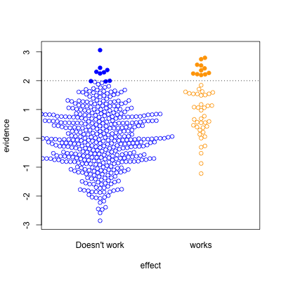
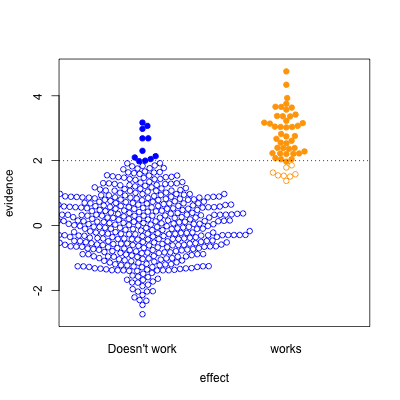
This graph shows possible results in statistical tests, for research where the effect of the thing you’re studying is real (orange) or not real (blue).  The solid circles are results that pass your statistical evidence threshold, in the direction you wanted to see — they’re press-releasable as well as publishable.

Only about half the ‘statistically significant’ results are real; the rest are false positives.

I’ve assumed the proportion of “real” effects is about 10%. That makes sense in a lot of medical and psychological research — arguably, it’s too optimistic.  I’ve also assumed the sample size is too small to reliably pick up plausible differences between blue and yellow — sadly, this is also realistic.

evidence02

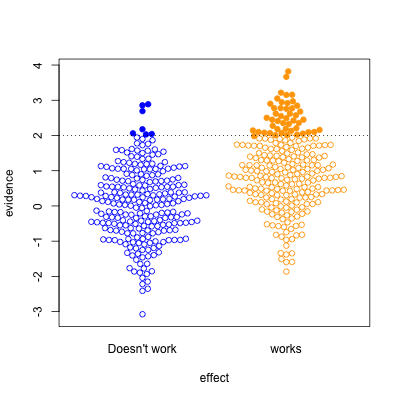
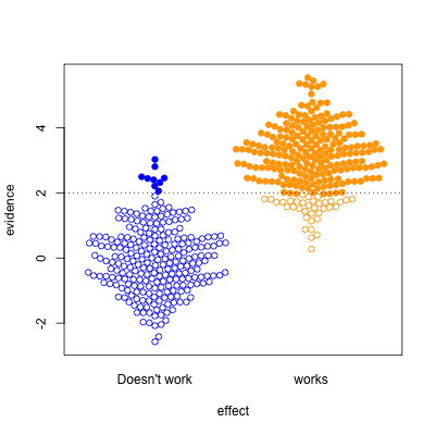
In the second graph, we’re looking at a setting where half the effects are real and half aren’t. Now, of the effects that pass the threshold, most are real.  On the other hand, there’s a lot of real effects that get missed.  This was the setting for a lot of clinical trials in the old days, when they were done in single hospitals or small groups.

evidence03

The third case is relatively implausible hypotheses — 10% true — but well-designed studies.  There are still the same number of false positives, but many more true positives.  A better-designed study means that positive results are more likely to be correct.

evidence04

Finally, the setting of well-conducted clinical trials intended to be definitive, the sort of studies done to get new drugs approved. About half the candidate treatments work as intended, and when they do, the results are likely to be positive.   For a well-designed test such as this, statistical significance is a reasonable guide to whether the effect is real.

The problem is that the media only show a subset of the (exciting) solid circles, and typically don’t show the (boring) empty circles. So, what you see is

evidence05

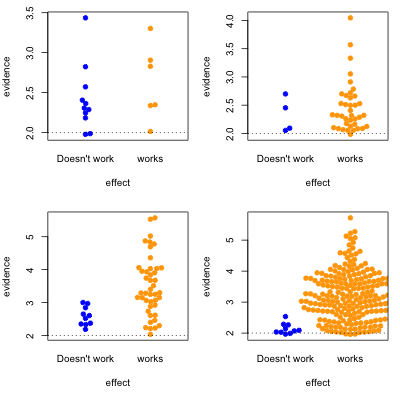
where the columns are 10% and 50% proportion of studies having a true effect, and the top and bottom rows are under-sized and well-design studies.


Knowing the threshold for evidence isn’t enough: the prior plausibility matters, and the ability of the study to demonstrate effects matters. Apparent effects seen in small or poorly-designed studies are less likely to be true.

August 18, 2016

Rigorously deidentified pie

footypie

Via Dale Warburton on Twitter, this graph comes from page 7 of the 2016 A-League Injury Report (PDF) produced by Professional Footballers Australia — the players’ association for the round-ball game.  It seems to be a sensible and worthwhile document, except for this pie chart. They’ve replaced the club names with letters, presumably for confidentiality reasons. Which is fine. But the numbers written on the graph bear no obvious relationship to the sizes of the pie wedges.

It’s been a bad week for this sort of thing: a TV barchart that went viral this week had the same sort of problem.

August 15, 2016

Graph of the week

From a real estate agent who will remain nameless

IMAG0280

Another example of the rule ‘if you have to write out all the numbers, the graph isn’t doing its work.”

August 4, 2016

Garbage numbers

This appeared on Twitter

CcO-e4rWwAERzX5

Now, I could just about believe NZ was near the bottom of the OECD, but to accept zero recycling and composting is a big ask.  Even if some of the recycling ends up in landfill, surely not all of it does.  And the garden waste people don’t charge enough to be putting all my wisteria clippings into landfill.

So, I looked up the source (updated link). It says to see the Annex Notes. Here’s the note for New Zealand

New Zealand: Data refer to amount going to landfill

The data point for New Zealand is zero by definition — they aren’t counting any of the recycling and composting.

When the most you can hope for is that the lies in the graph will be explained in the footnotes, you need to read the footnotes.


May 26, 2016

Budget visualisations

This will likely be updated as I find them

  1. From Keith Ng. Budget now and over time. This gets special mention for being inflation-adjusted (it’s in 2014 dollars). Doesn’t work on my phone, but works well on a small laptop screen
  2. NZ Herald. Works (though hard to read) on a mobile. Still hard to read on a small laptop screen, but attractive on a large screen. I still have reservations about the bubbles.
  3. Stuff has a set of charts. The surplus/deficit one is nicely clear, though there’s nothing about the financial crisis/recession as an explanation for a lot of it.
  4. The government has interactive charts of Core Crown Revenue, Core Crown Expenditure, and breakdown for a taxpayer. On the last one, they lose points for displaying just income tax, when the Treasury are about the only people who could easily do better.
April 29, 2016

Bar chart of the week

From the IMF, using OECD data, (via Sam Warburton)

chart2_

Bar charts should start at zero (and probably shouldn’t  have distracting house/arrow/tree reflections in the background), but this graph would look even worse if the y-axis went down to zero. The problem is that ‘zero’ isn’t 0 for this sort of measurement.  The index is the price:income ratio now, divided by the price:income ratio in 2010, multiplied by 100.  The “no change” value is 100, which suggests using that for the floor of the bars.  Making the bars wider relative to the spaces gives easier comparisons and makes the graph less busy.  The colour scheme isn’t ideal for dichromats, but it only reinforces the information, it’s not needed to interpret anything.


price2income

The next step, as Sam suggested on Twitter, would be to give up on the ‘index’, which is really economist jargon, and just describe the change in %.  He also suggesting putting the two labels in colour (which required some fiddling: for the text colour to look like the bar colour it has to actually be darker).

price2

One might also go back to the full names of the countries, but I quite like the abbreviations.


April 28, 2016

Walkability

Most of Auckland is within walking distance of a school: there are over 500 schools in the 560 km2 of Auckland’s urban area. That’s usually regarded as a Good Thing, and Healthy. Auckland Transport’s “walking school bus” program takes advantage of it to get kids more active and to get cars off the roads. The coverage is pretty impressive: in this map by Stephen Davis, the circles show a 800m (half-mile, 2 km2 ) area around each school:

dense

However, as a story at Stuff notes,  if most everywhere in Auckland is close to a school, the schools are going to be close to other establishments.  With a school on most square kilometres of urban land, there will be shops in the square kilometre around most schools selling fast food, or junk food.

That’s going to be even more true in denser, more walkable cities elsewhere, from Amsterdam to New AmsterdamYork.  “Near schools” isn’t a thing in cities. To reduce the number of these shops near schools, you have to reduce them everywhere.

This isn’t to say that all restrictions on fast-food sales are unreasonable, but having lots of things in a relatively small area is hard to avoid in cities. It’s how cities work.

April 20, 2016

Housing affordability graphics

Another nice Herald interactive, this time of housing affordability.

map

Affordability comes in two parts: down payment and monthly mortgage costs. The affordability index from Massey University looks at monthly payments; this one looks at the 20% down payment.

The difference between Auckland and the rest of the country is pretty dramatic, but there are other things to see. Above, the centre of Auckland is much less expensive than the rest of the city: 75% of properties are valued at under $500,000 by CoreLogic.  That’s the apartments, but they mostly aren’t the sort of apartments people are planning to stay in long-term.

Another interesting feature for Auckland is that the neighbourhoods really are ordered in price — you don’t see the spatial trends changing as you move the slider, so there aren’t areas where the low-end houses are especially cheap and the high-end houses especially expensive.

You can also see the difficulty of relating valuations to prices. In Point Chev, the valuations say 70% of homes are valued at over $1 million. On the other hand, the median sale price is $990,00, so less than half the homes that changed hands went for over a million.

CgcdhlFUMAAj56W

Both those numbers are correct. Well, ok,  I assume they are both correct; they are both what they are supposed to be.  It’s just that home sales aren’t a random sample of all homes.  But if the median sale price is $990k and the median valuation for all homes is $1.2m, you can see that interpreting these numbers is harder than it looks.

April 9, 2016

Movie stars broken down by age and sex

The folks at Polygraph have a lovely set of interactive graphics of number of speaking lines in 2000 movie screenplays, with IMDB look-ups of actor age and gender.  If you haven’t been living in a cave on Mars, the basic conclusion won’t be surprising, but the extent of the differences might. Frozen, for example, gave more than half the lines to male characters.

They’ve also made a lot of data available on Github for other people to use. Here’s a graph combining the age and gender data in a different way than they did: total number of speaking lines by age and gender

hollywood

Men and women have similar number of speaking lines up to about age 30, but after that there’s a huge separation and much less opportunity for female actors.  We can all think of exceptions: Judi “M” Dench, Maggie “Minerva” Smith, Joanna “Absolutely no relation” Lumley, but they are exceptions.

Compared to what?

Two maps via Twitter:

From the Sydney Morning Herald, via @mlle_elle and @rpy

creativemap

The differences in population density swamp anything else. For the map to be useful we’d need a comparison between ‘creative professionals’ and ‘non-creative unprofessionals’.  There’s an XKCD about this.

Peter Ellis has another visualisation of the last election that emphasises comparisons. Here’s a comparison of Green and Labour votes (by polling place) across Auckland.

votemap

There’s a clear division between the areas where Labour and Green polled about the same, and those where Labour did much better