Posts filed under Graphics (394)

April 8, 2013

Briefly

  • Interesting post on how extreme income inequality is. The distribution is compared to a specific probability model, a ‘power law’, with the distribution of earthquake sizes given as another example. Unfortunately, although the ‘long tail’ point is valid, the ‘power law’ explanation is more dubious.   Earthquake sizes and wealth are two of the large number of empirical examples studied by Aaron Clauset, Cosma Shalizi, and Mark Newman, who find the power law completely fails to fit the distribution of wealth, and is not all that persuasive for earthquake sizes. As Cosma writes

If you use sensible, heavy-tailed alternative distributions, like the log-normal or the Weibull (stretched exponential), you will find that it is often very, very hard to rule them out. In the two dozen data sets we looked at, all chosen because people had claimed they followed power laws, the log-normal’s fit was almost always competitive with the power law, usually insignificantly better and sometimes substantially better. (To repeat a joke: Gauss is not mocked.)


April 6, 2013

Gun deaths visualisation

Periscopic, a “socially conscious data visualization firm” has produced an interactive display of the years of life lost due to gun violence in the US, based on national life expectancy data. Each victim appears as a dot moving along the arc of their life, and then dropping at the age of death. More and more accumulate as you watch.

guns


Of course, it’s important to remember that this display gets a lot of its power from two facts: the USA is very big, and we know the names and ages of death of gun victims.  You couldn’t do the same thing as dramatically for smoking deaths, and it would look much less impressive in a small country.


Also, Alberto Cairo has a nice post using this as an example to talk about the display of uncertainty.

(via @hildabast)


April 4, 2013

Infographic meh.

The Herald has produced this Stat of the Week nomination

BuyOnlineApr13


The obvious problem is that the percentages add up to about 170%, not 100%. That’s why the bar labelled “41.8%” is only about 1/4 of the circle.These are not mutually exclusive categories, and in fact someone who is in one of these categories is actually more likely to be in others.

The most interesting results from the underlying data would be about which purchases go together. Is there an more-or-less consistent ordering of things so that someone who buys food and beverages online will also buy reading materials and electronics online, or is it more complicated?  That’s probably the sort of information that Roy Morgan Research would like to sell you, with the overall proportions as a teaser — selling detailed survey reports is their business.

On the other hand, while the ribbon adding up to a full circle is irrelevant because there isn’t a meaningful total, it’s hard to get very worked up about it.  A table, or a ‘forest plot’ of points and margin of error would be a bit more informative — it’s not clear what the margin of error in the smaller categories is like.

I’m slightly more worried about the fact that reading isn’t counted as leisure, somewhat more worried that it’s news that more people use the internet now than ten years ago, and much more worried that the graph says it refers to 4977 people but the text of the story says 12000 people.

April 3, 2013

Infographic of the day.

Our only Prime Minister has tweeted an infographic of the new crime figures

key


In his defense, I will first concede that Mr Key is not regarded as an unbiased source of information, so he doesn’t have the same responsibilities that journalists do.

Still.

One of the basic and classical problems with representing numbers by pictures (apart from the choice of picture) is scaling.  The crime rate was 16% lower in 2012 than in 2008. The blue bottle is 16% smaller in every dimension than the red bottle.  If you just look at the size of the picture, the area of the blue bottle is nearly 30% smaller than the red bottle. If you take the visual metaphor seriously, these bottles have volume, and the volume of the blue bottle would be 40% smaller.

One of the other basic and classical problems discussed in books on misleading statistical graphics is picking two points out of a time series. Using data from Stats New Zealand, we can plot 17 years.

keygraph


Crime has been decreasing for a long time, at roughly the same rate.  Mr Key’s graph corresponds to the red line.

Crime news vs crime data

If you actually look at the data, neither the Herald nor Stuff comes off well in today’s crime figure reports.  Stuff has the headline “Crime drop due to ‘tag and release'”, and it’s not until the third paragraph that they admit the ‘tag and release’ impact is on court workloads and has nothing to do with  number of crimes reported.  The Herald says

Crime is at its lowest level in 24 years but the percentage of offences that police solve is also dropping – less than half of all cases.

This is at least technically true, but the drop they are talking about is less than one percentage point, when the resolution rate differs between types of crime by about 90 percentage points. Even a small change in the relative numbers of different offenses would make a one percentage difference in overall resolution rate meaningless.  Here, using data from Stats New Zealand are the resolution rates for 16 categories of crime over the past 18 years.

crime-specific

I haven’t tried to label them all, but at the top are homicides, acts intended to cause injury, illegal drug offenses, and offenses against justice procedures and government operations.  The reasons vary:  the resolution rate for violent crimes is high because police put a lot of effort into solving them;  the rate is high for drug offenses because they aren’t usually reported except when the police discover them.  At the low end are burglary and unlawful entry, where the vast majority of cases are never resolved.  If anyone is trying to sell you a policy based on a small change in the average of these, without accounting for variation in proportions, you should keep a firm grip on your wallet.

Against that background, what does the trend in resolution rate look like?

overall


The lines show the past 18 fiscal years, the dot shows todays data for the 2012 calendar year.  It’s possible that the resolution rate is flattening out at its peak of 48%, or even decreasing slowly over the past few years, but it’s hardly convincing evidence of a trend.


The change in recorded crimes over time is also a fairly noisy trend, but generally downwards even before we account for population growth

recorded


It’s also worth pointing out that preventing crime is important, but catching criminals is beneficial primarily as a means of preventing crime.  A low crime rate with few crimes resolved is far preferable to a high crime rate with most crimes resolved.   The easiest way for the police to increase the resolution rate would be to put more effort into catching drug users, but it would be hard to regard that as the most socially useful way to spend their time and taxpayers money.


March 27, 2013

Does data visualisation matter?

“I wish there were more examples where data viz actually mattered. The case studies for us to lean on are sparser than they should be.”

Amanda Cox, NY Times chartmaker, interviewed at Harvard Business Review.  Includes a graph showing how the same unemployment report might be viewed by partisans of opposing parties.

March 25, 2013

Intergenerational inequality

The United States has surprisingly low social mobility: in every country, the children of the rich are more likely to be rich than the children of the poor, but the US is even worse than most Western countries.

Felix Salmon links to some graphs by Evan Soltas, looking at mobility in terms of education, with data from the US General Social Survey. He finds that people whose fathers did not go to university are much less likely to go to university themselves (unsurprising), and that this is true at all levels of income (more interesting).

I’ve repeated what Soltas did, but smoothing[1] the relationships to remove the visual noise, and also restricting to people aged 25-40 (rather than 18+)

ineq


In each panel, black is less than high school, dark red is high school, light brown is university or junior college and yellow is postgraduate. These are plotted by family income (in inflation-adjusted US dollars).  The left panel is for people whose fathers had at least a junior college degree; the right is those whose fathers didn’t.

The difference is striking, and as Soltas says, may imply a greater long-term value for encouraging education than people had thought.


[1] For people who want the technical details:  A sampling-weighted local-linear smoother using a Gaussian kernel with bandwidth $10000, ie, svysmooth() in the R survey package. Bandwidth chosen using the ‘Goldilocks’ method[2]

[2] What? $3000 is too wiggly, $30000 is too smooth, $10000 is just right.

March 24, 2013

Some interactive graphics

These might perhaps be evidence for or against the previous post

Puzzles, eye candy, or bling?

Stephen Few writes a blog called “Visual Business Intelligence”, which if you know that “Business Intelligence” is a euphemism for “Data Analysis”, or “Statistics” is clearly in our field.

He has a recent post complaining about a new release of the “visual business intelligence” tool Tableau, in particular, its apparent enthusiasm for bubble charts and word clouds, and other things that don’t really work.  Early marketing, now removed, for this version actually used the heading “Crave more bling?” to describe the features.

As he points out in detail, bubble charts and word clouds are always and everywhere less informative than bar charts.  You should go read the whole thing. And perhaps his gallery of bad examples.

I learnt about Few’s post from a column (The Data Trail) in the Vancouver Sun. Under the headline In Defense of Eye Candy, Bling,and Tableau 8, Chad Skelton writes

There’s just one problem: bar charts are kind of boring.

A lot of people who create data visualizations — whether reporters, non-profits or governments — are fighting tooth and nail to get people to pay attention to the data they’re presenting in an online world crowded with endless distractions. And when you’re trying to make someone take notice  – especially if the subject is census data or transit figures — a little eye candy goes a long way.

Data visualizations aren’t just a way to present data. They’re often also the flashing billboard you need to get people to pay attention to the data in the first place.

He has a point, but this argument wouldn’t fly in other parts of journalism.  An editor would be unlikely to admit: “Yes, the story about numbers on benefit gave the wrong impression about blame, but a clear story explaining it was just the state of the economy would be boring”. When it comes to text or headlines, ‘tabloid journalism’ is an indictment, not a defense.

“Bling”, in particular,  is  perhaps an unintentionally honest term from the marketers. You wear bling primarily to prove you can afford it; you draw interactive packed bubble charts to prove you know how.

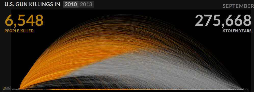
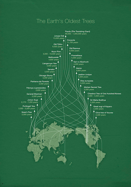
A more positive defense of complex infographics is that they function not as bling, but as art, and more importantly, as puzzles. As art, they are enjoyable to look at, but as puzzles, they are fun to explore. Andrew Gelman gives this example, by Michael Paukner (original here)
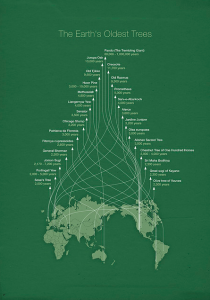
tree

He notes

The headache is, I believe, part of the point. First, if the lines were direct you wouldn’t get the pretty Christmas tree pattern. Second, the investment required in following the lines makes you appreciate what you’ve learned. Third, the curvy lines are themselves a puzzle; as you trace them, you gradually learn the meaning of the y-axis.

It’s a familiar idea in education that you absorb information better if you have to do something discover it rather than just being fed it. If that’s why less-informative graphs and infographics are appreciated, perhaps we should be glad of evidence it isn’t only kids and scientists that still think it’s fun to find things out for themselves.

But if that’s the reason, it also warns of the limits of the strategy.  These displays are, actually, less efficient and accurate at conveying information.  In a situation where information does need to be conveyed efficiently and accurately, bling or eye candy wouldn’t matter so much, but puzzles need to be avoided.


March 20, 2013

Frontiers in piecharts

From Bradley Voytek, apparently from Reddit, but unfortunately not further sourced there either

hHm8uJ0


I think the legend at the bottom right just makes this perfect.