March 20, 2013
It’s still dry
The NIWA soil moisture maps from March 10 and yesterday show how much difference a single storm doesn’t make:
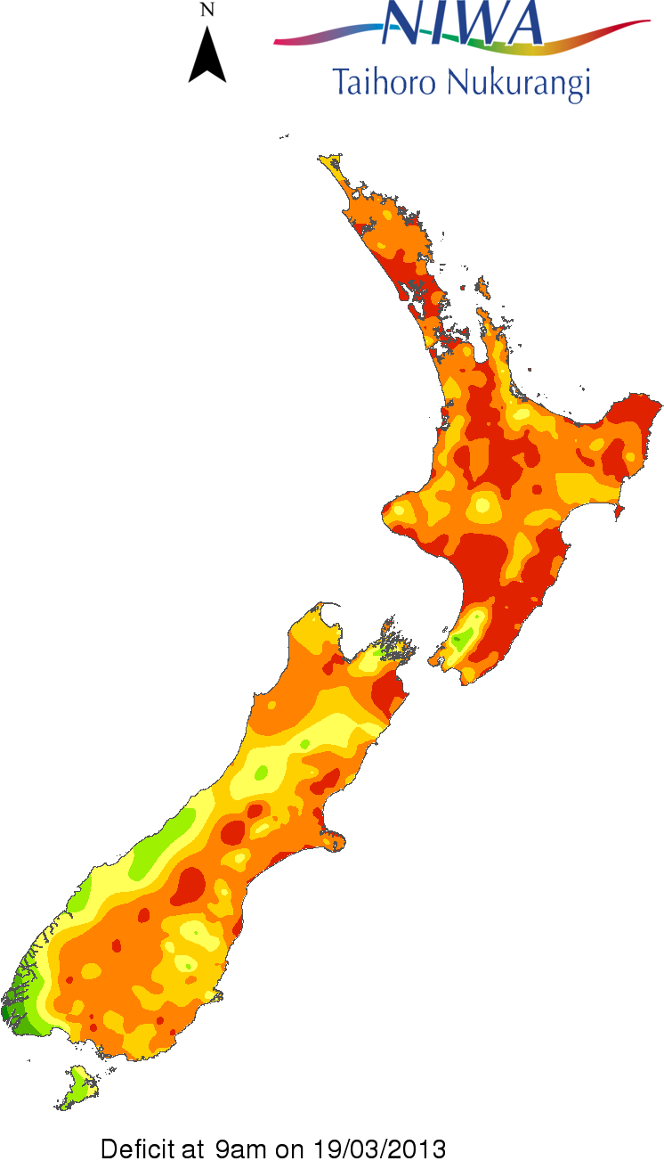
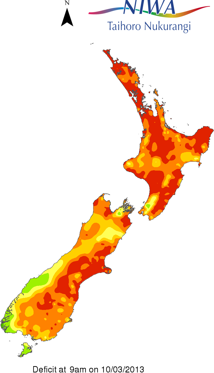
It’s a good thing there are date labels to distinguish them.
The NIWA soil moisture maps from March 10 and yesterday show how much difference a single storm doesn’t make:
It’s a good thing there are date labels to distinguish them.
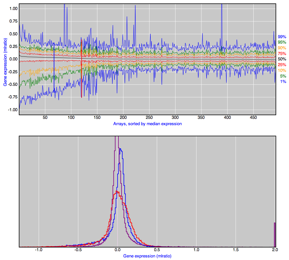
We’ve encountered Karl Broman before, for his list of the top ten worst graphs in the scientific literature. He also has some nice examples of interactive scientific graphics, both stand-alone and embedded in slides for talks.
One example: 500 boxplots of gene expression ratios (no, you don’t need to know or care what these are). The top panel shows minimum, maximum, median, quartiles, and as you move the mouse along, the bottom panel shows the whole distribution. Click, and the distribution stays in the bottom panel for comparison with others.
Karl, on Twitter, has also recommended a column on visualisation in the journal Nature Methods, but it’s not open-access, sadly.
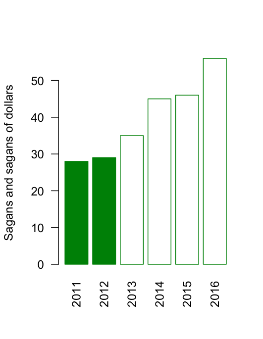
Promoted from comments: Steve Black
In the Wall St Journal article there is a graphic which does an excellent example of showing why you have to be careful.
So what we’re looking at is that 2011 and 2012 are real. All the rest are made up. And it looks like they made up the trend for 2014-2016 from the pattern of 2011-2013 (two about the same, next two higher) even though 2013 itself is not yet a quarter over. Less than a concrete example?
Yup. I should have noticed that one.
Standard practice is to use a different colour or shading for imaginary numbers:
Today in the USA is National Pi Day (they write their dates funny, and they’re a day behind, so it’s 3.14.2013 there). The Washington Post has a set of the best and worst pie charts to celebrate. Many of them are classics, but there was one I hadn’t seen before, showing that it’s possible to do even worse with a pie chart of a bogus poll than the Herald-Sun does.
Interesting new interactive drought map from Stuff.
I’m not 100% convinced it’s better than a couple of contour maps, but it’s probably the best interactive graph I’ve seen in the NZ mainstream media. (via Mike “@adzebill” Dickison on Twitter)
The global mean land-surface temperature reconstruction from the Berkeley Earth Surface Temperature project (other reconstructions are very similar), looks like this:
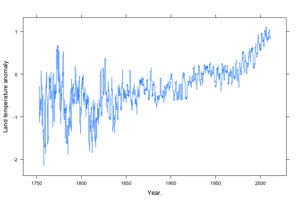
I’ve scaled the axes using Bill Cleveland’s method of “banking to 45 degrees“, that is, so the median of the slope is 45 degrees. Based on his research, this seems to give close to optimal perception of patterns. (more…)
From NIWA, soil moisture across the country (via @nzben on Twitter), compared to the same time last year and to the average for this date.
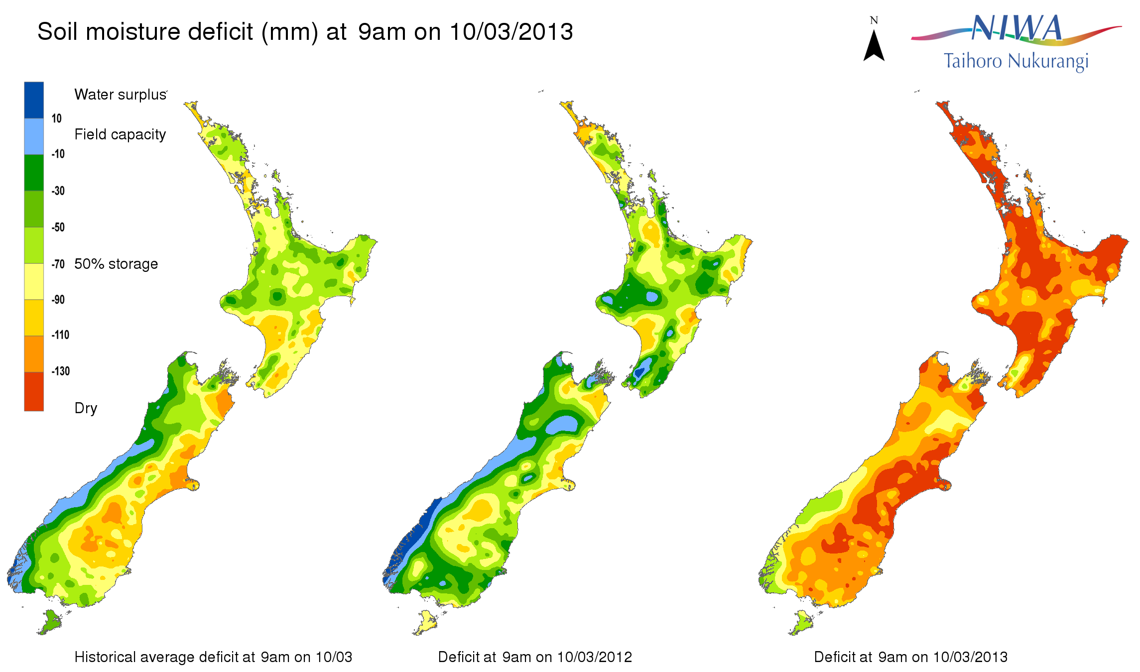
Update: If I had to be picky about something: that light blue colour. It doesn’t really fit in the sequence.
Update: Stuff also has a NIWA map, and theirs looks worse, but it’s based on rainfall over just the past three weeks (and, strangely, labelled “Drought levels over the past six days”)
A presentation from Jonathan Corum, who works at the New York Times.
Read it for the content, and read it to see how a speech with slides can be turned into an effective webpage.
This is based on his keynote talk at the Tapestry conference, which was held just before the Computer-Assisted Reporting conference I mentioned last weekend.
(via)