Posts filed under Graphics (394)

February 26, 2013

Compared to what?

The Auckland Transport Blog presents a dramatically bad example of organising and displaying what would otherwise be quite useful information

ITP-Destination-Demand


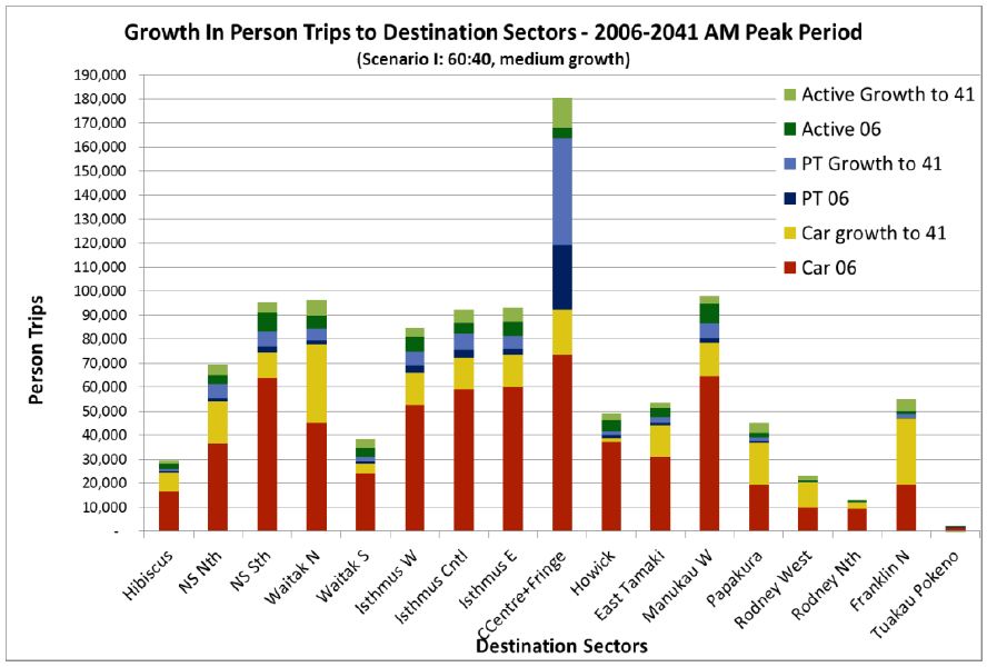
The legend indicates that the graph is trying to show three pairs of now vs future comparisons: car trips, public transport trips, and whatever ‘Active’ means (?walking and cycling, perhaps), and geographical variation.

Unfortunately, the stacking means that the easiest comparison is current car trips (red bars) vs all future trips (total bar length).   For example, in the City Centre and Fringe bar, the large projected growth in public transport is mixed up visually with the relatively large current public transport use.  The geographical variation would probably be clearer if the bars were sorted by current volume  rather than north to south, since then you would be able to see projected differences between currently similar areas.

As a relatively minor problem, the colour scheme also highlights growth in car trips more than it really deserves.

February 25, 2013

Infographics: so 1980s Soviet

Based on a tweet from Luis Apiolaza (@zentree), I found a bunch of genuine Soviet-era Pravda infographics (the rest of the site is good, too).


These are actually better than a lot of the modern crop.  They certainly handle piecharts better than the Herald-Sun.

Probably most of the numbers are made up, but it’s not as if the numbers on modern infographics are all that good.

But that’s not the worst part

Andrew Gelman passes on this infographic from the Carbon Trust

hourglass


His correspondent points out that the colour scheme is awful, and that the hourglass metaphor would only make sense if the ‘pinch point’ in the hourglass was ‘now’, not 3-5 years in the future.

But that’s not the worst part: Andrew points out that the teeny orange area is actually highest rate per year over the whole time period, a fact that’s masked by the design.

But that’s not the worst part.  The data in the graph come from telephone interviews with some unspecified set of senior executives (CEO, CIO, CTO, COO, etc) selected in an unspecified way with an unspecified response rate, from companies of varying but unspecified size in varying but unspecified industries, so it isn’t really as if the numbers mean much anyway.

Where to cut?

A US survey (see Wonkblog coverage) asked respondents about cutting government spending both overall, and in 19 specific areas.  Most people were in favour of overall cuts, but none of the 19 areas got a majority in favour of decreased funding (click to embiggen, as usual)

a good graph for a change


Even among self-identified Republicans, only two areas had majority support for cuts: unemployment benefits and foreign aid, which make up less than 3.5% of the federal budget.

The graph is pretty good, but some indication of the relative size of these areas (perhaps by the thickness of the bars) might improve it.

February 20, 2013

Is there a 3-strikes law for piecharts?

The Herald-Sun pie chart saga continues (thanks to @danfairbairn and @PeteHaitch on Twitter).   Can we get their piechart license suspended pending training and re-examination?

Can we revoke their piechart license?


This example further complicates the question of how they actually make these graphs.  In this one, the angle is at least approximately right, the percentages are right apart from being incorrectly rounded, but the graph is backwards.  We’ve also seen examples where the angles were completely wrong, but the two groups were correctly identified. It’s hard to see how an automated system could cause such a bewildering variety of problems, but it’s also hard to see how a real person could be so totally clueless about pie charts.


February 18, 2013

Colour schemes

Two more colour-scheme producers

  • I Want Hue: takes random colours from a user-specified range and uses Science k-means clustering to make them more distinct. Has nice demonstrations on colour theory. 
  • Colorscheme Designer: standard colour-space patterns, user-adjustable. Can show the impact of all the important types of impaired colour vision.

From Twitter #rstats

February 16, 2013

Visual perception illustration

This CT-scan picture illustrates an important perception issue for graphics.  Look carefully at the image, especially at the pattern of white spots.

_65896739_asd

Click through when you’re done
(more…)

Redesigning a graph

There are lots of posts criticizing graphs out there on the internet, and a few that provide an improvement, but not many that show their working.

An post at The Why Axis redesigns the jobs chart put out each month by the US Bureau of Labor Statistics, which starts off like this:

ted_20130111

and goes through a number of intermediate versions including this

bls-in4


before the final design.

(thanks to Luis Apiolaza for pointing out The Why Axis on Twitter)

February 13, 2013

Ordinal graphics

Graphics guru Edward Tufte has the lovely phrase “Pravda School of Ordinal Graphics” for a graphic style which forgets that numbers have a magnitude as well as an order.  Ben Brooks points us to the Herald’s effort


KiwisWhoSmokeFeb13


In the misinformation stakes this is a pretty venial sin, but it’s so unnecessary.  It’s not hard to compute the time lag between 1976 and 1996 or between 2002 and 2006, and to realize they aren’t the same.  The decrease isn’t slowing down as the graph suggests; it’s pretty much a straight line. The truncation of the vertical axis is more of a style thing: if the horizontal axis had been accurate, one could have argued that expanding the vertical scale to show changes in trend was more important. But if that was the rationale, you’d need to get the horizontal scale right.

And if you think of it as an infographic rather than conveying quantitative information there’s another problem: if you have a graphic where two of the colours are pink and blue, and two of the groups are ‘men’ and ‘women’….

February 12, 2013

Unclear on the pie-chart concept

Everyone recognises pie. Everyone likes pie. So pie must be a good representation of numbers, right?

One important detail: you want bigger numbers to translate into more pie. This would be especially important if the numbers meant anything, but it’s not a good look even if they don’t.

4XMQKnz

From the Herald-Sun, via Juha Saarinen on Twitter.

[Also: could a cynical reader perhaps think the question was a bit slanted?]

[Update: this looks like exactly the same pie chart they used for 56% vs 44% last month]