September 16, 2015
How many immigrants?
Before reading on, what proportion of New Zealand residents do you think were born overseas? (more…)
Before reading on, what proportion of New Zealand residents do you think were born overseas? (more…)
First, the Gulf States. It has been widely reported that the Gulf States have taken zero refugees from Syria. This is by definition: they are not signatories to the relevant UN Conventions, so people fleeing to the Gulf States do not count as refugees according to the UNHCR. Those people still exist. There are relevant questions about why these states aren’t signatories, and about how they have treated the (many) Syrians who fled there, and about whether they should accept more people from Syria, and about their humanitarian record in general. The official figure of zero refugees isn’t a good starting point, though.
Second, New Zealand. The Government has announced an increase in the refugee quota, but the announcement is a mixture of annual figures and figures added up across two and a half years. It would be clearer if the numbers used the same time period.
The current quota is 750 per year. Over the next 2.5 years that would be 1875 people. We are increasing this by 600, to 2475. The current budget is $58 million/year. Over the next 2.5 years that would be $145 million. We are increasing this by an estimated $48 million, to $193 million. Either by numbers or by dollars, this is about a 1/3 increase.
The New York Times has a well-deserved reputation for data journalism, but anyone can have a bad day. There’s a piece by Steven Johnson on the non-extinction of the music industry (which I think makes some good points), but which the Future of Music Coalition doesn’t like at all. And they also have some good points.
In particular, Johnson says
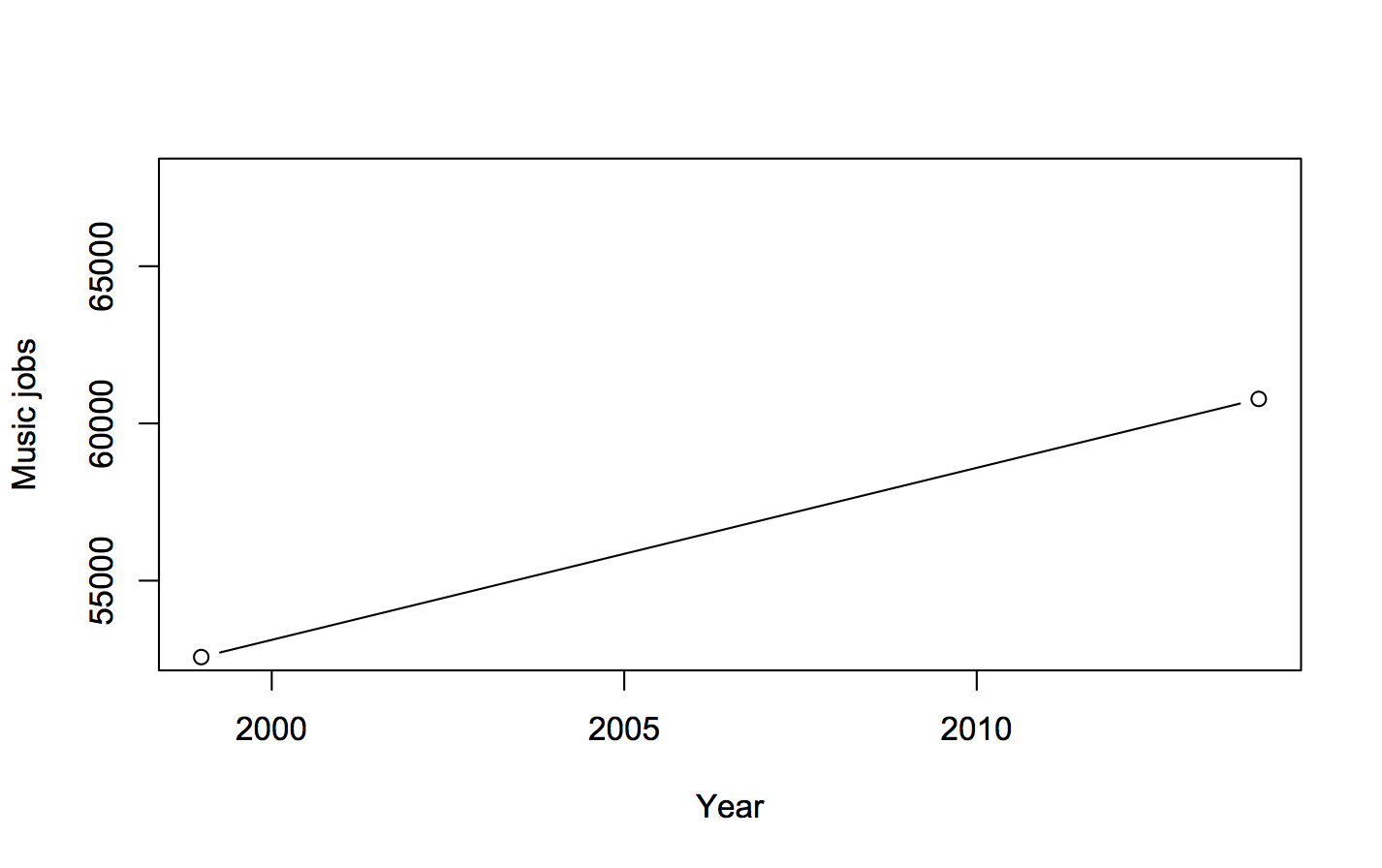
“According to the OES, in 1999 there were nearly 53,000 Americans who considered their primary occupation to be that of a musician, a music director or a composer; in 2014 more than 60,000 people were employed writing, singing, or playing music. That’s a rise of 15 percent.”
He’s right. This is a graph (not that you really need one)
The Future of Music Coalition give the numbers for each year, and they’re interesting. Here’s a graph of the totals:
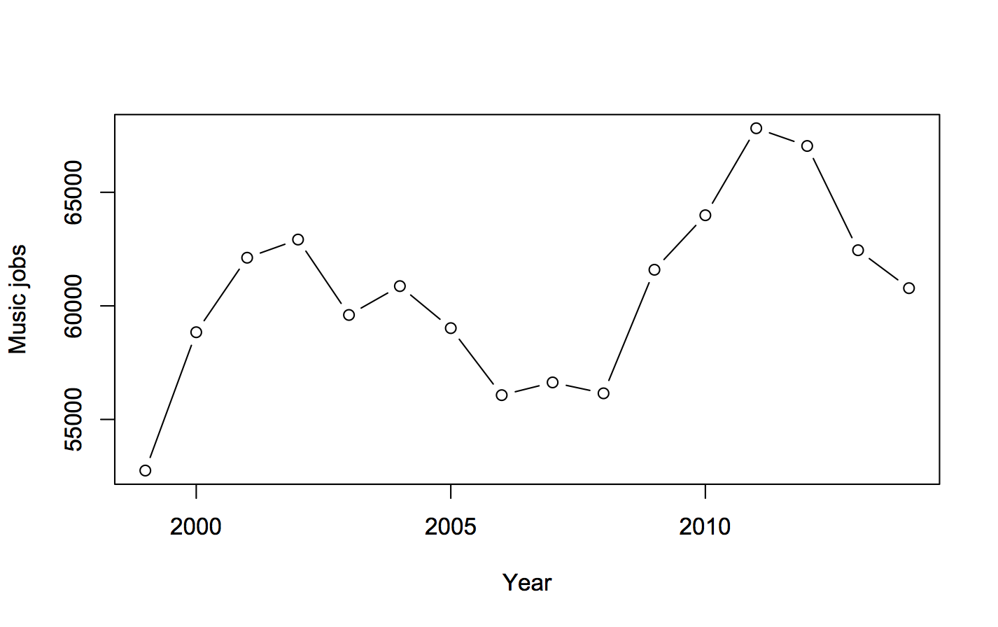
There isn’t a simple increase; there’s a weird two-humped pattern. Why?
Well, if you look at the two categories, “Music Directors and Composers” and “Musicians and Singers”, making up the total, it’s quite revealing
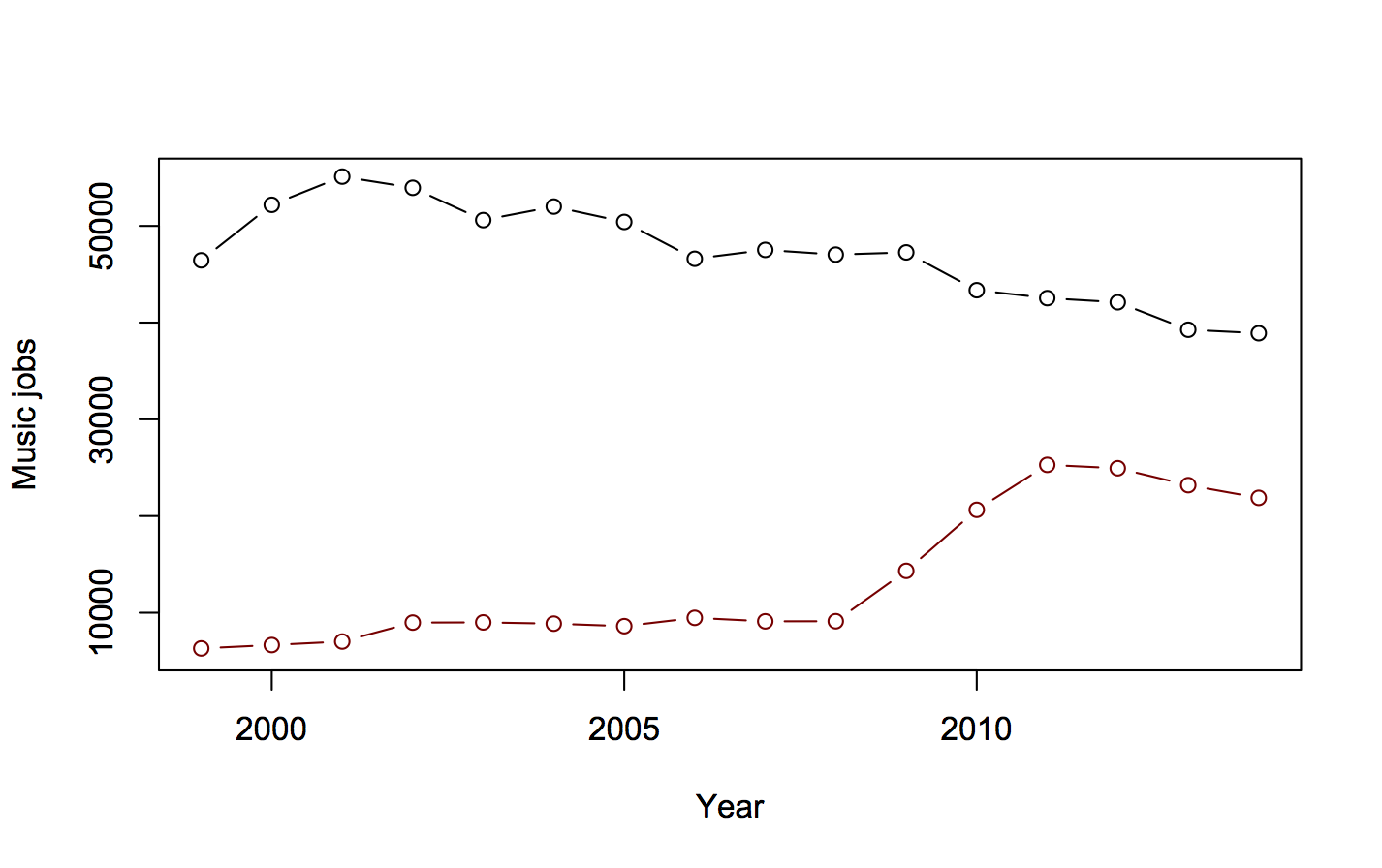
The larger category, “Musicians and Singers”, has been declining. The smaller category, “Music Directors and Composers” was going up slowly, then had a dramatic three-year, straight-line increase, then decreased a bit.
Going into the Technical Notes for the estimates (eg, 2009), we see
May 2009 estimates are based on responses from six semiannual panels collected over a 3-year period
That means the three-year increase of 5000 jobs/year is probably a one-off increase of 15,000 jobs. Either the number of “Music Directors and Composers” more than doubled in 2009, or more likely there was a change in definitions or sampling approach. The Future of Music Coalition point out that Bureau of Labor Statistics FAQs say this is a problem (though they’ve got the wrong link: it’s here, question F.1)
Challenges in using OES data as a time series include changes in the occupational, industrial, and geographical classification systems
In particular, the 2008 statistics estimate only 390 of these people as being employed in primary and secondary schools; the 2009 estimate is 6000, and the 2011 estimate is 16880. A lot of primary and secondary school teachers got reclassified into this group; it wasn’t a real increase.
When the school teachers are kept out of “Music Directors and Composers”, to get better comparability across years, the change is from 53000 in 1999 to 47000 in 2014. That’s not a 15% increase; it’s an 11% decrease.
Official statistics agencies try not to change their definitions, precisely because of this problem, but they do have to keep up with a changing world. In the other direction, I wrote about a failure to change definitions that led the US Census Bureau to report four times as many pre-schoolers were cared for by fathers vs mothers.
These ones are from the Seattle Times, since that’s where I was last week.
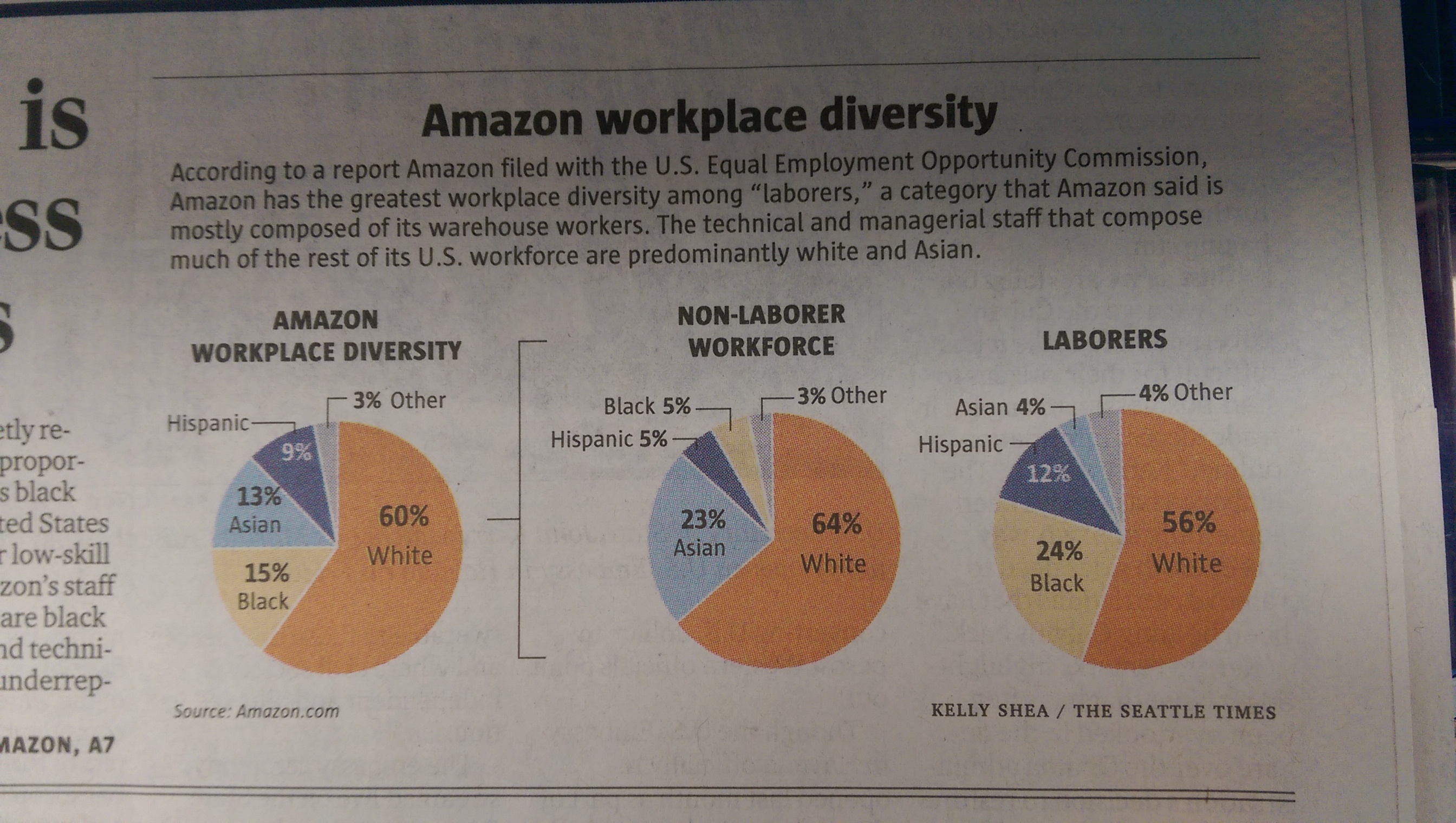
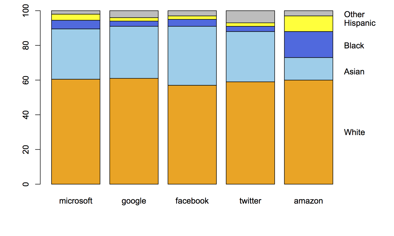
Amazon.com, like many other tech companies, had been persuaded to release figures on gender and ethnicity for its employees. On the original figures, Amazon looked different from the other companies, but Amazon is unusual in being a shipping-things-around company as well as a tech company. Recently, they released separate figures for the ‘labourers and helpers’ vs the technical and managerial staff. The pie chart shows how the breakdown makes a difference.
In contrast to Kirsty Johnson’s pie charts last week, where subtlety would have been wasted given the data and the point she was making, here I think it’s more useful to have the context of the other companies and something that’s better numerically than a pie chart.
This is what the original figures looked like:
Here’s the same thing with the breakdown of Amazon employees into two groups:
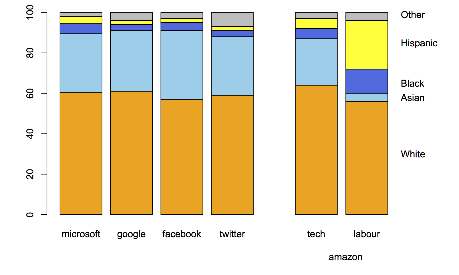
When you compare the tech-company half of Amazon to other large tech companies, it blends in smoothly.
As a final point, “diversity” is really the wrong word here. The racial/ethnic diversity of the tech companies is pretty close to that of the US labour force, if you measure in any of the standard ways used in ecology or data mining, such as entropy or Simpson’s index. The issue isn’t diversity but equal opportunity; the campaigners, led by Jesse Jackson, are clear on this point, but the tech companies and often the media prefer to talk about diversity.
From Kirsty Johnson, in the Herald, ethnicity in the highest and lowest decile schools in Auckland.
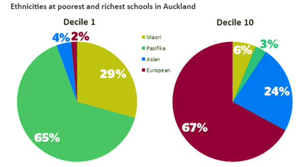
Statisticians don’t like pie charts because they are inefficient; they communicate numerical information less effectively than other forms, and don’t show subtle differences well. Sometimes the differences are sufficiently unsubtle that a pie chart works.
It’s still usually not ideal to show just the two extreme ends of a spectrum, just as it’s usually a bad idea to show just two points in a time series. Here’s the full spectrum, with data from EducationCounts
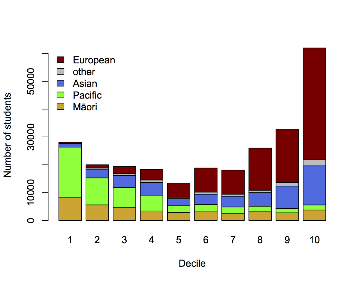
[The Herald has shown the detailed school ethnicity data before in other contexts, eg the decile drift story and graphics from Nicholas Jones and Harkanwal Singh last year]
I’ve used counts rather than percentages to emphasise the variation in student numbers between deciles. The pattern of Māori and Pacific representation is clearly different in this graph: the numbers of Pacific students fall off dramatically as you move up the ranking, but the numbers of Māori students stabilise. There are almost half as many Māori students in decile 10 as in decile 1, but only a tenth as many Pacific students.
If you’re interested in school diversity, the percentages are the right format, but if you’re interested in social stratification, you probably want to know how students of different ethnicities are distributed across deciles, so the absolute numbers are relevant.
Two more visualisations:
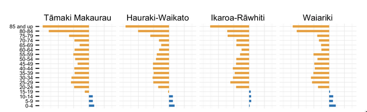
Kieran Healy has graphs of the male:female ratio by age for each electorate. Here are the four with the highest female proportion, rather dramatically starting in the late teen years.
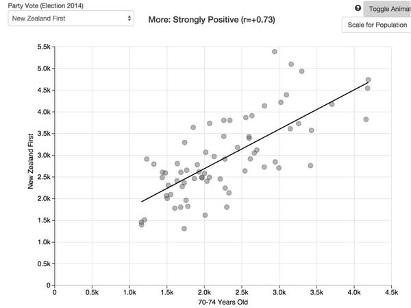
Andrew Chen has a lovely interactive scatterplot of vote for each party against demographic characteristics. For example (via Harkanwal Singh), number of votes for NZ First vs median age
Stuff’s headline is “Beneficiaries increasingly failing drug tests, numbers show”.
The numbers are rates per week of people failing or refusing drug tests. The number was 1.8/week for the first 12 weeks of the policy and 2.6/week for the whole year 2014, and, yes, 2.6 is bigger than 1.8. However, we don’t know how many tests were performed or demanded, so we don’t know how much of this might be an increase in testing.
In addition, if we don’t worry about the rate of testing and take the numbers at face value, the difference is well within what you’d expect from random variation, so while the numbers are higher it would be unwise to draw any policy conclusions from the difference.
On the other hand, the absolute numbers of failures are very low when compared to the estimates in the Treasury’s Regulatory Impact Statement.
MSD and MoH have estimated that once this policy is fully implemented, it may result in:
• 2,900 – 5,800 beneficiaries being sanctioned for a first failure over a 12 month period
• 1,000 – 1,900 beneficiaries being sanctioned for a second failure over a 12 month period
• 500 – 1,100 beneficiaries being sanctioned for a third failure over a 12 month period.
The numbers quoted by Stuff are 60 sanctions in total over eighteen months, and 134 test failures over twelve months. The Minister is quoted as saying the low numbers show the program is working, but as she could have said the same thing about numbers that looked like the predictions, or numbers that were higher than the predictions, it’s also possible that being off by an order of magnitude or two is a sign of a problem.
From the Herald (squashed-trees version, via @economissive)
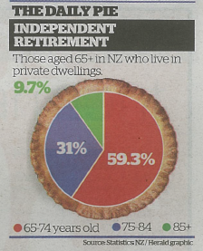
For comparison, a pie of those aged 65+ in NZ regardless of where they live, based on national population estimates:
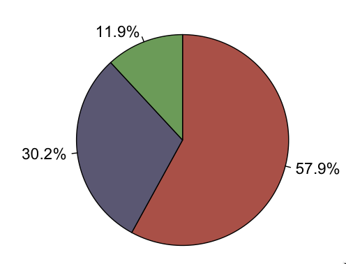
Almost all the information in the pie is about population size; almost none is about where people live.
A pie chart isn’t a wonderful way to display any data, but it’s especially bad as a way to show relationships between variables. In this case, if you divide by the size of the population group, you find that the proportion in private dwellings is almost identical for 65-74 and 75-84, but about 20% lower for 85+. That’s the real story in the data.
Brent Edwards on Radio NZ’s Checkpoint has done a good job of fact-checking claims about refugee numbers in New Zealand. Amnesty NZ tweeted this summary table
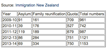
If you want the original sources for the numbers, the Immigration Department Refugee Statistics page is here (and Google finds it easily).
The ‘Asylum’ numbers are in the Refugee and Protection Status Statistics Pack, the “Approved” column of the first table. The ‘Family reunification’ numbers are in the Refugee Family Support Category Statistics Pack in the ‘Residence Visas Granted’ section of the first table. The ‘Quota’ numbers are in the Refugee Quota Settlement Statistics Pack, in the right-hand margin of the first table.
Update: @DoingOurBitNZ pointed me to the appeals process, which admits about 50 more refugees per year: 53 in 2013/4; 57 in 2012/3; 63 in 2011/2; 27 in 2010/11.