Posts filed under Polls (132)

December 11, 2015

Against sampling?

Stuff has a story from the Sydney Morning Herald, on the claim that smartphones will be obsolete in five years. They don’t believe it. Neither do I, but that doesn’t mean we agree on the reasons.  The story thinks not enough people were surveyed:

The research lab surveyed 100,000 people across its native Sweden and 39 other countries.

With around 1.9 billion smartphone users globally, this means ConsumerLab covered just 0.0052 per cent of active users for its study.

This equates to about 2500 in each country; the population of Oberon

If you don’t recognise Oberon, it’s a New South Wales town slightly smaller than Raglan.

Usually, the Sydney Morning Herald doesn’t have such exacting standards for sample size. For example, their recent headline “GST rise backed by voters if other taxes cut: Fairfax-Ipsos poll” was based on 1402 people, about the population of Moerewa.

The survey size is plenty large enough if it was done right. You don’t, as the saying goes, have to eat the whole egg to know that it’s rotten. If you have a representative sample from a population, the size of the population is almost irrelevant to the accuracy of survey estimates from the sample. That’s why opinion polls around the world tend to sample 1000-2000 people, even though that’s 0.02-0.04% of the population of New Zealand, 0.004%-0.009% of the population of Australia, or 0.0003-0.0006% of the population of the USA.

What’s important is whether the survey is representative, which can be achieved either by selecting and weighting people to match the population, or by random sampling, or in practice by a mixture of the two.  Unfortunately, the story completely fails to tell us.

Looking at the Ericsson ConsumerLab website, it doesn’t seem that the survey is likely to be representative — or at least, there aren’t any details that would indicate it is.  This means it’s like, say, the Global Drug Survey,  which also has 100,000 participants, out of over 2 billion people worldwide who use alcohol, tobacco, and other drugs, and which Stuff  and the SMH have reported on at great length and without the same skepticism.

December 8, 2015

What you do know that isn’t so

The Herald (and others) are reporting an international Ipsos-Mori poll on misperceptions about various national statistics.  Two of the questions are things I’ve written about before: crude wealth inequality and proportion of immigrants.

New Zealanders on average estimated that 37% of our population are immigrants.  That’s a lot — it’s more than New York or London. The truth is 25%, which is still higher than most of the other countries. Interestingly, the proportion of immigrants in Auckland is quite close to 37%, and a lot of immigration-related news seems to focus on Auckland.   I think the scoring system based on absolute differences is unfair to NZ here: saying 37% when the truth is 25% doesn’t seem as bad as saying 10% when the truth is 2% (as in Japan).

We also estimated that 1% of the NZ population own 50% of the wealth. Very similar estimates came from a lot of countries, so I don’t think this is because of coverage of inequality in New Zealand.  My guess is that we’re seeing the impact of the Credit Suisse reports (eg, in Stuff), which say 50% of the world’s wealth is owned by the top 1%.  Combined with the fact that crude wealth inequality is a bogus statistic anyway, the Credit Suisse reports really seem to do more harm than good for public knowledge.

September 28, 2015

Seeing the margin of error

A detail from Andrew Chen’s visualisation of all the election polls in NZ:

polls

His full graph is somewhat interactive: you can zoom in on times, select parties, etc. What I like about this format is how clear it makes the poll-to-poll variability.  The poll result for, say, National isn’t a line, it’s a cloud of uncertainty.

The cloud of uncertainty gets narrower for minor parties (as detailed in my cheatsheet), but for the major parties you can see it span an entire 10-percentage-point grid cell or more.

September 10, 2015

Do preferential voting and similar flags interact badly?

(because I was asked about Keri Henare’s post)

Short answer: No.

As you know, we have four candidate flags. Two of them, the Lockwood ferns, have the same design with some colour differences. Is this a problem, and is it particularly a problem with Single Transferable Vote (STV) voting?

In the referendum, we will be asked to rank the four flags. The first preferences will be counted. If one flag has a majority, it will win. If not, the flag with fewest first preferences will be eliminated, and its votes allocated to their second-choice flags. And so on. Graeme Edgeler’s Q&A on the method covers the most common confusions. In particular, STV has the nice property that (unless you have really detailed information about everyone else’s voting plans) your best strategy is to rank the flags according to your true preferences.

That’s not today’s issue. Today’s issue is about the interaction between STV and having two very similar candidates.  For simplicity, let’s consider the extreme case where everyone ranks the two Lockwood ferns together (whether 1 and 2, 2 and 3, or 3 and 4). Also for simplicity, I’ll assume there is a clear preference ranking — that is, given any set of flags there is one that would be preferred over each of the others in two-way votes.  That’s to avoid various interesting pathologies of voting systems that aren’t relevant to the discussion. Finally, if we’re asking if the current situation is bad, we need to remember that the question is always “Compared to what?”

One comparison is to using just one of the Lockwood flags. If we assume either that there’s one of them that’s clearly more popular, or that no-one really cares about the difference, then this gives the same result as using both the Lockwood flags.

Given that the legislation calls for four flags this isn’t really a viable alternative. Instead, we could replace one of the Lockwood flags with, say, Red Peak.  Red Peak would then win if a majority preferred it over the remaining Lockwood flag and over each of the other two candidates.  That’s the same result that we’d get adding a fifth flag, except that adding a fifth flag takes a law change and so isn’t feasible.

Or, we could ask how the current situation compares to another voting system. With first-past-the-post, having two very similar candidates is a really terrible idea — they tend to split the vote. With approval voting (tick yes/no for each flag) it’s like STV; there isn’t much impact of adding or subtracting a very similar candidate.

If it were really  true that everyone was pretty much indifferent between the Lockwood flags or that one of them was obviously more popular, it would have been better to just take one of them and have a different fourth flag. That’s not an STV bug; that’s an STV feature; it’s relatively robust to vote-splitting.

It isn’t literally true that people don’t distinguish between the Lockwood flags. Some people definitely want to have black on the flag and others definitely don’t.  Whether it would be better to have one Lockwood flag and Red Peak depends on whether there are more Red Peak supporters than people who feel strongly about the difference between the two ferns.  We’d need data.

What this argument does suggest is that if one of the flags were to be replaced on the ballot, trying to guess which one was least popular need not be the right strategy.

September 9, 2015

Assessing popular opinion

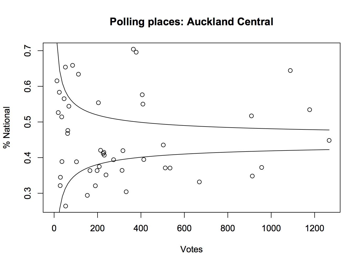
One of the important roles played by good-quality opinion polls before an election is getting people’s expectations right.  It’s easy to believe that the opinions you hear everyday are representative, but for a lot of people they won’t be.  For example, here are the percentages for the National Party for each polling place in Auckland Central in the 2014 election. The curves show the margin of error around the overall vote for the electorate, which in this case wasn’t far from the overall for the whole country.

kael

For lots of people in Auckland Central, their neighbours vote differently than the electorate as a whole.  You could do this for the whole country, especially if the data were in a more convenient form, and it would be more dramatic.

Pauline Kael, the famous New York movie critic, mentioned this issue in a talk to the Modern Languages Association

“I live in a rather special world. I only know one person who voted for Nixon. Where they are I don’t know. They’re outside my ken. But sometimes when I’m in a theater I can feel them.”

She’s usually misquoted in a way that reverses her meaning, but still illustrates the point.

It’s hard to get hold of popular opinion just from what you happen to come across in ordinary life, but there are some useful strategies. For example, on the flag question

  • How many people do you personally know in real life who had expressed a  preference for one of the Lockwood fern flags and now prefer Red Peak?
  • How many people do you follow on Twitter (or friend on Facebook, or whatever on WhatsApp) who had expressed a  preference for one of the Lockwood fern flags and now prefer Red Peak?

For me, the answer to both of these is “No-one”: the Red Peak enthusiasts that I know aren’t Lockwood converts. I know of some people who have changed their preferences that way — I heard because of my last StatsChat post — but I have no idea what the relevant denominator is.

The petition is currently just under 34,000 votes, having slowed down in the past day or so. I don’t see how Red Peak could have close to a million supporters.  More importantly, anyone who knows that it does must have important evidence they aren’t sharing. If the groundswell is genuinely this strong, it should be possible to come up with a few thousand dollars to get at least a cheap panel survey and demonstrate the level of support.

I don’t want to go too far in being negative. Enthusiasm for this option definitely goes beyond disaffected left-wing twitterati — it’s not just Red pique — but changing the final four at this point really should require some reason to believe the new flag could win. I don’t see it.

Opinion is still evolving, and maybe this time we’ll keep the Australia-lite flag and the country will support something I like next time.


September 8, 2015

Petitions and other non-representative data

Stuff has a story about the #redpeak  flag campaign, including a clicky bogus poll that currently shows nearly 11000 votes in support of the flag candidate. While Red Peak isn’t my favourite (I prefer Sven Baker’s Huihui),  I like it better than the four official candidates. That doesn’t mean I like the bogus poll.

As I’ve written before, a self-selected poll is like a petition; it shows that at least the people who took part had the views they had. The web polls don’t really even show that — it’s pretty easy to vote two or three times. There’s also no check that the votes are from New Zealand — mine wasn’t, though most of them probably are.  The Stuff clicky poll doesn’t even show that 11,000 people voted for the Red Peak flag.

So far, this Stuff poll at least hasn’t been treated as news. However, the previous one has.  At the bottom of one of the #redpeak stories you can read

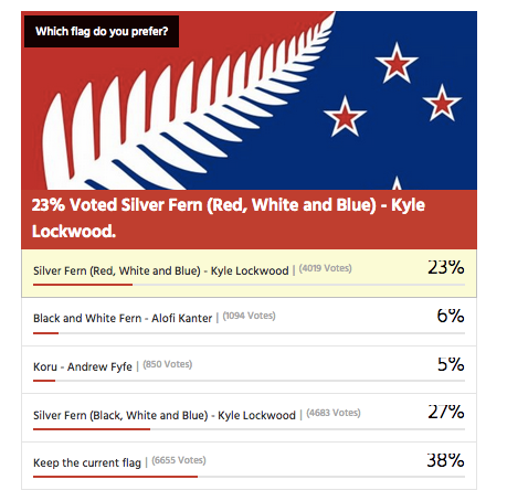
In a Stuff.co.nz poll of 16,890 readers, 39 per cent of readers voted to keep the current flag rather than change it. 

Kyle Lockwood’s Silver Fern (black, white and blue) was the most popular alternate flag design, with 27 per cent of the vote, while his other design, Silver Fern (red, white and blue), got 23 per cent. This meant, if Lockwood fans rallied around one of his flags, they could vote one in.

Flags designed by Alofi Kanter – the black and white fern – and Andrew Fyfe each got 6 per cent or less of the vote

They don’t say, but that looks very much like this clicky poll from an earlier Stuff flag story, though it’s now up to about 17500 votes

flagpoll

You can’t use results from clicky polls as population estimates, whether for readers or the electorate as a whole. It doesn’t work.

Over approximately the same time period there was a real survey by UMR (PDF), which found only 52% of people preferred their favourite among the four flags to the current flag.  The referendum looks a lot closer than the clicky poll suggests.

The two Lockwood ferns were robustly the most popular flags in the survey, coming  in as the top two for all age groups; men and women; Māori; and Labour, National and Green voters. Red Peak was one of the four least preferred in every one of these groups.

Only 1.5% of respondents listed Red Peak among their top four.  Over the whole electorate that’s still about 45000, which is why an online petition with 31000 electronic signatures should have about the impact it’s going to have on the government.

Depending on turnout, it’s going to take in the neighbourhood of a million supporting votes for a new flag to overturn the current flag. It’s going to take about the same number of votes ranking Red Peak higher than the Lockwood ferns for it to get on to the final ballot.

In the Stuff story, Graeme Edgeler suggests “Perhaps if there were a million people in a march” would be enough to change the government’s mind. He’s probably right, though I’d say a million estimated from a proper survey, or maybe fifty thousand in a march should be enough. For an internet petition, perhaps two hundred thousand might be a persuasive number, if there was some care taken that they were distinct people and eligible voters.

For those of us in a minority on flag matters, Andrew Geddis has a useful take

In fact, I’m pretty take-it-or-leave-it on the whole point of having a “national” flag. Sure, we need something to put up on public buildings and hoist a few times at sporting events. But I quite like the fact that we’ve got a bunch of other generally used national symbols that can be appropriated for different purposes. The silver fern for putting onto backpacks in Europe. The Kiwi for our armed forces and “Buy NZ Made” logos. The Koru for when we’re feeling the need to be all bi-cultural.

If you like Red Peak, fly it. At the moment, the available data suggest you’re in as much of minority as me.

July 15, 2015

Bogus poll story, again

From the Herald

[Juwai.com] has surveyed its users and found 36 per cent of people spoken to bought property in New Zealand for investment.

34 per cent bought for immigration, 18 per cent for education and 7 per cent lifestyle – a total of 59 per cent.

There’s no methodology listed, and this is really unlikely to be anything other than a convenience sample, not representative even of users of this one particular website.

As a summary of foreign real-estate investment in Auckland, these numbers are more bogus than the original leak, though at least without the toxic rhetoric.

June 5, 2015

Peacocks’ tails and random-digit dialing

People who do surveys using random-digit phone number dialing tend to think that random-digit dialling or similar attempts to sample in a representative way are very important, and sometimes attack the idea of public-opinion inference from convenience samples as wrong in principle.  People who use careful adjustment and matching to calibrate a sample to the target population are annoyed by this, and point out that not only is statistical modelling a perfectly reasonable alternative, but that response rates are typically so low that attempts to do random sampling also rely heavily on explicit or implicit modelling of non-response to get useful results.

Andrew Gelman has a new post on this issue, and it’s an idea that I think should be taken more further (in a slightly different direction) than he seems to.

It goes like this. If it becomes widely accepted that properly adjusted opt-in samples can give reasonable results, then there’s a motivation for survey organizations to not even try to get representative samples, to simply go with the sloppiest, easiest, most convenient thing out there. Just put up a website and have people click. Or use Mechanical Turk. Or send a couple of interviewers with clipboards out to the nearest mall to interview passersby. Whatever. Once word gets out that it’s OK to adjust, there goes all restraint.

I think it’s more than that, and related to the idea of signalling in economics or evolutionary biology, the idea that peacock’s tails are adaptive not because they are useful but because they are expensive and useless.

Doing good survey research is hard for lots of reasons, only some involving statistics. If you are commissioning or consuming a survey you need to know whether it was done by someone who cared about the accuracy of the results, or someone who either didn’t care or had no clue. It’s hard to find that out, even if you, personally, understand the issues.

Back in the day, one way you could distinguish real surveys from bogus polls was that real surveys used random-digit dialling, and bogus polls didn’t. In part, that was because random-digit dialling worked, and other approaches didn’t so much. Almost everyone had exactly one home phone number, so random dialling meant random sampling of households, and most people answered the phone and responded to surveys.  On top of that, though, the infrastructure for random-digit dialling was expensive. Installing it showed you were serious about conducting accurate surveys, and demanding it showed you were serious about paying for accurate results.

Today, response rates are much lower, cell-phones are common, links between phone number and geographic location are weaker, and the correspondence between random selection of phones and random selection of potential respondents is more complicated. Random-digit dialling, while still helpful, is much less important to survey accuracy than it used to be. It still has a lot of value as a signalling mechanism, distinguishing Gallup and Pew Research from Honest Joe’s Sample Emporium and website clicky polls.

Signalling is valuable to the signaller and to consumer, but it’s harmful to people trying to innovate.  If you’re involved with a serious endeavour in public opinion research that recruits a qualitatively representative panel and then spends its money on modelling rather than on sampling, you’re going to be upset with the spreading of fear, uncertainty, and doubt about opt-in sampling.

If you’re a panel-based survey organisation, the challenge isn’t to maintain your principles and avoid doing bogus polling, it’s to find some new way for consumers to distinguish your serious estimates from other people’s bogus ones. They’re not going to do it by evaluating the quality of your statistical modelling.


May 17, 2015

Polling is hard

Part One: Affiliation and pragmatics

The US firm Public Policy Polling released a survey of (likely) US Republican primary voters last week.  This firm has a habit of including the occasional question that some people would consider ‘interesting context’ and others would call ‘trolling the respondents.’

This time it was a reference to the conspiracy theory about the Jade Helm military exercises in Texas: “Do you think that the Government is trying to take over Texas or not?”

32% of respondents said “Yes”. 28% said “Not sure”. Less than half were confident there wasn’t an attempt to take over Texas. There doesn’t seem to be widespread actual belief in the annexation theory, in the sense that no-one is doing anything to prepare for or prevent it. We can be pretty sure that most of the 60% were not telling the truth. Their answer was an expression of affiliation rather than an accurate reflection of their beliefs. That sort of thing can be problem for polling.

Part Two: Mode effects and social pressure

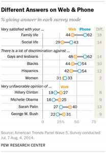
The American Association for Public Opinion Research is having their annual conference, so there’s new and exciting survey research coming out (to the extent that ‘new and exciting survey research’ isn’t an oxymoron). The Pew Research Center took two random groups of 1500 people from one of their panels and asked one group questions over the phone and the other group the same questions on a web form.  For most questions the two groups agreed pretty well: not much more difference than you’d expect from random sampling variability. For some questions, the differences were big:

mode-study-01

It’s not possible to tell from these data which set of answers is more accurate, but the belief in the field is that people give more honest answers to computers than to other people.

March 31, 2015

Polling in the West Island: cheap or good?

New South Wales has just voted, and the new electorate created where I lived in Sydney 20 years ago is being won by the Greens, who got 46.4% of the primary vote and currently 59.7% on preferences. The ABC News background about the electorate says

In 2-party preferred terms this is a safe Labor seat with a margin of 13.7%, but in a two-candidate contest would be a marginal Green seat versus Labor. The estimated first preference votes based on the 2011 election are Green 35.5%, Labor 30.4%, Liberal 21.0%, Independent 9.1, the estimated Green margin after preferences being 4.4% versus Labor.

There was definitely a change since 2011 in this area, so how did the polls do? Political polling is a bit harder with preferential voting when there are only two relevant parties, but much harder when there are more than two.

Well, the reason for mentioning this is a piece in the Australian saying that the swing to the Greens caught Labor by surprise because they’d used cheap polls for electorate-specific prediction

“We just can’t poll these places accurately at low cost,” a Labor strategist said. “It’s too hard. The figures skew towards older voters on landlines and miss younger voters who travel around and use mobile phones.”

The company blamed in the story is ReachTEL. They report that they had the most accurate overall results, but their published poll from 19 March for Newtown is definitely off a bit, giving the Greens 33.3% support.

(via Peter Green on Twitter)