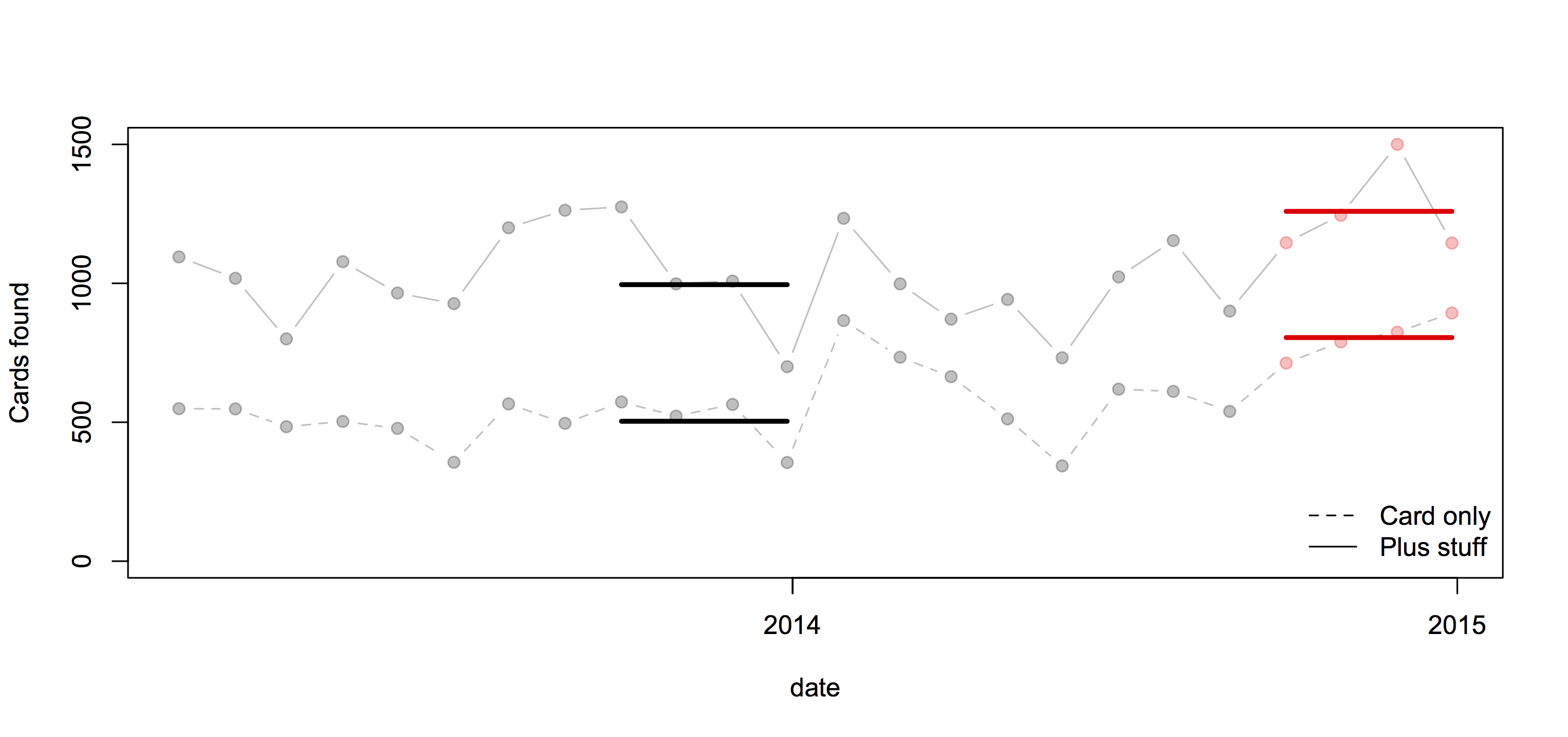
Awful graphs about interesting data
Today in “awful graphs about interesting data” we have this effort that I saw on Twitter, from a paper in one of the Nature Reviews journals.
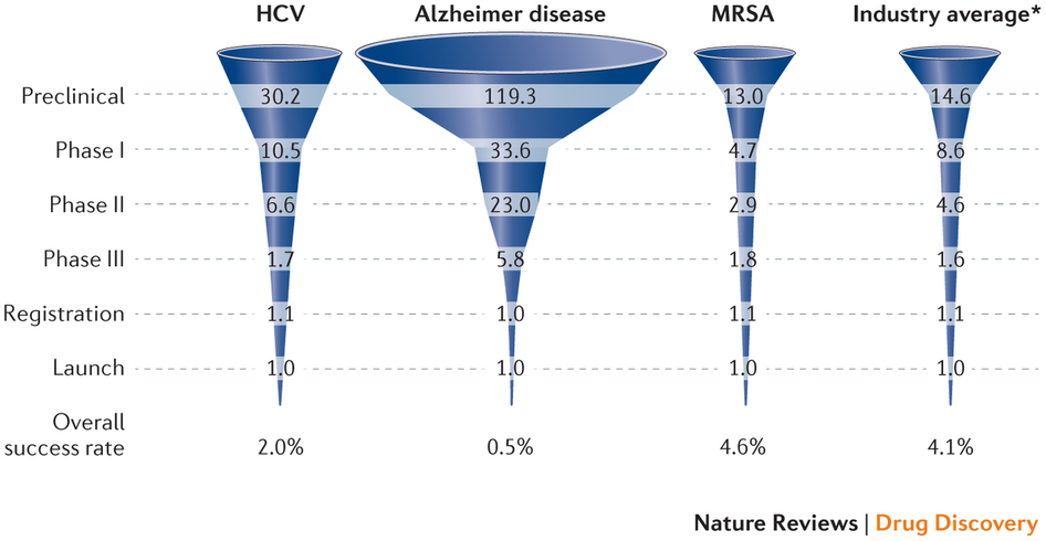
As with some other recent social media examples, the first problem is that the caption isn’t part of the image and so doesn’t get tweeted. The numbers are the average number of drug candidates at each stage of research to end up with one actual drug at the end. The percentage at the bottom is the reciprocal of the number at the top, multiplied by 60%.
A lot of news coverage of research is at the ‘preclinical’ stage, or is even earlier, at the stage of identifying a promising place to look. Most of these never get anywhere. Sometimes you see coverage of a successful new cancer drug candidate in Phase I — first human studies. Most of these never get anywhere. There’s also a lot of variation in how successful the ‘successes’ are: the new drugs for Hepatitis C (the first column) are a cure for many people; the new Alzheimer’s drugs just give a modest improvement in symptoms. It looks as those drugs from MRSA (antibiotic-resistant Staph. aureus) are easier, but that’s because there aren’t many really novel preclinical candidates.
It’s an interesting table of numbers, but as a graph it’s pretty dreadful. The 3-d effect is purely decorative — it has nothing to do with the represntation of the numbers. Effectively, it’s a bar chart, except that the bars are aligned at the centre and have differently-shaped weird decorative bits at the ends, so they are harder to read.
At the top of the chart, the width of the pale blue region where it crosses the dashed line is the actual data value. Towards the bottom of the chart even that fails, because the visual metaphor of a deformed funnel requires the ‘Launch’ bar to be noticeably narrower than the ‘Registration’ bar. If they’d gone with the more usual metaphor of a pipeline, the graph could have been less inaccurate.
In the end, it’s yet another illustration of two graphical principles. The first: no 3-d graphics. The second: if you have to write all the numbers on the graph, it’s a sign the graph isn’t doing its job.