Posts filed under Surveys (188)

September 21, 2015

It’s bad enough without exaggerating

This UK survey report is being a bit loose with the details, in a situation where that’s not even needed

stem for boys

The survey of more than 4,000 girls, young women, parents and teachers, demonstrates clearly that there is a perception that STEM subjects and careers are better suited to male personalities, hobbies and brains. Half (51 percent) of the teachers and 43 percent of the parents surveyed believe this perception helps explain the low uptake of STEM subjects by girls. [emphasis added]

Those aren’t the same thing at all.  I believe this perception helps explain the low uptake of STEM subjects by girls. Michelle ‘Nanogirl’ Dickinson believes this perception helps explain the low uptake of STEM subjects by girls. It’s worrying that nearly more than half of UK teachers don’t believe this perception helps explain the low uptake of STEM subjects by girls.

On the other hand, this is depressing and actually does seem to be what the survey said:

Nearly half (47 percent) of the young girls surveyed said they believe such subjects are a better match for boys.

as does this

difficult subjects It would fit with NZ experience if a lot of boys felt the same about the difficulty of science and maths, but that wouldn’t actually make it any better.


September 8, 2015

Petitions and other non-representative data

Stuff has a story about the #redpeak  flag campaign, including a clicky bogus poll that currently shows nearly 11000 votes in support of the flag candidate. While Red Peak isn’t my favourite (I prefer Sven Baker’s Huihui),  I like it better than the four official candidates. That doesn’t mean I like the bogus poll.

As I’ve written before, a self-selected poll is like a petition; it shows that at least the people who took part had the views they had. The web polls don’t really even show that — it’s pretty easy to vote two or three times. There’s also no check that the votes are from New Zealand — mine wasn’t, though most of them probably are.  The Stuff clicky poll doesn’t even show that 11,000 people voted for the Red Peak flag.

So far, this Stuff poll at least hasn’t been treated as news. However, the previous one has.  At the bottom of one of the #redpeak stories you can read

In a Stuff.co.nz poll of 16,890 readers, 39 per cent of readers voted to keep the current flag rather than change it. 

Kyle Lockwood’s Silver Fern (black, white and blue) was the most popular alternate flag design, with 27 per cent of the vote, while his other design, Silver Fern (red, white and blue), got 23 per cent. This meant, if Lockwood fans rallied around one of his flags, they could vote one in.

Flags designed by Alofi Kanter – the black and white fern – and Andrew Fyfe each got 6 per cent or less of the vote

They don’t say, but that looks very much like this clicky poll from an earlier Stuff flag story, though it’s now up to about 17500 votes
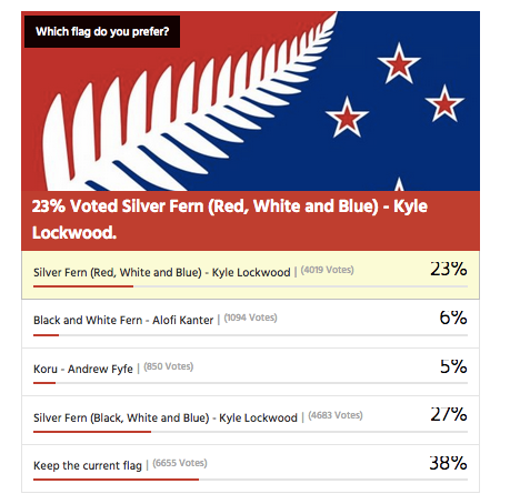
flagpoll

You can’t use results from clicky polls as population estimates, whether for readers or the electorate as a whole. It doesn’t work.

Over approximately the same time period there was a real survey by UMR (PDF), which found only 52% of people preferred their favourite among the four flags to the current flag.  The referendum looks a lot closer than the clicky poll suggests.

The two Lockwood ferns were robustly the most popular flags in the survey, coming  in as the top two for all age groups; men and women; Māori; and Labour, National and Green voters. Red Peak was one of the four least preferred in every one of these groups.

Only 1.5% of respondents listed Red Peak among their top four.  Over the whole electorate that’s still about 45000, which is why an online petition with 31000 electronic signatures should have about the impact it’s going to have on the government.

Depending on turnout, it’s going to take in the neighbourhood of a million supporting votes for a new flag to overturn the current flag. It’s going to take about the same number of votes ranking Red Peak higher than the Lockwood ferns for it to get on to the final ballot.

In the Stuff story, Graeme Edgeler suggests “Perhaps if there were a million people in a march” would be enough to change the government’s mind. He’s probably right, though I’d say a million estimated from a proper survey, or maybe fifty thousand in a march should be enough. For an internet petition, perhaps two hundred thousand might be a persuasive number, if there was some care taken that they were distinct people and eligible voters.

For those of us in a minority on flag matters, Andrew Geddis has a useful take

In fact, I’m pretty take-it-or-leave-it on the whole point of having a “national” flag. Sure, we need something to put up on public buildings and hoist a few times at sporting events. But I quite like the fact that we’ve got a bunch of other generally used national symbols that can be appropriated for different purposes. The silver fern for putting onto backpacks in Europe. The Kiwi for our armed forces and “Buy NZ Made” logos. The Koru for when we’re feeling the need to be all bi-cultural.

If you like Red Peak, fly it. At the moment, the available data suggest you’re in as much of minority as me.

June 18, 2015

Bogus poll story again

For a while, the Herald largely gave up basing stories on bogus clicky poll headlines. Today, though, there was a story about Gurpreet Singh,  who was barred from the Manurewa Cosmopolitan Club for refusing to remove his turban.

The headline is “Sikh club ban: How readers reacted”, and the first sentence says:

Two thirds of respondents to an online NZ Herald poll have backed the controversial Cosmopolitan Club that is preventing turbaned Sikhs from entering due to a ban on hats and headgear.

In some ways this is better than the old-style bogus poll stories that described the results as a proportion of Kiwis or readers or Aucklanders. It doesn’t make the number mean anything much, but presumably the sentence was at least true at the time it was written.

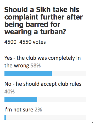
A few minutes ago I looked at the original story and the clicky poll next to it

turban

There are two things to note here. First, the question is pretty clearly biased: to register disagreement with the club you have to say that they were completely in the wrong and that Mr Singh should take his complaint further. Second, the “two thirds of respondents” backing the club has fallen to 40%. Bogus polls really are even more useless than you think they are, no matter how useless you think they are.

But it’s worse than that. Because of anchoring bias, the “two thirds” figure has an impact even on people who know it is completely valueless: it makes you less informed than you were before. As an illustration, how did you feel about the 40% figure in the new results? Reassured that it wasn’t as bad as the Herald had claimed, or outraged at the level of ignorance and/or bigotry represented by 40% support for the club?


June 15, 2015

Verbal abuse the biggest bullying problem at school: Students

StatsChat is involved with the biennial CensusAtSchool / TataurangaKiTeKura, a national statistics education project for primary and secondary school students. Supervised by teachers, students aged between 9 and 18 (Year 5 to Year 13) answer 35 questions in English or te reo Māori about their lives, then analyse the results in class. Already, more than 18,392 students from 391 schools all over New Zealand have taken part.

This year, for the first time, CAS asked students about bullying, a persistent problem in New Zealand schools.

School students think verbal mistreatment is the biggest bullying issue in schools – higher than cyberbullying, social or relational bullying such as social exclusion and spreading gossip, or physical bullying.

Students were asked how much they agreed or disagreed with statements about each type of bullying.  A total of 36% strongly agreed or agreed that verbal bullying was a problem among students at their school, followed by cyberbullying (31% agreed or strongly agreed), social or relational bullying (25% agreed or strongly agreed) and physical bullying (19% agreed or strongly agreed).

Read the rest of the press release here.


June 5, 2015

Peacocks’ tails and random-digit dialing

People who do surveys using random-digit phone number dialing tend to think that random-digit dialling or similar attempts to sample in a representative way are very important, and sometimes attack the idea of public-opinion inference from convenience samples as wrong in principle.  People who use careful adjustment and matching to calibrate a sample to the target population are annoyed by this, and point out that not only is statistical modelling a perfectly reasonable alternative, but that response rates are typically so low that attempts to do random sampling also rely heavily on explicit or implicit modelling of non-response to get useful results.

Andrew Gelman has a new post on this issue, and it’s an idea that I think should be taken more further (in a slightly different direction) than he seems to.

It goes like this. If it becomes widely accepted that properly adjusted opt-in samples can give reasonable results, then there’s a motivation for survey organizations to not even try to get representative samples, to simply go with the sloppiest, easiest, most convenient thing out there. Just put up a website and have people click. Or use Mechanical Turk. Or send a couple of interviewers with clipboards out to the nearest mall to interview passersby. Whatever. Once word gets out that it’s OK to adjust, there goes all restraint.

I think it’s more than that, and related to the idea of signalling in economics or evolutionary biology, the idea that peacock’s tails are adaptive not because they are useful but because they are expensive and useless.

Doing good survey research is hard for lots of reasons, only some involving statistics. If you are commissioning or consuming a survey you need to know whether it was done by someone who cared about the accuracy of the results, or someone who either didn’t care or had no clue. It’s hard to find that out, even if you, personally, understand the issues.

Back in the day, one way you could distinguish real surveys from bogus polls was that real surveys used random-digit dialling, and bogus polls didn’t. In part, that was because random-digit dialling worked, and other approaches didn’t so much. Almost everyone had exactly one home phone number, so random dialling meant random sampling of households, and most people answered the phone and responded to surveys.  On top of that, though, the infrastructure for random-digit dialling was expensive. Installing it showed you were serious about conducting accurate surveys, and demanding it showed you were serious about paying for accurate results.

Today, response rates are much lower, cell-phones are common, links between phone number and geographic location are weaker, and the correspondence between random selection of phones and random selection of potential respondents is more complicated. Random-digit dialling, while still helpful, is much less important to survey accuracy than it used to be. It still has a lot of value as a signalling mechanism, distinguishing Gallup and Pew Research from Honest Joe’s Sample Emporium and website clicky polls.

Signalling is valuable to the signaller and to consumer, but it’s harmful to people trying to innovate.  If you’re involved with a serious endeavour in public opinion research that recruits a qualitatively representative panel and then spends its money on modelling rather than on sampling, you’re going to be upset with the spreading of fear, uncertainty, and doubt about opt-in sampling.

If you’re a panel-based survey organisation, the challenge isn’t to maintain your principles and avoid doing bogus polling, it’s to find some new way for consumers to distinguish your serious estimates from other people’s bogus ones. They’re not going to do it by evaluating the quality of your statistical modelling.


May 26, 2015

Who is my neighbour?

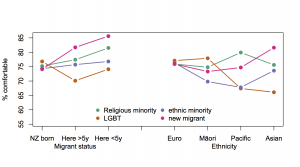
The Herald has a story with data from the General Social Survey. Respondents were asked if they would feel comfortable with a neighbour who was from a religious minority, LGBT, from an ethnic or racial minority, with mental illness, or a new migrant.  The point of the story was that the figure was about 50% for mental illness, compared to about 75% for the other groups. It’s a good story; you can go read it.

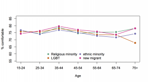
What I want to do here is look at how the 75% varies across the population, using the detailed tables that StatsNZ provides. Trends across time would have been most interesting, but this question is new, so we can’t get them. As a surrogate for time trends, I first looked at age groups, with these results [as usual, click to embiggen]

neighour-age

There’s remarkably little variation by age: just a slight downturn for LGBT acceptance in the oldest group. I had expected an initial increase then a decrease: a combination of a real age effect due to teenagers growing up, then a cohort effect where people born a long time ago have old-fashioned views. I’d also expected more difference between the four questions over age group.

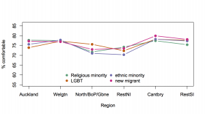
After that, I wasn’t sure what to expect looking at the data by region. Again, there’s relatively little variation.

neighbour-region

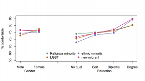
For gender and education at least the expected relationships held: women and men were fairly similar except that men were less comfortable with LGBT neighbours, and comfort went up with education.

neighour-sexeduc

Dividing people up by ethnicity and migrant status was a mixture of expected and surprising. It’s not a surprise that migrants are happier with migrants as neighbours, or, since they are more likely to be members of religious minorities, that they are more comfortable with them. I was expecting migrants and people of Pacific or Asian ethnicity to be less comfortable with LGBT neighbours, and they were. I wasn’t expecting Pacific people to be the least comfortable with neighbours from an ethnic or racial minority.

neighbour-ethnic

As always with this sort of data it’s important to remember these responses aren’t really level of comfort with different types of neighbours. They aren’t even really what people think their level of comfort would be with different types of neighbours, just whether they say they would be comfortable. The similarity across the four questions makes me suspect there’s a lot of social conformity bias creeping in.

May 17, 2015

Polling is hard

Part One: Affiliation and pragmatics

The US firm Public Policy Polling released a survey of (likely) US Republican primary voters last week.  This firm has a habit of including the occasional question that some people would consider ‘interesting context’ and others would call ‘trolling the respondents.’

This time it was a reference to the conspiracy theory about the Jade Helm military exercises in Texas: “Do you think that the Government is trying to take over Texas or not?”

32% of respondents said “Yes”. 28% said “Not sure”. Less than half were confident there wasn’t an attempt to take over Texas. There doesn’t seem to be widespread actual belief in the annexation theory, in the sense that no-one is doing anything to prepare for or prevent it. We can be pretty sure that most of the 60% were not telling the truth. Their answer was an expression of affiliation rather than an accurate reflection of their beliefs. That sort of thing can be problem for polling.

Part Two: Mode effects and social pressure

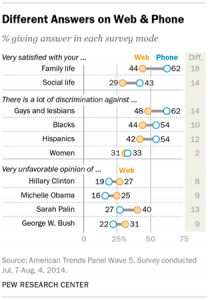
The American Association for Public Opinion Research is having their annual conference, so there’s new and exciting survey research coming out (to the extent that ‘new and exciting survey research’ isn’t an oxymoron). The Pew Research Center took two random groups of 1500 people from one of their panels and asked one group questions over the phone and the other group the same questions on a web form.  For most questions the two groups agreed pretty well: not much more difference than you’d expect from random sampling variability. For some questions, the differences were big:

mode-study-01

It’s not possible to tell from these data which set of answers is more accurate, but the belief in the field is that people give more honest answers to computers than to other people.

April 14, 2015

Northland school lunch numbers

Last week’s Stat of the Week nomination for the Northern Advocate didn’t, we thought point out anything particularly egregious. However, it did provoke me to read the story — I’d previously only  seen the headline 22% statistic on Twitter.  The story starts

Northland is in “crisis” as 22 per cent of students from schools surveyed turn up without any or very little lunch, according to the Te Tai Tokerau Principals Association.

‘Surveyed’ is presumably a gesture in the direction of the non-response problem: it’s based on information from about 1/3 of schools, which is made clear in the story. And it’s not as if the number actually matters: the Te Tai Tokerau Principals Association basically says it would still be a crisis if the truth was three times lower (ie, if there were no cases in schools that didn’t respond), and the Government isn’t interested in the survey.

More evidence that number doesn’t matter is that no-one seems to have done simple arithmetic. Later in the story we read

The schools surveyed had a total of 7352 students. Of those, 1092 students needed extra food when they came to school, he said.

If you divide 1092 by 7352 you don’t get 22%. You get 15%.  There isn’t enough detail to be sure what happened, but a plausible explanation is that 22% is the simple average of the proportions in the schools that responded, ignoring the varying numbers of students at each school.

The other interesting aspect of this survey (again, if anyone cared) is that we know a lot about schools and so it’s possible to do a lot to reduce non-response bias.  For a start, we know the decile for every school, which you’d expect to be related to food provision and potentially to response. We know location (urban/rural, which district). We know which are State Integrated vs State schools, and which are Kaupapa Māori. We know the number of students, statistics about ethnicity. Lots of stuff.

As a simple illustration, here’s how you might use decile and district information.  In the Far North district there are (using Wikipedia because it’s easy) 72 schools.  That’s 22 in decile one, 23 in decile two, 16 in decile three, and 11 in deciles four and higher.  If you get responses from 11 of the decile-one schools and only 4 of the decile-three schools, you need to give each student in those decile-one schools a weight of 22/11=2 and each student in the decile-three schools a weight of 16/4=4. To the extent that decile predicts shortage of food you will increase the precision of your estimate, and to the extent that decile also predicts responding to the survey you will reduce the bias.

This basic approach is common in opinion polls. It’s the reason, for example, that the Green Party’s younger, mobile-phone-using support isn’t massively underestimated in election polls. In opinion polls, the main limit on this reweighting technique is the limited amount of individual information for the whole population. In surveys of schools there’s a huge amount of information available, and the limit is sample size.

February 19, 2015

West Island census under threat?

From the Sydney Morning Herald

Asked directly whether the 2016 census would go ahead as planned on August 9, a spokeswoman for the parliamentary secretary to the treasurer Kelly O’Dwyer read from a prepared statement.

It said: “The government and the Bureau of Statistics are consulting with a wide range of stakeholders about the best methods to deliver high quality, accurate and timely information on the social and economic condition of Australian households.”

Asked whether that was an answer to the question: “Will the census go ahead next year?” the spokeswoman replied that it was.

Unlike Canada, it’s suggested they would at least save money in the short term. It’s the longer-term consequences of reduced information quality that are a concern — not just directly for Census questions, but for all surveys that use Census data to compensate for sampling bias. How bad this would be depends on what is used to replace the Census: if it’s a reasonably large mandatory-response survey (as in the USA), it could work well. If it’s primarily administrative data, probably not so much.

In New Zealand, the current view is that we do still need a census.

Key findings are that existing administrative data sources cannot at present act as a replacement for the current census, but that early results have been sufficiently promising that it is worth continuing investigations.


February 3, 2015

Meet Statistics summer scholar Daniel van Vorsselen

Every year, the Department of Statistics offers summer scholarships to a number of students so they can work with staff on real-world projects. Daniel, right, is working on a project called Working with data from conservation monitoring schemes with Associate Professor Rachel Fewster. Daniel explains:

Daniel Profile Picture“The university is involved in a project called CatchIT, an online system that aims to help community conservation schemes by proving users with a place where they can input and store their data for reference. The project also produces maps and graphics so that users can assess the effectiveness of their conservation schemes and identify areas where changes can be made.

“My role in the project is to help analyse the data that users put into the project. This involves correctly formatting and cleaning the data so that it is usable. I assist users in the technical aspects relating to their data and help them communicate their data in a meaningful way.

“It’s important to maintain and preserve the wildlife and plant species we have in New Zealand so that future generations have the opportunity to experience them as we have. Our environments are a defining factor of our culture and lifestyles as New Zealanders and we have a large amount of native species in New Zealand. It would be a shame to see them eradicated.

“I am currently studying a BCom/BA conjoint, majoring in Statistics, Economics and Finance. I’m hoping to do Honours in statistics and I am looking at a career in banking.

“Over summer, I hope to enjoy the nice weather, whether out on the boat fishing, at the beach or going for a run.”