January 26, 2020

Not all algorithms wear computers

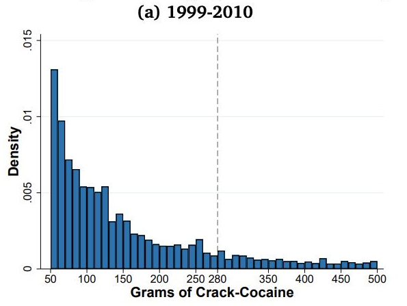
Via maths teacher Twitter, two graphs, from the economics PhD research of Cody Tuttle, showing data from the United States Sentencing Commission on recorded drug amounts in federal drug cases.

The first one shows amounts of crack cocaine 1990-2010
The second shows crack cocaine for the years 2011-2015
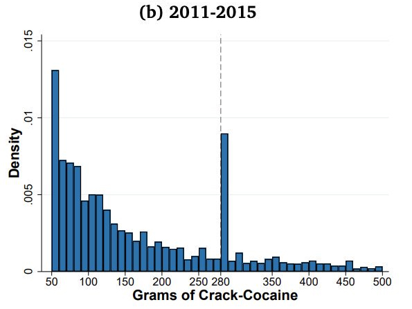
For some reason, people suddenly started getting caught with 280g of crack in 2011. Now, 280g is a rounder number than it looks — it’s 20 times 14g, or in other words, 10 ounces.  Even so, you’d wonder why 10oz loads of cocaine suddenly started being popular.

It turns out that there was a change in the law. Up to 2010, a relic of the ‘war on drugs’ period meant there was a mandatory 10-year minimum sentence for more than 50g. From 2011, the threshold for the mandatory minimum was 280g.  Suddenly, the proportion of people convicted of having 280-290g shot up.  Further graphs and analyses show that the increase was much more pronounced for Black and Hispanic defendants than White.

Interestingly, the paper says However, the data on drug seizures made by local and federal agencies do not show increased bunching at 280g after 2010.” The conclusion reached in the analysis is that a substantial minority of prosecutors, who have some discretion in deciding what quantity of drugs to list in the charges, misused this discretion. 

The analysis is a good example of the sort of auditing you’d like for high-stakes computer algorithms, and it shows how you can bias the outputs of a decision-making system (such as the court) by biasing the data you feed it.

One of the advantages of computerised algorithms is that this sort of auditing is much easier (in principle). It’s because you can’t force the US Federal court system to run on your choice of simulated data that you need to rely on ‘natural experiments’ like this one.
January 23, 2020

Gender pay gaps

New Zealand and international media are reporting an new analysis of the gender pay gap among NZ academics. At one level this isn’t anything very surprising: there’s a gender pay gap, of the same percentage order of magnitude as in NZ as a whole (larger in Medicine, smaller in Arts).

As I’ve pointed out before, we know this is caused by gender, it’s not just some sort of correlation caused by confounding factors, since there aren’t any. What’s interesting is how it is that women come to be paid less. You could imagine a range of direct mechanisms:

  • slower promotion
  • lower pay at the same grade
  • less likely to be head of department/school
  • more likely to be at institutions where pay is lower
  • more likely to be in fields where pay is lower

And you could imagine possible factors leading into these

  • lower research ability
  • lower average age, because of past discrimination
  • interested in putting more effort into teaching or into service
  • pushed into putting more effort into teaching or into service
  • interested in putting more effort into childcare
  • pushed into putting more effort into childcare
  • discrimination in salary assignments
  • discrimination in promotion

and so on.

While many people have more or less informed opinions about these mechanisms, it’s often hard to get good data.  The research (by Associate Professors Ann Brower and Alex James of the University of Canterbury) takes advantage of the 2018 PBRF evaluations of NZ academics.  These evaluations were based on research portfolios selected to show the best research from each person (quality rather than quantity) and were evaluated by panels of NZ and overseas experts in each field.

In this paper, Brower and James got access to PBRF ratings and salary data for NZ academics, and so could look at whether women of similar age with similar PBRF scores had similar pay. As will surely astonish you, they didn’t.  In particular, it appears that women are less likely to be promoted to Associate Professor and Professor, with similar PBRF ratings, that men are.  Differences in age distribution and research performance explain about half the gender pay gap; the other half remains.

The big limitation of any analysis of this sort is the quality of the performance data.  If performance is measured poorly, then even if it really does completely explain the outcomes, it will look as if there’s a unexplained gap.  The point of this paper is that PBRF is quite a good measurement of research performance: assessed by scientists in each field, by panels convened with at least some attention to gender representation, using individual, up-to-date information.  If you believed that PBRF was pretty random and unreliable, you wouldn’t be impressed by these analyses: if PBRF scores don’t describe research performance well, they can’t explain its effect on pay and promotion well.

There could be bias in the other direction, too.  Suppose PBRF were biased in favour of men, and promotions were biased in favour of men in exactly the same way.  Adjusting for PBRF would then completely reproduce the bias in promotion, and make it look as if pay was completely fair.

Now, I’m potentially biased, since I was on a PBRF panel in 2013 (and since I got a good PBRF score), but I think PBRF is a fairly good assessment. I think the true residual pay gap could easily be quite a bit smaller or larger than this analysis estimates, but it’s as good as you’re likely to be able to do, and it certainly does not support the view that the pay gap is zero.

What does that mean?

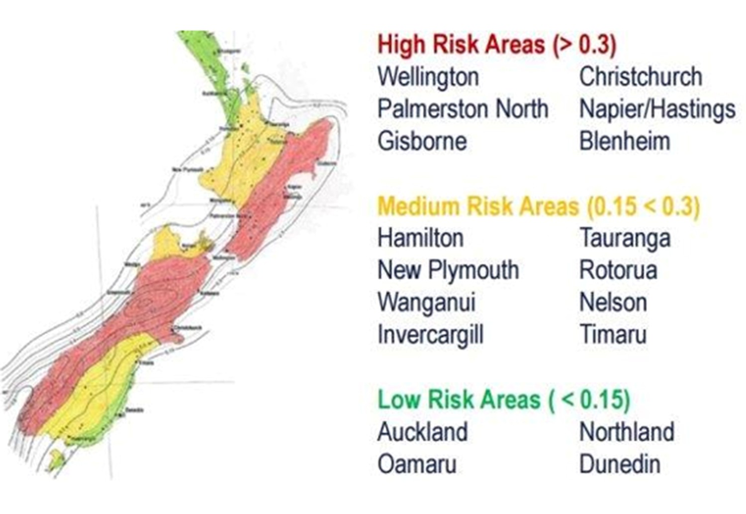
There’s a nice piece on Stuff about earthquake risk in New Zealand (basically, the geology is out to get us, and we should be prepared).

It includes this map, which comes from “SUPPLIED”

I wondered what the risk numbers (0.15, 0.3) actually meant.  Are they some kind of probability of a quake? Over what period of time?

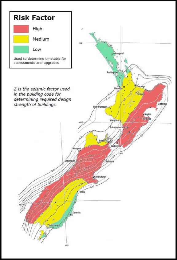
It’s surprisingly hard to find out.  The first step is easy: the numbers are seismic risk factors used in the building code, eg, see this map from Radio NZ in 2017

Searching a bit more, you can readily find that (eg, at building.govt.nz) these are the “Z-values to determine seismic risk”, and that there’s

  • a low seismic risk if the area has a Z factor that is less than 0.15; and
  • a medium seismic risk if the area has a Z factor that is greater than or equal to 0.15 and less than 0.3; and
  • a high seismic risk if the area has a Z factor that is greater than or equal to 0.3.

This isn’t getting us much further forward, but there is a reference to a Standard.  Now, there are (for some reason) serious penalties over and above the copyright law for being too explicit about the contents of a standard, but you can go and read it for yourself, and verify that Z is a hazard factor that you look up in a table, and that it gets combined with other information about soil and so on to give you a number that goes into how strong your building needs to be. But there isn’t any more explicit explanation of what a Z is.

Searching further, I found a research paper which describes the Australian standards as having a Z that looks very much like the NZ one, defined as the “effective peak ground acceleration with a return period of 500 years”. So, it’s not the probability of a quake, it’s the intensity of the largest quake expected over a 500 year period, in units of the acceleration due to gravity.  The US also has a Z with the same definition, though they probably say it ‘zee’.

So, two points: first, it shouldn’t be this much work to find out what the numbers mean on a map published on a major news website. Second, I’m not convinced that ‘seismic risk’ is a good name for this thing, since ‘seismic risk’ sounds more like it should involve probabilities.

January 22, 2020

They say the neon lights are bright

The Herald (on Twitter, today)

An international study has revealed why Auckland has been ranked low for liveability compared to other cities in New Zealand and the rest of the world.

Stuff (March last year)

The City of Sails continues to be ranked the world’s third most liveable city for quality of life.

Phil Goff, as Mayor of Auckland, obviously prefers the pro-Auckland survey and the Herald said he ‘rubbished’ the other survey, saying it “defies all the evidence which shows Auckland is a growing, highly popular city for all people.”

There’s no need for one survey to be wrong and the other one right, though. It depends on what you’re looking for.  Mercer’s rankings (where Auckland does well) are aimed at companies moving employees to overseas postings. One of their intended uses is to work out how much extra executives need to be paid in compensation for living in, say, Houston or Birmingham rather than Auckland or Vancouver.   Cost of living doesn’t factor into this; it’s quality of life if you’re rich enough.

Some of the quality of life features (good climate, safe streets, lack of air pollution) can be enjoyed by most people, but some really are more relevant if you’ve got money.

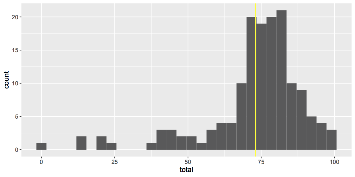
The Movinga ranking that the Herald quotes is about suitability for families.  Two important components are housing costs, and total cost of living, in terms of local incomes.  Auckland does fairly badly there, and also on a public transport/road congestion component.  The ranking of 94 out of 150 overstates the issue a bit: here’s the distribution of scores, with Auckland in yellow. Auckland is part of the main clump, where the rankings will be sensitive to exactly how each component is weighted.

There are important reasons to want to live in a particular city that neither ranking considers.  An obvious one is employment or business opportunities.  If your speciality is teaching statistics or installing HVAC in tall buildings or running a Shanxi restaurant, you’ll probably do better in Auckland than in New Plymouth.  Movinga also rates cities on suitability for entrepreneurs, jobseekers, and as places to find love (Auckland is 34th out of 100 on that last one).


January 21, 2020

Can you win a million dollars?

As Betteridge’s Law of Headlines says, the correct response to any headline ending in a question mark is “No”.

From the Herald: “Kogan Mobile – a relative newcomer to NZ – is offering $1 million if you can correctly pick the result of every game in the first six rounds of the new Super Rugby seasons.”

This is a good deal for Kogan Mobile. They get coverage in the Herald and on NewstalkZB (albeit at 5:20am), and they get a lot of email addresses, many of which will be genuine.  There will be people who hadn’t heard of the company last week who now have heard of them.

I shouldn’t think the publicity is worth a million dollars, but they’re very unlikely to have to pay out.  As I told Chris Keall and Kate Hawkesby, if you typically average 2 out of 3 correct predictions (roughly what StatsChat’s David Scott gets), you’ve got one chance in ten million of getting forty correct predictions — to be precise, (2/3)40

It’s actually a bit worse than that. David gets two out of three correct, but there are easy picks and hard picks, and he does better on the easy ones than the hard ones.   Variation in difficult makes it harder to get all the picks right  — imagine someone who was 100% wrong whenever the Hurricanes played the Chiefs; they could still average two out of three, but they couldn’t get 40 out of 40.

The variation in difficulty doesn’t make that much difference. Suppose you had a 50:50 chance for 29 of the games and the other 11 were so easy you had a 100% chance. That averages close to 2/3, and the variation is more extreme than really plausible, but the chance of getting all forty correct is (0.5)29×(1)11, or one in 500 million, only lower by a factor of 50.

If Kogan Mobile get a million entries, which seems quite a lot for New Zealand, they’d still have probably less than one chance in ten of paying out.   They might have decided to wear that chance, or they might have bought insurance — in 2003, when Pepsi offered a billion dollar lottery-style prize, they insured the risk of paying out, for less than $10 million.

So should you play? Sure, if you feel like it.  You just shouldn’t expect much of a chance of winning.

Super Rugby Predictions for Round 1

Team Ratings for Round 1

The basic method is described on my Department home page.
Here are the team ratings prior to this week’s games, along with the ratings at the start of the season.

Current Rating Rating at Season Start Difference
Crusaders 17.10 17.10 -0.00
Hurricanes 8.79 8.79 -0.00
Jaguares 7.23 7.23 0.00
Chiefs 5.91 5.91 0.00
Highlanders 4.53 4.53 0.00
Brumbies 2.01 2.01 -0.00
Bulls 1.28 1.28 0.00
Lions 0.39 0.39 -0.00
Blues -0.04 -0.04 -0.00
Stormers -0.71 -0.71 -0.00
Sharks -0.87 -0.87 -0.00
Waratahs -2.48 -2.48 -0.00
Reds -5.86 -5.86 0.00
Rebels -7.84 -7.84 0.00
Sunwolves -18.45 -18.45 0.00


Predictions for Round 1

Here are the predictions for Round 1. The prediction is my estimated expected points difference with a positive margin being a win to the home team, and a negative margin a win to the away team.

Game Date Winner Prediction
1 Blues vs. Chiefs Jan 31 Chiefs -1.40
2 Brumbies vs. Reds Jan 31 Brumbies 12.40
3 Sharks vs. Bulls Jan 31 Sharks 2.40
4 Sunwolves vs. Rebels Feb 01 Rebels -4.60
5 Crusaders vs. Waratahs Feb 01 Crusaders 25.60
6 Stormers vs. Hurricanes Feb 01 Hurricanes -3.50
7 Jaguares vs. Lions Feb 01 Jaguares 12.80


January 14, 2020

Hard to treat people are hard to treat

There’s a revolutionary hypothesis about the cost of US healthcare: that it’s driven by the extreme, chronic costs of a few people.  These people have problems that go far beyond medicine, but they could be helped by high-level, individualised social services and support, that would still be cheaper than their medical costs.  Atul Gawande wrote a famous article in the New Yorker on the topic.

In Camden, New Jersey, a program of this sort has been in place for several years.  A new research paper says

The program has been heralded as a promising, data-driven, relationship-based, intensive care management program for superutilizers, and federal funding has expanded versions of the model for use in cities other than Camden, New Jersey.To date, however, the only evidence of its effect is an analysis of the health care spending of 36 patients before and after the intervention and an evaluation of four expansion sites in which propensity-score matching was used to compare the outcomes for 149 program patients with outcomes for controls

What we need here is a randomised trial.  Impressively, given that the program has been famous, and has already been expanded into other cities, the Camden Coalition did a randomised trial, comparing the promising, data-driven, relationship-based, intensive care management program to treatment as usual.  As the New York Times reports

 While the program appeared to lower readmissions by nearly 40 percent, the same kind of patients who received regular care saw a nearly identical decline in hospital stays.

The difference between the groups was tiny, with less than one percentage point difference in risk of hospital re-admission.  The uncertainty interval around that estimate went from 6 percentage points benefit to 7.5 percentage points harm.  There could possibly have been a modest benefit, but you don’t do this sort of intervention for the possibility of a modest benefit.

How did it go wrong? One of the problems is regression to the average. That is, there is always a small group of people driving the medical expenditures, but it’s not always the same people. It’s like treating a cold: a data-driven, relationship-based, intensive care management program will get rid of a cold in only a week, but relying on hot lemon and honey will take seven days.

The failure of this one intervention doesn’t mean the concept doesn’t work.  As the NYT story says, it may be that the programs need more resources, or that they need to target people earlier, or that they need to put more effort into improving housing for the sickest people.  Even if providing basic medical care free to everyone is the most cost-effective approach, if that’s not politically feasible in the USA it might be that ‘hot-spotting’ is second best.

The Camden researchers should be congratulated, though.  It would have been very easy for them to just spread their apparently-successful program around the country — there’s no shortage of work to do.  Instead, they set out to evaluate it, and published what must have been disappointing results in one of the world’s most-read medical journals.

Briefly

  • Reuters graphics showing the size of the Australian bushfires
  • From Jen Hay (linguist) on Twitter Karl du Fresne recently wrote: “The year just passed was notable for the supplanting of the letter T by D in spoken English, so that we got authoridy in place of authority, credibilidy instead of credibility, securidy for security, and so on”. Professor Hay goes on to point out that this is a long-standing trend in NZ English, and show that du Fresne himself was doing it as long ago as 2013!
  • On cancer hype (via Derek Lowe) By email or through their press representatives, STAT asked 17 of the leaders who were quoted in that press release to reflect on what the moonshot has and hasn’t accomplished in the past four years. None of them agreed to comment.
  • Also from Derek Lowe, about cancer trends.  Some cancers are occurring at the same rate they used to, but people aren’t dying from them (good). Some are occurring less often than they used to (good). Some are occurring much more often than they used to, but no more people are dying from them.  That sounds as though it might be good, but (at least in part) it will be overdiagnosis — the cancers aren’t really getting that much more common, we’re just diagnosing harmless cases.
  • 538 are giving forecasts for the US primary elections — including uncertainty intervals, which are really wide still. In 80% of simulations, [Biden] wins between 5% and 45% of the vote. He has a 3 in 10 (30%) chance of winning the most votes, essentially tied with the second most likely winner, Sanders, who has a 3 in 10 (28%) chance.
January 11, 2020

(Pretending to) believe the worst?

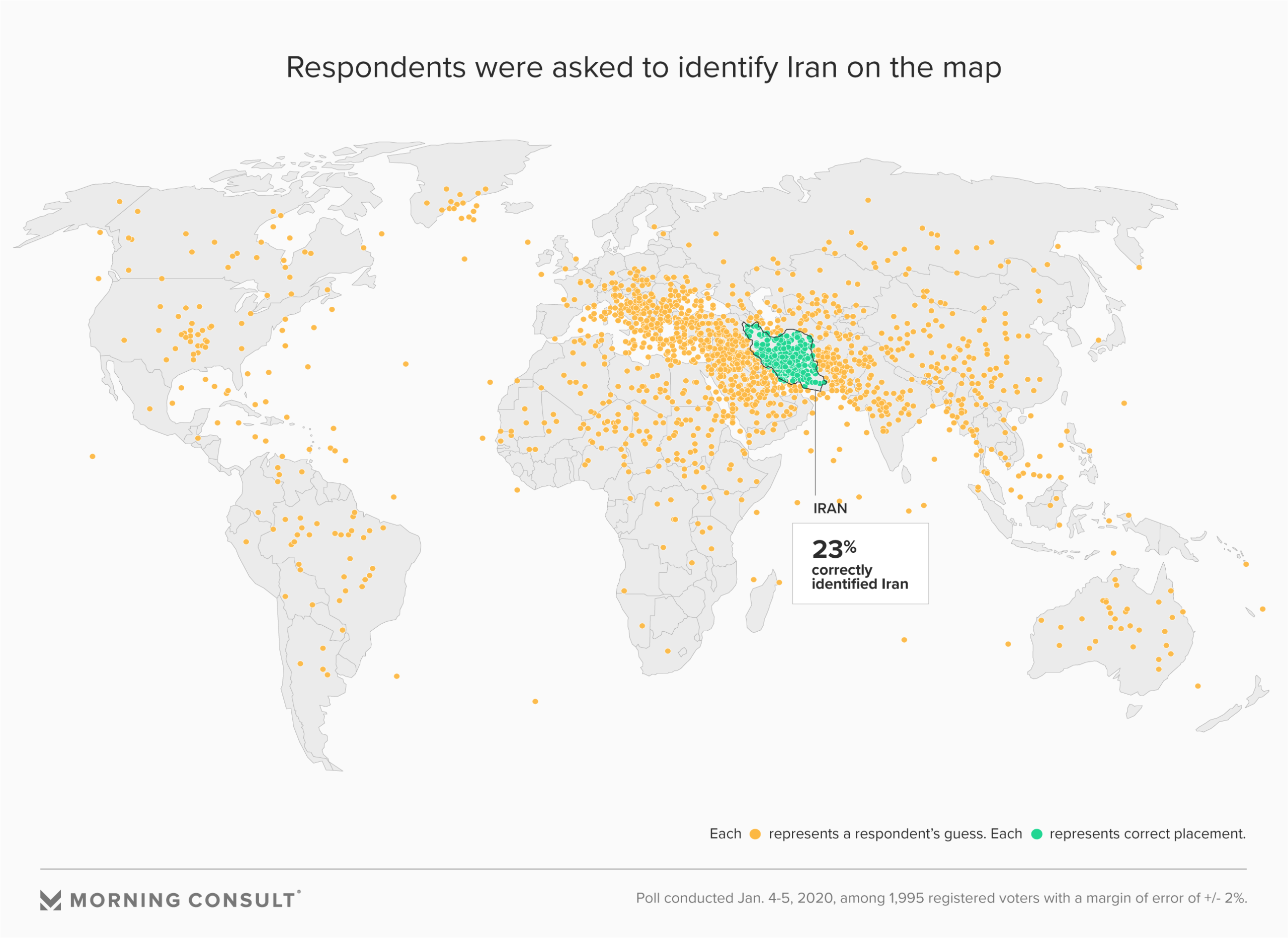
Morning Consult and Politico run a survey where they asked registered US voters to point Iran out on a map.  About a quarter could. Here are the complete results

As you will notice, there are dots everywhere. Morning Consult didn’t go in for any grandiose interpretations; they just presented the proportion of respondents getting the answer correct. Other people were less restrained. There was much wailing and gnashing of teeth over this map, on Twitter, but also at other media outlets.  For example, Rashaan Ayesh wrote at Axios

While the Middle East saw definite clustering, some respondents believed — among dozens of wild responses — that Iran was located in:

  • The U.S.
  • Canada
  • Spain
  • Russia
  • Brazil
  • Australia
  • The middle of the Atlantic Ocean

The claim that some respondents believed Iran to be in the US or the middle of the Atlantic ocean is worrying to me.   I can’t see how a sensible journalist could possibly state as a fact that someone had a belief like that based just on the incredibly flimsy evidence that there’s a dot there on the map.  I’d want to at least have someone explicit claim that they thought Iran was in the middle of the ocean, and ideally have follow-up questions asked about where they think Iranians keep their mosques and carpets and where they grow their rice and barberries and pomegranates and walnuts and so on.

It’s a well-known phenomenon that people don’t always give the answers you want on surveys. Scott Alexander has written about the ‘Lizard-man constant’, and that’s even before you give people a clicky interactive map to play with.   It’s barely conceivable — no, actually it isn’t, but let’s pretend it is — that some people think that large continent on the upper left of the map is the Middle East, or recognise it as North America but believe Iran is in the US.

It seems much more likely to me, though, that

  • they don’t know where Iran is and would rather give an obviously wrong answer than look as if they’re trying
  • they clicked wrong on the map, because interactive maps are actually kind of a pain to use, especially on a phone.
  • they think having heard of Iraan, Texas (pronounced Ira-an), or Persia, Iowa, will make them look clever.
  • they want to mess up the survey because they hate polling or for political reasons or because they’re having a bad day

The next question, of course, is how much it matters that the majority of US voters couldn’t find Iran on a map.  Iran is relatively easy, as countries go — I knew that it had a coastline on the Persian Gulf and that it wasn’t on the Arabian Peninsula, and Iran is big enough that this is sufficient.  But suppose I thought it was where Iraq is, or Syria, as many people did. Should have an impact on my political views (assuming I’m in the US)?  It’s not clear that it should.  The potential ability of Iran to close the Straits of Hormuz (and the Doha and Dubai airports) does depend on its location, but the question of whether the US was justified in killing Qasem Soleimani or threatening to bomb Iranian cultural sites doesn’t seem affected.


January 9, 2020

Missing data

There’s a story by Brittany Keogh at Stuff on misconduct cases at NZ universities (via Nicola Gaston).  The headline example was someone bringing a gun (unloaded, as a film prop). There were 1625 cases of cheating.

As with crime data, there are data collection biases here: whether or not things are reported to the university, and whether the university takes any action, and whether that action ends up as a misconduct record, and how that record is classified.   Notably,

Victoria University of Wellington was the only university that noted disciplinary cases for sexually harmful behaviour, with three incidents reported in 2018. 

The university defined sexually harmful behaviour as “any form of unwelcome sexual advance, request for sexual favours, and any other unwanted behaviour that is sexual in nature”, including sexual harassment or assault.

There’s no way there were only three cases at universities. Or only three cases reported to universities.

The under-reporting is not quite as bad as that: the University of Canterbury reported ‘several’ harassment cases that resulted from a Law Society review into sexual misconduct, so we’ve got a classification problem as well.  Some of the harassment cases at other universities might also be included.  And there’s no data from Otago (which hasn’t responded) or Massey (which refused).

It’s definitely possible to go too far the other way — in the US, Federal law requires reporting and investigation for all incidents, even in the absence of a complaint, which means that a victim who doesn’t want to be put through an investigation is quite limited in who they can talk to.

With these numbers, though, the big story shouldn’t be that someone once brought an unloaded gun to campus with no violent intent; it should be that the universities are managing not to notice sexual harassment and assault.