December 11, 2015

Against sampling?

Stuff has a story from the Sydney Morning Herald, on the claim that smartphones will be obsolete in five years. They don’t believe it. Neither do I, but that doesn’t mean we agree on the reasons.  The story thinks not enough people were surveyed:

The research lab surveyed 100,000 people across its native Sweden and 39 other countries.

With around 1.9 billion smartphone users globally, this means ConsumerLab covered just 0.0052 per cent of active users for its study.

This equates to about 2500 in each country; the population of Oberon

If you don’t recognise Oberon, it’s a New South Wales town slightly smaller than Raglan.

Usually, the Sydney Morning Herald doesn’t have such exacting standards for sample size. For example, their recent headline “GST rise backed by voters if other taxes cut: Fairfax-Ipsos poll” was based on 1402 people, about the population of Moerewa.

The survey size is plenty large enough if it was done right. You don’t, as the saying goes, have to eat the whole egg to know that it’s rotten. If you have a representative sample from a population, the size of the population is almost irrelevant to the accuracy of survey estimates from the sample. That’s why opinion polls around the world tend to sample 1000-2000 people, even though that’s 0.02-0.04% of the population of New Zealand, 0.004%-0.009% of the population of Australia, or 0.0003-0.0006% of the population of the USA.

What’s important is whether the survey is representative, which can be achieved either by selecting and weighting people to match the population, or by random sampling, or in practice by a mixture of the two.  Unfortunately, the story completely fails to tell us.

Looking at the Ericsson ConsumerLab website, it doesn’t seem that the survey is likely to be representative — or at least, there aren’t any details that would indicate it is.  This means it’s like, say, the Global Drug Survey,  which also has 100,000 participants, out of over 2 billion people worldwide who use alcohol, tobacco, and other drugs, and which Stuff  and the SMH have reported on at great length and without the same skepticism.
December 10, 2015

#!;@? punctuation


From Stuff

Ending your texts with a full stop is truly monstrous. We all know this. Grammar be darned, it just doesn’t look friendly.

Now a study has confirmed it. Researchers led by Binghamton University’s Celia Klin report that text messages ending with a full stop are perceived as being less sincere, probably because the people sending them are heartless.

Or from The Wireless, which at least knows what ‘grammar’ means:

Researchers at the University of Binghamton in the US have released a study concluding that the full stop is evil. Or, in their own words: “Inclusion of a sentence-final period in text messages affects readers’ perception of the sincerity of the messages”. 

The quote is correct; that is what the researchers said! But as graphics guru Edward Tufte points out, one of the characteristics of numbers is that they have a magnitude as well as a direction!

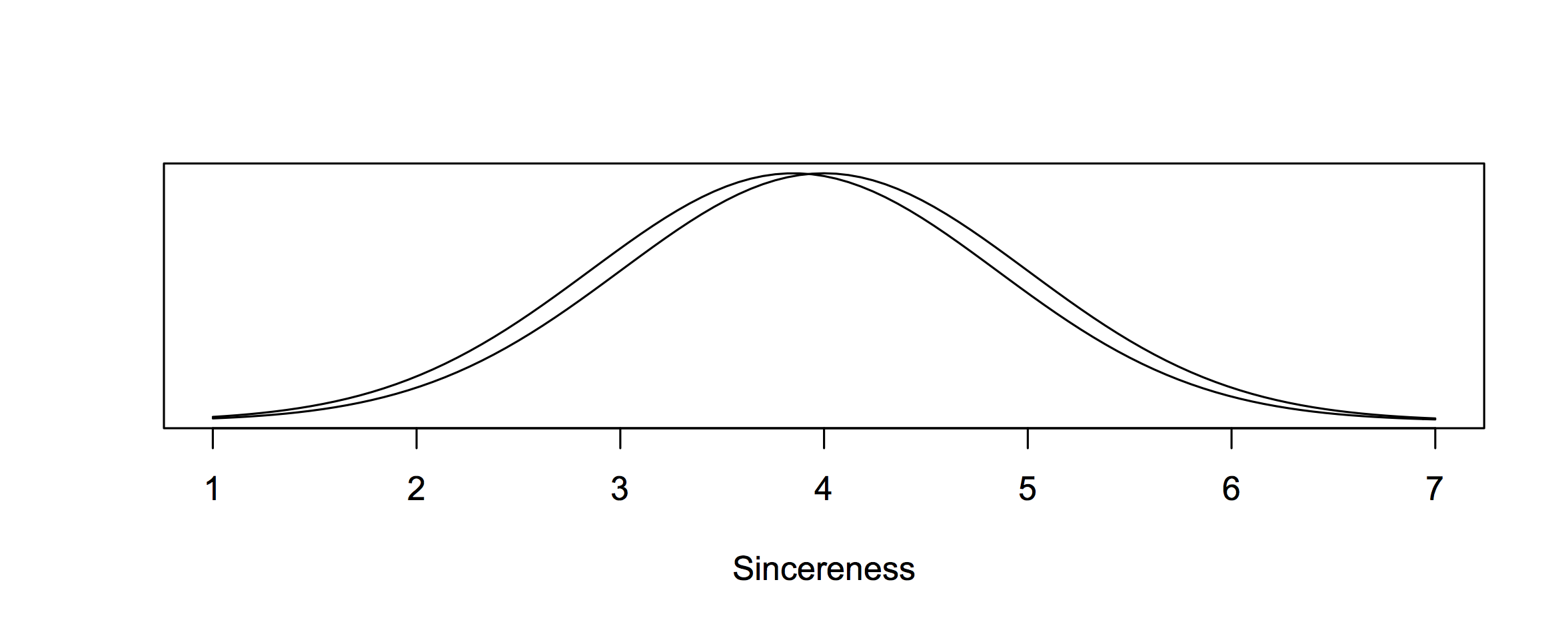
How evil is the full stop? Well, assuming the people you text have the same assumptions about writing as undergraduate students in upstate New York, the following graph gives a picture! These are two Normal distributions with the mean and variance that the researchers found for messages with and without a full stop!

 sincereness  

Truly monstrous and evil!!

The press release also says

In some very recent follow-up work, Klin’s team found that a text response with an exclamation mark is interpreted as more, rather than less, sincere.

That’s a relief!!!!

December 9, 2015

Briefly

  • “Clearly, they had to train the model against some existing data set, and the one they chose was Nazi Germany in the run-up to Operation BARBAROSSA.” There are newly declassified documents about the USSR’s computer model for the risk of a US surprise attack.  As Alex Harrowell writes “The neural network that classifies cat photos must by definition contain enough information to make a random collection of pixels catlike, although uncannily not quite right. Similarly, RYAN picked up a lot of unrelated data and invariably made it vaguely Hitler-y.”
  • The usually-reliable New York Times has an infographic saying luxury hotels spend $1200 per room per month on bathroom products. Felix Salmon doesn’t believe it. Neither do I.
  • As I’ve pointed out from time to time, you don’t have to choose which of the AA and the petrol companies to believe about costs and prices: MBIE monitors the ‘importer margin’ on a weekly basis.
  • A book recommendation list from people involved with the UK charity Sense about Science
  • A description of how an infographic about bacteria in house dust was designed, at Scientific American

Not how barcharts work

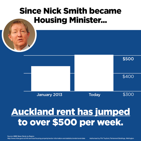
From the @nzlabour twitterwallah, via Matt Nippert

CVu23dIXAAE8H7T

Barcharts start at zero. Other sorts of charts don’t need to, but barcharts do. A line chart cut off at $300 would be ok — though if you were going to do that, you might as well include a longer range of data.

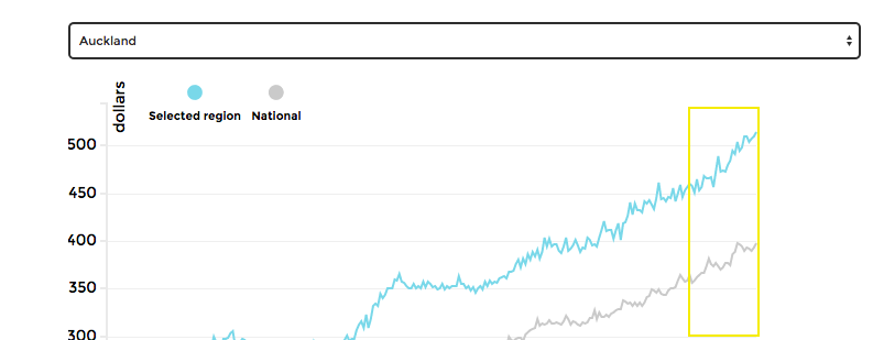
For example, here’s the top couple of inches of the detailed graph from Herald Insights, with the jump under Mr Smith’s administration highlighted in yellow.

rents

Or you might compare to the increase in median household income for the Auckland region over that period, which was about 9%, and say that affordability of rental housing has decreased by maybe 5% over that time period.  Or compare to the increase in minimum wage (7%). Or something.

Representing a time trend for which there’s weekly monthly data by a two-point decapitated bar chart suggests a low opinion of your audience. When Fox News does it, that’s fair enough, but from a New Zealand political party it’s unfortunate.


December 8, 2015

Sense of direction

From the Herald:

For a lot of men, the notion that they have a better sense of direction than women was already a fact, now a scientific study proves it.

Researchers from the Norwegian University of Science and Technology conducted a study where volunteers completed a series of navigation based tasks with brain scans taken in the process.

The results show men have a more adept sense of direction because they use a separate part of their brain to find their way.

The press release is here, and it describes the research as coming from two separate experiments. There’s a link to the research paper, but only for the second experiment involving testosterone. No link is given for the claim about men vs women.  I tried the PubMed research database, but the data aren’t in any of the other papers published by the same lead researcher.

The second experiment involved only women, half of whom were given a dose of testosterone. The story says

It was also found when women in the study had a dose of testosterone dropped onto their tongue, their navigational skills improved.

The research paper says

Surprisingly, the specific increase in MTL activity was not accompanied by increased navigation performance in the testosterone group.

That is, they saw changes in brain waves, but no change in navigation. The press release has this right, saying

“We hoped that they would be able to solve more tasks, but they didn’t.”

So, we have two claims. For one of them the evidence isn’t available, for the other it contradicts the story.

What you do know that isn’t so

The Herald (and others) are reporting an international Ipsos-Mori poll on misperceptions about various national statistics.  Two of the questions are things I’ve written about before: crude wealth inequality and proportion of immigrants.

New Zealanders on average estimated that 37% of our population are immigrants.  That’s a lot — it’s more than New York or London. The truth is 25%, which is still higher than most of the other countries. Interestingly, the proportion of immigrants in Auckland is quite close to 37%, and a lot of immigration-related news seems to focus on Auckland.   I think the scoring system based on absolute differences is unfair to NZ here: saying 37% when the truth is 25% doesn’t seem as bad as saying 10% when the truth is 2% (as in Japan).

We also estimated that 1% of the NZ population own 50% of the wealth. Very similar estimates came from a lot of countries, so I don’t think this is because of coverage of inequality in New Zealand.  My guess is that we’re seeing the impact of the Credit Suisse reports (eg, in Stuff), which say 50% of the world’s wealth is owned by the top 1%.  Combined with the fact that crude wealth inequality is a bogus statistic anyway, the Credit Suisse reports really seem to do more harm than good for public knowledge.

December 7, 2015

Stat of the Week Competition: December 5 – 11 2015

Each week, we would like to invite readers of Stats Chat to submit nominations for our Stat of the Week competition and be in with the chance to win an iTunes voucher.

Here’s how it works:

  • Anyone may add a comment on this post to nominate their Stat of the Week candidate before midday Friday December 11 2015.
  • Statistics can be bad, exemplary or fascinating.
  • The statistic must be in the NZ media during the period of December 5 – 11 2015 inclusive.
  • Quote the statistic, when and where it was published and tell us why it should be our Stat of the Week.

Next Monday at midday we’ll announce the winner of this week’s Stat of the Week competition, and start a new one.

(more…)

November 30, 2015

Stat of the Week Competition: November 28 – December 4 2015

Each week, we would like to invite readers of Stats Chat to submit nominations for our Stat of the Week competition and be in with the chance to win an iTunes voucher.

Here’s how it works:

  • Anyone may add a comment on this post to nominate their Stat of the Week candidate before midday Friday December 4 2015.
  • Statistics can be bad, exemplary or fascinating.
  • The statistic must be in the NZ media during the period of November 28 – December 4 2015 inclusive.
  • Quote the statistic, when and where it was published and tell us why it should be our Stat of the Week.

Next Monday at midday we’ll announce the winner of this week’s Stat of the Week competition, and start a new one.

(more…)

November 27, 2015

To find the mind’s construction near the face

Q: This Herald photo caption says “Men with facial hair showed much higher levels of hostile sexism, the study found.”  Did it?

A: No.

Q: Ok, how about the introduction “Bearded men will just have to take it on the chin – they are, apparently, more sexist.”?

A: Not really.

Q:  <sigh> Was this mice again?

A: No, there aren’t good animal models for these variables, as far as I know.  It was people.

Q: University students?

A: No, that’s so five years ago. It was a survey on Amazon’s Mechanical Turk, of men from the US and India.

Q: A representative survey?

A: Well, they paid people US$0.25 to participate, so I’m guessing maybe not. It’s probably better than using an undergraduate psychology class, though.

Q: And they measured sexism and beards over the internet?

A: The sexism was a standard questionnaire, so I think we should accept it. The participants were shown a set of facial hair images and asked to pick what their facial hair looked like. Probably ok, too.

Q: And men with beards were the most sexist?

A: No, men with moustaches, goatees, or soul patches.

Q: Then men with beards?

A: Then ‘light beards’, then light and heavy stubble, then heavy beards, then clean-shaven, then light medium beards.

Q: So it’s not primarily beards, it’s more other sorts of facial hair?

A: That’s what the study suggests

Q: Just like the photo caption?

A: Up to a point. “Much higher” is pushing it.

Q: How much higher?

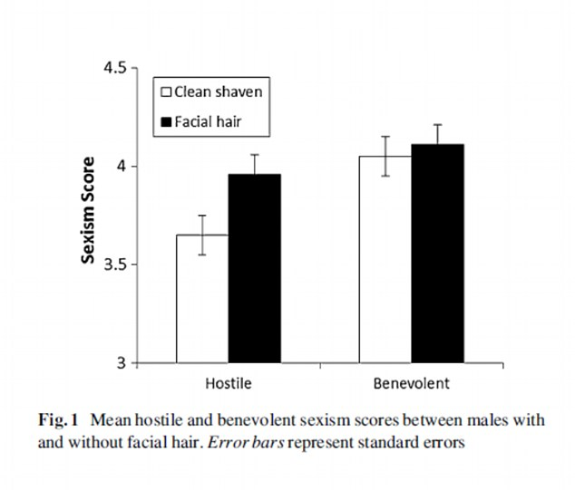
A: About a third of a point, on a six point scale. About 1.5% of the variation between men could be predicted by their facial hair.

Q: Is there a bar chart, perhaps cut off at some non-zero value?

A: You’ve been reading the Daily Mail, haven’t you? Yes, there is:

hairbar

Q: That’s not a very big difference, is it?

A: No

Q: So some men with facial hair are probably ok?

A: Probably.


What should data use agreements look like?

After the news about Jarrod Gilbert being refused access to crime data, it’s worth looking at what data-use agreements should look like. I’m going to just consider agreements to use data for one’s own research — consulting projects and commissioned reports are different.

On Stuff, the police said

“Police reserves the right to discuss research findings with the academic if it misunderstands or misrepresents police data and information,” Evans said. 

Police could prevent further access to police resources if a researcher breached the agreement, he said. 

“Our priority is always to ensure that an appropriate balance is drawn between the privacy of individuals and academic freedom.

That would actually be reasonable if it only went that far: an organisation has confidential data, you get to see the data, they get to check whether you’ve reported anything that would breach their privacy restrictions. They can say “paragraph 2, on page 7, the street name together with the other information is identifying”, and you can agree or disagree, and potentially get an independent opinion from a mediator, ombudsman, arbitrator, or if it comes to that, a court.

The key here is that a breach of the agreement is objectively decidable and isn’t based on whether they like the conclusions. The problem comes with discretionary use of data. If the police have discretion about what analyses can be published, there’s no way to tell whether and to what extent they are misusing it. Even if they have only discretion about who can use the data, it’s hard to tell if they are using the implied threat of exclusion to persuade people to change results.

Medical statistics has a lot of experience with this sort of problem. That’s why the International Committee of Medical Journal Editors says, in their ‘conflict of interest’ recommendations

Authors should avoid entering in to agreements with study sponsors, both for-profit and non-profit, that interfere with authors’ access to all of the study’s data or that interfere with their ability to analyze and interpret the data and to prepare and publish manuscripts independently when and where they choose.

Under the ICMJE rules, I believe the sort of data-use restrictions we heard about for crime data would have to be disclosed as a conflict of interest.  The conflict wouldn’t necessarily lead to a paper being rejected, but it would be something for editors and reviewers to bear in mind as they looked at which results were presented and how they were interpreted.