If you have to make a decision with several options, each with different types of positive and negative effects, it’s going to be hard. Techniques for breaking down complex decisions into sets of simpler questions are very valuable, but it’s important that the way you break down the problem and recombine the answers fits with how you answer the simpler questions.
I’ve been pointed to what looks like an unfortunate example from the NZTA, in assessing options for the Petone–Grenada link road to be constructed near Wellington. The road comes in two sections: from Petone to the eastern section of Lincolnshire Farm, and from there to Grenada. According to the scoping report (PDF), these can be decided independently of each other, so there’s an ideal opportunity to simplify the decision making. NZTA describes four options P1 to P4 for the first section, and four options A to D for the second section.
I would have expected them to just make independent recommendations for the two sections, but what they actually did was more complicated. First, they looked at the P options and decided based on four criteria that P4 was best. They then looked at A+P4, B+P4, C+P4, and D+P4 for the same four criteria, and said in a footnote (p172) “Upon combining one of Option P1, P2, P3 or P4 with one Option A, B, C or D the effect more towards the negative takes precedence.”
This can only make sense if the harms or benefits weren’t independent. Sometimes that’s possible. In particular, one of the criteria was “resilience”, and you might argue that it doesn’t matter how robust the second part of the road is when the first part is under several meters of rock and mud, or filled with bumper-to-bumper traffic jams. It could make sense to take the worst value of the two sections when assessing resilience: but people who know more about Wellington-area transport than I do still seem dubious.
The same argument certainly doesn’t apply for the other criteria: archaeological, ecological, landscape/visual impact, and transport benefit/cost. If one section of the road is an environmental nightmare, that doesn’t make the environmental impact of the other section unimportant. If one section of the road is unavoidably ugly, that doesn’t excuse making the other section ugly. If one section destroys an important heritage site, it doesn’t mean the other section doesn’t have to care about preservation of the past. If one section is ridiculously expensive it doesn’t mean the costs are unimportant for the other section.
The impact of decomposing and recombining the evaluation as they did, is that any criterion where P4 was bad becomes much less important in choosing among options A to D. P4 was very bad on the landscape/visual criterion, and moderately bad on ecology.
By now you should be expecting the punch line: evaluated independently, options A and B look good because they score well on ecology and landscape/visual criteria. Evaluated in combination with P4, they look terrible, because the ecology and landscape benefits are masked by the “more negative” combining rule. That’s a problem with the combining rule, not with the road. Here’s a colour-coded version of the information in Table 23-19, p182 (from T. Duran)
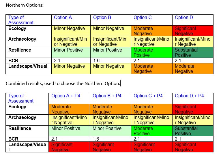
Not only is the combining rule obviously missing some information, it’s not even internally consistent. If the evaluation had been done in the opposite order they might well have chosen A first, and then looked at A+P1 to A+P4. Even D was what they’d chosen first, P3+D would then look slightly better than P4+D.
It’s very tempting to look for ways of combining preferences that don’t rely on numbers, just on orderings, but in most cases they aren’t available, and attempts to do it leave you worse off than before.
This evaluation wasn’t set up to focus only on resilience — even assuming that the resilience assessment is valid, which I hear is also being questioned — it was set up to value the four criteria equally. It really looks as though a minor detail of the approach to simplifying the evaluation has had a large, accidental effect on the result.
Recent comments