Posts filed under General (3156)

February 12, 2014

Evils of Axis

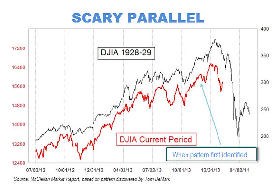
A scary chart showing how the stock market looks just like it did before the big crash that started the Great Depression:

MW-BU310_scary__20140210132547_MG


Or perhaps not


That is, if you scale the charts so that the vertical scale corresponds to the same proportional rise and fall for both of them, and extend them up to the day of publication rather than stopping in mid-January, the similarity vanishes.

How do we know which scaling is right?  It depends on whether you think the detailed day-to-day shape of stock market fluctuations is much more important than the size of the fluctuations. And on whether you think it’s still January.

Briefly

  • An interview with Sir David Cox, probably the most famous living statistician “I know the term ‘the profession of statistics’ is widely used but I am not that keen on it. I would like to think of myself as a scientist, who happens largely to specialise in the use of statistics. “
  • A page with interactive graphics to demonstrate Simpson’s Paradox. I’m not sure the interactivity helps, but more important, they show dividing people into groups can change the direction of association, but don’t talk about how you decide which of the two is correct.
  • “Disinformation Visualization”
  • A long-term personalised-medicine study. “We hope to develop a whole series of stories about how actionable opportunities have changed the wellness of individuals, or have made them aware of how they can avoid disease,” We can be confident they will find stories. It’s less clear they will be true.
February 6, 2014

Briefly

Eurobeer-map

  • From Derek Lowe, a post about recent research suggesting antioxidants may be positively bad for you (translation note: ‘reactive oxygen species’ is roughly what used to be called ‘free radicals’ in this context)
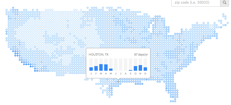
  • Kelly Norton has an interactive map showing the number of ‘pleasant’ days per year in parts of the US. The projection is a bit ugly but the data are interesting.  By his definition, essentially all Auckland days without rain are ‘pleasant’, so Auckland has about 165 pleasant days per year, putting it ahead of everywhere except a few places on the California coast. The key thing he misses out is humidity, so the map says Flagstaff, Arizona has a much less pleasant climate than Chicago, which will be news to many people.

nice

I’m currently in Houston, where it’s pleasant

February 5, 2014

Gambling problems

From Stuff

New Zealanders are the world’s fourth-biggest gamblers per capita, new figures show.

The figures come from H2 Gambling Capital, an international gaming research agency, and have been published in the Economist magazine.

This is unusually accurate for a ‘top in the world’ story, the only quibbles being that the data were actually published in one of the Economist blogs, and the data is on  gambling in New Zealand, not on  gambling by New Zealanders — it includes gambling by tourists.

More worrying is the last sentence of the story

The Ministry of Health reports that most New Zealand gamblers are recreational gamblers, with about 0.3 per cent of the population at risk of “problem gambling”.

In fact, the Ministry of Health reports that about 0.3% of the population are actually problem gamblers, “gambling at levels that are leading to negative consequences”,  with another 1% at moderate risk.

February 4, 2014

What an (un)likely bunch of tosse(r)s?

It was with some amazement that I read the following in the NZ Herald:

Since his first test in charge at Cape Town 13 months ago, McCullum has won just five out of 13 test tosses. Add in losing all five ODIs against India and it does not make for particularly pretty reading.

Then again, he’s up against another ordinary tosser in MS Dhoni, who has got it right just 21 times out of 51 tests at the helm. Three of those were in India’s past three tests.

The implication of the author seems to be that five out of 13, or 21 out of 51 are rather unlucky for a set of random coin tosses, and that the possibility exists that they can influence the toss. They are unlucky if one hopes to win the coin toss more than lose it, but there is no reason to think that is a realistic expectation unless the captains know something about the coin that we don’t.

Again, simple application of the binomial distribution shows how ordinary these results are. If we assume that the chance of winning the toss is 50% (Pr(Win) = 0.5) each time, then in 13 throws we would expect to win, on average, 6 to 7 times (6.5 for the pedants). Random variation would mean that about 90% of the time, we would expect to see four to nine wins in 13 throws (on average). So McCullum’s five from 13 hardly seems unlucky, or exceptionally bad. You might be tempted to think that the same may not hold for Dhoni. Just using the observed data, his estimated probability of success is 21/51 or 0.412 (3dp). This is not 0.5, but again, assuming a fair coin, and independence between tosses, it is not that unreasonable either. Using frequentist theory, and a simple normal approximation (with no small sample corrections), we would expect 96.4% of sets of 51 throws to yield somewhere between 18 and 33 successes. So Dhoni’s results are somewhat on the low side, but they are not beyond the realms of reasonably possibility.

Taking a Bayesian stance, as is my wont, yields a similar result. If I assume a uniform prior – which says “any probability of success between 0 and 1 is equally likely”, and binomial sampling, then the posterior distribution for the probability of success follows a Beta distribution with parameters a = 21+ 1 = 22, and b = 51 – 21 + 1 = 31. There are a variety of different ways we might use this result. One is to construct a credible interval for the true value of the probability of success. Using our data, we can say there is about a 95% chance that the true value is between 0.29 and 0.55 – so again, as 0.5 is contained within this interval, it is possible. Alternatively, the posterior probability that the true probability of success is less than 0.5 is about 0.894 (3dp). That is high, but not high enough for me. It says there at about a 1 in 10 chance that the true probability of success could actually be 0.5 or higher.
January 31, 2014

Briefly

  • Data journalism and computing. Scott Klein (Nieman Journalism Lab, Harvard): In 2014, you will be scooped by a reporter who knows how to program.  Alexander Howard (Tow Center for Digital Journalism Columbia) If you contrast his approach to commentators who make observations about Twitter without data or much experience, it’s easy to score one for the data journalist


  • Post hoc ergo propter hoc: When the Huffington Post writes about a lottery winner “Perhaps fortune cookies really can predict the future. Or at least William Johnson’s did” you know they don’t really mean you to take the claim seriously, so it isn’t really irresponsible. When Stuff writes, in what’s basically an ad for an alternative medicine book  `taking an alternative approach “was a gamble I was willing to take”, Jess says. It paid off,’ it’s less clear that they know this is bogus.  At least they do mention her mother tried the same thing (for a potentially-curable type of cancer) and died. For ‘balance’ read what a cancer surgeon says about this case.


  • There is no meaningful sense in which the recent fall in the Australian dollar affects the affordability of Auckland houses. The problem is bad enough without this sort of nonsense.
January 29, 2014

Using statistics to fight crime

“I want to ‘Money Ball’ criminal justice” – Anne Milgram

Fascinating video from TED.

“When she became the attorney general of New Jersey in 2007, Anne Milgram quickly discovered a few startling facts: not only did her team not really know who they were putting in jail, but they had no way of understanding if their decisions were actually making the public safer. And so began her ongoing, inspirational quest to bring data analytics and statistical analysis to the US criminal justice system.

Anne Milgram is committed to using data and analytics to fight crime.”

January 25, 2014

When do we care about international comparisons?

I’ve done a bunch of posts recently about international comparisons. A good way to get a headline is to say NZ is the worst (second-worst, third-worst) in the world.  These tend not to be true — what’s usually true is that NZ is the worst among a smaller group of countries with high-quality official statistics.

But when do we even care? I’ll look at three recent examples

  • NZ is the worst (only not) in bowel cancer rates, so we need subsidised screening
  • NZ is the third worst (only probably not) in child road deaths, so we need to require child car seats up to age 11.
  • NZ is the second worst (only not) in imprisonment rates, so we need to change the justice system

When deciding whether to subsidise bowel cancer tests there are just two things that matter: whether it works, and how much it costs. If the screening isn’t effective, we shouldn’t do it. If it is effective, but costs a lot more than other ways of preventing the same amount suffering and loss of life, we should do those instead. It doesn’t matter whether the rates are higher in Austria or Australia. No-one should be taking that into account.

When deciding whether to require child car seats, there are three things that matter: do they prevent injuries, how much do they cost to buy, and how much does the law cost in enforcement and in the (subjective but real) costs of forcing people to do things. If the seats don’t prevent injuries, we shouldn’t use them. If they don’t prevent more injuries than other things we could do at a similar price, we should consider those things first. And to make them compulsory, the benefit has to be large enough to be worth the monetary and non-monetary costs of enforcement, but not large enough that parents will do it voluntarily. If we can satisfy these criteria, we should pass the law, regardless of what is happening in other countries. If we can’t satisfy these criteria, we shouldn’t.

Imprisonment rates are a bit different. It’s not obvious what the ‘right’ imprisonment rate is, so international comparisons are actually helpful in deciding whether the NZ rate is high or low. Comparisons to the whole world are still pointless, but it makes sense to compare to other countries with basically similar legal systems and a fairly high level of trust in government.

Even when we shouldn’t care about what is being done in other countries, it’s often useful to know why they do what they do. That’s why I link to things like the US Preventive Services Taskforce recommendations. It’s not that New Zealand should necessarily do what the US does, but the PTF has more resources for making decision, and they show their working. We can look at their collected evidence and read their rationales, and that’s helpful in deciding what to do in New Zealand.

Briefly

  • Warren Buffett is offering a prize of a billion dollars for correctly predicting all 63 US college Division 1 basketball games. Corey Chivers analyses the odds, and summarises as “You’re not going to win, but you’re still going to play.”  (via Jie Fu Yu)
  • According to the Herald, nearly one in three people (28%) admitted to the emergency room on Saturday nights had been drinking. According to the NZ Alcohol and Drug Use Survey 26% of people in New Zealand drink more than twice a week, and it would be deeply unsurprising if Saturday was one of those nights. The real statistic is that 80% of those had been drinking heavily: that’s just over 20%, almost twice the proportion of people who report drinking heavily at least once a week. There is an increased risk, but less than the story implies.
  • Some researchers at Princeton have modelled Facebook as an epidemic (PDF preprint), and predict that 80% of people will recover by 2017. I’m not convinced — they aren’t modelling the heterogeneity in Facebook users, and I think the older users will hang on longer. [Update: Mike Devlin uses web and social media data to show that Princeton will also disappear]


January 23, 2014

Onward and upward

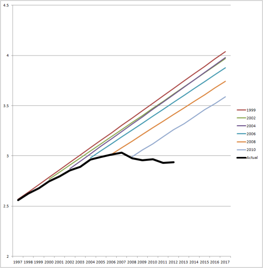
This graph (from Clark Williams-Derry via Andrew Gelman) shows US national traffic forecasts over time (the straight lines) and the reality (the black line)

VMT-C-P-chart-big1-541x550


Initially, the straight-line extrapolation would have made sense, but for the past five years or so it’s been increasingly obvious that it’s bogus.   Some of the fall off from expectations is due to the US recession, but people in the US seem to just be driving less than forecast.

It would be interesting to see this sort of graph for NZ data.