Posts filed under General (3156)

April 12, 2013

Metrics and multivariate data

If you have a large collection of measurements there isn’t going to be a unique way to put them together into a single ordering: what you get out depends to some extent on your criteria. That doesn’t mean the measurements, or even the rankings, are meaningless, but it does mean that you should work out what your criteria are before you see the data, and that criticism of the choice of criteria is perfectly reasonable.

An illustration is yesterday’s PBRF research evaluation results.  For those of you playing along at home, PBRF is one of the mechanisms the country uses to allocate research funding. Unlike individual research grants, which are based on competition between individual proposals, PBRF funding is allocated to large groups of researchers for long periods of time based on a aggregated results from a single standardised evaluation.

Though it’s not the point of the system, the existence of a large number of grades invariably tempts university management into coming up with ways to combine them to make their institution look good. And they always succeed:

  • In first place, we have the University of Auckland: “secured the largest share of the fund, $80.4m or 30.6% of the national total… This is due in part to the University’s impressive 288 international quality (A-rated) researchers – the greatest number of leading researchers anywhere in the country.”
  • And in first place, the University of Otago: “Otago was ranked first among New Zealand universities in the measure of research quality weighted by its postgraduate roll (AQS (P)) and second in the measure weighted by degree-level enrolments and higher (AQS (E)). The University is the only TEO to be ranked in the top four in all four AQS measures.”
  • In first place, also, Victoria University of Wellington: ” the latest PBRF Evaluation ranks Victoria as number one in New Zealand….With 678 staff actively involved in research, and 70 percent of them operating at the highest levels (ranked as either an A or B), we now have external confirmation of our status as New Zealand’s most research intensive university.”
  • And finally, in first place (special subject), Lincoln University:  “confirms Lincoln University’s position as New Zealand’s specialist land-based university. … Lincoln University also has the highest amount of external funding for research (measured as income/staff member), demonstrating close links with industry and relevance of the University’s research.”

Other institutions aren’t claiming first place, but are still saying that the PBRF demonstrate how successful they have been. This has been another illustration that anyone saying “the data speak for themselves” is not to be trusted. The question matters.
Briefly

  • “With less than two months to go until I graduate from the UC Berkeley Graduate School of Journalism, I’ve been looking back at my experience over the past two years. I’m among a handful of students at the school who are really interested in data journalism and making pretty and functional online news packages. It’s made me think about how J-schools need a more structured and thorough track for us computer-assisted reporters, for lack of a better term.John Osborn


April 10, 2013

Why science journalism matters

Britain is currently having a measles epidemic.

Measles has been a preventable illness for decades, but the vaccination rate dropped after the widely-publicized and bogus claims of a link to autism. The measles epidemic is especially severe in southwest Wales, in the circulation area of a paper that was especially anti-vaccination.

There are many examples where the media just reported uncertainty within the scientific community. This was not one of them.

April 8, 2013

Briefly

  • Interesting post on how extreme income inequality is. The distribution is compared to a specific probability model, a ‘power law’, with the distribution of earthquake sizes given as another example. Unfortunately, although the ‘long tail’ point is valid, the ‘power law’ explanation is more dubious.   Earthquake sizes and wealth are two of the large number of empirical examples studied by Aaron Clauset, Cosma Shalizi, and Mark Newman, who find the power law completely fails to fit the distribution of wealth, and is not all that persuasive for earthquake sizes. As Cosma writes

If you use sensible, heavy-tailed alternative distributions, like the log-normal or the Weibull (stretched exponential), you will find that it is often very, very hard to rule them out. In the two dozen data sets we looked at, all chosen because people had claimed they followed power laws, the log-normal’s fit was almost always competitive with the power law, usually insignificantly better and sometimes substantially better. (To repeat a joke: Gauss is not mocked.)


All clinical trial results should be published

If you’re one of the 40,000 or so people who has signed the Alltrials petition you will have received an email from Ben Goldacre asking for more help.

The  Declaration of Helsinki, the major document on research ethics in medicine, already states

30. Authors, editors and publishers all have ethical obligations with regard to the publication of the results of research. Authors have a duty to make publicly available the results of their research on human subjects and are accountable for the completeness and accuracy of their reports. They should adhere to accepted guidelines for ethical reporting. Negative and inconclusive as well as positive results should be published or otherwise made publicly available. Sources of funding, institutional affiliations and conflicts of interest should be declared in the publication. Reports of research not in accordance with the principles of this Declaration should not be accepted for publication.

The petition is trying to get these principles enforced. Publication bias isn’t just a waste of the voluntary participation of (mostly sick) people in research. Publication bias means we don’t know which treatments really work.

In my first job (as a lowly minion) in medical statistics, my boss was Dr John Simes, an oncologist. Back in the 1980s he had shown that publication bias in cancer trials gave the false impression that a more toxic chemotherapy regimen for ovarian cancer had substantial survival benefits to weigh against the side-effects.  Looking at all registered (published and unpublished) trials showed the survival benefit was small and quite possibly non-existent.  The specific treatment regimens he studied have long been outmoded, but his message is still vitally important.

These examples illustrate an approach to reviewing the clinical trial literature, which is free from publication bias, and demonstrate the value and importance of an international registry of all clinical trials.

Nearly thirty years later, we are still missing information about the benefits and risks of drugs.

For example, influenza researchers have used detailed simulation models to assess control strategies for pandemic flu. These simulation models need data about the effectiveness of drugs and vaccines.  When the next flu pandemic hits, we really need these models to be accurate, so it’s especially disturbing that Tamiflu is one of the drugs with substantial unpublished clinical trial data.

Kiwi students hold their own census

What are Kiwi kids’ most common food allergies? What time do they go to sleep at night? How long can they stand on their left leg with their eyes closed?

Many thousands of students aged between 10 and 18 (Year 5 to Year 13) are due to start answering these questions – and a host of others about their lives – on Monday May 6, the first day of the new term and the day CensusAtSchool 2013 begins.

So far, 461 schools have registered to take part. The 32-question survey, available in English and Māori, aims to raise students’ interest in statistics and provide a fascinating picture of what they are thinking, feeling and doing. Teachers will administer the census in class between May 6 and June 14.

“A good way to engage students in mathematics and statistics is to start from a place that’s familiar to them – their own lives and the lives of their friends,” says co-director Rachel Cunliffe, a University of Auckland-trained statistician.“Students love taking part in the activities and then, in class with their teachers, becoming “data detectives” to see what stories are in the results – and not just in their own classroom, but across the country.”

This year, students are being asked for the first time about food allergies to reflect the lack of data on the issue, says Cunliffe. “Students will be able to explore the dataset to compare the prevalence of self-reported allergies for different ages, ethnicities and sexes.”

Westlake Girls High School maths teacher Dru Rose is planning for about 800 Year 9 and 10 students to take part. She’s keen to see the data that will emerge from two other new questions about how many hours of homework students did the night before, and how many hours sleep they had. “It’s real-life stuff,” she says. “We’ll be able to examine the data and see if there are any links.”

Andrew Tideswell, manager of the Statistics New Zealand Education Team, says our  statistics curriculum is world-leading, and CensusAtSchool helps teachers and students get the most out of it.

“By engaging in CensusAtSchool, students have an experience that mirrors the structure of the national census, and it encourages them to think about the need for information and ways we might use it to solve problems,” he says. “Students develop the statistical literacy they need if New Zealand is to be an effective democracy where citizens can use statistics to make informed decisions.”

CensusAtSchool, now in its sixth edition, is a biennial collaborative project involving teachers, the University of Auckland’s Department of Statistics, Statistics New Zealand and the Ministry of Education. It is part of an international effort to boost statistical capability among young people, and is carried out in Australia, the United Kingdom, Canada, the US, Japan and South Africa.


April 5, 2013

Frontpage news

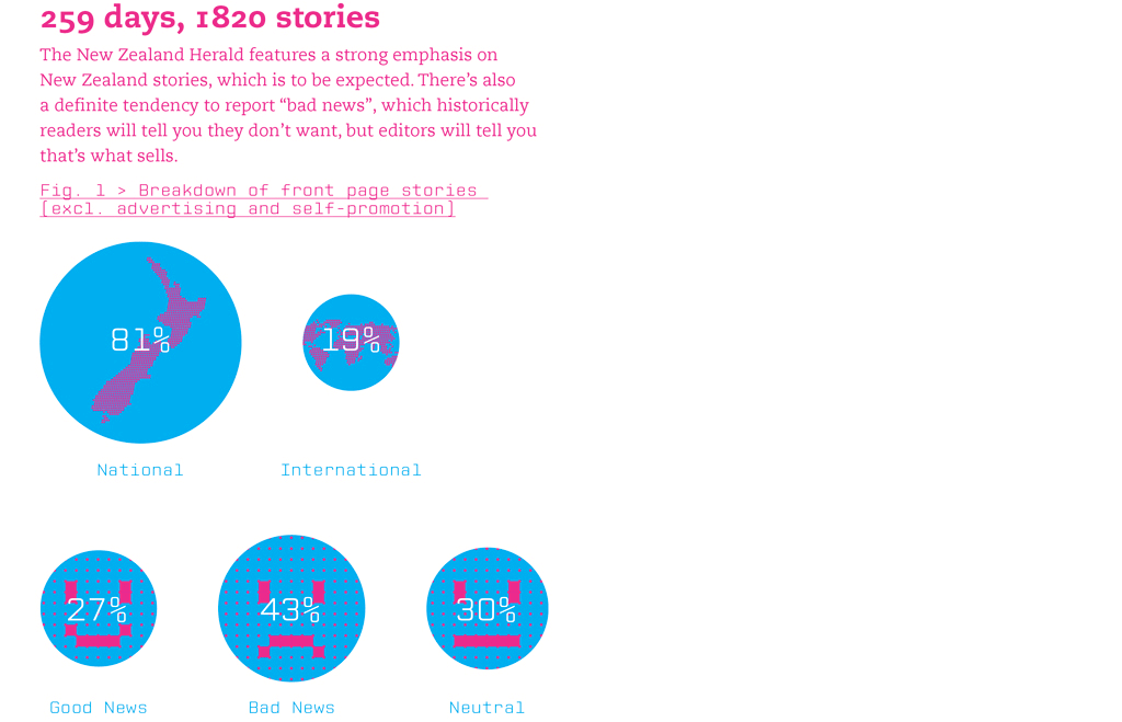
James Wendelbourn, a graphic designer, has summarized the content of the NZ Herald front page every day for a year.

He’s made a series of infographics about it, at sellingthenewz.tumblr.com, for example

frontpage


I don’t really like the graphics from the point of view of presentation of quantitative information, but the actual content is interesting.

As always with this sort of thing, you might disagree with the classifications, but they are generally reasonable: I like the division of ‘consumer’ news into “outrage”, “shopping”, and “other”.

April 4, 2013

Describing risk

From “Decision Science News”, a post on communicating risks to the general public (eg, in newspapers)

infogrid


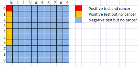
They give a list of approaches to use less often (relative risks, single-event probabilities as fractions, conditional probabilities) and approaches to use more often (frequencies with an explicit reference group).

They don’t mention David Spiegelhalters ‘micromorts‘, or the useful `number needed to treat’ for describing screening or treatment probabilities, though the latter is implicit in their examples.  The picture above shows a hypothetical situation where you would need to screen 81 100 people, and have six false positive diagnoses, in order to have one true positive diagnosis. In terms of the traditional conditional probabilities  that’s a test with 100% accuracy in detecting cases  and better than 90% accuracy in detecting non-cases, which sounds much more useful than the situation revealed by the picture.

April 3, 2013

Briefly

March 31, 2013

A simple genetics question

A rocket scientist and winner of the National Medal of Technology and Innovation died recently, and has an obituary in the New York Times.  The first paragraph of the obituary is about family and cooking.

Can you guess how many X chromosomes the scientist had?


[Yes, of course,  writing about her family is fine, especially as family life was clearly very important to her. But leading with beef stroganoff?]

[Update: the NYT has thought better of the stroganoff:  See Newsdiffs for the comparison of old and new versions]