Posts filed under General (3156)

March 28, 2013

Briefly

  • And since it’s a long weekend coming up: something that’s not remotely statistics, but is Quite Interesting. Siouxsie Wiles has another bioluminescence animation up on Youtube, on the Hawaiian bobtail squid, invisibility cloaks, and quorum sensing.
March 20, 2013

Big Data is not enough

There’s a good piece in one of the New Yorker‘s blogs  about the Human Connectome Project and the proposed Brain Activity Map.  The Connectome project has produced two terabytes of functional and structural data on the brains of 68 volunteers, and the Brain Activity Map is more or less what it says on the tin.

Almost certainly people will be able to do something useful with all this data, but some of the claims for what it means to our understanding of the brain are a bit much. As the RealClearScience blog points out (in a slightly different context), we know the complete nervous system of the nematode C. elegans.  We know every cell and all its connnections to other cells.  We still can’t use this knowledge to reliably predict the nematode’s behaviour even by brute-force simulation, let alone by sophisticated analysis.

Simply using Big Data to work out how a complex system functions requires a lot of simplifying assumptions to be true.  This isn’t because we’re not smart enough to build more complex models (though we’re not), and it isn’t because the computation is beyond us (though it is), it’s a fundamental limitation on learning without an underlying theory to help you.

The way Amazon or Netflix does prediction with all its data is to look for a large group of people who are similar to you, in relevant ways, and see what they bought or watched. That sounds easy, but the weasel words are ‘in relevant ways’.  If you have a moderately large number of variables, there are far too many ways in which people, or nerve signals, or protein concentrations could be similar, and you need to decide which ones are relevant.   This is critical, because finding the true relationships in large numbers of associations is only possible if nearly all the associations are zero; in current jargon, the model is ‘sparse’.

In order to see sparseness, you need to know how to look.    Consider the economy: if you just look at associations between measurements, everything is correlated: you see inflation, you see population growth,  you see seasonal variation.  These patterns need to be removed to get a sparse model where you’ve got some hope of disentangling cause and effect.

In really complex fields like brain activity, we don’t know enough about how to pose the problem so that Big Data will have a hope of solving it.


March 17, 2013

To trend or not to trend

David Whitehouse through the Global Warming Policy Foundation has recently released a report stating that “It is incontrovertible that the global annual average temperature of the past decade, and in some datasets the past 15 years, has not increased”. In case it is unclear, both the author and institute are considered sceptics of man-made climate change.

The report focuses on arguing the observation that if you look at only the past decade then there is no statistically significant change in global average annual temperature. Understanding what this does, or doesn’t, mean requires considering two related statistical concepts; 1) significant versus non-significant effects and 2) sample size and power.

Detecting a change is not the same as detecting no change. Statistical tests, indeed most of science, generally operates around Karl Popper’s falsification. Null hypotheses are set-up, generally a statement or test of the form ‘there is no effect’ and the alternative hypothesis is set-up in the contrary ‘there is an effect’. We then set-out to test these competing hypotheses. What is important to realise, however, is that technically one can never prove the null hypothesis, only gather evidence against it. In contrast however one can prove the alternative hypothesis. Scientists generally word their results VERY precisely. As a common example, imagine we want to show there are no sharks in a bay (our null hypothesis). We do some surveys, and eventually one finds a shark. Clearly our null hypothesis has been falsified, as finding a shark proves that there are sharks in the bay. However, let’s say we do a number of surveys, say 10, and find no sharks. We don’t have any evidence against our null hypothesis (i.e. we haven’t found any sharks..yet), but we haven’t ‘proven’ there are no sharks, only that we looked and didn’t find any. What if we increased it to say 100 surveys? That might be more convincing, but once again we can never prove there are no sharks, only demonstrate that after a large number of surveys (even 1,000, or 1,000,000) its highly unlikely there are any. In other words, as we increase our sample size, we have more ‘power’ (a statistical term) to be confident that they represent the underlying truth.

And so in the case of David Whitehouse’s claim we see similar elements. Just because an analysis of the last decade of global temperatures does not find a statistically significant trend, does not prove there is none. It may mean there has been no change, but it might also mean that the dataset is not large enough to detect it (i.e. there is not enough power). Furthermore, by reducing your dataset (i.e. only looking at the last 10 years rather than 30) you are reducing your sample size, meaning you are MORE likely NOT to detect an effect. A cunning statistical sleight of hand to make evidence of a trend disappear.

I lecture these basic statistical concepts to my undergraduate class and demonstrate it graphically. If you put a line over any ten years of data, it probably could be flat, only once you accumulate enough data, say thirty years, does the extent of the trend become clear.
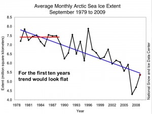
Arctic sea ice 1979-2009

Demonstrates the difficulty in detecting long-term trends with noisy data

This point is actually noted by the report (e.g. see Fig. 16).

Essentially, the only point that the report makes is that if you look at a small part of the dataset (less than a few decades), you can’t make a statistically robust conclusion, since you will be within a low power margin of error. Most importantly, we must be able to detect trends early even when the power to detect them may be low. And as I have stated in earlier posts, changes in variability are as important a metric as changes in the average, and the former, which is predicted from climate change, will make detecting the latter, which is also predicted, even more difficult.
March 15, 2013

Briefly

March 13, 2013

Briefly

“A small, easily checkable fact needs to be checked; a larger but greyer assertion, not so much — unless it is defamatory,” they write. “Thus, verification for a journalist is a rather different animal from verification in scientific method, which would hold every piece of data subject to a consistent standard of observation and replication.”

March 11, 2013

Suppressio variation, suggestio falsi

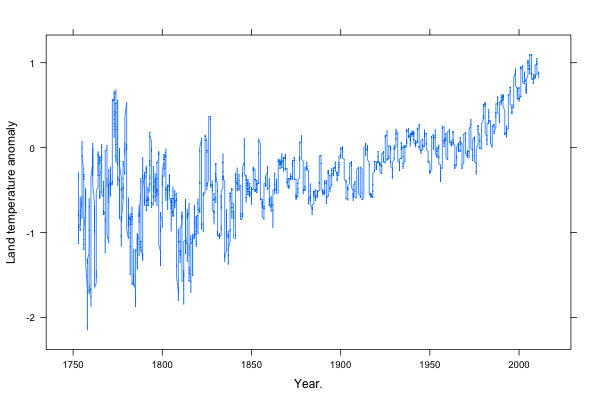
The global mean land-surface temperature reconstruction from the Berkeley Earth Surface Temperature project (other reconstructions are very similar), looks like this:

Rplot001

I’ve scaled the axes using Bill Cleveland’s method of “banking to 45 degrees“, that is, so the median of the slope is 45 degrees.  Based on his research, this seems to give close to optimal perception of patterns. (more…)

March 8, 2013

Eat bacon and die

The Herald, under the arguably-overstated headline Eating processed meats could cut your life short, have the reasonable lead

A diet packed with sausages, ham, bacon and other processed meats appears to be linked to an increased risk of dying young, a study of half a million people across Europe suggests.

The main problem with the summaries of risk that reported in the story is that they are for the people who eat the highest amount of processed meat.  It’s notable that nowhere in the Herald story do they tell you how high this consumption level was, either as a fraction of the participants or as a weight or number of servings. (3News did better)

It’s probably true that you would have lower risk if you ate less processed meat than this highest-consumption group, but you probably already do — they were the top half a percent of the 450000 participants, and they averaged more than 160g per day, or 1.1kg per week.

There are also problems with how the statistics get translated into deaths.  The study estimated hazard ratios, which compare the rates of death for high and low processed meat consumption, and then try to turn these into proportions. The Herald quotes a study researcher as saying

“Overall, we estimate that 3 per cent of premature deaths each year could be prevented if people ate less than 20 grams of processed meat per day.”

This should get the response “define ‘premature'”, but it’s actually more carefully phrased than in the research paper, which says

We estimated that 3.3% (95% CI 1.5% to 5.0%) of deaths could be prevented if all participants had a processed meat consumption of less than 20 g/day.

suggesting that  3.3% of vegetarians would be immortal.

Turning hazard ratios into information about life expectancy or premature death is tricky.  David Spiegelhalter’s microlives are useful here. The study estimates a hazard ratio of 1.18 for 50g extra per day of processed meat.  If that really is due to the meat, not to other differences in health risk,  and if it really is approximately constant across all types of processed meat, it corresponds to about 2 microlives per 50g — about an hour of life per serving, or about the same as four cigarettes.

There are reasons to be a bit skeptical about the magnitude of the results: the study didn’t find any evidence of higher risk in people who eat a lot of red meat, contradicting previous studies.  Also, the analysis used statistical techniques to correct for measurement error in meat consumption, but not in any of the other risk factors they analysed.  If people with high processed meat consumption are also at higher risk in other ways (which they are), this analysis will tend to shift the apparent risk towards processed meat.

Still, I shouldn’t think anyone is really surprised that bacon’s not a health food.

Recreational genotyping and ancestry

There’s a fuss at the moment in Britain over the recreational genotyping companies that purport to tell you where your ancestors came from.  One of the stories that provoked this, was the claim that over 1 million Brits are descended from Roman soldiers. For example, in the Telegraph, under the headline “One million Brits ‘descended from Romans'”

The Romans departed abruptly in the early fifth century, leaving behind relics of their rule including Hadrian’s Wall along with a host of towns, roads and encampments.

But perhaps the most enduring sign of their legacy is in our genes, experts claim, with an estimated million British men descending from the invading forces.

The first sign that something is wrong is that ‘one million Brits’ turns into ‘a million British men’.  What about the women?  The reason for the `one million’ estimate is the same as the reason it’s just men — the ‘experts’ are looking only at male-line descent, via the Y chromosome. In fact, the number of British men descended from Roman soldiers is probably more like 25 million.  That is, there’s a general principle that anyone in the distant past is either a direct ancestor of no-one in the present, or of almost everyone in the present.

If you go back 100 generations to the time of Roman occupation of Britain,  you would have 1267650600228229401496703205376 ancestors.  That’s roughly a bazillion times the number of people alive then, so there is a lot of overlap.  If you look just at pure male-line ancestors, from whom you inherited a Y chromosome, you either have none (if you don’t have a Y chromosome) or one. It’s clear why the ancestry-mongers want to simplify their sales pitch by focusing on the Y chromosome (and on mitochondrial DNA, which is inherited through the female line), but it’s not clear why anyone should listen to them.

Even if you live in Britain and your Y chromosome came from someone in Roman legions, it didn’t necessarily come via the British occupation.  After all, lots of men have migrated to Britain since then: the Vikings and the Normans back in History, and more recently from all over the world. Some of them would have had Roman-looking Y chromosomes too.  And even the idea of a ‘Roman’ Y-chromosome is a bit dodgy.  Broadly speaking, a group of Y chromosomes tends to get attributed to the region in the world where it is seen most today (unless that’s, say, the US). There’s no guarantee that this is where the Y-chromosome group was common 1000 years ago.

There is some potential for using whole-genome data to say something more meaningful about relatively recent ancestry, but to be useful even that needs to come with uncertainty estimates, which will often be huge.

Sense about Science have put out a good information sheet, but the basic message is that at the moment anything interesting someone tells you about your distant ancestors based on genetic information, they could tell you equally well without bothering to do any genotyping.

March 7, 2013

Briefly

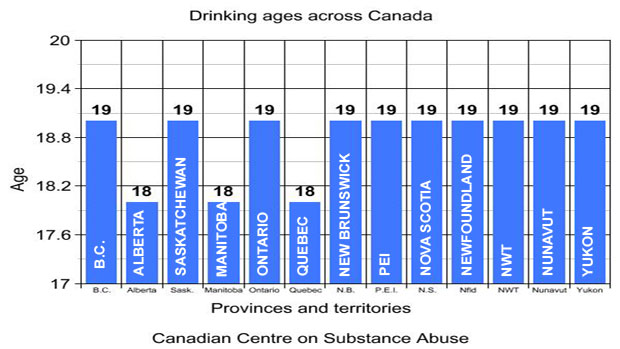
  • From the frozen north: the most pointless bar graph I’ve seen in a long time.

 li-drinking-graph

  • A website with interviews in data science and analytics, currently featuring UoA graduate Hadley Wickham, in his role as Chief Scientist of RStudio


  • From the Herald, a successful HRC-funded randomised trial of an NZ-invented inhaler for asthma.  They don’t link to the paper and editorial (which are not in ‘the prestigious Lancet medical journal’, but in the perfectly respectable Lancet Respiratory Medicine journal)


  • The US Census Bureau has released data on commute times, collected in the American Community Survey.  The Census Bureau has an infographic (sigh),  but since the data are available, other people can do better, in this case the New York public radio station WNYC (via)


March 5, 2013

Biomarkers and the underpants gnomes

The Gnomes appeared in an episode of South Park. They had a detailed business plan:

  1. Steal underpants
  2. ???
  3. Profit!

I’ve just been pointed to a story `Make your own cancer diagnostic test’, from a newsletter of the Stanford Medical School, about a year ago.  The idea seems to be

  1. Find a biomarker
  2. ???
  3. Diagnostic test!

That is, the story describes how you could use the massive databases of knowledge about gene expression, and the ability to order up inexpensive samples and assays, to find a cancer biomarker, a protein that was present in large quantities in people with a specific type of cancer, but not in healthy people.

There are a few problems before you even get that far, like the fact that most proteins don’t wander around in the blood but stay inside cells or attached to membranes, but those issues could be handled without too much difficulty.  There’s also the possibility that the particular type of cancer you’re looking at doesn’t put large quantities of any unique protein into the blood, but let’s ignore that one.

The real problem is that what you end up with is a strategy for diagnosing cancer in people who already know they have it.  For a diagnostic test to be useful, it has to diagnose cancer accurately, with few false positive, and do it well before you would otherwise know about.  That’s hard.  There are plenty of known protein biomarkers for cancer, but very few of them (some people would say none of them) are currently useful for early detection

To drive this point home: ten years ago, a paper appeared in Proceedings of the National Academy of Sciences, describing a better version of  this proposed search strategy for biomarkers.  It worked, in the sense that they discovered new biomarkers for multiple types of cancer.  With a decade of followup, how many of these have been turned into new diagnostic tests? Not a lot.