Posts filed under Graphics (394)

January 9, 2013

3-d graphics

Most ‘3-dimensional’ graphics that you see are using fake perspective and don’t actually provide much additional information. The Australian Bureau of Meteorology maximum temperature forecasts are a genuine 3-d data display, illustrating that you really, really don’t want to be in eastern central Australia this week.  Notice how the coolest parts of Australia are the same temperature as here.

It's too darn hot.


The purple colour at the top of the scale doesn’t fit in well with the rest of the spectrum, and stands out on the map. Normally this would a bad thing, but 50C deserves to stand out.

January 1, 2013

Looking a lot like Christmas

Stuff says

Facebook’s Instagram lost almost a quarter of its daily users a week after it rolled out and then withdrew policy changes that incensed users who feared the photo-sharing service would use their pictures without compensation.

There’s two things wrong with this (apart from almost-explicit post hoc ergo propter hoc).  The first is that the ‘quarter of its daily users’ is actually an estimate based on people who use Instagram in a way that shows up on AppData’s counters for Facebook apps. As AppData says

This application is integrated into Facebook from one or more platforms outside the Facebook.com canvas. As such, only users who connect to the app using Facebook are included in the active user counts above & below.  

The Stuff story actually admits to this later, contradicting the lead. Even with the data just coming from a non-representative sample, the change in use is pretty dramatic, but the phrase ‘a week after’ in the story is also important.  AppData shows just two weeks of data free, but we can put together the Dec 14-28 graph shown by Quartz when they covered this with the current graph from Dec 17 to now:

chart


chart2


The new license agreement came out on Dec 17.  Nothing happened for a week, then there was a decrease.  On December 29 there was another decrease.

AppData’s results for weekly active users of Instagram didn’t change much over this period, and other apps also saw a decrease in daily users via Facebook — Stuff mentions Yelp, but I also saw it for Scribd, Spotify, Bing, and TripAdvisor.  In fact, StatsChat has also seen a decrease in users via Facebook over the past week.

It could be that Instagram’s license mistake is reponsible for its decrease, but at this time of year there are other possible explanations for people changing their computer use habits. We’ll be able to tell in a month or so whether the decrease is persistent. Perhaps Stuff can revisit the issue then.


December 17, 2012

Unscientific polls of scientists

The graph below is an overly-creative variation on barplots, which I think confirms the principle “if you want to write the data values on the graph, it’s probably a bad graph”.

Good thing it wasn't two hours

The data are supposed to be “time per day spent using mobile apps”.  Presumably it’s mean time per day, though I can’t tell whether the mean is restricted to people who spend non-zero time.  The graphs come from a “study” conducted by the “Science Advisory Board®”.  The “Science Advisory Board®” is an online survey panel for market research, where biomedical scientists are the market.  Or as they put it

The Board is an independent, worldwide panel of life science and medical professionals that convenes electronically to voice their opinions on a wide range of topics.

Here “convenes electronically” means “gets sent survey links by email”, and since I’m not a “member”, in my case this means spam about a survey on lab equipment.

The “Science Advisory Board®” homepage includes various things aimed at making their study samples feel like a community. There’s also widget that cycles through their past few days of Twitter feed at a rate of about one every five seconds, and, rather surprisingly for a company that wants to give the impression of solid opinion research, a clicky bogus poll™.

December 11, 2012

(Almost) all the world’s powerplants

From GE, via Ezra Klein’s blog at the Washington Post, this is supposedly a map of all the powerplants in the world, by size and type.

It looks as though they are missing a few.

NZ data/graphics site

Wiki New Zealand bills itself as “A collaborative website making data about New Zealand accessible for everyone.”

They have lots of graphics of comparative data on New Zealand, with comparisons within the country, over time, and compared to other countries.

Two quibbles: it would be nice if the data source links gave a bit more information on how to find the data than just, eg, pointing to StatsNZ Infoshare.  Also, the thematic maps are currently all of total population counts, without any denominators.

December 10, 2012

Briefly

I’ve been away or busy for a couple of weeks, so here are some collected links on statistics, graphics, the media, and risk

November 29, 2012

Happy little tweeps

Via Stuff, Twitter heat maps composed by SGI, showing positive and negative sentiment on Twitter on particular topics.

This one is from the US election, and it shows the good and bad aspects of the heatmap.  Since the information is in the colour scale, you don’t have the problem we saw earlier this week


On the other hand, you do have the problem that high population density regions are the ones that show up — giving a perhaps-misleading impression in this image that there was overwhelmingly more positive sentiment than negative about the US election results.

[update: wrong map initially]

November 25, 2012

XKCD on denominators

XKCD on the data visualisation equivalent of forgetting that Auckland is larger than Wellington

I’m looking at you, Facebook

November 20, 2012

Avoiding midlife uncertainty

Stuff and the Herald have the identical AP story, so you can read either one

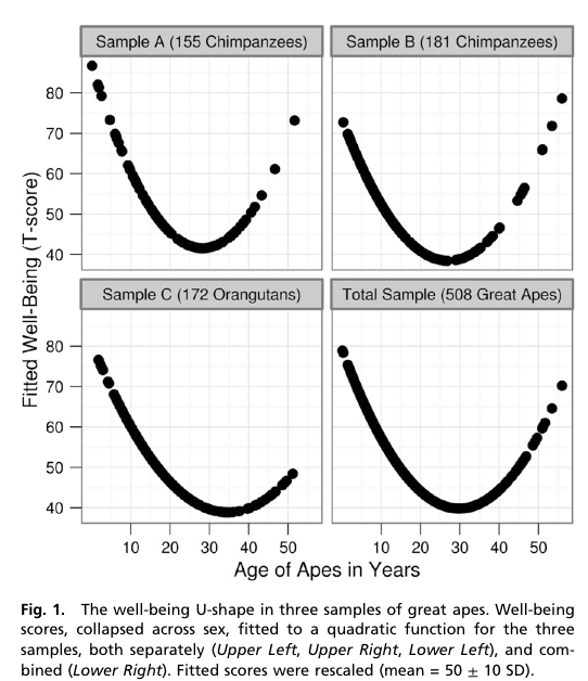
Chimpanzees in a midlife crisis? It sounds like a setup for a joke. But there it is, in the title of a report published in a scientific journal: ‘Evidence for a midlife crisis in great apes.

The researchers asked handlers to estimate ‘well-being’ for 508 great apes: 172 orang-utans, the rest, chimpanzees.  They fitted a statistical model to look for a decrease in mid-life followed by an increase, and got dramatic graphs

The x-axis is in years, showing the trough of despondency in the mid-thirties.  The y-axis isn’t in anything — the curves were rescaled to look similar and the numbers are arbitrary.

The reason the curves look so dramatic is partly the higher-than-wide shape of the graph, but mostly the lack of any indication of uncertainty. The data are actually consistent with a wide range of flatter or steeper U-shapes and with the `mid-life’ crisis happening anywhere over quite a range of years.  I can’t be more precise than that, because the researchers don’t even provide the necessary information to compute the uncertainty in the curve [they give uncertainties in regression coefficients, but not correlations between them].

However, they do have an appendix that looks at chopping up age into five-year bands and estimating the midlife crisis that way.  They don’t give a graph, but they do give enough information to draw one. It’s not as impressive.

The U-shaped pattern does seem to probably be real (though the extent to which the so-called mid-life crisis is really the apes’ problem rather than than the handlers’ problem isn’t clear), but the graphs in the research paper are overselling it. Badly.

[Update: the intervals in the plot are +/- 1.4 standard errors for the coefficient. This should be in the ballpark for a 95% interval for the mean for that age group]

November 17, 2012

Isn’t technology –ing wonderful?

A new website WTFlevel.com (SFW, but makes siren noises) does real-time monitoring of the intensity of swearing on Twitter (only in English, unfortunately).

The record level so far was on US election day, where nearly 11% of tweets contained language unsuitable for those of a delicate constitution, most commonly in combination with the words “Romney” “Obama”, “election”, “stupid”, “white”, and “black”.