Posts filed under Graphics (394)

February 10, 2013

Two of these things belong together

From an op-ed column in the New York Times, describing three countries

But there is one thing all three have in common: gigantic youth bulges under the age of 30, increasingly connected by technology but very unevenly educated.

If I tell you two of these countries are Egypt and India, can you guess the third?  Anyone? Anyone? Bueller?

It might take a while: in the real world, the third country Friedman includes is better known for instituting draconian (but successful) population-growth controls thirty years ago.

Here are the population age distributions for Egypt, India, and somewhere else, from populationpyramid.net.
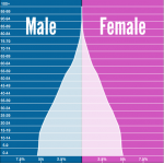
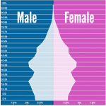
egyptindiachina


(via)

February 3, 2013

What do Kiwis die of?

University of Auckland research scientist Dr Siouxsie Wiles (she’s the one who makes bacteria glow in the dark) has teamed up with data visualisation expert Mike Dickison to create a series of infographics looking at the morbidly fascinating topic of what New Zealanders die from.

Here’s one (click to enlarge). See the whole post on Siouxsie’s blog Infectious Thoughts  here.

battle-of-the-sexes-infographic1

January 28, 2013

More misplaced creativity

I encountered a new form of awful graph yesterday.  You can think of it as a 3-d bargraph seen from a very bad angle so that the bars get in each other’s way. Or a line graph without the lines.


I think the interpretation is that the height of each coloured segment is the trade imbalance (if it’s the smallest positive or largest negative one), the difference between the trade imbalance and the next lower one (if it’s positive) or the difference between the trade imbalance and the next higher one (if it’s negative).  If two countries/regions have the same trade imbalance, one of them will be nearly invisible.

When the ordering of countries changes, things get even more confusing.  For example, the pink band switches from an almost-invisible slice at the top in 2012 to an almost-invisible slice at the bottom in 2013.  I don’t know what happens to the dark green band after 2012.

The point of the graph appears to be that the light green band is above the red one: Germany’s trade surplus is larger than China’s.  (via)

January 24, 2013

Pie charts rot the brain

Evidence from a well-known West Island newspaper

hun


The chart says about 20%, the numbers say 44% (actually 45% if you can round correctly, but let’s not quibble).  (via and)

January 23, 2013

Bad graphs

A few resources for connoisseurs of bad graphics

But remember, as Martyn Plummer demonstrates, the graph may not be the author’s fault.

PS: we get a surprising number of readers searching for “cool excel graphics”, which is an excellent resource for bad graphs

January 21, 2013

Minus several million for good thinking

A monstrosity from The Globe & Mail (Canada)

Globe & Mail (via Dennis Cotes & Andrew Gelman)


Andrew Gelman demolishes it and suggests better ways to display the data.  His conclusion is interesting

But that’s part of the problem—the clearer graph would also be easier to make! To get a distinctive graph, there needs to be some degree of difficulty.

In other words, ten out of ten for style.

January 12, 2013

14-dimensional graphics

An interesting attempt to graph the recovery from the Great Recession, from the Atlanta Federal Reserve Bank (via)

Atlanta Fed.


The outer circle shows 13 economic indicators at the peak of the boom, and the inner yellow circle shows the bottom of the recession.   You can see that the ‘leading indicators’, that is, things that tend to move ahead of the rest of the economy, are improving quite a lot.  Employer behaviour and confidence indicators are up a bit, but the employment indicators are still stuck at recession levels.   If the leading indicators really are ‘leading’, the rest of the circle should be expanding relatively soon.

This graph will get confusing when there are many time periods or when the patterns are not strong.  You could probably handle a larger number of time periods by having the older ones fade to grey or some such, but it still won’t be clear unless there’s a dramatic pattern.

Also, the 13 economic variables are in a particular order around the circle, and with some graphs like this, the visual effect can be quite sensitive to the order; clearly a bad thing.

January 11, 2013

With friends like these…

One of the worst graphs of the year, from Climate Central, via Andrew Gelman

Conclusively proving that hotter years are further to the right


More temperature graphics

There has been a lot of coverage of Australian weather recently, and people who haven’t been to southeastern Australia in summer may have been struck by how big the reported temperature variations are.  There’s a data set of daily maximum temperatures in Melbourne over ten years that has been used as an example in time series research because of the unusual patterns — a bimodal distribution in day-to-day temperature change.

The graph shows Melbourne maximum temperatures from November through March for ten years.  The basic pattern is that tomorrow’s maximum is either slightly higher than today’s, or is about 21C.  The temperature keeps increasing day to day as long as the wind is from the land, then you get a cold front and people can sleep for a few nights.

It looks even more dramatic (why?) when the change in temperature is plotted against today’s temperature


January 9, 2013

Something beginning with ‘D’

The graph shows letter frequencies in English by position in the word — for example, ‘e’ is much less common as the first letter than as the third letter.

wordfrequency


The first systematic study of these was done using a sample of 20 000 words collected by hand and analysed with punched cards and a card-sorting machine.  The author recently wrote to Peter Norvig, at Google, suggesting that an update might be of interest.  The full details, using 0.75 trillion words,  are on Norvig’s web page.

While you’re there, if you have yet to encounter the “Gettysburg Powerpoint”, now is your opportunity.