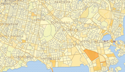
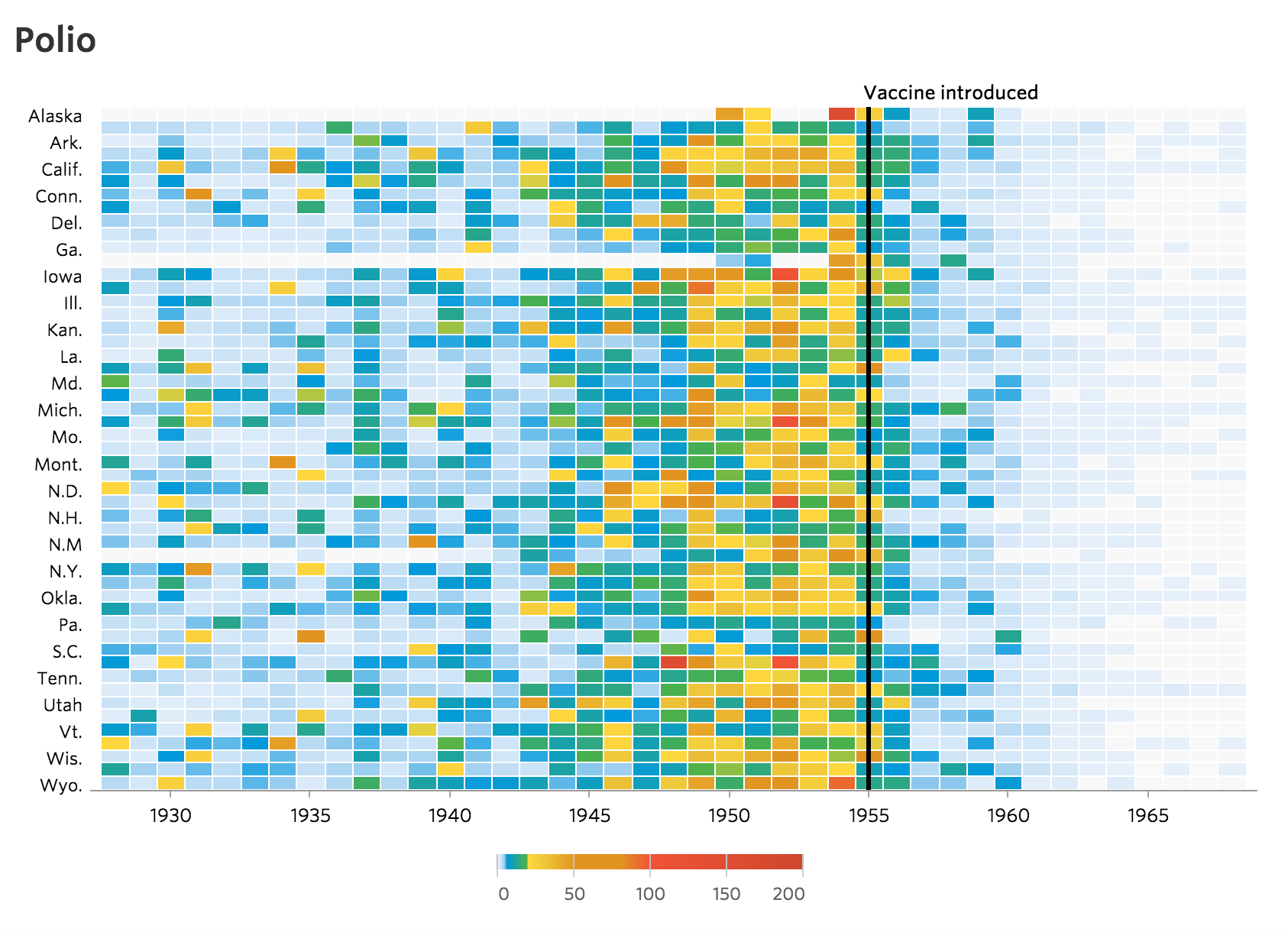
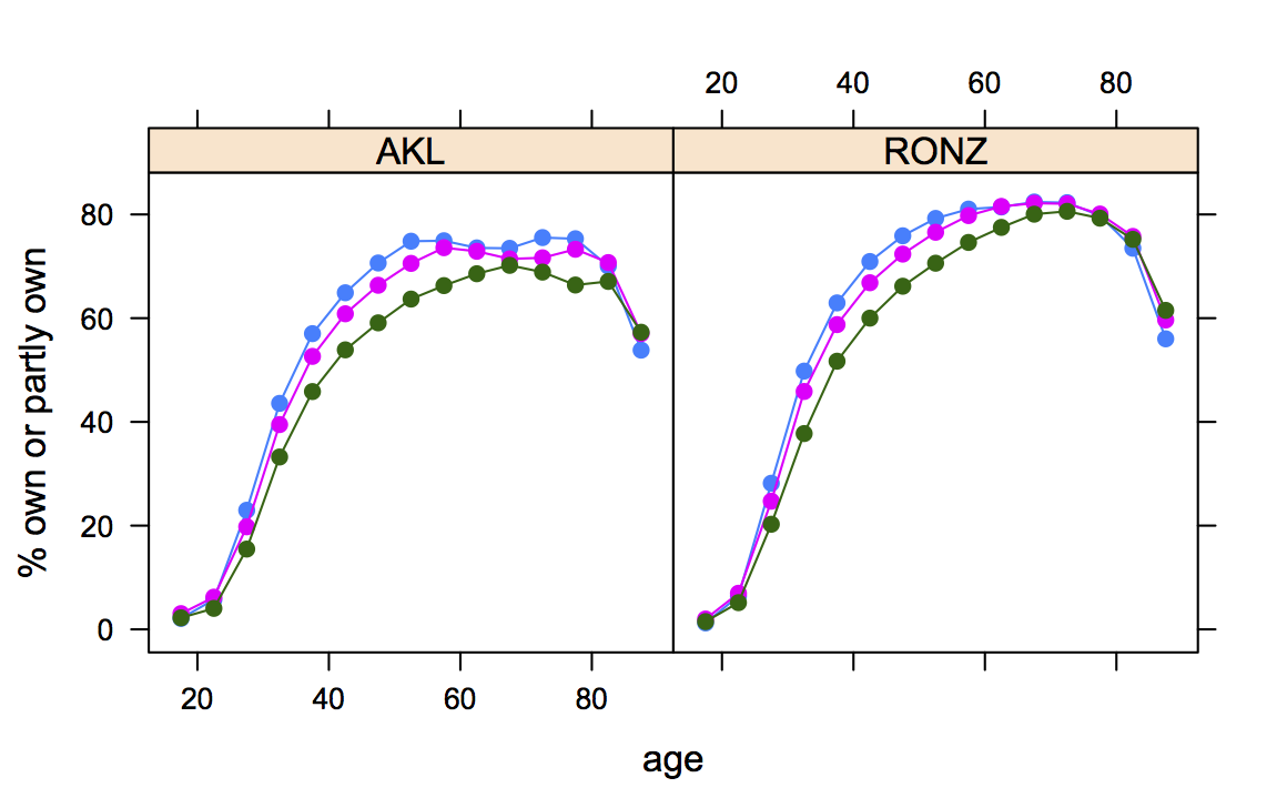
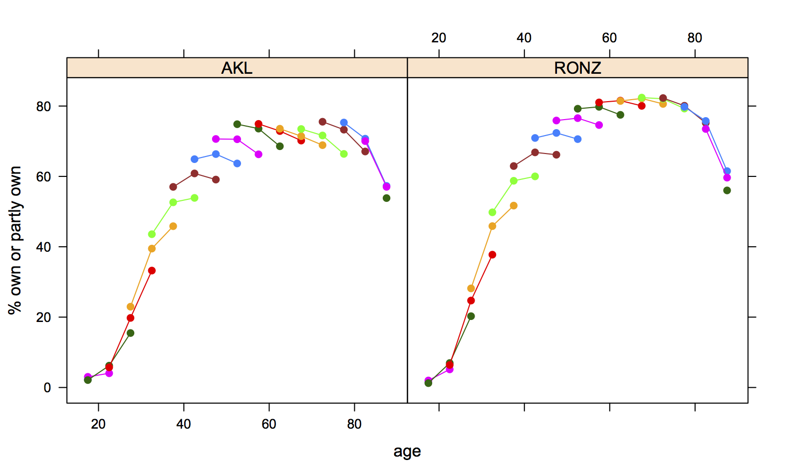
 Every summer, the Department of Statistics offers scholarships to a number of students so they can work with staff on real-world projects. Oliver, right, is working on visualising conservation data with Associate Professor Rachel Fewster. Oliver explains:
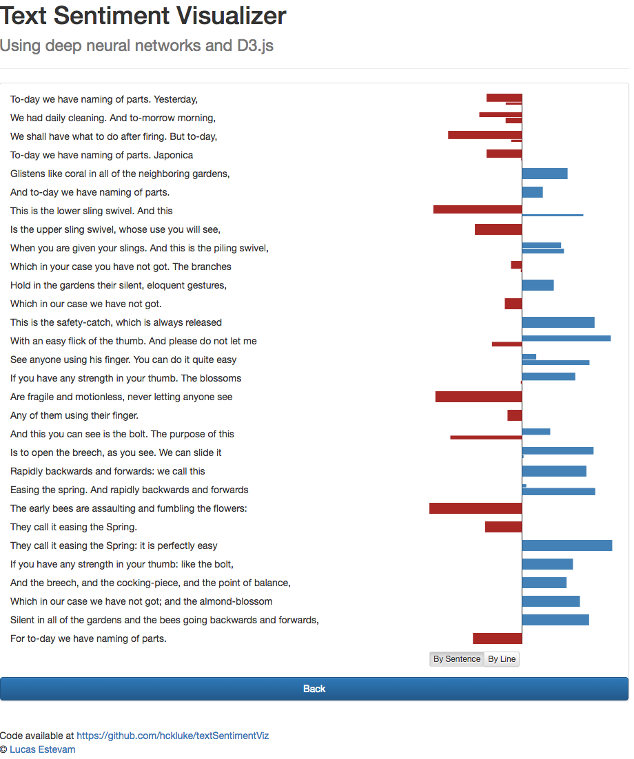
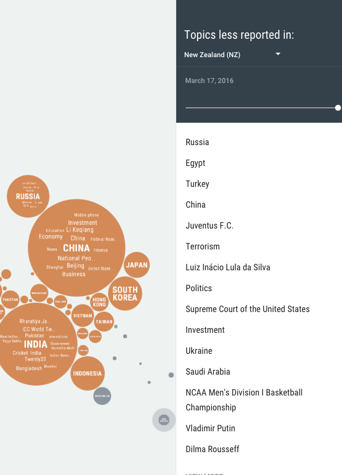
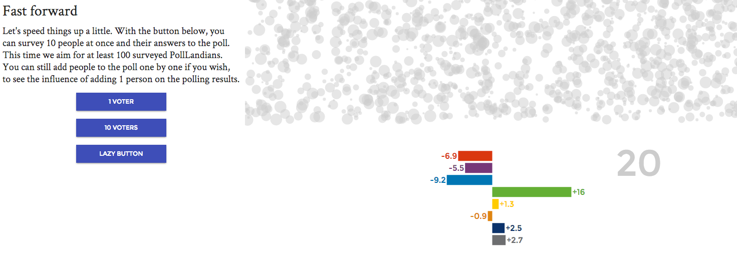
“This summer project is called Maps, graphs, and data analysis for community conservation projects, and builds on my Honours project from the past year. It involves developing interactive applications that automate the display of catch data from various conservation projects around New Zealand.
“The aim of this project is to allow volunteers to engage with their data in more depth than ever before. After a day in the field, a conservation volunteer is able to go online and use these applications to produce maps or graphics to view their day’s work. The graphics illustrate exactly how a volunteer’s work is impacting their local environment and will ideally keep them motivated to continue with what they are doing.
“I graduated from the University of Otago in 2014 with a Bachelor of Science majoring in Statistics and minoring in Psychology, before completing an Honours degree in Statistics at the University of Auckland in 2015. In 2016, I plan on pursuing a Master of Science in statistics, completing this degree as a research masters.
“I enjoy statistics due to its numerous applications. Nowadays, data exists in almost every facet of life, and wherever there is data, we can use statistics to try and gain a deeper understanding of what is really going on around us.
“In my spare time this summer, I will, hopefully, be able to watch the Black Caps as they continue with their summer of cricket.”
 orts with Associate Professor Rachel Fewster. Hubert explains: