Posts filed under Graphics (394)

December 23, 2015

Pre-attentive perception and pandas

The University has closed until the New Year and we are on compulsory holiday, so from my point of view it’s the StatsChat Silly Season.

An important scientific issue in designing graphics is preattentive perception: for example, it’s easy to see the one different point in this plot
preattentive1

The circle vs triangle distinction is pre-attentively perceived: your visual system annotates it before you get to see the picture.  More complicated distinctions aren’t pre-attentive, and so don’t make as good plotting characters.

Here, as a Christmas card, is a picture from Hungarian cartoonist Gergely Dudás. One of the snowmen is a panda. Pandas are not pre-attentively perceived.

snowmen_1

(update: yes, I saw the Herald has it too.)

December 15, 2015

Graphs: when zero is not a relevant value

Bar charts have a filled area tying the axis to the plotted value, and this only makes sense when the axis is at a true zero.  Scatterplots and line plot don’t have the same limitations, and can be useful even when there isn’t a true zero or it isn’t a relevant value.

Here’s the Wikipedia compilation of world average temperature estimates back into deep time:

All_palaeotemps.svg

The zero on the graph is the 1960-1990 average, because that’s a reasonable point of comparison. It’s not a true zero; you couldn’t use barcharts.

Here’s the Berkeley Earth estimate of average land temperatures, based on actual thermometer readings at weather stations, using all the data, with open code, data and methods.

global-land-TAVG-Trend

They could have put a zero on the graph by using differences from the average for some period — their data output is difference from the 1951-1980 average — but they presumably thought it was clearer to just label in degrees Celsius and not make everyone do the conversion.

We had a comment suggesting that zero Celsius should be on this sort of graph, and there’s a graph circulating on Twitter that has its baseline at zero Fahrenheit.

CWN3D6nWUAUmQWW

These looks like a deliberately uninformative choice: there’s nothing special about zero Fahrenheit and nothing special about zero Celsius as temperatures either in any absolute sense or as mean global temperatures.

The only natural zero for temperature is zero kelvin. If you want to argue there has to be a zero on climate graphs, it should be that one. But you’d look silly.
temp-zero

If you want to use graphs of temperature history to make a point about policy, the graph needs to be one where differences that would matter for policy are clearly visible. As far as I know, no-one denies that a rapid 4C (7F) change in global temperature would be important. If your graph would make it look unimportant, your graph is wrong.


December 9, 2015

Not how barcharts work

From the @nzlabour twitterwallah, via Matt Nippert

CVu23dIXAAE8H7T

Barcharts start at zero. Other sorts of charts don’t need to, but barcharts do. A line chart cut off at $300 would be ok — though if you were going to do that, you might as well include a longer range of data.

For example, here’s the top couple of inches of the detailed graph from Herald Insights, with the jump under Mr Smith’s administration highlighted in yellow.

rents

Or you might compare to the increase in median household income for the Auckland region over that period, which was about 9%, and say that affordability of rental housing has decreased by maybe 5% over that time period.  Or compare to the increase in minimum wage (7%). Or something.

Representing a time trend for which there’s weekly monthly data by a two-point decapitated bar chart suggests a low opinion of your audience. When Fox News does it, that’s fair enough, but from a New Zealand political party it’s unfortunate.


November 18, 2015

Old-time graphics advice

  1. We must keep symbols to a minimum, so as not to overload the reader’s memory. Some ancient authors, by covering their cartograms with hieroglyphics, made them indecipherable.”
  2. “One of us recommends adopting scales for ordinate and abscissa so the average slope of the phenomenon corresponds to the tangent of the curve at an angle of 45◦”.
  3. “Areas are often used in graphic representations. However, they have the disadvantage of often misleading the reader even though they were designed according to indisputable geometric principles. Indeed, the eye has a hard time appreciating areas.”
  4. “We should not, as it is sometimes done, cut the bottom of the diagram under the pretext that it is useless. This arbitrary suppression distorts the chart by making us think that the variations of the function are more important than they really are.”
  5.  “In order to increase the means of expression without straining the reader’s memory, we often build cartograms with two colors. And, indeed, the reader can easily remember this simple formula: ‘The more the shade is red, the more the phenomenon studied surpasses average; the more the shade is blue, the more phenomenon studied is below average.’ ”

These are from a failed attempt to get the International Institute of Statistics to set up some standards for statistical graphics. In 1901.

(from Hadley Wickham)

November 13, 2015

Flag text analysis

The group in charge of the flag candidate selection put out a summary of public responses in the form of a word cloud. Today in Insights at the Herald there’s a more accurate word cloud using phrases as well as single words and not throwing out all the negative responses

wordcloud

There’s also some more sophisticated text analysis of the responses, showing what phrases and groups of ideas were common, and an accompanying story by Matt Nippert

Suzanne Stephenson, head of communications for the flag panel, rejected any suggestion of spin and said the wordcloud was never claimed as “statistically significant”.

“I think people misunderstood it as a polling exercise.”

“Statistically significant” is irrelevant misuse of technical jargon. The only use for a word cloud is to show which words are more common. If that wasn’t what the panel wanted to do, they shouldn’t have done it.


November 9, 2015

Inelegant variation

These graphs are from the (US) National Cable & Telecommunications Association (the cable guys)

cableguy

Apart from the first graph, they are based on five-point agree-disagree scales, and show the many ways you can make pie and bar charts more interesting, especially if you don’t care much about the data. I think my favourites are the bendy green barchart-orbiting-a-black-hole and the green rectangles, where the bars disagree with the printed numbers.

Since it’s a bogus poll, using the results basically to generate artwork is probably the right approach.

To each according to his needs

There’s a fairly overblown story in the Guardian about religion and altruism

“Overall, our findings … contradict the commonsense and popular assumption that children from religious households are more altruistic and kind towards others,” said the authors of The Negative Association Between Religiousness and Children’s Altruism Across the World, published this week in Current Biology.

“More generally, they call into question whether religion is vital for moral development, supporting the idea that secularisation of moral discourse will not reduce human kindness – in fact, it will do just the opposite.”

The research found that kindergarten (update: and primary school) children from religious families scored lower on an altruism test (a version of the Dictator game).  Given ten stickers, non-religious children would give about one more away on average than religious children.


While it’s obviously true that this sort of simple moral behaviour doesn’t require religion, the cause-and-effect conclusion the story is trying to draw is stronger than the data. I’m pretty confident the people quoted approvingly wouldn’t have been as convinced by the same sort of research if it had found the opposite result.

The research does provide convincing evidence on another point, though: three-dimensional graphics are a Bad Idea.

religion


October 22, 2015

Early NZ data visualisation

From the National Library of New Zealand, via Jolisa Gracewood

natlib.govt

Types of motor-vehicle accidents in rural areas vary considerably from those ocourrlng In urban areas, as shown in tho above chart. Tho percentages are based on figures of the Transport Department in respect of accidents causing’ fatalltles during the twelve months, April I, 1932, to March 31, 1933.

The text goes on to say “The black section representing collisions with tram and train forms only I per cent, of the whole, through this type of accident appeals to the popular Imagination’ from its spectacular nature.”  Some things don’t change.

September 28, 2015

Seeing the margin of error

A detail from Andrew Chen’s visualisation of all the election polls in NZ:

polls

His full graph is somewhat interactive: you can zoom in on times, select parties, etc. What I like about this format is how clear it makes the poll-to-poll variability.  The poll result for, say, National isn’t a line, it’s a cloud of uncertainty.

The cloud of uncertainty gets narrower for minor parties (as detailed in my cheatsheet), but for the major parties you can see it span an entire 10-percentage-point grid cell or more.

September 26, 2015

US:China graph of the day

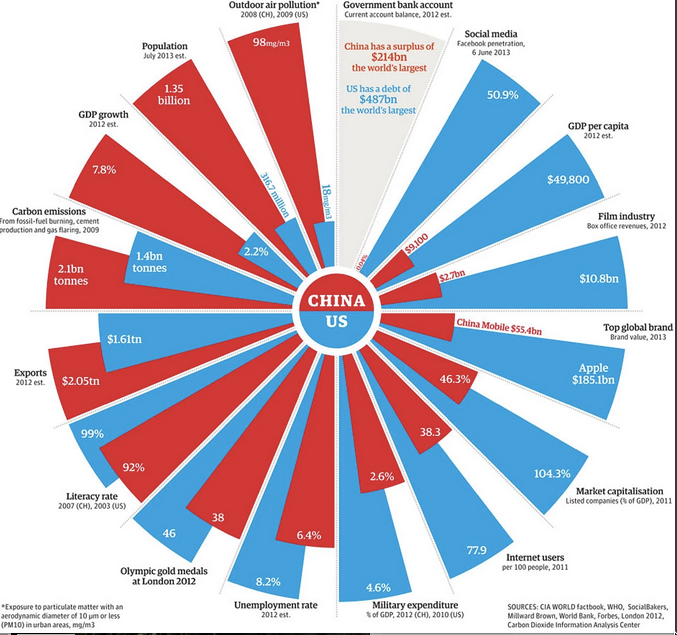
This (via @albertocairo) is from the Guardian, two years ago.

china

At first it looks like a pie chart, but it isn’t. It’s a set of bar charts warped into a circle, so that the ratio of blue and red areas in a wedge is the square of the ratio of the numbers. Also, the circle format means the longest wedge in each pair must be the same length: 8.6% unemployment rate is the same as 4.6% military expenditure, 104% market capitalisation, and 46 Olympic gold medals.

Many of these are proportions or per-capita figures, but not all. Carbon emissions are national totals, making China look worse. Film industry revenues and exports are totals; they are also gross revenues — because the whole visual metaphor falls apart completely for numbers that can be negative. That’s why the current-year budget surplus/deficit isn’t treated like the other numbers.

There are also some unusual definitions. “Social media”, the bar where China is furthest behind, is defined just by the proportion who use Facebook, which obviously underestimates the social-media activity of the US (and also, perhaps, of China).

The post has some discussion of the difficulties — for example, the measurement and even the definition of unemployment in the two counties — and is much better than the graph.

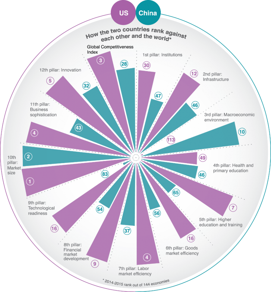
Here’s a different take on the same countries, in the same format, from the World Economic Forum

uschina-949x1024

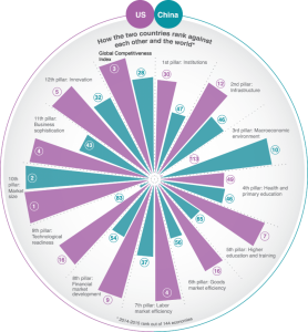
They have similar problems with total vs proportion/mean variables. They solve the y-axis problem by working with international ranks, which at least gives a common scale. However, having 1 as the largest rank and some unspecified large number as the smallest rank does make the relationship between area and number fairly weird.  It also means that the actual numbers for each wedge aren’t fractions of a total in any sensible way.

If the main point is to be an eye-catching hook for the story, the Guardian graph is more successul