July 29, 2015
Hadley Wickham
Dan Kopf from Priceonomics has written a nice article about one of Auckland’s famous graduates, Hadley Wickham. The article can be found Hadley Wickham.
Dan Kopf from Priceonomics has written a nice article about one of Auckland’s famous graduates, Hadley Wickham. The article can be found Hadley Wickham.
 Every year, the Department of Statistics offers summer scholarships to a number of students so they can work with staff on real-world projects. Kai, right, is working on a project called Constrained Additive Ordination with Dr Thomas Yee. Kai explains:
“In the early 2000s, Dr Thomas Yee proposed a new technique in the field of ecology called Constrained Additive Ordination (CAO) that solves the problems about the shape of species’ response curves and how they are distributed along unknown underlying gradients, and meanwhile the CAO-oriented Vector Generalised Linear and Additive Models (VGAM) package for R has been developed. This summer, I am compiling code for improving performance for the VGAM package by facilitating the integration of R and C++ under the R environment.
“This project brings me the chance to work with a package in worldwide use and stimulates me to learn more about writing R extensions and C++ compilation. I don’t have any background in ecology, but I acquired a lot before I started this project.
“I just have done the one-year Graduate Diploma in Science in Statistics at the University of Auckland after graduating from Massey University at Palmerston North with a Bachelor of Business Studies in Finance and Economics. In 2015, I’ll be doing an honours degree in Statistics. Statistics is used in every field, which is awesome to me.
“This summer, I’ll be spending my days rationally, working with numbers and codes, and at night, romantically, spending my spare time with stars. Seeing the movie Interstellar [a 2014 science-fiction epic that features a crew of astronauts who travel through a wormhole in search of a new home for humanity] reignited my curiosity about the universe, and I have been reading astronomy and physics books in my spare time this summer. I even bought an annual pass to Stardome, the planetarium at Auckland, and have spent several evenings there.”
A recurring issue with trends over time is whether they are ‘age’ trends, ‘period’ trends, or ‘cohort’ trends. That is, when we complain about ‘kids these days’, is it ‘kids’ or ‘these days’ that’s the problem? Mark Liberman at Language Log has a nice example using analyses by Joe Fruehwald.
If you look at the frequency of “um” in speech (in this case in Philadelphia), it decreases with age at any given year
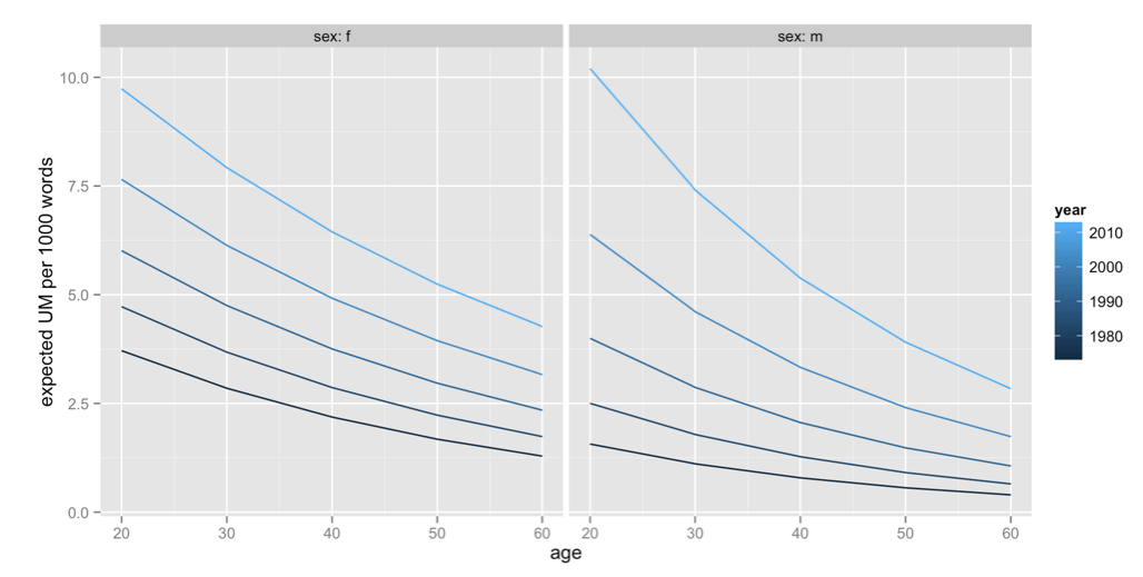
On the other hand, it increases over time for people in a given age cohort (for example, the line that stretches right across the graph is for people born in the 1950s)
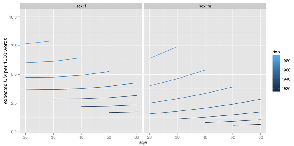
It’s not that people say “um” less as they get older, it’s that people born a long time ago say “um” less than people born recently.
The official maximum margin of error for an election poll with a simple random sample of 1000 people is 3.099%. Real life is more complicated.
In reality, not everyone is willing to talk to the nice researchers, so they either have to keep going until they get a representative-looking number of people in each group they are interested in, or take what they can get and reweight the data — if young people are under-represented, give each one more weight. Also, they can only get a simple random sample of telephones, so there are more complications in handling varying household sizes. And even once they have 1000 people, some of them will say “Dunno” or “The Conservatives? That’s the one with that nice Mr Key, isn’t it?”
After all this has shaken out it’s amazing the polls do as well as they do, and it would be unrealistic to hope that the pure mathematical elegance of the maximum margin of error held up exactly. Survey statisticians use the term “design effect” to describe how inefficient a sampling method is compared to ideal simple random sampling. If you have a design effect of 2, your sample of 1000 people is as good as an ideal simple random sample of 500 people.
We’d like to know the design effect for individual election polls, but it’s hard. There isn’t any mathematical formula for design effects under quota sampling, and while there is a mathematical estimate for design effects after reweighting it isn’t actually all that accurate. What we can do, thanks to Peter Green’s averaging code, is estimate the average design effect across multiple polls, by seeing how much the poll results really vary around the smooth trend. [Update: this is Wikipedia’s graph, but I used Peter’s code]
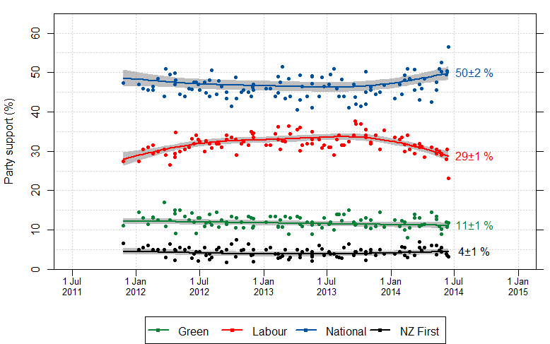
I did this for National because it’s easiest, and because their margin of error should be close to the maximum margin of error (since their vote is fairly close to 50%). The standard deviation of the residuals from the smooth trend curve is 2.1%, compared to 1.6% for a simple random sample of 1000 people. That would be a design effect of (2.1/1.6)2, or 1.8. Based on the Fairfax/Ipsos numbers, about half of that could be due to dropping the undecided voters.
In principle, I could have overestimated the design effect this way because sharp changes in party preference would look like unusually large random errors. That’s not a big issue here: if you re-estimate using a standard deviation estimator that’s resistant to big errors (the median absolute deviation) you get a slightly larger design effect estimate. There may be sharp changes, but there aren’t all that many of them, so they don’t have a big impact.
If the perfect mathematical maximum-margin-of-error is about 3.1%, the added real-world variability turns that into about 4.2%, which isn’t that bad. This doesn’t take bias into account — if something strange is happening with undecided voters, the impact could be a lot bigger than sampling error.
Alyssa Frazee, a PhD student in biostatistics at Johns Hopkins, has an interesting post looking at gender of programmers using the Github code repository. Github users have a profile, which includes a first name, and there programs that attempt to classify first names by gender.
This graph (click to embiggen, as usual) shows the guessed gender distribution for software with at least five ‘stars’ (likes, sort of) across programming languages. Orange is male, green is female, grey is “don’t know”
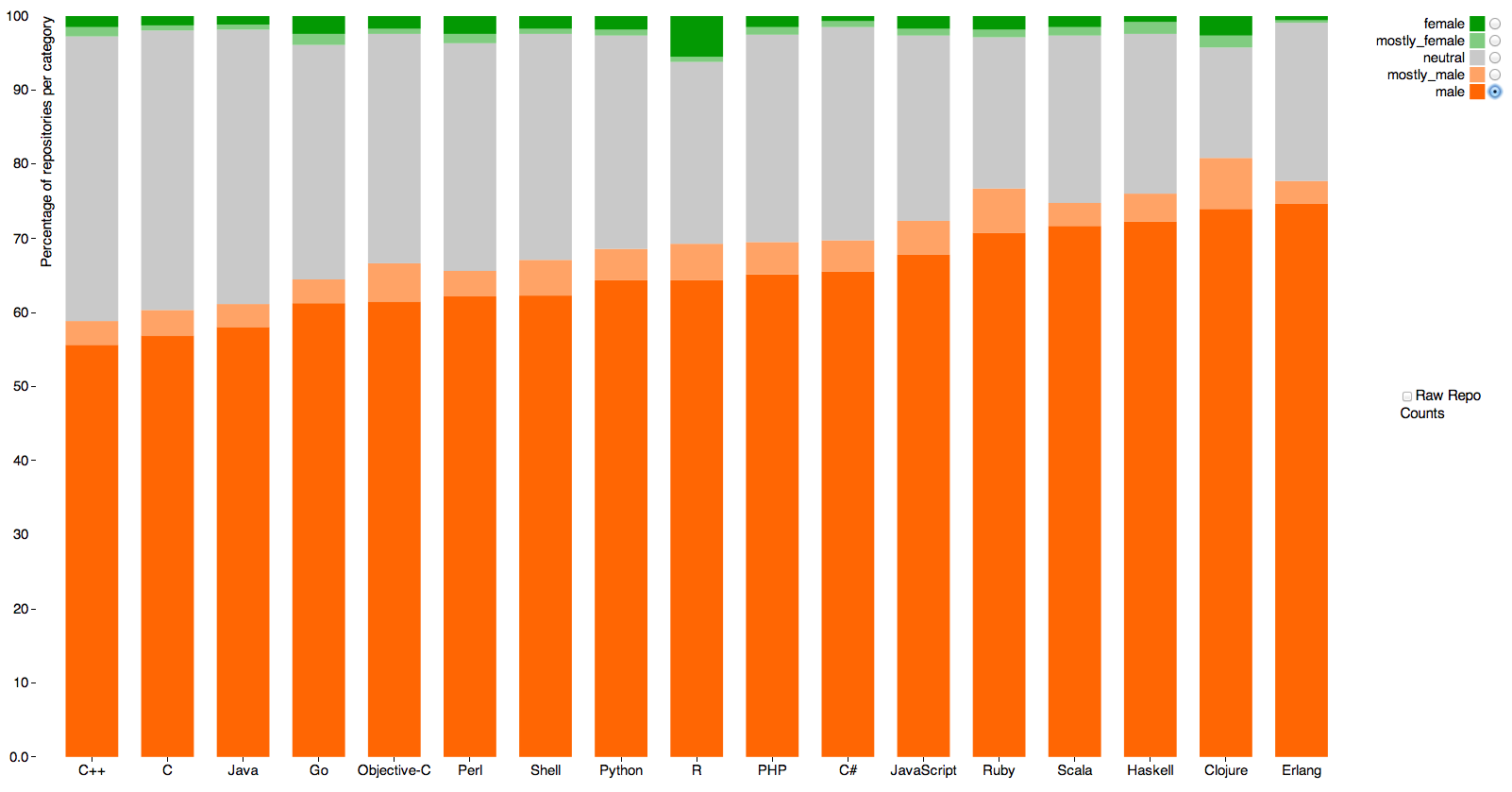
The main message is obvious. Women either aren’t putting code on Github or are using non-gender-revealing or male-associated names.
The other point is that the language with the most female coders seems to be R, the statistical programming language originally developed in Auckland, which has 5.5%. Sadly, 3.9% of that is code by the very prolific Hadley Wickham (also originally developed in Auckland), who isn’t female. Measurement error, as I’ve written before, has a much bigger impact on rare categories than common ones.
Gareth Robins has answered this question with a very beautiful visualization generated with a surprisingly compact piece of R code.

Distance to the nearest road in New Zealand
Check out the full size image and the coded here.